Welcome to the fascinating world of vintage logos. The spirit of the past and contemporary design is in harmony. Graphic Springs is not just a logo maker. Pride in providing a truly personalized experience with our custom logo design service. Vintage or retro logos reflect a business, company, or brand using vintage fonts, images, objects, or visuals. We revive memories and create an emotional connection, thus appealing to and influencing our target audience. This article is going to be the ultimate guide for understanding a vintage logo and enhancing branding.
Part 1: Why we choose a vintage logo?
Through vintage design the product becomes more attractive to the audience since it creates emotional appeal within visual content. If your business has historical origins, deep cultural roots or inspiring stories, you should choose a vintage iconic logos. Also, if you are dealing with traditional or cultural products, the classic logo is perfect. Even if it is not such a business, it is a good choice to incorporate retro words into the design of the vintage logo.
How Vintage Logos Create Lasting Connections?
There are many benefits to using classic styling and retro visuals for the brand logo. Branding of companies, businesses and products depends on creating profits and establishing long-lasting relationships. Therefore, it is of great value to add a reflection of the times when people feel value. The following benefits highlight the retro-visual benefits of the brand logo:
- Eye-catching, stunning visual.
- Inspire and attract audience curiosity and emotion.
- Creating the Foundation for Inspiring Brand Identity.
- By establishing a connection with the past, it is easy to remain in memory.
- Cut through marketing confusion with unique features.
- Encourage prospects to engage and interact with brands.
- Create and transform more leads by matching brand goals.
Part 2: Understand the vintage logo
If you are looking for a way to evoke nostalgia and charm in branding, the vintage logo may be the best. These logos feature elegant typography, retro motifs, and timeless sensations that evoke warm emotions. Here’s what you need to know about the vintage logo:
Design Elements
The combination of these elements creates a visually attractive logo that looks like it was created decades ago. Vintage logos often incorporate trendy design elements such as:
- Faded texture
- Writing body or script font
- Serif Font
- All-cap trademark text
- Retro motifs such as arrows, stars and badges
Color palette
Vintage logo colors palette is popular earth color such as beige, brown and green. However, by using pop colors, you can become interested and catch the eye. When choosing the color of the vintage logo, it is important to choose a soft and delicate color.
Typography
Typography is an important element of the vintage logo. Serif logo fonts are often used in vintage logos because of their classic and timeless atmosphere. Writing and script fonts can also be used to add elegant and sophisticated touches.
Application of branding
There is a very wide application of vintage logos in branding use from the business card to letterheads up to websites and social media. Especially ideal for businesses trying to convey tradition, reliability, and quality. In general, the vintage logo is a beautiful way to create personality and charm your branding look by using the elements of the retro design and silent colors together with elegant typography that will result in something very classic and timelessness.
Part 3: The significance of the vintage logo
In recent years, the popularity of vintage logos has increased. It gives the nostalgic feeling and timelessness, and it is the sympathy of many audiences. This chapter discuss the retro logo in relevance to brand identity and attraction towards the audience.
Brand Identity
The logo with a vintage appeal helps define the brand and can be considered a symbol for the history it brings along, making it longer. You also get to state the quality as well as craftsmanship of the yesteryear. Vintage logos give brands a differentiating look and feel against the competition.
Audience Appeal
The vintage logos appeal to almost anyone; people who experienced this period or are merely aesthetes. It creates nostalgia, comfort, reliability, and a feeling of something that has been going on for a while. By using the vintage logo, the brand can utilize these emotions to create connections with the audience.
Part 4: The Psychological Appeal of Vintage Logos
These vintage logoes are unique, telling about the earlier days and memories. It gives the feeling evocation and trust. There is something magical in the old logos, which makes a brand seem personalized and trustworthy to its customers; it generates long-term relations between business and customer. This section shall discuss why old logos are effective in grabbing customer’s attention and how such nostalgic appeal changes the perception regarding the brand.
Nostalgia and Emotionalism
There is warmth with the old logos, which actually depicts the days when everything went easy and where people are closer to the design of happier times and the day of childhood. It is something that can work emotionally to cause people to have a stronger attach to the brand. Buying tends to be on nostalgia; so, people have always been attuned to be attracted to items that they deem comforting and close to them.
Perceived Authenticity
Consumers perceive old designs to be authentic and trustworthy. An old logo gives a business the impression of age, experience, and commitment to quality. Most brands utilize vintage elements to signal tradition and reliability, in addition to craftsmanship. The old and artisanal feel of a vintage logo gives an impression of authenticity and encourages customers to believe in the brand values and promises.
Part 5: Examples of Vintage Logo
The vintage logos will add that kind of nostalgia and a personal touch to your brands in the most impressive ways. Much of the legendary brands maintained all their classic designs, which aided their logos for it to last even after numerous decades and becoming highly recognizable without having to strain for even one minute. Check out some good examples of amazing logos that tested times:
1. Coca-Cola
The classic logo of Coca-Cola is one of the most recognizable logos in the world. Spencerian flowing script was first used in 1887, and the color scheme red and white is more energetic and livelier, giving it more attention. Over time, small improvements have kept it fresh without losing its age-old char. The branding of Coca-Cola has become a nostalgic heritage brand because of this aspect. The shape of the vintage bottle and the script font are an iconic identity for it.
2. Levi’s
Levi’s vintage logo is a true classic, reflecting its long-standing reputation in the denim industry. The brand’s famous red tab, introduced in 1936, remains a defining feature of Levi’s branding. The bold typography and minimalistic design make the logo both stylish and timeless. Over the years, Levi’s has maintained its vintage appeal while adapting to modern trends. The logo’s association with quality and durability has cemented its status in fashion history.
3. Harley-Davidson
Harley-Davidson, for example has a very old logos that epitomizes its brand – it is indeed very toughly rebellious. The ‘bar-and-shield’ logotype, originally from 1910, stands as such an icon symbolizing freedom or adventure. One has seen too many variations. Its typography is quite powerful, and strength resonates power and masculine force. The logo symbolizes a vintage that speaks more to the motorcyclist and collector.
4. Ford
Ford’s old logo has undergone a lot of changes since the company was first established in 1903. Initially, the logo was more complex, but later it became more minimalist and fashionable. The present blue oval symbol, which began in 1976, is one of the most recognizable automobile symbols. Classic Ford cars are never out of the memories for people who have used the old vintage script lettering in previous models.
5. Jack Daniel’s
The old classic, Jack Daniel’s, is the quintessence of brand heritage and tradition. Old No. 7 is a designation that dates way back to 1955 and has since been an icon from the sands of time cut out in its own right, representing fine quality whiskey. Black-and-white bold classic gives off an intricate and ornate typography, representing craftsmanship and heritage. It is one of the most iconic pieces of American whiskey culture, depicting tradition and authenticity.
6. Pepsi
The classic Pepsi logo has been through a series of revolutions in changes since it was first discovered in 1898. It was first done in script with lettering that was quite ornate and not very common at the time for a word mark. Later, the logo continued to evolve with a round logo and introduced red, white, and blue colors in 1950. Vintage Pepsi-Cola script is something that is simply iconic and vintage about the brand.
7. Shell
Shell’s previous logo has a very long history. Its original version dates back to the year 1900. The more lifelike drawn shell originally was used to signify the industry for which the business was established: primarily oil and petroleum production. By the year 1948, its style had gradually changed into its iconic simplification through highly bold red-yellow colors. Thus, this color scheme contributed much to making the corporate image and name better known.
8. Warner Bros.
The Warner Bros. shield logo has remained an entertainment icon for nearly a century, although the actual design first surfaced in 1923 as a beautiful, classic emblem with bold typography to portray the golden age of Hollywood. While decades went by, the stylized shield shape continued to be typical, though the vintage designs of the 1930s and 1940s are still lauded for their unparalleled style. Early hues of gold and black made it elegant and class.
9. Kodak
Kodak’s landmark sign has forever been simple, yet revolutionary. The first serif font with an elegance touch, even until today, is the original logo from 1907. Bold red and yellow colors were introduced by Kodak in the 1930s, which later became a trademark of the brand. Even after decades, the classic wordmark of Kodak itself changed little and eventually became synonymous with trust and photographic excellence. Even when the company entered the digital age, the company still preserved some of the vintage logo’s elements.
10. Michelin
Bibendum or the Michelin Man is perhaps the most recognized mascot of Michelin’s vintage logo. The early version of the character was intricately hand drawn in 1898. Its design evolved, becoming streamlined with a vintage twist. The earliest typography used on Michelin signage was classic bold serif, evoking a century-old history and tradition. Still, collectors as well as the design community covet the elaborate hand-drawn illustrations that feature in the more vintage logos.
Part 6: How to make a logo with vintage inspiration?
If you want to start trying graphic design, here is a list of steps in the logo design process. It will help you accurately embed the most attractive features in your layout. Vintage logo for inspiration:
Logo ideas and research
I think you already have a logo idea, but if you don’t, let’s use an online logo maker. You can search for business logo ideas online or enter business details on the AI logo maker platform. Draft the first concept and investigate the target layer to select the most attractive features. Let’s list the purpose of the brand and incorporate visuals that support its achievement. Investigate the motivation to stimulate prospects and take necessary actions.
Select retro fonts
Classical fonts similar to handwritten characters and old writing bodies can change any emblem to vintage. Using vintage fonts not only increases the retro feeling of the emblem, but also effectively appeals to the audience. While bold and heavy characters intrigue professionals and middle-aged people, the writing body grabs the mind of young people. Classic style fonts may use ink marks to fill vague colors or partial shades, but do not need to be used frequently.
Vintage Color Palette
In a classic emblem, a vintage color palette plays an important role in reflecting the emotions and charms of that era. You can choose bright colors similar to neon signs and minimal shades of gray, black and brown. Explore the contrast and color scheme of the specific era you want to draw and use it for layout. Remember that the efficiency of printing and painting in that era may not be as perfect as it is now.
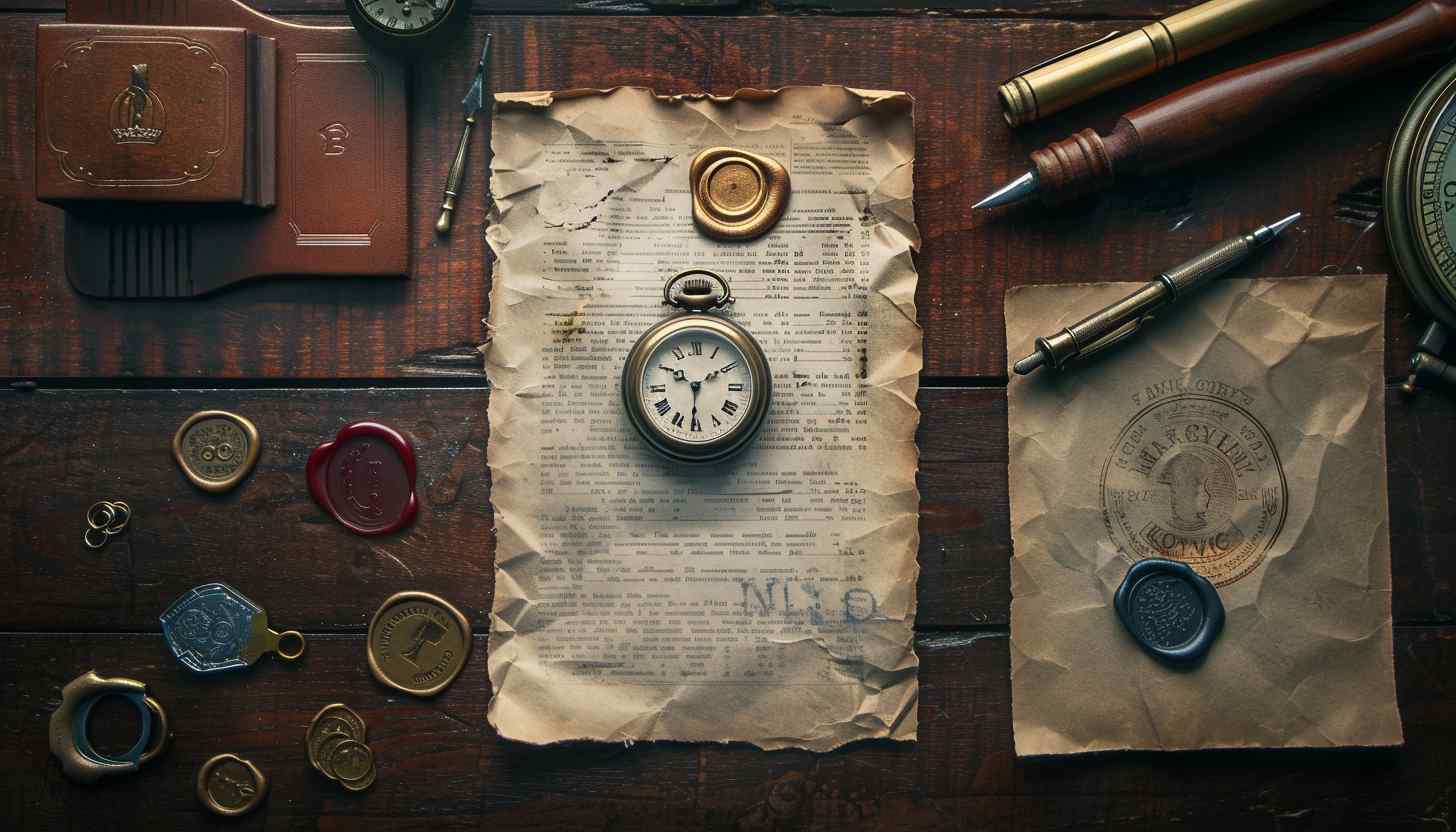
Images and symbols
The images and objects of the trademark symbol are at the center of vision, wherever the viewer is. Do a thorough image search and find images that remind you of the past by clicking on the old memory of the prospect. You can use AI image generator or get inspiration from old university seals, official documents, copyright symbols, signboards, etc. Old tools and crafts can also play a role if they are famous and retain important value in viewer recognition.
Design Principles
To unify all elements, we must follow the principles and basics of design. Pre-research in this area helps refine visuals by focusing on best practices in graphic design. How to maintain the hierarchy of contrast, balance and features? How to set alignment, proximity and ratio? And How to incorporate rhythm, pattern and symmetry? With all these questions, you can design with professional skills.
Part 7: Classic logo creation tips
After the design process, visit the timeless logo area to ensure the creation of classic emblems. Below are the parameters that prevent your visuals from the effects of time.
1. Memory
Retro logos that are hard to remember, hard to remember, and hard to recognize have no meaning. Incorporating many functions and complex pictures into the retro logo threatens its memory. A minimal design approach with simple images and objects is good. To maintain a modern and classic design, add texture, but avoid adding fine details.
2. Unique
Many old logos use the same patterns and colors to express vintage design. Use fresh ideas and custom retro font generators to highlight your brand identity and avoid confusion. Retro words are mainstream of vintage logo design. Remember you’re looking for a unique custom font that uses inspiration to create exceptional visuals.
3. Adaptability
Even the most classic logo requires adaptability due to different background colors, printing media, and digital media. The retro logo design enhances its versatility by being tidy to the background, surrounding environment, and usable size. The signboards on the roadside must remain as attractive as packages and websites. Even if the size is reduced for Fabicon, there is no merit using vintage words.
4. Reflection
Think of retro graphic designs and vintage badge logos. Do they reflect industry, company or audience? Is it similar to 70s fashion, 80s design or 80s logo? How to make an antique shop logo using vector or vintage color palette of vintage labels? By answering these questions, you can embed the necessary details in your logo idea without falling into creative blocks.
5. Appeal
To add appeal to the idea of a business logo, vintage logo maker, 80s graphic design, classic font selection is not enough. The process of combining influential customer-centric visuals is necessary to achieve the purpose of the brand. AI image generators can create thousands of images, but you need to hire a graphic designer with expertise and experience to add appeal. You can also use visuals related to the interests and preferences of the target market.
Part 8: Arvin AI: Bridging Tradition and Technology
Branding is of the utmost importance for any business, and a well-designed logo will surely help in building a strong identity. The designing tools need to be accurate; some designs only appear before the eyes of Arvin AI, and for that, it is the best logo maker when it comes to vintage designs. It is thoughtfully able to bring history into designing and modern technology together, making it easy for designers to craft authentic and pop-out vintage logos.
Key Features of Arvin AI
- AI-Based Design: Arvin AI offers unique logo ideas that fit your brand.
- Customization Options: You can customize every element of the design to suit your imagination.
- Digital Optimization: The logos are automatically optimized to appear great on any device or platform.
- Large Template Collection: Access a large collection of professionally designed templates for inspiration.
- User-Friendly Interface: The intuitive interface allows anyone to create logos without prior design experience.
Steps to Use Arvin AI for making Logo
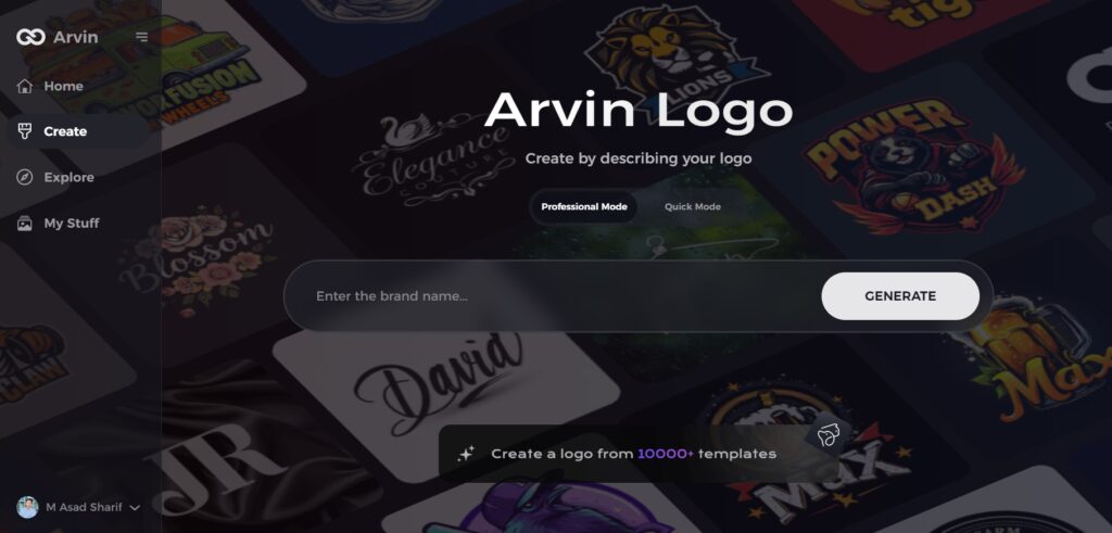
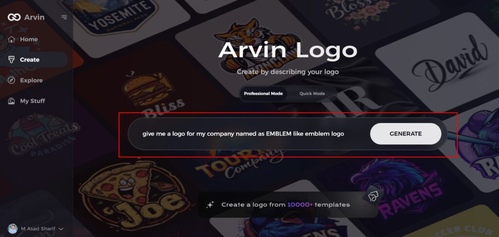
Step 1: Visit the Arvin AI Website
Open your web browser and navigate to the logo design page at logo.arvin.chat to begin crafting your emblem logo.
Step 2: Enter Your Business Details
Provide essential information about your business, including your business name and category. This helps the AI tailor designs that are aligned with your specific brand identity.
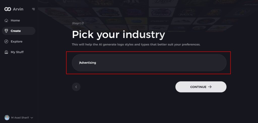
Step 3: Select Your Industry
Choose the industry your business operates in from a list of options. This step ensures that the AI refines the logo styles to match the trends and aesthetics relevant to your field.
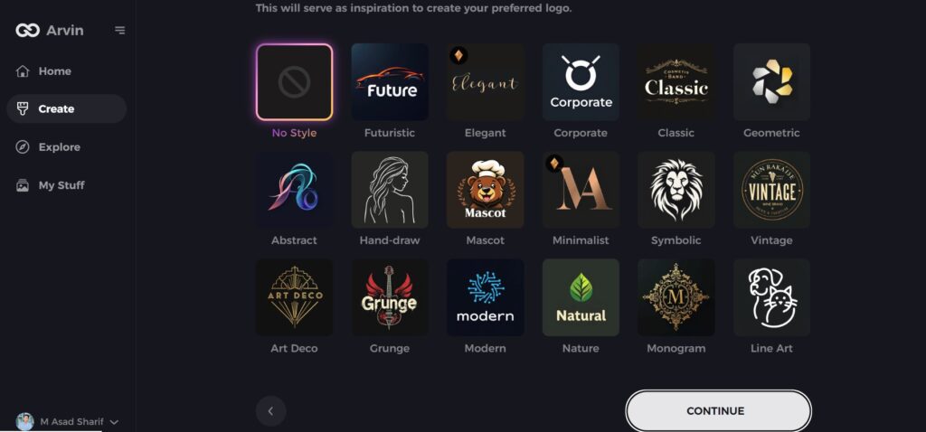
Step 4: Choose Your Design Style
Browse through the available design styles and select the one that best represents your brand’s vision. If you’re unsure, you can skip this step and allow the AI to generate logo ideas based on default inspirations.
Step 5: Review Logo Concepts
The AI will generate a selection of emblem logos based on the details you’ve provided. Take your time to explore the options and select the ones that best reflect your brand image.
Step 6: Customize Your Logo
Fine-tune your chosen logo by adjusting elements such as color scheme, font, icons, and layout to perfectly match your brand’s style and tone.
Step 7: Download Your Final Logo
Once you are satisfied with your emblem logo, download it in high-quality formats like PNG or SVG. These formats ensure your logo is ready for use across websites, social media, and print materials.
Conclusion
A timelessness logo can be still attractive because it brings history combined with authenticity together. It creates an emotional attachment, remembering tradition and making something by hands. Whether honoring the past or bringing back old memories, a well-crafted vintage logo will let your brand standout. The selection of the best tools is fundamental in achieving a classic look for this logo design. Arvin AI is your best option when it comes to vintage-type logos. It combines the best of history and modern technology to make it easier to create an authentic, eye-catching logo that will surely reach your target audience.
FAQs
What makes a vintage logo design?
A vintage logo design is the classic fonts, traditional symbols, and aged textures used to give the nostalgic feel.
Why are vintage logos effective in modern branding?
They inspire feelings, establish trust, and have a history that can be used to narrate a brand.
Can a new brand use an old logo?
Yes! Vintage logos give old brands an old-world feel of authenticity and nostalgia with tradition.
How does Arvin AI create vintage logos?
Arvin AI analyzes the historic trends of designs and gives a user-friendly tool to design the vintage logos.