A fitness logo, like any other logo, reflects the essence of a business. It reminds the audience of the mission and values represented by the business. For a fitness business, a logo transcends into strength, health, and energy. A strong fitness logo stimulates client trust and serves as both an attractive foundation for potential members and reflects the brand identity. Through this guide we will demonstrate why fitness logos are important while teaching you essential logo design principles coupled with modern design trends to create your fitness brand’s distinctive logo.
Part 1: Why Fitness Logos Matter
A fitness logo is the foundation of visual expressions of your brand. The marketing tool builds trust through recognition which directly leads to forming emotional connections with the audience. A fitness logo serves among the crucial elements to differentiate brands within a crowded fitness industry because it helps establish uniqueness.
Building Brand Recognition
A good logo is a vital asset for building brand identity in the competitive fitness industry. A memorable fitness logo will be associated with the personality of the brand and instantly connect with the potential clients. Whether it is a gym, personal trainer, or a fitness apparel brand, a unique logo will make your business stand out in the crowded fitness market.
Conveying Trust and Professionalism
For any fitness-related business, trust is usually the initial currency of operation because clients must feel at ease selecting a gym or personal trainer. A professionally designed logo communicates to customers that your business is reliable, quality-conscious, and serious about health and fitness. For example, a simple clean, polished logo, modern font, and strong color palette can immediately develop professionalism and draw confidence from your prospective customers.
Appealing to Target Audiences
Such an effective logo can even speak to your target audience, be it gym-goers, athletes, or casual fitness enthusiasts. A weight training fitness brand is going to have the most excellent logo incorporating big fonts and very huge, sharp geometric shapes, while a yoga studio will opt for softer lines and more soothed colors. Well-tailored logo marks will be excellent because they will resonate with interests and life.
Examples of Successful Fitness Logos
Several fitness logos have left lasting marks in the industry. Take Nike’s Swoosh for example. Immediately, it symbolizes movement and athleticism, hence its company mantra: performance and empowerment. A similar case with Gold’s Gym is their muscular figure logo that simply speaks about strength and dedication directly to a bodybuilder or someone working out.
Part 2: Key Elements of a Fitness Logo
Key aspects to be discussed are how a great fitness logo is created by highlighting the vital elements that encompass your target audience. Colors, typography, and images are what finalize the communication of your brand message.
Colors: Choosing the Right Palette
Chose Colors for your fitness logo are also important so the proper message is conveyed; bold colors such as red, orange, and yellow tell the story of strength, energy, and passion. These colors are great for athlete-oriented brands or high-intensity workout brands. Cooler tones like blue and green can give the feeling of being cool, trustworthy, and professional, but perfect for yoga studios, wellness centers, or branding that focuses on balance and health.
Typography: Selecting the Right Fonts
Typography is the most important tool in communicating your personality as a fitness brand. Bold, strong fonts with clean lines are perfect for fitness logos, as they represent power, strength, and professionalism. Sans-serifs with sharp edges or custom lettering can be bold. For businesses with a more holistic or wellness-oriented approach, softer, rounded fonts may be suitable, as they convey calmness and approachability.
Iconography: Choosing the Right Symbols
Iconography is used in many fitness logos to visually communicate the essence of the brand. Symbols include weights, dumbbells, running shoes, muscles, and athletic figures. These visual cues can immediately communicate the business’s focus: bodybuilding, running, or general fitness. Use icons that are easily recognizable and reflect the values of your brand.
Shapes: Creating Balance and Dynamics
Geometric shapes are important in logo design, as they give balance and structure in them. Circular logos represent wholeness, unity, and movement-all perfect qualities for a fitness program. Triangular logos represent strength and stability, while angular shapes might represent speed and agility in motion. A shape has to complement the overall message of the brand. Through the use of these geometric shapes strategically, you can come out with a logo that is both aesthetically pleasing and dynamic.
Simplicity: Emphasizing Clarity
Less is more with fitness logos. Simple designs are quite effective in communicating the brand’s identity or personality in a straightforward yet memorable way. Too many details water the message down while making the logo less recognizable. Simpleness matters-mostly in terms of clean lines, strong color palette, and the right icon to make it stand out on multiple marketing materials, from business cards to gym signs.
Part 3: Popular Fitness Logo Trends in 2024
With the evolution of fitness branding, so do its design trends as they fashion their logos for the world of fitness. In 2024, it is breaking up the mold on traditional design for new, meaningful visuals to appeal to their market. Let us take a glance at the trendy fashion in fitness logo designs:
Abstract Logos
Many fitness brands are dropping literal representations and opting for abstract logos in 2024. Abstract logos employ shapes, colors, and forms that don’t necessarily depict objects that relate to fitness but convey energy, motion, and strength in a more conceptual way. Abstract logos allow brands to be versatile and give a modern, unique edge.
Vintage Aesthetics
Old logos are again being used with a feel of nostalgia, particularly in the fitness industry, as companies want to feel the nostalgia but remain contemporary. People are using retro fonts, grey-scaled color palettes, and the good old emblems related to mid-20th-century designs. This style hits timeless reliable qualities, indicating that the brand stands the test of time.
Geometric Designs
Geometric logos were also common in branding for 2024 fitness. These logos mostly use sharp, clean shapes like triangles, circles, squares, and hexagons to bring out bold, minimalist designs. Geometric logos are sleek and modern while promoting simplicity, making them easy to recognize and memorable. This is important to fitness enthusiast, but the use of symmetrical and angular shapes can suggest precision, structure, and balance.
Typography-Focused Logos
Typography is going to be one of the focuses of many logos for fitness this year. These logos include a text or fonts that are creative and personalized, and the brand name is central in the visual element. In typographic logos, the brand can really establish an identity while pushing the message or feeling behind the brand. Fitness brands are bold and heavy with their font, symbolizing strength, or sleek and flowing as if movement and flexibility are keywords in describing the style.
Nature-Inspired Logos
As more fitness brands focus on wellness and holistic health, nature-inspired logos are gaining popularity. These designs include elements like mountains, leaves, trees, and water that symbolize growth, sustainability, and vitality. Nature-inspired logos speak to the consumer who not only values health in terms of physical fitness but also environmental consciousness.
Part 5: How Arvin AI Can Help You Design Your Fitness Logo
Arvin AI is a revolutionary design tool that utilizes artificial intelligence to make the process of creating a logo easy. If you are a fitness brand that wants a different logo or a designer looking for inspiration, Arvin AI can be of great help. Its user-friendly interface and powerful features enable you to generate custom logos that fit your style and values in your fitness business. It means to create a well-designed professional-looking logo with your target audience within a short while using Arvin AI.
Key Features:
- Logo based on chosen industry and desired style, designed by AI.
- Editable templates fit for a fitness brand.
- Has easy access to thousands of fonts, icons, and colors associated with the fitness industry?
- User-friendly interface, makes changing any design quite effortless.
- Immediate Preview of Logos in various formats and for different uses.
Steps to Use Arvin AI for making Logo
Step 1: Create an account and log in on Arvin AI
Visit the website of Arvin AI, open an account, and log in for the logo design feature.
Step 2: Input your brand information and preferences
Input your brand name, slogan, and industry. Specify all your design preferences, which may include font styles or images themes.
Step 3: Pick your industry:
Now select your industry related to your niche. This will help the AI generate logo styles and types that better suit your preferences.
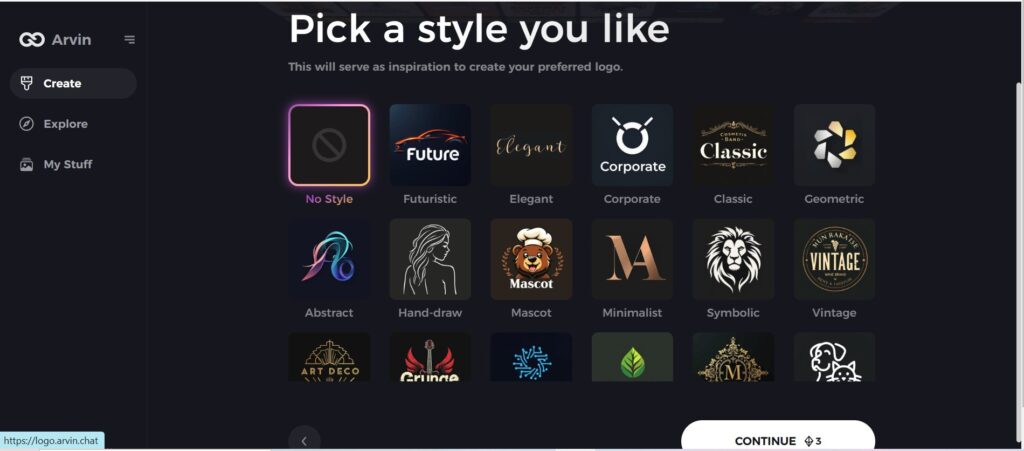
Step 4: Select Style:
Now select a style which you would like and continue. This will serve as inspiration to create your preferred logo.
Step 5: Design Personalize through the tools of Arvin AI
After Arvin AI gives create your logo, you can customize those logos with the tools that have elements such as font style, layout, and the positioning of symbols. Experiment on different designs until you like what you see.
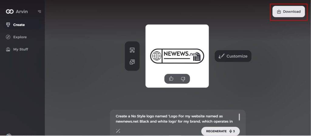
Step 6: Save and download the final logo
Preview the finished logo and save it in a high-resolution format for both print and digital uses.
Conclusion
A well-designed fitness logo is the most critical part of developing a memorable and professional brand. It communicates your business’s core values and connects emotionally with your target audience. Experimenting with design fitness logos elements such as bold fonts, energetic colors, and dynamic symbols can help create a standout logo. Remember that your fitness logo should evolve over time to stay relevant to your audience’s changing needs and trends. Tools like Arvin AI make the process of logo making much easier, and you can easily access AI-powered solutions that help you craft a logo that speaks to your fitness brand.
FAQs About Fitness Logos
What makes a fitness logo stand out?
A fitness logo stands out by meaning that it holds strong imagery, bold fonts, and unique color palettes, which harmonize with the feel of energetic and empowering fitness branding.
How can I design a fitness logo when I have no experience in design?
This aspect will not require any design experience, and tools like Arvin AI can make the process of logo development easier. Most of these AI-based platforms are user-friendly, with templates you can use to try out many different designs without needing advanced design skills.
Which of the following colors are most commonly used in a fitness logo?
Colors like red, orange, and green are the most energetic colors for a fitness logo. Red symbolizes passion, energy, and strength, while orange symbolizes enthusiasm and vitality.
How do I choose the right symbol for my fitness logo?
Choose symbols that are associated with your core values as a business, which might be strength, health, and vitality. Some popular symbols for fitness logos include dumbbells, runners, or generic designs that can convey energy and resilience.