The Tennessee Titans logo is one of the most sought-after logos in the NFL. It symbolizes power, toughness, and being closely related to Tennessee history. Over time, the logo has evolved an amendment, but its uniqueness has never been lost. Throughout this article timeframe, we will examine the history of the Titans logo, the significance of the logo, and how the logo has evolved over time.
Part 1: What is the Tennessee Titans?
The Tennessee Titans the name of an American professional football club founded in Nashville, Tennessee in 1959. He is currently in the National Football League, with Nissan Stadium as his home arena, and Mike Vrabel as head coach.
Part 2: Meaning and history of the Tennessee Titans logo
The history of the Tennessee Titans logo has an indisputable relationship with the history of the team. It also reflects the characteristics of the region. Titans has several iconic logos that have undergone various changes, from minor to significant. Overall, the main logo collection contains seven emblems.
1960 – 1961
When the Houston Oilers first appeared on the football field, their emblem represented a man who was seen as a football player and cowboy, wearing a cowboy hat and wearing a uniform. Color scheme is blue (uniform) and gold (hat and boots). There was an oil excavator in the background. After that, several minor changes were made, including changes in the color scheme. Therefore, the gold color was abolished.
1961 – 1968
Changed the coloring of the human mascot. The color scheme was generally changed to light blue and white. In addition, the cowboy’s head became a safety helmet (the boot remains intact). In addition, there are fewer buildings in this version.
1969 – 1971
A completely new symbol appeared on behalf of the old logo. The player’s helmet silhouette contoured with black thick lines and depicted oil derricks on the helmet.
1972 – 1979
The color of the oil derrick changed from black to red, and the blue border entered. The helmet has a blue line.
1980 – 1996
The Oilers logo announced in the year was very simple and symbolic at the same time. The club did not change the logo for 18 years, but there is a fact that the blue color was slightly saturated.
1997 – 1998
This next version is basically the same as the old tower, but it has a slightly dark color scheme.
1999 – Current
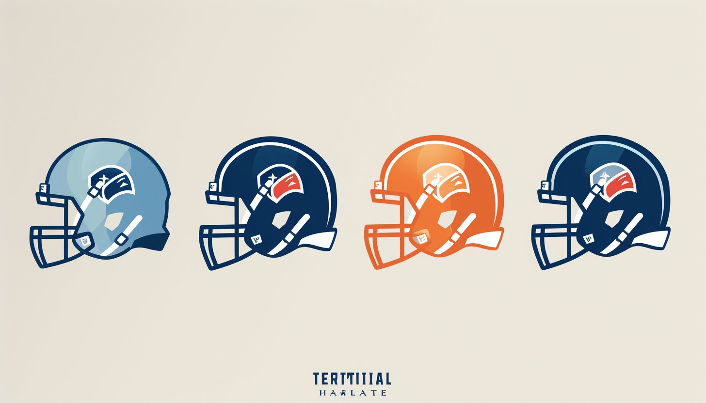
In 1999, the new nickname required a completely new logo. The Tennessee Titans logo includes a white ring symbolizing the sun, three stars on a dark blue background, and a large “T” character reminiscent of a sword. There is also a flame reminiscent of a comet. There is some discussion about the meaning of the logo. Some are somewhat skeptical that it symbolizes defense rather than attack.
Part 3: Symbolism and Meaning Behind the Logo
A logo is not simply a drawing, it is deep in significance and is a representative of a team’s identity. The Tennessee Titans logo filled with symbolism with regard to Tennessee’s strength, speed, and rich history. From the fiery “T” to the three stars and colors, all is part of crafting the image of the team.
The Flaming “T” and Three Stars Symbolism
The flaming “T” represents movement and power. It provides the colorful logos with a dynamic feel, highlighting the team’s power and speed. The three stars in the background represent respect for the Tennessee state flag and accord between the three parts of the state.
The Color Palette: Navy, Titan Blue, Red, and Silver
The Titans logo colors have been selected in order to represent the team as strong and contemporary:
- Navy Blue represents confidence and strength.
- Titan Blue provides a special touch and makes the team stand out.
- Red represents energy and passion.
- Silver provides a professional and streamlined look.
Influence of Greek Mythology in the Titans Branding
The name “Titans” is Greek in origin, used in the context of mythology as the name of powerful gods that were exceedingly strong. It’s a name that fits well for the team identity, given it highlights power, strength, and dominance. The use of the logo design with bold shapes and bold colors gives the image of a warlike team.
Part 4: Fan Reactions and Cultural Impact
The Tennessee Titans logo is more than the symbol of the team. It is, in fact, the essence of the fan experience. Since its inception, it has defined the manner in which the fans identify with the team and how it is perceived in the sporting world. From the branding of NFL to selling Titans merchandise, the symbol is major in defining the Titans.
How Fans Perceive the Logo in Different Eras?
When the Titans first rolled out their logo in 1999, the fans loved the tough and new look. The logo quickly became a symbol of team loyalty and strength. The logo has stood the test of time and is still popular to this day, and fans appreciate that it has been relatively unaltered, maintaining its distinctive and strong look despite the passage of time.
Merchandise and Branding Influence on the NFL Fanbase
The Titans logo used on jerseys, hats, and other products, and thus forms part of the team identity. Its bold and unique look is employed to construct a stronger team brand and attract the fans. The prominence of the logo on different products also enhances team morale and leaves an enduring legacy among the NFL fan base.
How the Titans Logo Compares to Other NFL Team Logos?
When the Titans first rolled out their logo in 1999, the fans loved the tough and new look. Fans adopted the logo as their emblem of team devotion while having it represent their athletic power. The logo from that day continues to win fans throughout modern times because fans value its distinctive solution which has kept its original strength in appearance since the first use.
Part 5: Future of the Titans Logo
Logos evolve over time to continue being new and current. In spite of the fact that the Titans logo has been unchanged since 1999, change is always on the horizon. Changes in the future can be in the form of trendy design fashion today, subtle enhancements, or technological updates.
Will the Tennessee Titans Rebrand in the Future?
There is no rebranding on the horizon, but NFL franchises will update their logos from time to time simply to remain consistent with contemporary design aesthetic. Such changes driven by contemporary design aesthetic, evolving fan expectations, and branding principles. Even though the Titans logo didn’t change.
Potential Redesigns and Modern Trends in Sports Logos
Future redesigns may include even more accurate outlines, more intricate textures, or subtle color changes to give it a fresher look. The club can also make the lines of the logo sharper, add more shadows, or implement subtle 3D effects. But the fundamental elements of the Titans logo, such as the “T” burning and three stars, will likely stay to help keep it with its robust identity.
Part 6: Logo Branding and Why Arvin AI is the Best Logo Maker
A good logo lies at the center of a team’s brand. A logo enables fan-team connection and produces memories that stick with viewers. Successful Titan logos require three crucial elements as they should appear attractive to viewers while representing key team symbolism and being built for longevity. The design or redesign process for logos becomes efficient when teams use Arvin AI. Logo optimization for branding success, Arvin AI allows teams to be unique in a competitive sports industry.
Key Features of Arvin AI
- Logo Identification: Uses artificial intelligence to analyze sports logos and identify main design aspects.
- Logo Design Trend: Tracks and predicts logo design evolution within a period of time.
- Analysis of Brand History: Provides an analysis of team logo design overhaul history.
- Optimization of Team Logo: Provides suggestions for enhancing logo appeal and functionality.
- Custom Branding Insights: Offers personalized recommendations based on the brand and fanbase of a team.
Steps to Use Arvin AI for making Logo
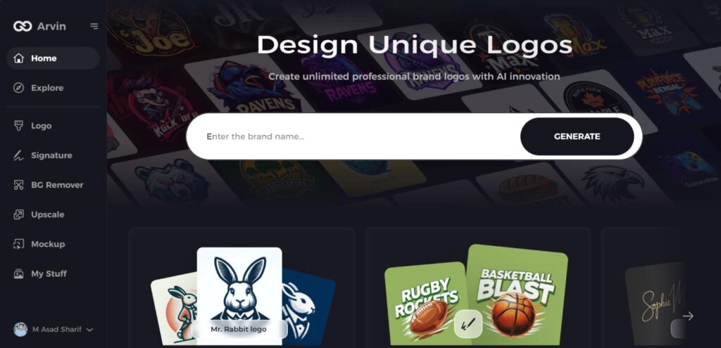
Step 1: Explore the Design Platform
Start by visiting the logo creation page at Arvin AI using your preferred web browser. This platform is your gateway to designing the perfect logo for your brand.
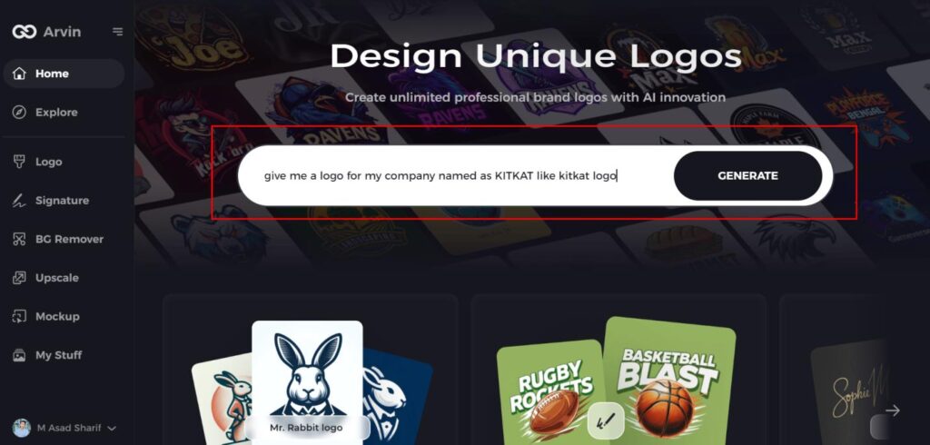
Step 2: Enter Business Details
Provide essential information about your business, such as its name and category. This helps the AI generate logo designs that align with your brand’s identity.
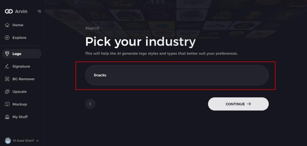
Step 3: Specify Your Industry
Choose the industry your business belongs to from the provided list. This selection allows the AI to tailor logo styles and elements that best fit your industry.
Step 4: Select a Design Style
Browse the available design styles and pick one that reflects your brand’s vision. If none feel right, skip this step and let the AI default to its creative inspirations.
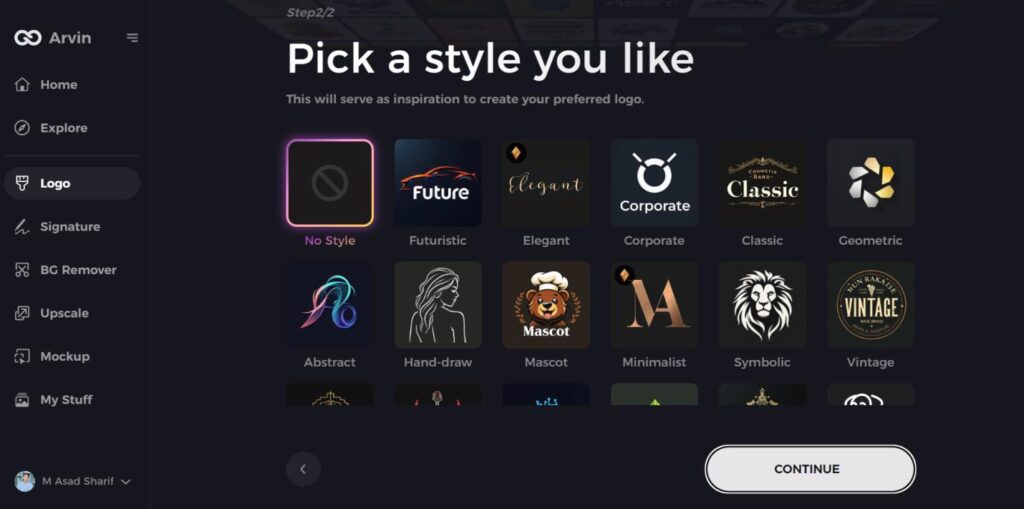
Step 5: Review Logo Ideas
The AI will present you with a variety of logo designs based on your input. Carefully evaluate these options to find the one that resonates most with your brand image.
Step 6: Customize Your Logo
Once you’ve selected a design, personalize it to suit your preferences. Modify elements like colors, fonts, icons, and layouts to ensure the logo embodies your brand’s unique style.
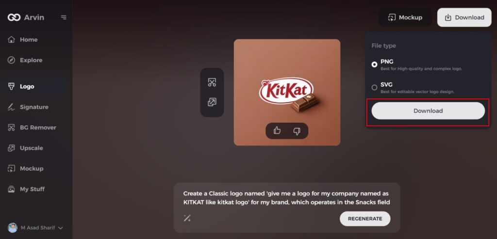
Step 7: Finalize and Download
When your logo is complete, download it in formats such as PNG or SVG. These versatile formats are ideal for digital platforms, social media, and printed materials.
Conclusion
A powerful logo for the Tennessee Titans showcases the team identity through visible evolution throughout time while maintaining its fundamental aspects. Logos with strong power have deep brand effects which help sports teams gain fan recognition. The logo combines innovative elements of power and speed with heritage to create a forceful element of team identity. Every successful logo needs special unique qualities that enable easy mind retention of essential qualities. When seeking professional logo development Arvin AI represents the outstanding choice for this requirement.
FAQs
What does the Titans logo mean?
The Titans logo represents power, speed, and Tennessee historical and mythological heritage. The “T” that is aflame represents movement and energy, and the three stars are a reference to the Tennessee state flag.
Has the Titans logo changed since its inception?
The Titans logo were originally unveiled in 1999 and hasn’t been significantly changed since, with only some minor adjustments made to make it appear more pretty-looking.
How does Arvin AI help in logo analysis?
Arvin AI uses cutting-edge AI-driven solutions to analyze logos of sports teams, identify patterns, and provide remarks on branding and looks.
Could the Titans logo change in the future?
While no such claim issued, NFL teams modify logos to suit design styles occasionally. The Titans can also do the same in the future without altering their defining characteristic.
