Speaking about chicken, the logo of KFC will come to mind. This emblem evolved throughout the many years that transformed itself into a synonym for fast food and comfort. History with evolution is in fact, rich in creativity and innovation for KFC logo design. Based on bright red and white, the logo with the iconic face of Kernel Sanders is synonymous with crispy fried chicken and a luxurious dining experience. Let’s get ready to understand the meaning of KFC logos, history, design, shape, font, and the secrets of the smile with red and white stripes.
Part 1: What is KFC?
KFC or Kentucky Fried Chicken is the colloquial reference for this worldwide fast food joint specializing in fried chicken. Headquarters for the enterprise are based at Louisville, Kentucky. KFC is the largest restaurant chain around the globe apart from McDonald’s. KFC restaurants exist worldwide, over 150 countries at the very minimum.
Part 2: Philosophy and meaning of KFC logo design
Understanding the philosophy and meaning of the logo is similar to unraveling the soul of the brand. With its iconic image and strategic evolution, KFC’s cool logo designs expresses more than the visual identity of the fast food chain. The subsequent section addresses five very significant aspects of philosophy and meaning that make for an interesting KFC logo design for graphic designers.
Personal connections and heritage
The portrait of Colonel Sanders, the founder of KFC, is not just an emblem, but rather a personal touch and legacy he left behind. Constant exposure of his face through different designs indicates a promise of original recipes and quality. It is a master in branding that creates human relationships and trust like the hearts of the customers.
Warmth and hospitality
Red is often used in KFC logo design, not just in style. Red is an intriguing color related to warmth, passion, and hospitality, thus with the condensation of the brand desire to make space warm and inviting. The strategic use of red is indispensable for brands that subliminally communicate comfort and friendliness and pride in customer service.
Global recognition and consistency
KFC’s logo design balances uniqueness and consistency. Despite the changes over the years, symbolic elements such as Colonel’s portrait and certain color palettes remain. This will ensure a global recognition as well as make sure that images are consistent within different platforms and locations. Again, this teaches how to remain with brand integrity in the new explorations on designs.
Part 3: Historical Timeline of KFC Logo Evolution
KFC’s logo is one of the emblem logos which balances uniqueness and consistency. Despite the changes over the years, symbolic elements such as Colonel’s portrait and certain color palettes remain. This consistency does ensure global recognitions and offers consistent brand imagery across platforms as well as in locations. As such, that is also a lesson; maintain brand integrity while exploring innovative ways of designing.
1952-1978
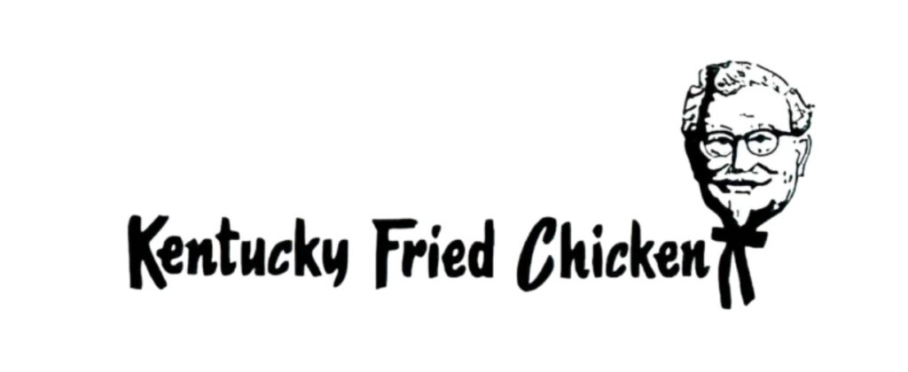
KFC’s original logo, released in 1952, features a satirical painting of Colonel Harland Saunders. This picture, emphasizing the details of a black cord Thailand in a white suit, projects the core elements of a new restaurant: tradition and hospitality. The font of Kentucky Fried Chicken is a choice of straight lines complimenting traditional aestheticism.
Design influences and designers
- Lippincott & Margulies: The original KFC logo designed by the Lippin Cot & Margery office.
- Colonel Harland Sanders: Harland Sanders’s founder, Kernel Sanders, also had a significant impact on design.
Interesting Facts
- Franchise Pioneer: By the mid-1960s, KFC was one of the first fast food chains to expand internationally.
- “Finger-Lickin ‘Good”: In this era, KFC’s famous slogan “It’s Finger-Lickin’ Good” spread and became synonymous with the brand.
- Secrets of the recipe: The secret recipe consisting of 11 herbs and spices is strictly protected, spurred by the mystique and marketing appeal of KFC.
- Rapid expansion: Kernel Sanders rapidly expanded KFC with a franchise model, growing to over 600 stores by 1964.
- Custom Buckets: The introduction of the KFC bucket in 1957 revolutionized the way chicken served and became a popular takeout menu.
1978-1991
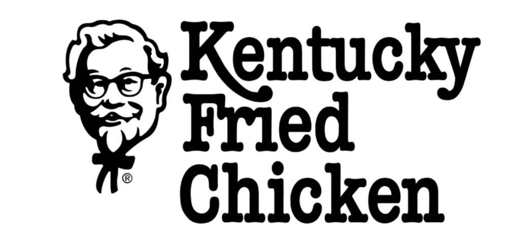
In 1978, as KFC expanded globally, the KFC logo became simple to fit in a circular frame, focusing on the head and upper body of Kernel Sanders. With the black and white color scheme intact, a thicker and stronger line incorporated to enhance visibility from far away, which is important for fast food stores. In addition, by refreshing the background of the logo, we increased scalability in various marketing materials.
Design influences and designers
- Lippin Cot & Margrez Revisited: To increase awareness at fast food stores, we emphasized simplicity and reviewed original designs to meet modern branding needs.
- Market Expansion: With the proactive global expansion of KFC, it became globally recognized and needed a logo that was easy to replicate.
Interesting Facts
- Globalization of brands: KFC has expanded into new markets in the Middle East and Asia, offering menus tailored to local preferences.
- Introduction of KFC Corporation: Reorganized into KFC Corporation in 1986 after the owner change.
- Advertising strategy: In the late 70s and 80s, we shifted to a more diverse advertising strategy to reach a wider audience.
- Menu innovation: During this period, new menus were introduced, including hot wings and other local dishes.
- Changes: KFC acquired by R.J. Reynolds in 1982 and subsequently sold to PepsiCo.
- Sponsorship: KFC started sponsorship of major sports and improved recognition and brand image.
1991-1997
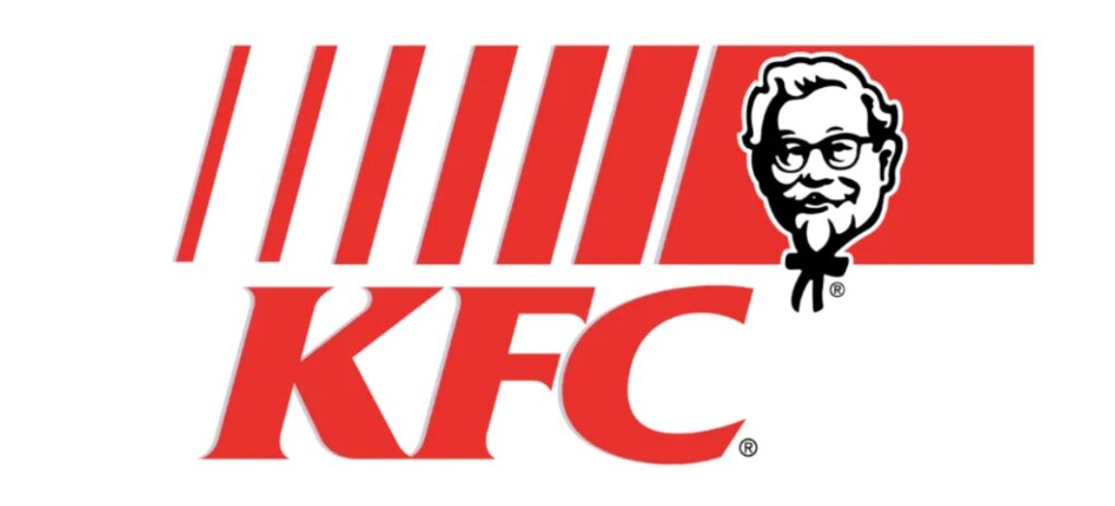
During this period, the colonel steered a much more modern branding approach. The image of the colonel further abstracted and became a monochrome portrait focusing on characteristic faces such as glasses and beards, and the background became plain. This minimalistic approach aims to be easily recognized and replicated on a variety of branding platforms, which are essential for rapidly globalizing brands.
Design influences and designers
- Simplification of graphics: Transitions to more stylized abstract designs were influenced by the need for logos that could be easily identified and replicated in various media.
- Technological advancements: Advances in digital technology have enabled more accurate and scalable logo designs and influenced minimalist approaches.
Interesting Facts
- Technical Integration: KFC has started to incorporate technology into operations, including computerized delivery systems and training programs.
- Awareness of nutrition: In the early 1990s, consumer awareness of nutrition increased, and KFC introduced a lighter menu.
- Brand Mascot: The image of Kernel Saunders remained the center of advertising despite the minimalist logo design changes.
- Cultural Adaptation: KFC continued to adapt menus and marketing to suit the cultural preferences of international markets.
- Environmental considerations: During this period, KFC began to address environmental issues, including packaging waste.
- Market challenge: KFC faced increasing competition from other fast food chains, leading to further innovation in marketing and menus.
1997-2006
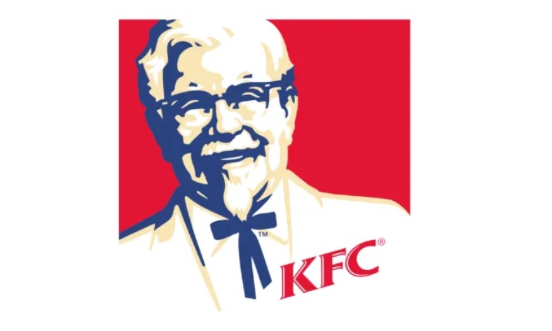
This KFC logo reintroduces color and adopts bright red on the background, which instantly attracts attention and evokes a sense of warmth and appetite. The updated Kernel Sanders image is softer, more sophisticated and detailed strokes of illustrations that represent friendly and engaging characters. The bold red-based logo uses white with a contrast between the diagrams and letters to enhance readability and impact.
Design influences and designers
- Color Reintroduction: It aims to attract consumers by using the strong red image that stimulates appetite.
- Market Trends: The design influenced by market trends that favor bold and impressive brand elements.
Interesting Facts
- Diversify menus: KFC expands menus, increases side dishes and dessert choices, and addresses a wider range of customer preferences.
- International Growth: From the late 90s to the early 2000s, KFC has grown internationally, showing a presence in more than 100 countries.
- Cultural Campaigns: Marketing campaigns are increasingly tailored to local culture, and global appeal has been strengthened.
- Health-oriented changes: With health-oriented growth, KFC introduced grilled chicken, reflecting the shift to a healthier menu.
- Brand Partnership: KFC engaged in brand alliances with other food and beverage companies and used cross-promotion opportunities.
- Digital Advances: During this period, the introduction of online ordering systems began and shifted significantly to digital integration.
2006-2014
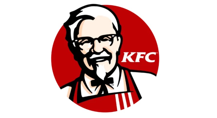
In 2006 KFC logo changed to a cleaner and more modern design based on red and white. The graphics of Kernel Sanders’ portraits became simpler, focusing on core elements such as glasses and bow ties, achieving a balance of detail and abstraction suitable for contemporary branding. The red used in this version was somewhat deep and helped maintain visual interest and brand consistency in digital and physical media.
Design influences and designers
- Digital adaptation: The slight design adjustment of this logo is influenced by the need to optimize digital display, reflecting the brand’s adaptation to the digital age.
- Consumer preferences: The focus on cleaner and more rational designs is to meet consumer preferences for simpler and more modern beauty.
Interesting Facts
- Brand Revamp: At this time, a global brand named “Re-Colonization” was revamped, aiming to revitalize the brand and improve the quality of the entire store.
- Expansion in Asia: China became an important market for KFC and other significant expansion efforts were made to the Asian market.
- Localization of the menu: We continued to emphasize the localization of the menu and incorporated unique menus such as rice dishes that became popular in Asia.
- Social Media Utilization: KFC has launched active engagement with customers through social media platforms and adapted to new ways of interacting with consumers.
- Customer interaction: KFC introduced an interactive ordering system in the restaurant to improve customer experience.
- Mobile Technology: The launch of mobile apps for KFC orders and promotions has been an important move towards integrating mobile technology.
2014-2018
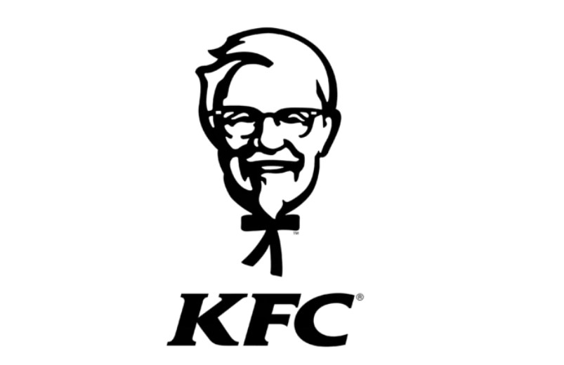
This KFC logo update focused primarily on refining existing elements for more digital applications, with minimal adjustments. This helped make it clear and impactful even for smaller digital displays by smoothing the contours of Kernel Sanders and slimming the overall design. This is a strategy from KFC as part of subtle refresh for increased digital presence against changing patterns of media consumption among consumers.
Design influences and designers
- Refinement to digital media: During this period, the logo was improved to be more suitable for digital applications.
- Simplicity and clarity: This slight design change was easily recognizable in a rapidly changing digital environment and influenced by the need for a memorable logo.
Interesting Facts
- Digital Presence Enhancement: During this period, KFC significantly strengthened its digital marketing strategy in line with the rise of social media and online advertising.
- Responsive Design: Redesigning the logo was part of a massive effort to make all branding materials responsive and visually appealing on digital platforms.
- Global Brand Campaign: During this period, KFC succeeded several global marketing campaigns, including “I Ate the Bones” and “How Do You KFC,” to rejuvenate the brand and penetrate the younger generation.
- Introducing innovative products: In this era, innovative products such as “Double Down” and “Face Mass Bowl” appeared, and became a cultural phenomenon, demonstrating an experimental motivation for KFC’s menu.
- Sustainability Initiatives: KFC continued its sustainability efforts, particularly in procurement and waste management, in line with global corporate responsibility trends.
- Contributing to Local Communities: KFC has expanded its efforts to local communities, including educational programs and local charity support.
2018 – Current
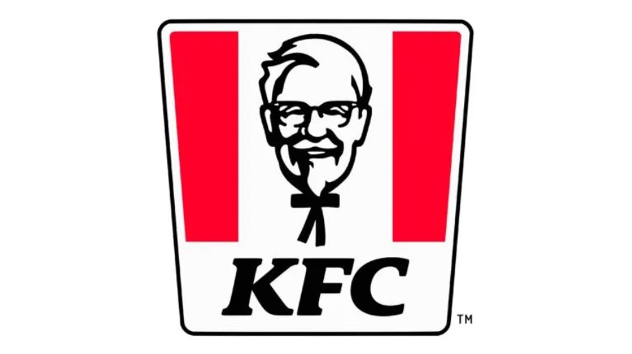
The latest KFC logo incorporating modern design trends is a highly simplified, stylized kernel Saunders and placed in a bright red square frame. This design adopts the principle of flat design, characterized by bold, shading-free colors and simplified shapes, and is highly scalable and visually effective on modern digital platforms. The logo typeface is robust and modern, enhancing brand visibility and awareness.
Design influences and designers
- Modern Minimalism: This design reflects the industry-wide trend of simplifying and concentrating on the core elements of the brand.
- Brand evolution: Evolution into a more minimal logo reflects KFC’s efforts to maintain relevance and visual appeal in a rapidly changing digital first world.
Interesting Facts
- Global Rebranding: In this era, global brand restructuring efforts focus on streamlining and modernizing customer experiences.
- Technology Integration: KFC introduces state-of-the-art technologies including AI and robotics to increase operational efficiency.
- More healthy options: More healthy menus and more diverse menus for a wider audience.
- Cultural sensitivity: Emphasize cultural sensitivity in marketing and product delivery to respect a diverse global market.
- Focus on sustainability: Strengthen sustainability initiatives, including reducing packaging waste and improving supply chains.
- Digital Transformation: A major investment in digital transformation, including updating POS systems and enhancing digital ordering platforms.
- Community Programs: Expansion of community programs and partnerships with local and global charities.
Part 4: Impact of KFC logo on branding
The Kentucky Fried Chicken logo carries an image of Kernel Harland Sanders, playing a crucial part in the determination of the corporation’s brand, and global excellence. Its establishment and continuous occurrence form the spine of KFC’s marketing system and international perception. As KFC made a great progress over the year, so it is one of the cute logos for your brand.
Brand Identity and Customer Recognition
The original logo, introduced in 1952, played an important role in establishing Kernel Sanders not only as the face of the company, but also as a symbol of quality and reliability. This personal touch made KFC stand out in the early fast food industry and created its own sales proposition. Kernel Sanders’ image reflected the founder’s real-life commitment to quality, helping to cultivate customer trust and loyalty.
Adaptation to global markets
As KFC’s global expansion progressed, the logo was further developed to maintain its relevance and appeal in different cultures. The shift to a simplified logo in the 1990s, which centered on Colonel Sanders “head, helped the brand’s visual impact. This was particularly effective in non-English-speaking countries, where the image could overcome the language barriers and made the brand immediately recognizable.
Part 5: Design Elements of KFC
A logo is identified by its visualization and unique identity. In this regard elements can make a memorable for branding. Following are the main key element of this unique logo.
Font
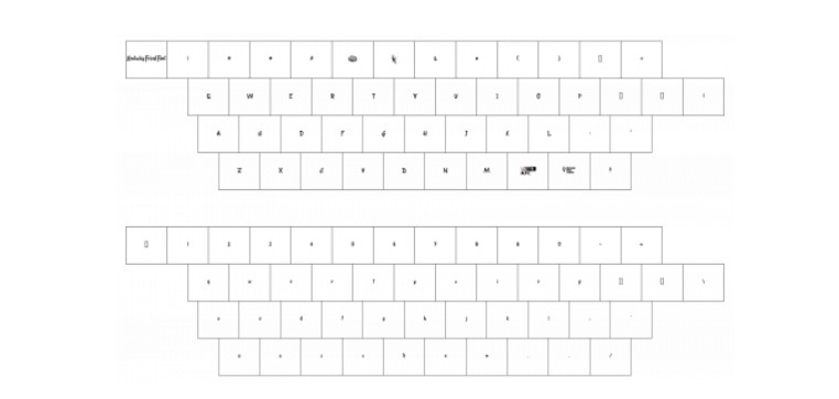
The simple italics used in the “KFC” character in the current emblem have been used since 1991. The font of the letter “Kentucky Fried Chicken” has been changed and become more minimal. This type of logo fonts help you to build uniqueness in your branding.
Color
Basically, this color scheme (red, black, white) does not change from the logo of the 1991 edition. However, if you look closely at the latest emblem, you should notice the difference in red color used.
| Color | Hex Color | RGB | CMYK | Pantone |
| Pigment Red | #f40027 | 167, 30, 49 | 5, 100, 71, 22 | PMS Bright Red C |
| Black | #000000 | 0, 0, 0 | 0, 0, 0, 100 | PMS Process Black C |
Part 6: How Arvin AI Can Enhance Branding and Logo Design
Logos are, in fact, the backbone of a brand’s identity. They are the first impression and lasting symbol of trust and recognition. A good logo can illustrate the values for a brand in addition to expressing emotional attachment or connection to customer and also establish loyalty. To build such an impactful design for businesses, Arvin AI is the best answer. It uses the latest technological advancement analyzing branding needs to deliver customized logo designs.
Key Features of Arvin AI
- Custom Logo Design: Arvin AI provides logo designing tools to let a brand communicate its values and target audience.
- Design Flexibility: Users can play with different colors, fonts, and styles to come up with something unique.
- AI-Powered Suggestions: It comes up with design recommendations based on industry trends and target audience analysis.
- Logo Adaptability: Arvin AI makes sure that logos are flexible and tailored for different uses, such as social media, websites, and packaging.
- Collaboration Tools: Teams can work in real-time to perfect designs and give direct feedback on them within the application.
Steps to Use Arvin AI for making Logo
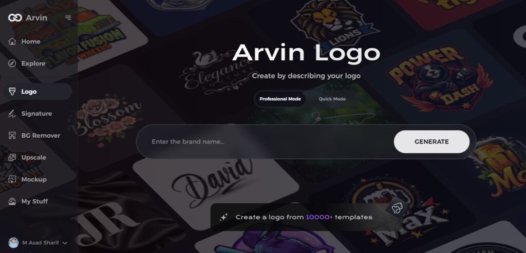
Step 1: Access the Arvin AI Logo Maker
Open your web browser and navigate to the Arvin AI logo maker page to begin designing a logo.
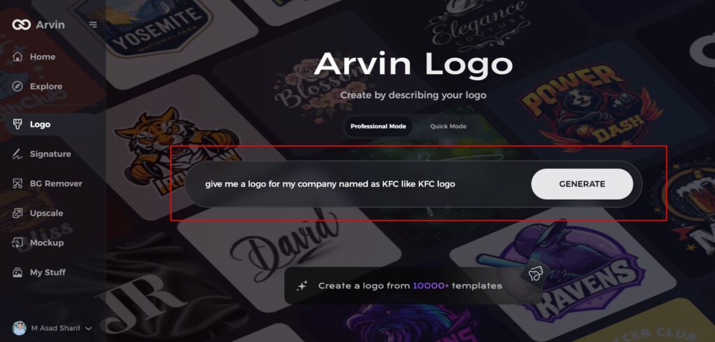
Step 2: Input Your Business Details
Provide essential business information, such as your business name and category. This allows the AI to generate logo designs tailored to your brand.
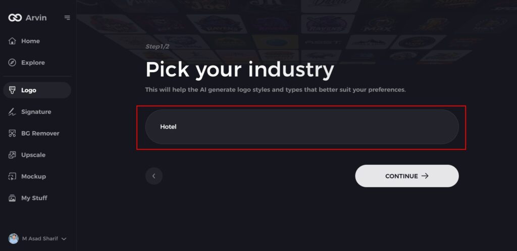
Step 3: Specify Your Industry
Select your industry from the provided list. This step helps the AI refine the design options, drawing inspiration from styles relevant to your business.
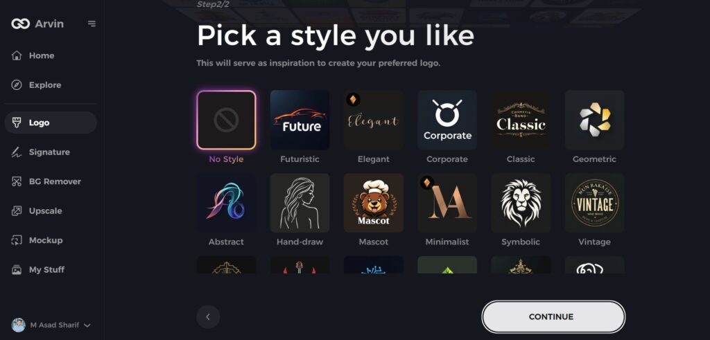
Step 4: Choose a Design Style
Explore the available design styles and select one that aligns with your brand’s vision. If you’re unsure, you can skip this step, and the AI will create designs based on its default inspiration.
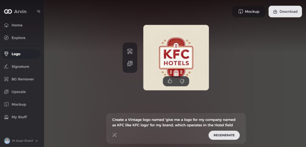
Step 5: Explore Logo Concepts
Arvin AI will generate multiple logo concepts based on your inputs. Review these designs and identify the ones that best represent your brand’s image.
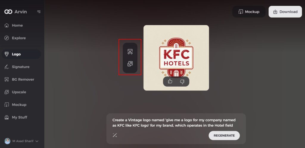
Step 6: Customize Your Design
Personalize your chosen logo by adjusting colors, fonts, icons, and layouts to reflect your brand’s unique style and values.
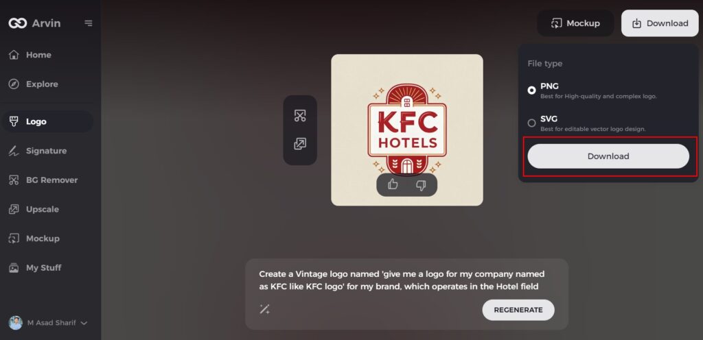
Step 7: Download Your Final Logo
Once you’ve perfected the design, download your logo in versatile formats like PNG or SVG. These formats ensure your logo looks great across websites, social media, and print materials.
Conclusion
The KFC logo is a perfect example of great branding. From its first appearance up to its present shape, it has been undergoing change. This symbolizes quality, tradition, and innovation of the qualities of KFC logo. Indeed, one of the best examples of how a logo can change a brand’s identity and connect with a customer in a way that brings success is the case of KFC. Just like KFC, if you ever need a perfect logo for your brand, you can use Arvin AI, which is your best bet at creating a personalized design
FAQs
What does the KFC logo mean?
The KFC (Kentucky Fried Chicken) logo prominently showcases the likeness of Colonel Harland Sanders, the visionary behind KFC’s original fried chicken recipe and the brand’s founder. Typically depicted in a white suit and bow tie, Colonel Sanders is often seen holding a bucket of KFC chicken in the logo
What was the KFC original symbol?
The first KFC logo was introduced in 1952 and featured a “Kentucky Fried Chicken” typeface and a logo of the Colonel.
How does the KFC logo impact consumer trust in the brand?
It has led to trust and recognition of the logo among minds of the customer, thereby allowing them to get confident of quality about the brand.
How can Arvin AI be used to create a logo that resembles the KFC brand?
Arvin AI assist companies in the process of the creation of the logos. It can create a long lasting first impression of the business as a way of creating the business brands.

