Logos are the visual backbone of any brand, and Wendy’s logo is no exception. Being one of the most recognizable fast-food chains in the world. Wendy’s owes part of its global recognition to its iconic logo. This article delves into the journey of Wendy’s logo, exploring its origins, evolution, and the strategic innovations over the decades. We will see how Wendy’s branding decisions reflect its commitment to staying ahead in the competitive fast-food industry while still keeping a connection to its roots.
Part 1: The Origin of Wendy’s Logo
Wendy’s was founded in 1969 by Dave Thomas in Columbus, Ohio. Thomas wanted a brand that would put quality over speed, emphasizing fresh ingredients and personalized service. Wendy’s name was derived from his daughter, Melinda Lou “Wendy” Thomas, whose childhood nickname became the identity of the brand. From its inception, Wendy’s was different with its square hamburgers, which symbolized the company’s commitment to “not cutting corners.”
The Original Wendy’s Logo: Design, Concept, and Meaning
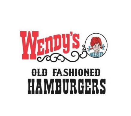
The first logo for Wendy’s had a hand-drawn image of a young girl with pigtails, wearing a blue-and-white striped dress, inspired by Dave Thomas’s daughter, Wendy. This design was to make the brand seem personal and connect with the customers because it was a family-oriented brand. Along with the image was the phrase “Quality Is Our Recipe,” which stated Wendy’s commitment to fresh, home-style cooking? The logo was rustic and approachable in style, signifying trust and warmth, thus differentiating Wendy’s from its competitors.
Symbolizing Wendy’s Early Identity
This original Wendy’s logo was more of an identity and a philosophy built into the brand. The hand-drawn image of young Wendy portrayed innocence, freshness, as well as homeliness, thus enforcing a company focus on quality food and superior service to the customers. This early branding effort set up Wendy’s as a trusted name in fast foods, being a company that greatly cared for its patrons’ experiences and offered something beyond the meal itself—a connection.
Part 2: The First Major Redesign: A Shift in Branding
The 1980s was one of the busiest decades of the fast food industry. During this period, rivals such as McDonald’s and Burger King employed aggressive strategies embracing innovations in branding in their pursuit of market share over a growing clientele. Wendy’s needed a face-lift that would make the brand relevant in attracting the emerging new market. The choice to rebrand went beyond aesthetics, embracing a change that would keep Wendy’s competitive, aligned with the shifting expectations of consumers, and anchored in a fast-growing market.
New Design Elements: What Changed and Why
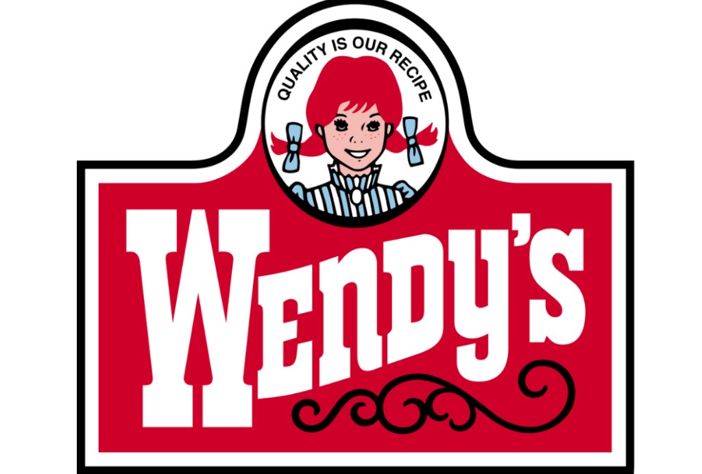
Apparent changes were introduced in the 1980 redesign of Wendy’s logo, such as a more refined version of Wendy herself; the lines were cleaner with simpler details that made the visual appealing and versatile. The typeface evolved using a modernized font that gave the logo a much clearer view and all the flexibility that may be needed for a particular use. Such updates maintained the feel of the original but gave it a more contemporary feel.
Reception of the Redesign
During the 1980s, there was an overall positive response in the reception of the redesigned Wendy’s logo. The senior citizens were nostalgic about the earlier hand-drawn logo, while still the majority appreciated the modernized look that did not lose the identity of the logo. The new design of Wendy’s easily fit in any of the newest marketing channels-from television commercials to print ads, but it is still recognizable.
Effect on Brand Perception and Market Presence
The new design changed the face of the Wendy’s brand and market image. It moved from a family-owned, local chain feel to a brand that could compete at a global level. The clean and professional look helped attract a wider audience, including young customers who preferred contemporary branding. This change allowed the company to increase its reach and solidify its position in the fast-food market.
Part 3: The Modern Wendy’s Logo: Embracing Simplicity and Freshness
In 2013, Wendy’s rebranded itself to become a representation of quality, freshness, and more modern times. Changes that have been implemented so far are outlined, and the new logo is analyzed for whether it really conveys the image of Wendy’s.
The 2013 Rebranding: Introduction of a Sleeker, More Modern Logo
The 2013 version of Wendy’s logo is far from the one that was being used for ages. The new version is very modern and clean in comparison to the old, intricate, and detailed version. It is a part of a greater effort of revamping the brand image to be more appealing to a young crowd interested in design. The new look represented the willingness of Wendy’s to keep up with the times yet still remain faithful to itself.
Simplicity in Design: The Decision to Remove the Wordmark
One of the boldest decisions in the redesign was stripping the logo of the wordmark and focusing more on the iconic “Wendy” character. Focusing on the instantly recognizable red-haired mascot, the company streamlined its branding to make sure it was clean, versatile, and easily identifiable across platforms. This minimalist approach reflected the broader trend in corporate branding toward simplicity and adaptability.
The Significance of the New Logo: Aligning with Wendy’s Values and Customer Appeal
The new logo did not only focus on aesthetics but was a reflection of the values that Wendy’s communicates. The simplified design places emphasis on Wendy’s’ promise of fresher, better ingredients and the brand’s mission to make dining at a restaurant feel more approachable and personal. The update of its logo made Wendy’s pass across an improved emotional connection between itself and the customers and also present as a forward-thinking fast-food house.
Analysis of Design Elements: Color Choices, Font, and Visual Representation
The new logo designed to be consistent with the color scheme that characterized the brand-red and yellow. These colors speak of energy, warmth, and hunger. Typography was friendlier and softer to give the feel of approachability. Meanwhile, the illustration of “Wendy” was fine-tuned to a youthful and modern look.
Part 6: Arvin AI: Enhancing Branding with AI Technology
Branding is one of the most important steps in establishing a company’s identity. Arvin AI has an intelligent system and platform where various modern AI solutions can be used to minimize and improve branding processes. Whether it is in designing unique logos for enterprises or measuring the effectiveness of logos used, Arvin AI provides those tools that are required by businesses to come up with proper logo and branding techniques. Tame attributes make it the panacea for current branding demands-one can gain significant time, enhance imagination and acquaint oneself with the reactions of the target market to specific cues.
Key features of Arvin AI
- AI-Powered Logo Design and Brand Analysis: The feature uses sophisticated algorithms to create custom logos and concurrently offers actionable research based on branding trend.
- Custom Branding Elements Generation: Generate tailored elements such as fonts and color palettes.
- Real-Time Performance Analytics: Evaluate logo effectiveness across markets with instant feedback to refine strategies.
- Market-Specific Design Suggestions: Receive design recommendations based on regional and demographic preferences.
- User-Friendly Interface: Enjoy seamless navigation and tools designed for both beginners and professionals.
Steps to Use Arvin AI for making Logo
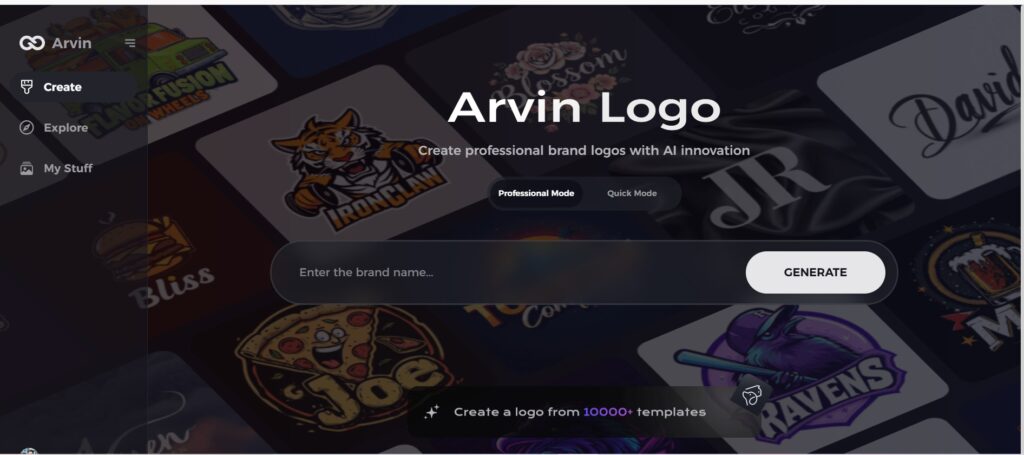
Step 1: Go to the Arvin AI Website
Open your browser and go to Arvin Logo Maker to start designing a unique, transparent company logo.
Step 2: Enter Your Company Details
Provide your company’s name and select its category. Request a transparent logo to let the AI generate designs tailored to your specific needs and business representation.
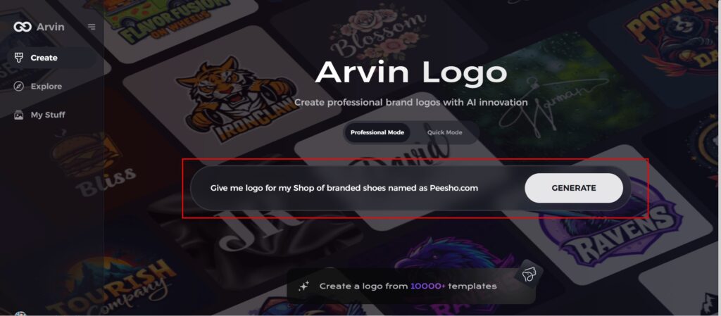
Step 3: Choose Your Industry
Select the industry that you do business in. This selects the AI to create logotypes that fit your brands values and market niche as well.
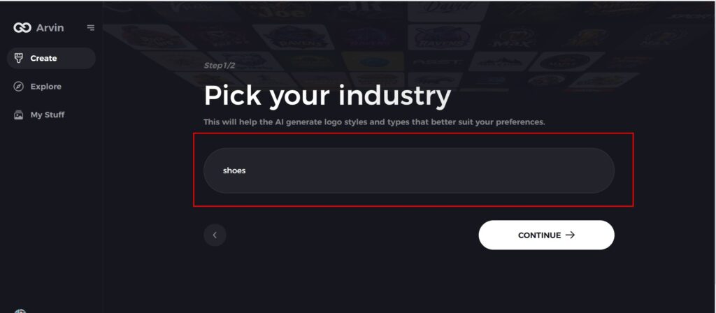
Step 4: Select a Design Theme
Select a design style that you like. You can leave it on “no style” if you haven’t decided yet. It creates some amazing designs for you without any input from you.
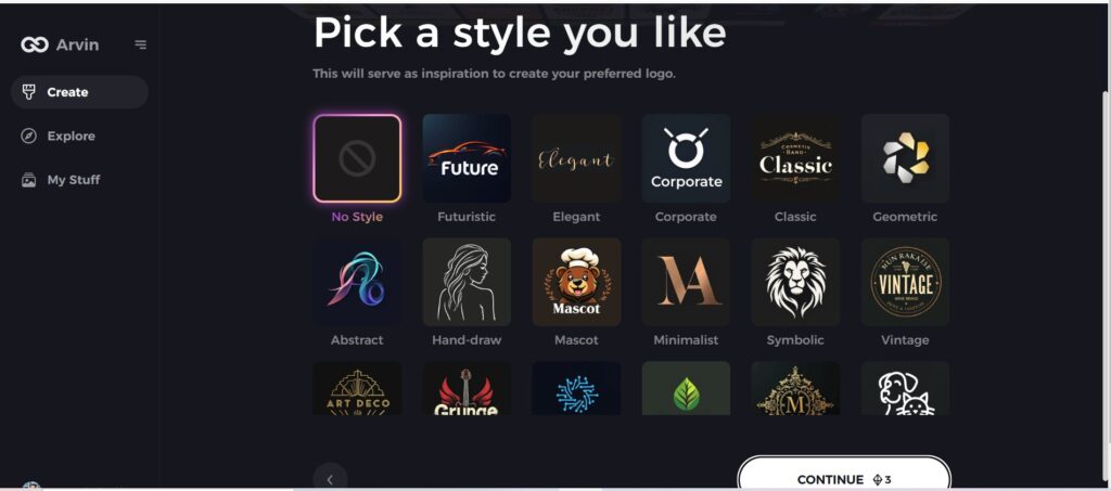
Step 5: View Logo Concepts
Review the logo designs created by Arvin AI. Scroll through the options to find one that resonates with your brand identity.
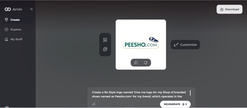
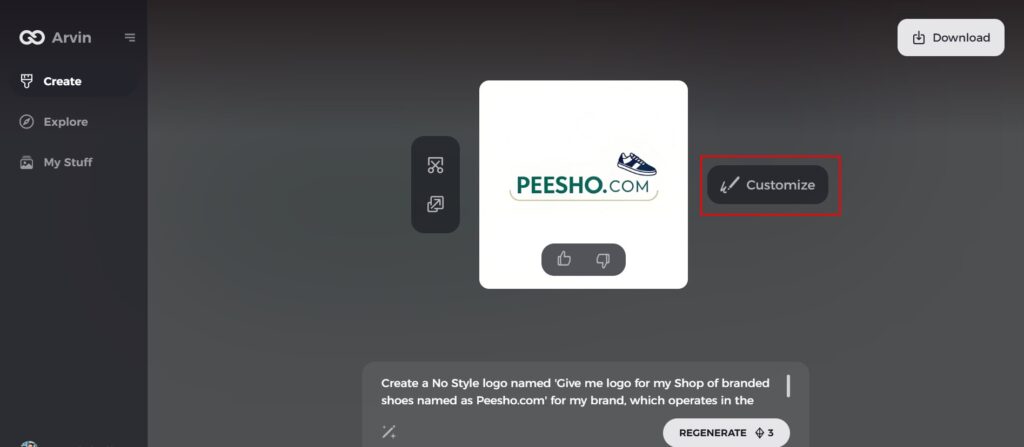
Step 6: Customize Your Logo
Refine the selected logo by tweaking colors, fonts, and icons to align perfectly with your brand’s personality and aesthetics.
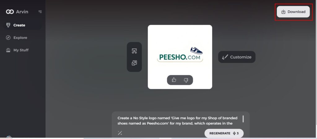
Step 7: Download Your Final Logo
Once satisfied, download your logo in versatile formats like PNG or SVG, ensuring it looks professional across websites, social media, print, and other media platforms.
Conclusion
The evolution of Wendy’s logo represents how thoughtful design drives brand identity and relevance. From the first appearance in 1969 to the modern look in 2013, Wendy’s has struck a balance between tradition and innovation while strengthening its quality commitment and connection with customers. For impactful logos, brands have found a good solution in Arvin AI. With AI-powered design tools, customization options, and user-friendly features, it helps craft logos that resonate with audiences and reflect unique brand values. Start your branding journey with Arvin AI for a modern, professional logo today.
FAQs
Why did Wendy’s change its logo?
To achieve the change of the image and increase attention to the firm, the company decided to modernize the logo of Wendy’s. This change had been driven by the perceived need to obtain and retain a larger number of the youthful consumers in the fast-food segment so as to effectively compete.
What does the Wendy’s logo represent?
Many a times, the emblem, LT is a direct reflection of the brand history and its adherence to high-quality cuisine. The added appearance of a pretty red-haired girl, named Wendy in the poster signifies the warm human face of the company and its focus in the family.
How has Wendy’s logo contributed to its brand awareness?
The evolution of Wendy’s logo has significantly contributed to its brand awareness. Maintaining the evolving process has ensured that it has remained relevant in the market but still retains a core recognizable part, such as the redhead.
Am I able to make my logos on my brands through Arvin AI?
Indeed, Arvin AI is ideal for the personalized design of any logos. Utilizing the very latest in technology by way of advanced artificial intelligence. Arvin AI is best to take any logo of yours and redesign them according to the identity.

