The Barbie logo ranks very high in pop culture and branding history, being one of the best examples of design to create lasting impact. It includes the discovery of the evolutions Barbie logos, identification of iconic elements that defined them and how you might create inspiring Barbie designs today using powerful tools . Join with us a fascinating tour we are set to discover more, the evolutionary journey of the Barbie logo, its importance in defining the significant parts of designs, and of course some practical ways one can carry out in getting your trending and fashionable one.
The Evolution of Barbie Logos
Changes that character define the Barbie logo from time. With changes in fads of fashion, culture, and designs, the Barbie has remained fresh, yet never changed in a drastic fashion. Knowing this process means one can know the aspect of branding but also realize how icons come about. Let’s examine how Barbie’s logo is traced to her status among pop culture.
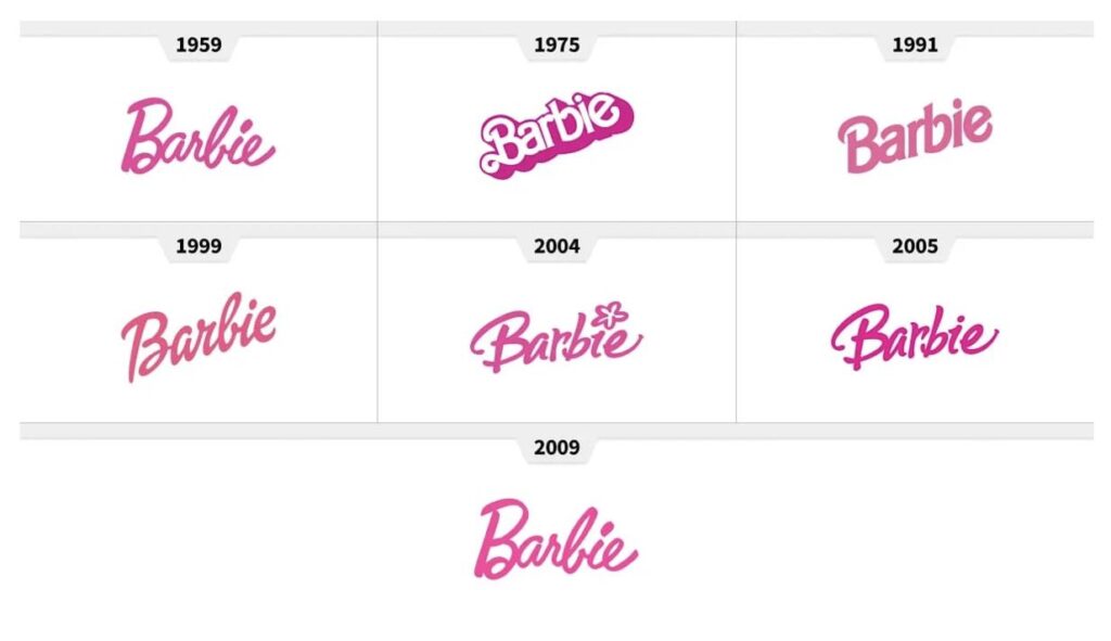
Origins of the Barbie Logo 1959-1970s
The Barbie logo debuted in 1959, with an unusual, handwritten script that characterized the fashion-forward and playful nature of the brand. The original design revolved around a cursive typeface that was at once beautiful and original. The logo color scheme remained largely pale pinks to reflect the youth, especially female target market. In this context logo was symbolic of the aspirational femininity and would lay groundwork to become a cultural icon.

The Modernization Phase (1980s-1990s)
In the 1980s, the Barbie logo was modernized in keeping with the changing trends. The typeface was modernized with a bolder, more contemporary look. The color of the logo deepened to pink, an indicator of the dynamic energy that this decade represented. In the meantime, Barbie’s brand became filled with vibrant gradients and shadowing effects as these fit the bold looks of the era. It marked Barbie’s shift to a more diverse and empowering image.

Sleek and Minimalist Evolution (2000s-Present)
In the 2000s, a design philosophy shift occurred: minimalism was the center of attention. The digital medium-friendly Barbie logo came into being. The typeface still maintained its cursive look but now adopted simplicity, enabling it to be easily read on a variety of surfaces-from packaging to social media. The reason for this period underscored how Barbie’s branding had become flexible – calling to align with what’s inclusive and modern.

Barbie Logo’s Significance in Pop Culture
The Barbie logo is more than just a brand icon; it’s a cultural icon. It has been used in films and merchandise and is widely seen in fan art. It is a testament to Barbie’s legacy, as its flexibility and timelessness have earned it a place in the hearts of people around the globe. Its appearance in popular culture reflects the creativity represented, aspirants and empowerment seeded with this logo.
Elements of a Perfect Barbie Logo
The three elements are all very much important in making a recognizable and emotionally connected design for the brand. From this we can infer how the Barbie Logo can be so lasting and memorable, which affect how the brand will be recognized by different generations in terms of identity. Here is the guide to Complete Branding Package: Build a Standout Identity.
Typography and Fonts
The base of the Barbie logo is typography. Script-style writing makes the text look classy, playful, and approachable—just like Barbie herself. Its flowing, cursive style evokes creativity and individuality, both attractive to young audiences and nostalgic adults who hold dear the Barbie heritage. This typography, beyond making the logo more recognizable, also speaks of aspiration and fun. The curves and balanced proportions that the font has give the logo a sense of movement, since Barbie is dynamic. Read about the best serif fonts for stunning designs for logos. A timeless design that can adjust to modern branding needs both on digital platforms and merchandise.
Color Palette
The pink color of the Barbie logo is not just a design, but it is a trademark. Pink represents femininity, fun, and creativity as part of the essence of Barbie. White and gold often go with pink in complementary colors to add an element of sophistication and versatility. By combining these colors, they create emotionally charged but balanced visual identity that will hits you hard, but at the same time will feel balanced, and will be very fresh and interesting to keep doing the same with the logo.
Icons and Symbols
Although typography is dominant in the Barbie logo, associated symbols such as hearts, stars, and crowns enhance its storytelling. Imagination and empowerment are such motifs, therefore expanding the scope or identity of a brand. Whenever such factors are incorporated, Barbie once again reiterates that message of dreams and creativity, and the logo turns into a representation of never-ending possibilities.
Designing a Barbie-Inspired Logo
Designing a Barbie-inspired logo involves creativity and strategy. Whether it is for personal projects or branded ventures, capturing the feel of Barbie requires an individual to understand design basics in addition to knowing what the customer wants. A well-finished logo can be a reflection of the iconic charm and playful nature of Barbie while belonging uniquely to your vision. With the right approach and tools, along with necessary inspiration, you can ensure that your logo is hot and timeless. You like to read more about complete branding package: build a standout identity.
Understanding the Target Audience
A Barbie-inspired logo must be related to its audience. Generally, this would include young girls, teens, or nostalgic adults. It’s also important to know what such audiences like-vibrant colors, playful fonts, and whimsical designs for young audiences; bright pinks, purples, and bold patterns could do the trick. For the nostalgic adults, some of the retro elements of previous Barbie eras might remind them of a good old time and, hence create a sense of belonging. A good design aligns to the aspirations, and ultimately the values, of the people they are talking to and inspiringly connects on an emotional level, making the brand meaningful to them, thus making them loyal to it.
Essential Tools for Logo Design
An expertly created logo requires certain software, such as Adobe Illustrator and Canva provide sophisticated tools to create detailed designs that have a polished touch. Other more technological interfaces such as Arvin AI come that actually try to generate designs, including automatic text-type and color palette plus layouts recommendations based on a profile created by you. Tools use templates, color choices and easy-to-use interface make sure all ideas are implemented successfully; both professional and newcomer could make use of this set of tools.
The Influence of Barbie Logos in Marketing and Branding
The Barbie logo is simply one of the most exemplary cases of how branding influences identity as well as perception. And, in its evolution over time and constant appeal over decades, it proves that very well how design can connect and make a difference in the success of a product or venture. In this case, it is a good lesson we can learn as we go through the lesson though of the impact it will bring to other brands in other industries.
How Barbie Logos Shape Brand Identity
The Barbie logo is just an excellent masterwork of a brand identity. The trust and recognition that is reminded come from its consistent design elements. The iconic pink script font is immediately recognizable and has become synonymous with the values of femininity, creativity, and fun. Over the years, the logo has become finely refined in its identity over time, yet it still adheres to current trends in a manner that keeps it as a timelessness brand in the minds of the end-users.
Lessons learned from Barbie’s Successful Marketing Strategies:
- Consistency breeds familiarity: A consistent logo breeds loyalty and makes it easier for consumers to remember products linked to a known identity.
- Design evolution: The adaptation of the logo according to cultural and technological change keeps it modern and desirable.
- Emotional connection: A logo that connects with people on an emotional level creates loyalty toward the brand.
Applying Barbie Logo Principles to Other Brands
The principles behind Barbie’s logo can inspire other brands that are aiming to achieve similar success:
- Use typography that reflects your brand’s essence: Fonts should align with the brand’s personality and values.
- Choose colors that evoke an emotional response in your audience: Carefully chosen colors evoke the desired emotions and associations.
- Make sure it is scalable and adaptable for digital and physical platforms: A versatile logo means an effective logo everywhere.
Fun Facts About Barbie Logos
Beyond its aesthetic beauty, the Barbie logo holds a great history of little-known facts, record-breaking moments, and cultural landmarks. It adds another layer of fun in which more depth is appreciated in ‘design and impact’. Let’s discover some lesser know parts of this iconic logo.
Hidden Elements in the Logos
There are even subtle kerning adjustments as well as color gradients incorporated strategically into the design for an added touch of visual appeal in the Barbie logo. These subtle decisions make it both refined and ageless. For example, the letter spacing of the script font was deliberately done to create an elegant balance that is both readable and beautiful. The result of all these small details makes the logo iconic.
The role of Barbie logos in fan merchandise.
There are shirts to the more exotic home decor items featuring Barbie. A consumer brand backed by a unique and appealing design like this can be easily a good value brand that appeals to people worldwide. Everywhere on this earth, fans are implementing it in their products while trying to express the age-long magic of the product. From stationery items to the high-fashion brands collaborating, this logo is very important in popular culture.
Record-breaking moments for Barbie logo popularity.
It was at its most popular during the release of this movie, celebration of any anniversary, and any milestone of the brand’s life. For example, the release of Barbie’s 60th-anniversary doll collection in 2019 saw a surge in demand for products featuring the logo. Also, with its partnership deals with successful movies along with recognized designers, the logo became internationally famous. These incidents are the fact that the logo alive as a cultural and commercial brand and was not defeated.
Design Stunning Barbie-Inspired Logos with Arvin AI
With the advent of the digital age, it has never been easier to create amazing logos. Arvin AI is a state-of-art solution for designers and fanatics who want to give expression to their ideas. Designed with advanced tools and user-friendly interfaces, Arvin AI brings the process into seamless flows and enjoyment. Let us see how it works and why it’s a big deal in logo creation.
Key Features of Arvin AI
- AI-Powered Design: Using the latest algorithms, Arvin AI provides you with personalized recommendations on how your logos should look, making them visually interesting and adhering to your preferences.
- Customizable Templates: Offers a wide array of pre-designed templates that can be tailored to suit various industries and styles, saving time while maintaining creativity.
- Intuitive User Interface: A user-friendly platform with drag-and-drop functionality and straightforward navigation, making it accessible even for beginners.
- Color Palette Generator: Automatically generates harmonious color schemes based on your input or project needs, ensuring a professional and cohesive look.
- Typography Assistance: Curated font pairings and typography suggestions to match the desired brand personality and tone.
- Export in Multiple Formats: Export your designs in high-quality formats like PNG, SVG, and PDF, ensuring versatility across print and digital platforms.
Steps to use Arvin Ai for logo creation
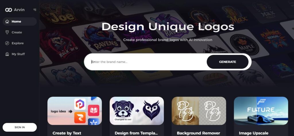
Step 1: Sign Up and Log In to Arvin AI
Go to the Arvin AI website, sign up, and log in to access the logo design features.
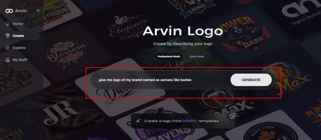
Step 2: Input Your Brand Details
Input the necessary brand details such as your brand name, slogan, and industry. Specify design preferences such as desired font styles, color schemes, or image themes.
Step 3: Choose Your Industry
Choose your industry niche from the options given. This will enable Arvin AI to create logo styles based on your brand’s identity.
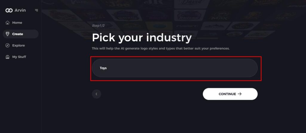
Step 4: Select a Style
Scroll and click on a style of the logo that suits your theme. This will act as a base for your cool and fashionable Barbie-themed logo.
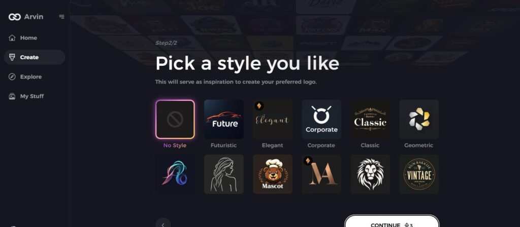
Step 5: Customization of Your Design
Finish by refining your logo in design tools provided by Arvin AI. It lets you customize elements of a logo, such as font types, colors, layouts, and symbol placements, as you try to perfect some mix of these variations.
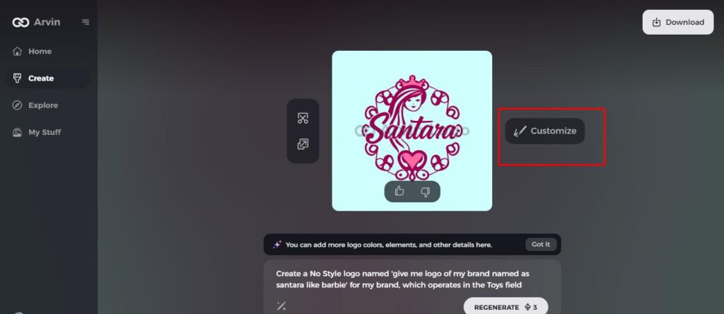
Step 6: Save Your Logo
View your final design and save it for print and online platforms as high-resolution file types.
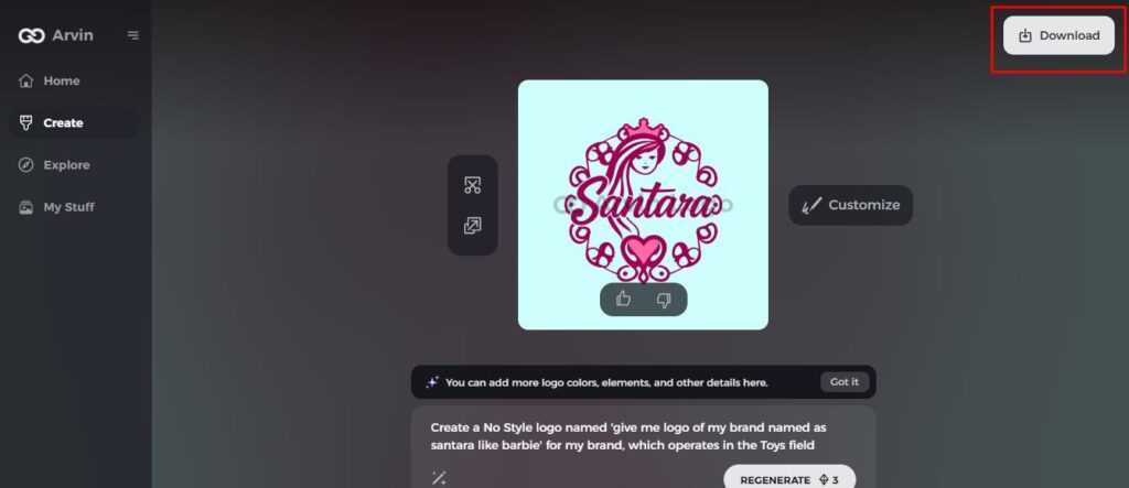
Conclusion
The Barbie logo has taken shape over the years-to timeless typography and pink hues. The Barbie logo is inspired time after time by generations with full creativity. Now you also can bring your ideas alive with ease through Arvin AI merging innovation into artistry. Designing today, start with Barbie’s logo to create and stand out.
FAQs
Why is Barbie a logo so pink?
The pink color resonates with the feminine touch, creativity, and playfulness that appeal to the core target audience and brand essence of Barbie.
How do the Barbie logos change through time?
The logo, from whimsical cursive in the 1950s to sleek minimalism in the 2000s, changes with shifting design trends but retains the core identity.
Can I legally create my Barbie-inspired logos?
You may be inspired by the Barbie logo but cannot use it to draw it because that is a form of copyright infringement. The original designs will keep your logo legal and creative.
How does Arvin AI help with logo design?
Arvin AI streamlines the design process through customizable templates, advanced tools, and real-time feedback, which is accessible to users regardless of their skill level.
Read More:
How to Make a Logo Transparent: Online & Software Tools
Minimalist Fonts: How to Choose the Perfect Style for Your Brand

