The Nike Swoosh logo represents victory and innovation. Few logos around the world are immediately recognizable, which makes this one stand out. The Journey of the Swoosh – from beginnings into becoming a Symbol of Excellence – speaks much about creativity and well-crafted brand strategy. The interesting Nike logo history, development, and influence of the Nike logo will traced in the course of tracing the origins of this brand. It starts from its earliest beginnings as Blue Ribbon Sports through its evolution to an icon of lasting impression in sports and fashion.
Part 1: The Birth of Nike as Blue Ribbon Sports
Nike logo history, the origin of Nike as Blue Ribbon Sports has brought forth, focusing the characteristics of its founders. How the company became a global sports brand.
The Founders: Bill Bowerman and Phil Knight
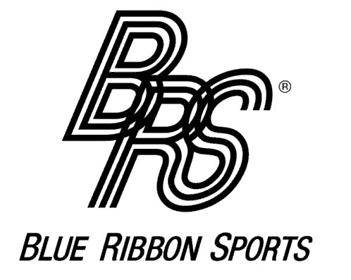
In 1964, a track coach, Bill Bowerman, and his former student, Phil Knight, established Blue Ribbon Sports in Nike logo history. The company was a distributor of Onitsuka Tiger shoes, looking to import low-cost, quality footwear for the American athlete. The innovation of the shoe design that Bowerman had and the business acumen of Knight was the basis.
The Decision to Rebrand to Nike
The businessmen, founders of the business, finalized to start brand by the end of 1970s and partnership with Onitsuka Tiger. They named the mission “Nike,” inspired by the Greek goddess of victory and enable the athletes in the process. In a bold step from being distributors to designing the product, it paved their way to innovate and dominate market shares.
Part 2: How the Name ‘Nike’ Was Chosen
The name “Nike” submitted by Jeff Johnson, one of the earliest employees of Blue Ribbon Sports, who simply loved Greek mythology. The connotation of the goddess Nike related to victory and glory, corresponding to the vision that the company holds for the brand. It resonated well with the founders because it was their aim in celebrating athletic victory. It fit well for the company’s rebranding process. Its ambition to conquer the world sports market due to its cultural depth and association with matters of excellence.
Part 3: The Creation of the Nike Swoosh Logo
It describes the birth of the Swoosh Nike logo history from its creation, design, symbolic meaning, through to cultural influence.
The Story of Carolyn Davidson
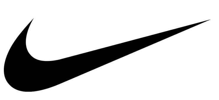
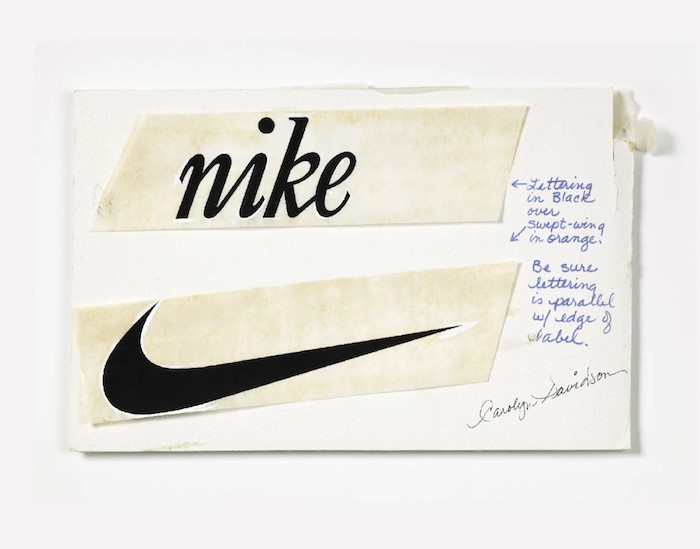
In 1971, Nike’s graphic design student, Carolyn Davidson, was hired by Phil Knight. Davidson came up with the inspiration of the wing of the Greek goddess of victory. She came up with a logo in 1971 targeting the idea of movement and speed. However, it took some time to convince Knight; the simplicity and dynamism of the logo were able to capture the athletic performance. The poor sum she got for the job was little payment to consider. She would see it one of the few logos that would develop into an icon of innovation and excellence.
The Meaning Behind the Swoosh
The Swoosh curved to represent movement, energy, and motion in line with Nike’s inspiration of achievement. It speaks of aspiration and success and goes in an upward trajectory. That’s why this symbol is perfect for all those hopeful athletes who strive to be the best. With the simplicity in its design, it will certainly fit into any product or campaign. From day one to now, the Swoosh surpassed the original intent to become a global symbol of quality, resilience, and relentless victory.
Initial Reactions and Later Recognition
Phil Knight was still unsure about his new Swoosh, as he famously noted, “I don’t love it, but I think it will grow on me.” Miraculously, it grew on most people because as Nike became extremely popular so did the logo. In 1983, the company marked the occasion for Carolyn Davidson when she gifted a gold Swoosh ring and stock options for coming up with that iconic design. Today, the Swoosh is one of the world’s most iconic logos, and personifies the legacy of excellence for Nike.
Part 4: The Evolution of the Nike Logo Over Time
Within this section, transformations of the Nike logo from 1971 to date marked to point out key design milestones as well as how each iteration helped build the brand identity.
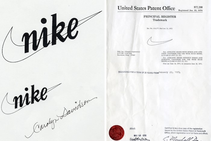
1971–1978: The First Nike Logo
When the Swoosh mark appeared in 1971 that it accompanied a wordmark logo typeset in a large sans-serif letter form. Both developed to support communication and visual definition of a company while spelling out its name-a critical task, making recognition necessary to an early stage. It is simple yet so potent; it is plain but energetic and dynamic, through which Nike had to capture the very same feeling for athleticism.
1978–1985: A Bold New Look
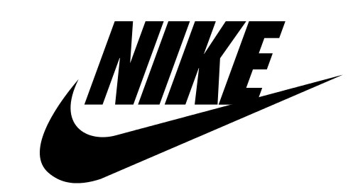
In 1978, the Nike logo history was modified to add an italic typeface that would be bolder. This would give the company a new face. It was around the time of great expansion of Nike in the sports sector and a time when the brand needed to attract more diversified consumers. The Swoosh now had more consequential representations in advertisements and this wordmark made everyone feel that it is not just about running but now moving forward. In this period, Nike became the undisputed global sportswear giant: the logo evolved to understand such increased ambitions.
1985–1995: Iconic Color Pairings and the ‘Just Do It’ Era
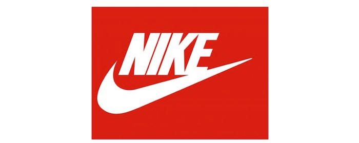
The mid 1980s realized another version of the Nike logo with the new version including bold color combinations like black and red. The ‘Just Do It’ campaign launched, and the Swoosh marked its status in the minds of people as the symbol of determination and power. This would place the logo on shoes, as well as clothing, and play a very important role in the image of Nike as it became involved in some of its most legendary ad campaigns.
1995 – Present: The Icon Swoosh
Nike was groundbreaking in 1995, when it decided to get rid of the wordmark and let the Swoosh be the icon. Minimalism is the way of stressing the fact that the logo is recognized all over the world, and the brand is confident about its visual identity. The one Swoosh symbol has become a global icon of athleticism, innovation, and victory. Its design will always be relevant, because the development of materials and branding approaches will subtly change it according to the market changes.

Part 5: Why the Nike Swoosh Is a Branding Masterpiece
Learn why simplicity, symbolism, and recognition globally make the Nike logo history effective.
- Simplicity: A Design That Speaks Volumes: Minimalism means instant recognition, a high degree of adaptability, transcends cultural boundaries, and works across wide branding mediums such as shoes, apparel, and advertisements.
- Symbolism: Capturing the Essence of Victory: Conveys victory and achievement inspired by Nike’s wing, which symbolizes speed, movement, and progress while communicating aspirations and aligning with Nike’s mission for inspiring greatness.
- Global Recognition: A logo known worldwide: Consistently marketed and featured in campaigns with athletes and products, symbolizes excellence and innovation, and leads to power storytelling and strategic branding.
- Emotional Attachment: Loyalty by Identity: It epitomizes the lifestyle of being a performer; it develops emotional attachment, embodies the spirit of resistance and perseverance, and establishes customer loyalty that views Nike as their success partner.
Part 6: Ten Amazing Facts About Nike and Its Logo
Nike’s path from a small sports retailer to a global phenomenon is filled with attractive small stories and milestones. Here are 10 interesting facts about Nike that show Nike logo history and cultural impact:
Initial Reaction to the Swoosh
Nike’s founder, Phil Knight, did not like the Swush right away. He said, “I don’t like it, but I will love it.” This is quite a difference from its symbolic significance.
A bargain investment
The Nike Swush designer, Carolyn Davidson rewarded only with $35. For her contribution, Nike granted her 500 shares, which today valued to over $1 million.
First Nike shoe with Swoosh
The first shoe by Nike that embraced the company’s first swoosh shoe was Nike Cortets in 1972. This running shoe became an icon for a very long time.
Waffle iron inspiration
Nike co-founder and track and field coach Bill Bowerman devised a new tread pattern for running shoes, hinting at his wife’s waffle iron. This led to the development of the famous waffle trainer in 1974, which revolutionized athletic footwear.
The name that wasn’t
Other names, including “Dimension Six,” were considered before the name was finally settled on as “Nike.” Nike was selected because he embodied the spirit of victory and athletics.
Breaking2 project
Nike launched the Breaking2 project in 2017, an ambitious attempt at breaking the two-hour marathon wall. Eliud Kipchoge, a Kenyan runner, wore a special Nike-designed Zoom Veiper Fly Elite and finished with 2 hours 00 minutes 25 seconds.
Environmental initiatives at Nike
Nike is very known for its sustainability initiatives. The Reuse-a-Shoes program, which began in 1993, recycles old athletic shoes into new Nike products, therefore reducing wastes.
Cultural impact
Suwsch of Nike transends boundaries for only sport and has featured in movies, music, and political movements. And has become a cultural icon that would represent something more than excellent athletic prowess.
The customization revolution at Nike
In 1999, Nike logo history unveiled NIKEiD. NIKEiD is an innovation service that provides with the facility to design Nike shoes, such as color choice and material.
Athletic sponsorships
The strategies of sponsoring athletes are of high importance in Nike’s marketing. In 1972, he sponsored Romanian tennis player Ily Nastase, the first professional athlete to recommend Nike, and later on sponsored global icons such as Michael Jordan and Selina Williams.
Nike’s Swush is not a logo; it represents athleticism, innovation, and global culture. As Nike grows and develops, so does its symbol, Souche, and its name in the history of branding.
Part 8: The Role of Arvin AI in Enhancing Brand Design and Storytelling
The business world transforms constantly with the advancing frontiers of technology. Brands create different ways to become identified in front of their audience. The recent technology, Arvin AI, enables companies to create logos and brand stories through advanced artificial intelligence. Businesses are now capable of creating logos not only impactful in nature but also impacting the customers on a different level through such technology.
Key Features of Arvin AI
AI-Driven Design Process
Arvin AI uses the influence of machine learning algorithms to generate custom logo designs based on a firm’s preferences and values. This technology gives the business opportunity to test many design concepts, optimizing them for the highest impact.
Brand Storytelling Integration
In addition to creating logos, Arvin AI helps companies build entire brand stories. It produces tailored story-structure outlines based on the company’s mission, values, and target market. This approach makes sure that each graphic.
Customizable Design Options
Arvin AI has lots of customization options where companies can change the colors, typography, and layout to tweak their logos. It’s important for companies who want to achieve unique and distinctive identities while looking very professional and polished.
Efficient Collaboration Tools
Arvin AI helps business owners, designers, and marketing teams collaborate. Using the intuitive interface of Arvin AI, the team can easily share design concepts and give each other real-time feedback. Thus making acceleration in this process possible while knowing every member’s points.
Cost-Effective Branding
For small businesses and startups, Arvin AI offers an affordable alternative to expensive design agencies. Brands can now produce top-quality logos and branding materials without burning a hole in their pocket.
Steps to Use Arvin AI for making Logo
Step 1: Create an account and log in on Arvin AI
Visit the website of Arvin AI, open an account, and log in for the logo design feature.

Step 2: Input your brand information and preferences
Input your brand name, slogan, and industry. Specify all your design preferences, which may include font styles or images themes.

Step 3: Pick your industry:
Now select your industry related to your niche. This will help the AI generate logo styles and types that better suit your preferences.

Step 4: Select Style:
Now select a style which you would like and continue. This will serve as inspiration to create your preferred logo.

Step 5: Design Personalize through the tools of Arvin AI
After Arvin AI gives create your logo. You can customize those logos with the tools that have elements such as font style, layout, and the positioning of symbols. Experiment on different designs until you like what you see.

Step 6: Save and download the final logo
Preview the finished logo and save it in a high-resolution format for both print and digital uses.

Conclusion
Nike logo history is something that goes above the sporting context and becomes more of a culture icon. In the vision of future branding, such innovations as Arvin AI will help businesses start from scratch to develop an identity about consumer minds in a new and creative way. As once business can stand as an opportunity of Nike to revolutionize sportswear. Ready to revolutionize your brand? Start your journey with Arvin AI and redefine how your business connects with the world.
Frequently Asked Questions About the Nike Logo
Who is credited with designing the Nike logo?
The Nike Swoosh has the symbolic emblem of the brand. It was designed by graphic design student Carolyn Davidson of Portland State University in 1971. This is the development of the logo. she did as a freelance for Nike co-founder Phil Knight on his request, asking for something to symbolize movement and speed.
What does the Nike Swoosh stand for?
The Swoosh is a combination of movement, speed, and progress, in short, it represents athleticism in all its meanings. It’s the wing inspired by Nike, the Greek goddess of victory: victory and excellent performance both in the field and outside.
How much was the designer of the Nike logo paid?
Carolyn Davidson paid for her work back in the company could at the time allow her to. Nike logo history remunerated Davidson with stock, which is more than million today.
Why did Nike remove the wordmark from its logo?
By 1995, the Swoosh so widely recognized that the company decided to simplify its branding by removing the wordmark “Nike.” The logo’s shape alone had become synonymous with the brand’s values of excellence, innovation, and athletic success.

