There is an undeniable charm in retro color palette, which seems to bring nostalgia, emotion, and timelessness. History has inspired these palettes from soft pastel to neon hued. We will review the history of retro color palates, famous palettes from different decades, and some useful tips and tools how to implement these colors in the designs. If you’re a graphic designer, a branding expert, a user of vintage aesthetics, this article will teach you how to make the most of retro color palettes.
Part 1: What Are Retro Color Palettes?
Retro color palettes are inspired by the hues and combinations that were defining a specific era, essentially between the 1950s and the 1990s. These kinds of palettes reflect everything about cultural trends, technologies, and social movements then. They allow designers a means to tap into a particular emotional and nostalgic experience that people have with respect to the past. A root source of retro color palettes finds itself in historical contexts. Like the pastel tones during the 1950s to neon shades in the 1980s. This type of historical influence helps to bring designers visually strikingly in the use of retro color palettes as well emotionally charged designs.
Part 2: Popular Retro Color Palettes by Decade
Retro color palette hold deep meaning in the decades in which they are found, reflective of the cultural trends and mood of their time. In the case of these iconic palettes, investigation could spark the inspiration and insight of designers. Each era has something to offer and the mute tones of the 1950s to the vibrant neon colors of the 1980s offer opportunity for the good design.
During 1950s:
Renewal and Hope for World War II, The 1950s Pastel colors became trendy during this period, with soft pink, mint green, and cream quickly dominating every aspect of home décor and advertising. These warm, friendly colors were perfect for creating designs with a comfortable inviting feel.
During 1960s:
The 1960s witnessed a cultural revolution; even the color palette followed it, so the era included a bold orange and a brilliant yellow along with an electric purple, encapsulating everything experimental and free. Patterns and bright hues began forming a part of this unique style known as psychedelic art.
During 1970s:
Earth tones dominated the 1970s, giving way to a growing sense of environmental consciousness and a rediscovery of nature. Colors like burnt orange, deep browns, mustard yellow, and olive green featured heavily. These warm tones added depth and grounding quality to designs, ideal for a vintage or retro ambiance.
During 1980s:
The 1980s loved all things excess, boldness, and technology. Neon bright were everywhere, in the style of magenta, cyan, and lime green dominating fashion, advertising, and pop culture. Such brilliant colors paired with geometric patterns created dynamic and eye-catching designs.
During 1990s:
Colors introduced by the 1990s, like grunge-inspired palettes in muted, dark, and neutral tones such as olive green, charcoal gray, and faded blues, give a raw and edgy feel that resonates with the era’s aesthetic influenced by the music and fashion of the grunge movement.
Part 3: Using Retro Color Palettes in Design
Retro color palettes are a great, flexible design tool as it acts as a bridge between the old and the new. They can still make you nostalgic while keeping a modern aesthetic. And no matter if it’s a website, branding, social media, or interior design, these palettes make timelessness and contribute to crafting engaging visual stories.
Web Design:
Retro color palettes can add nostalgia to modern websites, making them unique. Pastel colors can be soft and approachable, or neon and super bright to add a nice energetic edge. If you are going retro, make sure it does not compromise on usability and accessibility by balancing retro hues with clean, user friendly layouts that pay attention to usability and readability.
Branding and Logos:
Retro color palette are great for brands that want to establish an emotional connection with their audience. Earthy tones from the 1970s resonate with sustainability and warmth, while bright neon shades from the 1980s convey excitement and dynamism. These palettes can help tell your brand’s story and leave a lasting impression.
Social Media Graphics:
Retro-inspired graphics are a great way to get attention on social media platforms. Bright and bold retro colors make posts visually striking, while softer pastel tones add a nostalgic warmth. Add some vintage-inspired textures and patterns to your designs to create graphics that really stand out and evoke a sense of familiarity and charm.
Interior Design:
Retro color palette can completely give the interior space a character and some sort of charm. Pastel shades do work great for mid-century modern, and earthy tones have that cozy, vintage atmosphere. For those who just love the playful aesthetics of the 1980s, neon accents can spice up any room with an entertaining twist.
Part 4: Best Practices for Working with Retro Color Palettes
Balance Nostalgia with Modernity
Although retro colors are cute, overusing them gives designs an outdated feel. Balance retro hues with modern design elements, like minimalist layouts or modern typography.
Color Combinations
Retro palettes often feature unique and unexpected color pairings. For example, mustard yellow and olive green can create a 1970s-inspired look, while magenta and cyan can channel 1980s vibes. Experiment with combinations to find the right balance for your design.
Typography Pairings
Typography is important in reinforcing retro color palettes. Employ typefaces that fit your chosen era, such as bold geometric fonts for designs inspired by the 1980s or script fonts for 1950’s aesthetics. This combination will elevate the entire retro feel of your work.
Part 6: Pro Tip: Generate Retro Logos with Arvin AI
Designing retro-inspired logos might be quite challenging, especially for the right color palette or balancing nostalgia with modern aesthetic appeal. This is when Arvin AI, a logo generation tool driven by AI, comes into the picture. From a professional designer to an average creative enthusiast, this tool makes the designing process intuitive, and easy to customize thus allowing you to set up retro designs easily. Below is a section that describes some unique aspects of Arvin AI including automatic retro color palette suggestions and quick export options so that your logo designs have a vintage feel.
Key Features of Arvin AI
- AI-Powered Creativity: Generates professional-quality logos, graphics, and designs using minimal input for businesses and creatives.
- User-Friendly Interface: Simple and intuitive design process that is suitable for both beginners and experienced designers.
- Customization Options: Fonts, colors, icons, and layouts can be customized to fit the brand identity.
- Fast turnaround: Delivers designs in minutes as compared to the traditional design method.
- Versatile Outputs: Provides high-resolution files suitable for digital, print, and social media use.
- Cost-effective solutions: It provides low-cost design solutions as compared to hiring in-house designers.
Steps to Use Arvin AI for making Logo
Step 1: Create an account and log in on Arvin AI
Visit the website of Arvin AI, open an account, and log in for the logo design feature.
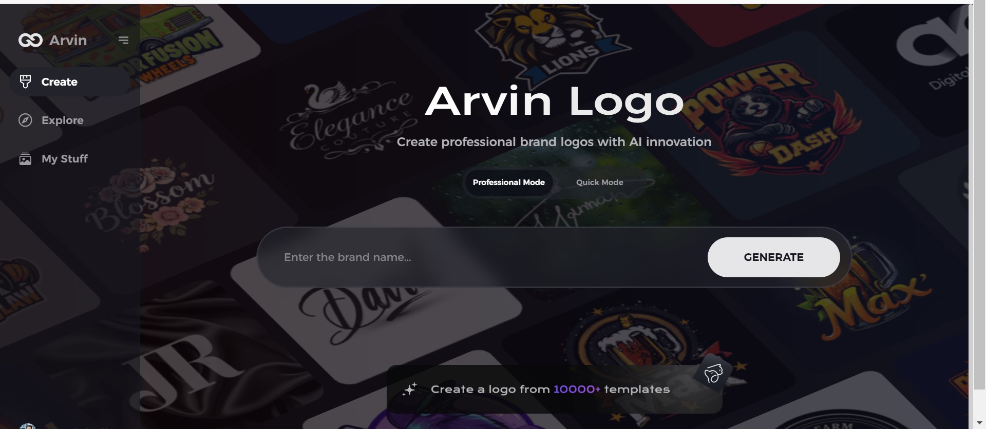
Step 2: Input your brand information and preferences
Input your brand name, slogan, and industry. Specify all your design preferences, which may include font styles or images themes.
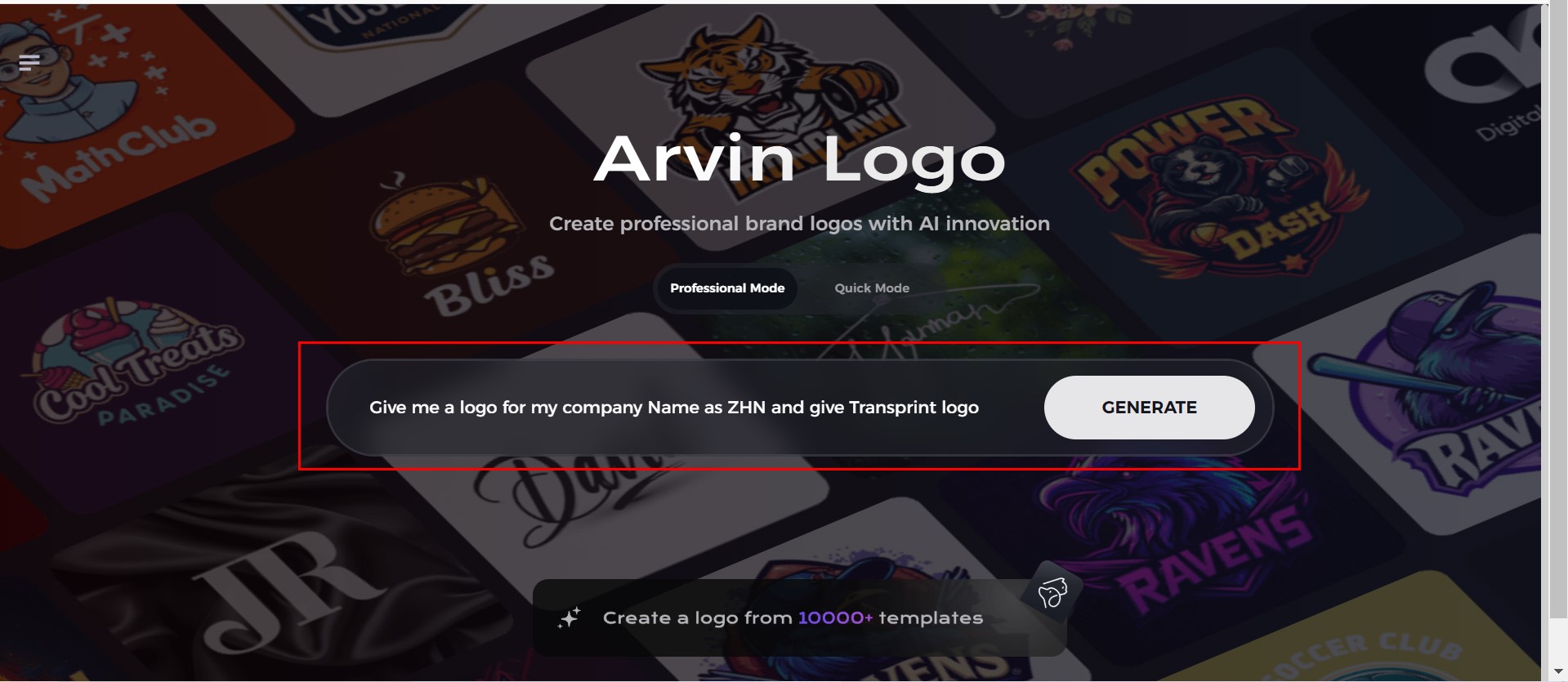
Step 3: Pick your industry:
Now select your industry related to your niche. This will help the AI generate logo styles and types that better suit your preferences.
Step 4: Select Style:
Now select a style which you would like and continue. This will serve as inspiration to create your preferred logo.
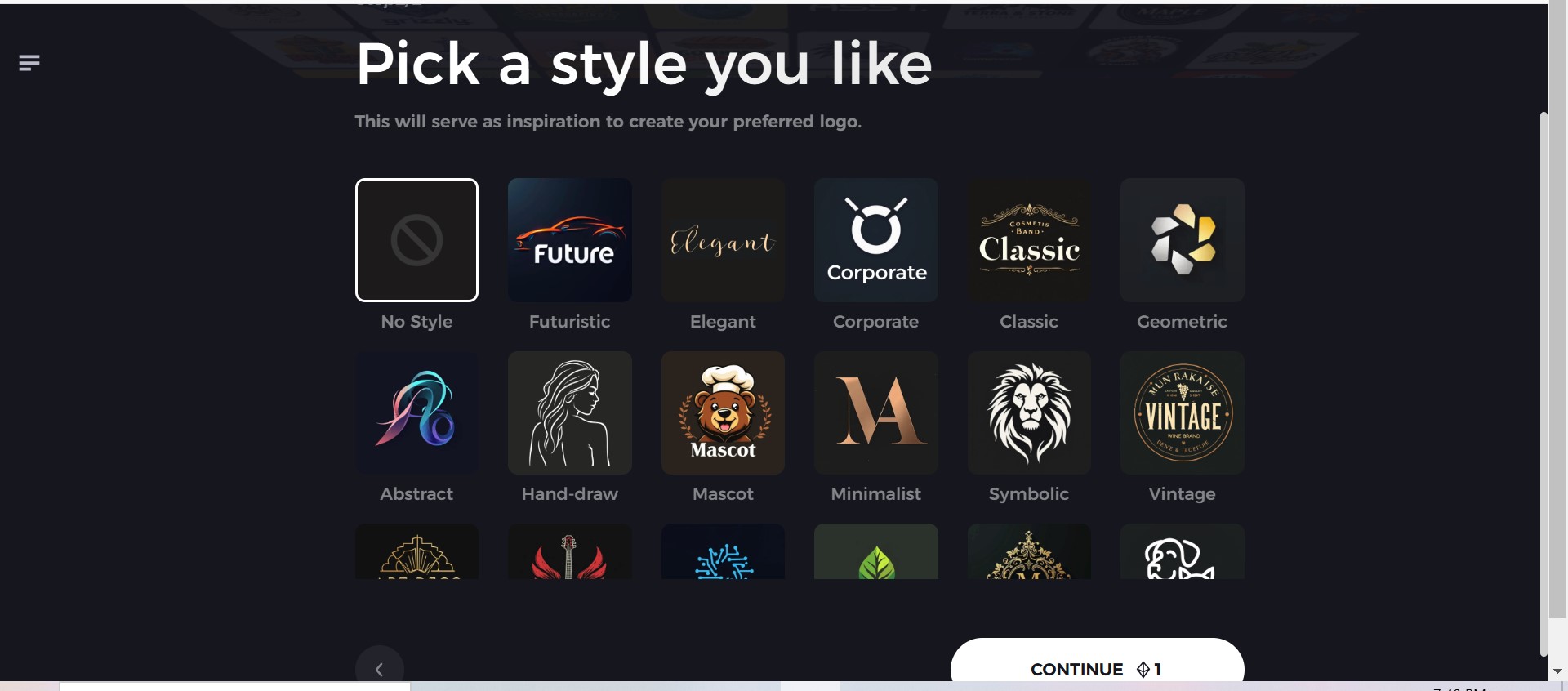
Step 5: Design Personalize through the tools of Arvin AI
After Arvin AI gives create your logo, you can customize those logos with the tools that have elements such as font style, layout, and the positioning of symbols. Experiment on different designs until you like what you see.
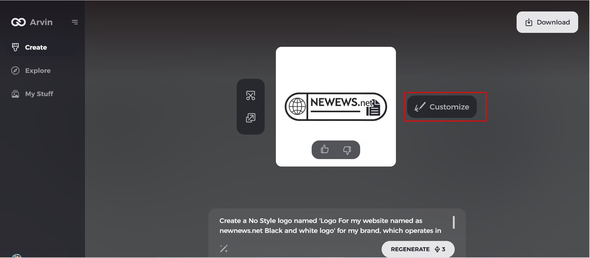
Step 6: Save and download the final logo
Preview the finished logo and save it in a high-resolution format for both print and digital uses.
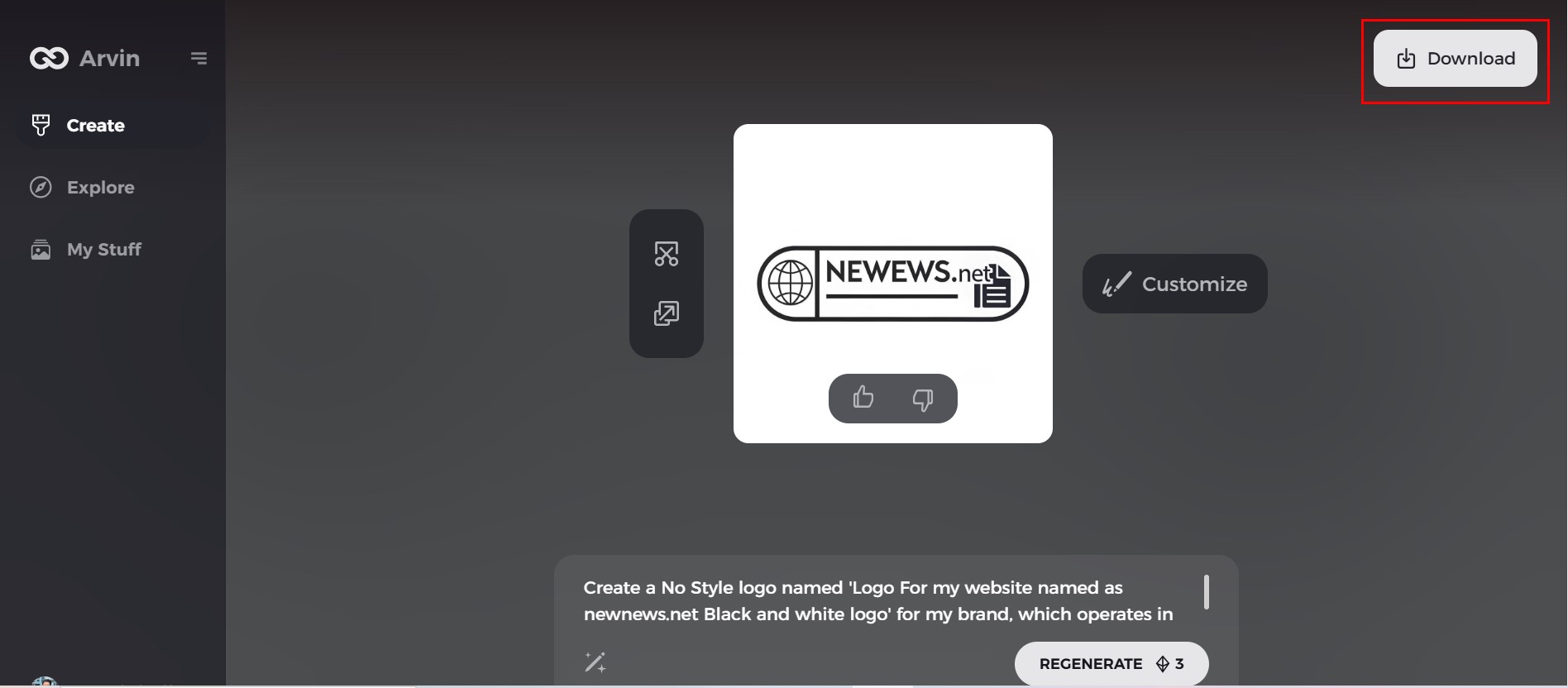
Conclusion
Branding and design initiatives for a project that seems truly timeless can employ vintage-inspired color schemes, artworks, and elements of aesthetic. A nostalgic- styled logo can best communicate itself to your audience, who’ll recognize it as relatable or warm and nostalgic. Tools, including Arvin AI, make easy a way to create logos on one platform, with enough choices featuring features that contribute toward having a professional finish, yet retro in style. Arvin AI provides you with the best retro color palette from any era, ensuring that you get the right tones for your design.
FAQs
What is a retro color palette?
A retro color palette consists of colors that were popular decades ago. The palettes generally include muted tones, earthy shades, and bright hues such as pastel pinks, mustard yellows, and neon brights that were cultural trends of the time.
How do I make a retro color palette?
Create a retro color palette by researching design trends from specific decades, experimenting with muted and bold tones, or using tools like Arvin AI to get color suggestions based on vintage themes and your preferred aesthetic.
What are examples of retro colors?
Some examples of retro colors include pastel pink, mustard yellow, mint green, burnt orange, and neon hues such as magenta and cyan. Every decade produces its unique palette of colours echoing the social and design of the period in which they were developed.
Can I use Arvin AI for designing a retro logo?
Arvin AI helps create retro-themed logos by providing pre-designed templates, automatic color palette suggestions, and options for the customization of fonts, icons, and layouts, thereby making it easy to produce nostalgic, professional logos for your brand.

