Speaking of symbolic and refreshing visual of sprite logo design. Since its inception, the Vivid and refreshing Sprite logo has changed many times, reflecting the ever-evolving trend of graphic design. Whether you’re a veteran designer or still a rushing designer, the history and evolution of Sprite’s logo design will be a fascinating case study. From bold typography to vivid imagery, it captures the spirit of innovation that every graphic designer aims for. Let’s open the cap of one of the world’s most beloved sodas, its design history.
Part 1: Meaning and History of Sprite Logo
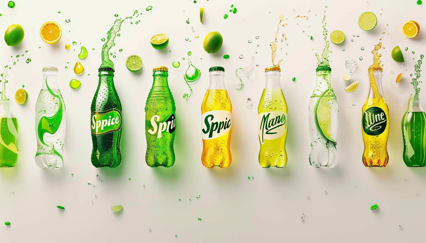
The most important thing in the Sprite logo is the freshness of the iconic logos at a glance. The color palette and shape of the graphical elements of the brand badge express the sparkline and lemon taste of the iconic drink. This shows the company’s advanced approach and attention to detail.
1961 – 1964
In the early sixties, Sprite logo design marked the beginning of a vibrant journey that resonated with people’s love for refreshing drinks. However, a distinctive emblem began to form in 1964. In this era, the visual identity of the brand underwent a remarkable change, and a playful color palette based on red and green adopted.
964 – 1974
During the decade between 1964 and 1974, Sprite’s logo design continued to evolve, reflecting the vibrant image of the brand. The red and glass green combination, introduced in 1964, added a cheerful character to the emblem and became a decisive feature. With an innovative touch with a red vertical bar on top of I, the bolder red stars continued to shine in the design.
1974 – 1989
From 1974 to 1989, Sprite’s logo design marked a new chapter. In the 1974 design change, the typeface was renewed, and smooth sans serif body, soft angle and thick line were adopted. This shift matched the trend of the time and added a modern sense to the emblem. The contrast between red and green disappeared, and the main text became green again, except for the circular beta points drawn in red.
1989 – 1995
At the end of the 1980s, the Sprite logo design marked a major turning point, and in 1989, an iconic lemon logo appeared instead of a dot. This novel touch is not only symbolic, but also visually attractive, making it a characteristic appearance that can be understood at a glance. The new logo highlighted in a thick, elegant font with a slightly italic light green wordmark.
1995 – 2003
In the mid-nineties, the Sprite logo design changed to maintain the brand’s vibrant personality, even as the time went by. The detailed lime and lemon emblem changes to an abstract with two circles overlapping in 1995. A new icon placed on an oblique white character placed on the background of a green and blue gradient, with a stripe pattern accented.
2002 – 2005
In the early 2000s, the Sprite logo became more modern. In 2002, the word mark typeface revamped, the angle became sharper, and the edge became more prominent. The white letters complemented by thin blue outlines and thick shadows, highlighting the brand’s refreshing features. In this era, the dot of Lime Lemon became smoother and smoother, the shadow of the letters turned into a thick blue outline.
2004 – 2009
In the history of sprite logo design, 2004-2009 was characterized by a strategic shift in placing badges horizontally. In this era, subtle changes in effective design were seen, and letters became fringed with thick blue outlines, but the typeface of the inscription remained intact. The true peak of this era is that the yellow dot above “I” has changed to an artistic design of lemon overlapping lime.
2008 – 2021
In 2008, Sprite’s logo design continued to evolve, and a sophisticated wordmark was born that felt elegance. The smooth white letters wrapped in a dark blue outline fit in a dandy gradient badge characterized by a hexagonal corner and horizontal sides that arch towards the center. A distinctive feature of this renewal is that the dot above “I” replaced with an oversized lemon and the bottom colored into a creative green.
2014 – 2021
From 2014 to 2021, the Sprite logo changed to a simple design. The emblem created in 2008, removing the color of the gradient and its shiny texture, transforming it into a flat image of green and white. This transition to minimalism was not merely in line with modern design trends, but rather a strategic decision to emphasize the core value of the sprite brand.
2018 – 2021
The 2018-2021 Sprite logo design shows the stage in which simplicity plays a major role. In 2018, the lemon, which had become synonymous with the logo, were removed and the visual identity of the previous version of Sprite was fully reproduced with the rest of the details. This shift in the logo design of Sprite preserves a strong visual identity while retaining decoration and bringing attention to the essence of the brand.
2019 – 2022
Sprite’s logo design continued to evolve in 2019, switching to bright colors. This time, a white wordmark took its place on a sharp green badge. The emblem of the iconic lemon was replaced by a plain yellow dot, which, while looking simple, was a change that brilliantly expressed the flavor and freshness of the famous drink. This sprite logo design reflects the balance between modernity and tradition.
2022 – Current
In the 2022 redesign, the Sprite logo design became even simpler, using a solid green logotype placed next to it as the sole element of the badge. The typeface of the new wordmark is very similar to the one used in the previous badge, but only a few careful changes have been made. The attractive detail is seen in the dot above “I,” but it is now close to the vertical bar, with an arched cut like a “smile” at its end.
Part 2: Evolution of analysis sprite logo design
The evolution of Sprite logo design is a fascinating journey that brings together years of changes in branding and graphic design. From vivid color shifts to simple forms, the Sprite logo has changed many times, reflecting the brand’s core values and market trends.
Simplicity Adoption
For decades, Sprite’s logo design has shifted from complex imagery to minimalist and sophisticated design. The transition from a visually dense badge to a simple logotype reflects the modern design philosophy that being simple is king.
How to use color
The sprite logo design uses color in an exciting way. From the combination of red and glass green to the modern sharp green badge, intelligent logo colors makes the logo fresh and attractive.
Symbolism and Image
Icons and symbols play an important role in the sprite logo design. Whether the skillful use of lemon emblems or abstract versions with overlapping circles, these symbols have combined visual identity with product flavor profiles.
Typography Selection
Changes in typefaces and logo fonts subtly alter the logo design without disrupting sprite identity. From bold sans-serif typefaces to more modern and sharp angular typefaces, typography has evolved to suit modern design sensibilities.
Adapting to modern trends
The most comprehensive theme in the evolution of Sprite’s logo design is its ability to adapt to modern design trends without losing its core identity. Whether incorporating minimalism or playing with geometry, the Sprite logo has shown how the brand can remain relevant and attractive. It is a valuable lesson to keep timeless designs fresh and attractive.
Part 3: Arvin AI: A Tool for Perfecting Emblem in Logos
Modernization is a characteristic of good logo design, but perfect balance is hard to attain. This is where Arvin AI comes in. Arvin AI is a new design tool that generates an easy and precise way towards sprite logos. Using Arvin AI would thus make the process of coming up with sprite logos more streamlined and user friendly. Whether you are a professional designer or a beginner, Arvin AI makes the process easier and guarantees you professional results every time.
Key Features of Arvin AI:
- AI-Driven Assistance:Provides real-time suggestions to enhance symmetry and balance in logo designs.
- Industry-Specific Insights:Design Elements According to Your Industry and Target Group
- Live Adjustments:Instant modifications with a preview, so your design looks perfect and professional.
- Template Library:Libraries of templates that can be customized according to the uniqueness of your brand.
- Tools for Precision Alignment:To ensure every element is in the proper position without being unbalanced on the design side.
Steps to Use Arvin AI for making Logo
Step 1: Visit Arvin AI’s Website
Open your browser and navigate to the Arvin AI logo design page at Arvin AI to begin crafting your logo.
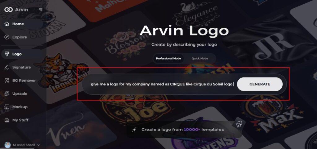
Step 2: Enter Your Business Information
Provide key details such as your business name and category. This helps the AI tailor the designs to match your brand’s identity.
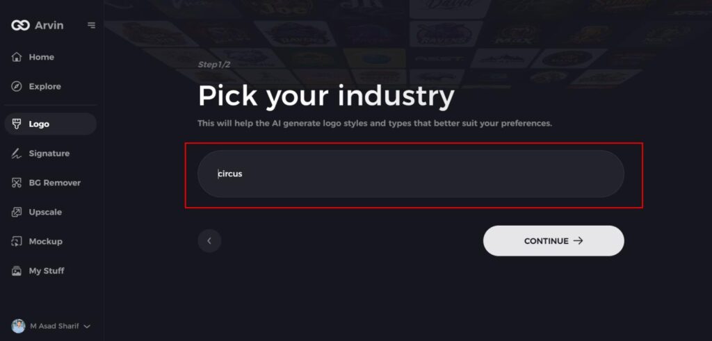
Step 3: Choose Your Industry
Select the appropriate industry from the list. This will help the AI focus on logo styles and options best suited for your field.
Step 4: Select a Logo Style
Browse through the available styles and pick one that aligns with your brand’s vision. If unsure, you can skip this step, and the AI will suggest a default design.
Step 5: Generate Logo Ideas
The AI will create a variety of logos based on your inputs. Review these options to find the one that best represents your brand.
Step 6: Customize Your Logo
Refine your selected design by adjusting elements like colors, fonts, icons, and layouts to fit your preferences.
Step 7: Download Your Logo
Once satisfied with the final design, download your logo in formats like PNG or SVG. These formats ensure your logo is ready for use on websites, social media, and print.
Conclusion
The development history of Sprite logos showcases an evolution which started from creativity into branding innovation. A logo demonstrates capability to transform while maintaining brand integrity for different periods. Graphic designers discover interest in the Sprite logo because its exact design evolved into a worldwide recognizable symbol. The contemporary version of minimalism and artificial intelligence-based design applications identified as Arvin AI transform how creators work.
FAQs
When was the first Sprite logo introduced?
The first approved Sprite logo first appeared in 1961 when the company initially released under The Coca-Cola Company. It was in a simple yet powerful appearance that set the stage for what was to come.
Why does Sprite use green and yellow in its logo?
Green employed to represent the tangy lemon-lime flavor of the drink and its fresh, and cool character. Yellow to represent the citrus zing and zest of the business.
How often has the Sprite logo changed?
The Sprite logo has been revised numerous times since it has been introduced, with important redesigns during the 1970s, 1990s, 2000s, and the latest one in the 2020s in order to make it conform to modern branding culture.
How can Arvin AI help in logo design?
Arvin AI provides AI-driven logo analysis with insights into design trends, color psychology, and brand strategies. This help businesses create successful and recognizable logos like Sprite.
