From a humble shop in Spain to the world’s biggest fashion retailers, Zara has been a flag of Index. From its products offerings, however, its brand and logo are something that would find themselves at the very heart of their worldwide recognition. The Zara logo goes further than a simple design-it says the philosophy behind the brand, simple, elegant, and definitely fashion-forward. Logos are the first point of contact for consumers with a brand. This article explores the meaning, history, and evolution of the Zara logo.
Part 1: Meaning and History of the Zara Logo
The logo of Zara is a word that leads to extreme simplicity and sophistication. Logo design perfectly goes with the value of producing timelessness with novelty in style and fashion. The logo of Zara always follows simplicity to speak of elegance and accessibility.
At first glance, when Amancio Ortega began Zara in 1975, it was a place for the fashionable to become accessible to all. Since then, the company has been taking care with the design of its logo as much as to reflect the three major values that would define the brand: style, adaptability, and inclusivity. There was nothing fancy about its design, and it made Zara brand incredibly competitive in fashion.
This logo has very consistently communicated Zara’s message of quality and innovation as the backbone of its brand identity. It has symbolized reliability and class for the millions of customers spread globally.
Part 2: The Evolution of the Zara Logo Over the Years
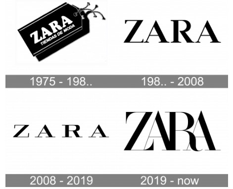
The Zara logo over the years, has changed substantially, responding to the changing nature of the trend in the market and the overall growth of the brand. Further, let us break down the journey.
1975 — 1980s: Origin of Zara logo
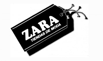
The first logo of Zara was introduced in 1975 when the business entered Spain. The design was serif, giving the feeling of trust and sophistication. This font choice was shown to be highlighted through Zara strategic vision in infusing luxury and accessibility and thereby paving a path for future expansion.
1980s – 2008: The First Redesign
In the 1980s, Zara expanded its operations beyond Spain. At that time, the company required a more matured visual identity. It changed the logo with an elegant serif font for the attraction of a high-class audience. Thus, this time Zara entered into an international fashion brand beyond the status of a local retailer. This defines the identity of Zara in the competitive marketplace.

2008-2019: Modernization
Once the brand gained fame in the international market, Zara’s logo was modified in 2008. This time, it emphasized the modernity and compactness of the logo. The letter spacing was reduced to make the logo appear sleek and integrated. This version reflected Zara fast-fashion ideology including modernity, efficiency, and accessibility.

2019 — Today
In 2019, Zara presented a new logo that consists of intertwined letters. The design triggered much controversy and debate between the critics and the fans. Overlap of the letters, serif was brought in which made it so innovative and creative by depicting that the brand Zara was one among the world fashion streams. The logo, during this version, truly epitomized innovation with some level of risk and the fact that differentiated it from each of the other competitors.
Part 3: The Symbolism of the Zara Logo
Logos are not just visual elements; they carry meaning and tell stories. Zara’s logo is not an exception. The four-letter design is very simple, and this is what the brand’s philosophy is all about: less is more. With the help of this move, it simply communicates to its customers that they will deliver quality stylish products without much embellishment and distractions.
In the present logo, the interlocked letters of the name are a manifestation of fluidity and connectedness, which reflects Zara’s adaptability to changing global fashion patterns. This logo can also represent the interest of the brand in customer relation and innovation.
Part 4: Zara’s Logo and Its Global Presence
International Branding in the case of Zara rests in its emblems. There’s such poise, effortlessly translated and transcending the restrictions of languages and cultures, so this is why the international logo is globally acknowledged.
Zara Man and Zara Home Logos
The logo, being the major one, has different variations of sub-brand logos such as Zara Man and Zara Home. Each of them still retains the minimalism of the parent brand but targets a specific market it is meant to target. The Zara Home logo portrays warmth and sophistication because that is what is targeted in a home decor focus, while the Zara Man logo is masculine yet sophisticated.

Global Influence of the Logo
In countries around the globe, the word Zara would be synonymous for modernity, and accessibility: the logo represents appeal for fast fashion and drive in leadership across age groups. Its adaptability makes it in line with the consumer psyche in markets from Europe to Asia and the Americas.
Part 5: Zara’s Marketing Strategy and the Logo’s Role
One of the most striking strategies of Zara is its low dependence on conventional advertising. Instead, it was careful about superior store locations, high turnover of products, and excellent visual identity. The logo is an important part of Zara’s marketing approach. Its design is minimalist, set in contrast with the fast-fashion model of Zara, where trends change fast, but the logo stays permanent. This consistency creates brand awareness and good will among the consumers.
Part 6: Arvin AI – Revolutionizing Logo Design
Creating a logo that embodies a brand’s essence, like Zara’s, requires skill and creativity. Arvin AI is a powerful AI tool that simplifies the logo design process and delivers a professional result which can boost your brand identity.
Key Features of Arvin AI
- Customizable Templates: Choose from a library of templates inspired by leading brands.
- AI-Powered Suggestions: Receive intelligent recommendations for fonts, colors, and layouts.
- Real-Time Previews: Visualize how your logo will look across various platforms and products.
- User-Friendly Interface: Make the design process intuitive and accessible through an easy-to-use interface.
Steps to Use Arvin AI for making Logo
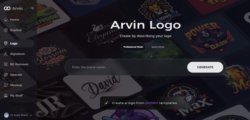
Step 1: Create an account and log in on Arvin AI
Visit the website of Arvin AI open an account, and log in for the logo design feature.
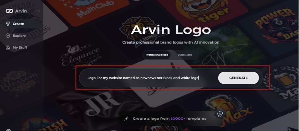
Step 2: Input your brand information and preferences
Input your brand name, slogan, and industry. Specify all your design preferences, which may include font styles or images themes.
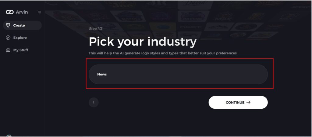
Step 3: Pick your industry:
Now select your industry related to your niche. This will help the AI generate logo styles and types that better suit your preferences.
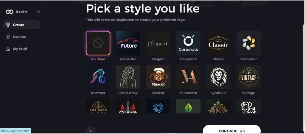
Step 4: Select Style:
Now select a style which you would like and continue. This will serve as inspiration to create your preferred logo.
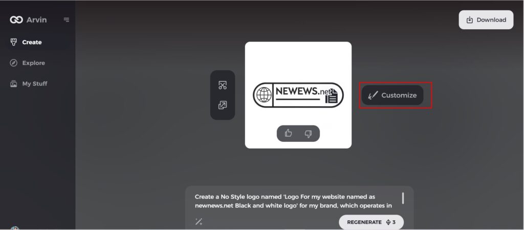
Step 5: Design Personalize through the tools of Arvin AI
After Arvin AI gives create your logo, you can customize those logos with the tools that have elements such as font style, layout, and the positioning of symbols. Experiment on different designs until you like what you see.
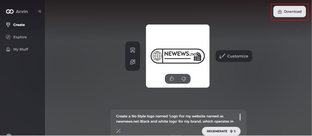
Step 6: Save and download the final logo
Preview the finished logo and save it in a high-resolution format for both print and digital uses.
Conclusion
Evidence of adaptability and innovativeness is found in the Zara logo evolution from its humble start in 1975 to a redesign in 2019. A significant feature for the identity of the global leader in fashion, Zara, it is reflective of the idea to deliver timeless fashion for everyone. Simplicity, elegance, and versatility best define ageless fashion and have importance to aspiring designers and brand managers. If you want to create a logo for brand, then powerful AI tools like Arvin AI help the user to make designs resonate with the target audience. Be it a new brand or refreshing an existing one, Arvin AI gives users resources and inspiration for designing logos that last for life.
FAQs About the Zara Logo
What does the Zara logo represent?
The Zara logo is a epitome of elegance, subtlety, and flexibility; so these characteristics also closely relate to its objective of quality fashion for people globally.
Why does Zara have two logos?
The original logo followed by the most prevalent emblems of the brand. The second Zara logo served the brand for twenty-eight years, supporting its meteoric rise to fame globally.
Who created the Zara logo?
In 2019, Zara updated their logo. It was designed by the French agency Baron & Baron.
How can I use Arvin AI to create a logo similar to Zara’s?
Arvin AI allows you to have templates from which you can give you AI-based suggestions to be able to have a simple and elegant logo design like Zara.
