Logos are not just mere pictures-they are the representations of unity, identity, and branding for a group of people from sports or corporations and even small-town community ventures. A well-designed team logos inspires confidence and bonding besides being aesthetically pleasing but creates a rallying symbol among the community toward shared value or aspirations. We will see how important a team logos could be, share alternative design ideas applicable to various teams, and provide tips on how best to create that perfect logo to help you out in making it meaningful and powerful.
Part 1: Importance of Team Logos
A team logo is more than just an icon to represent one’s team; it becomes a soul of a team’s identity. Here, the team logos symbolize the team spirit and goes with the values and bond to the fans, hence it is an efficient means of unification and recognition. The section that follows shall relate why a good team logos mean so much by going beyond aesthetic value and become a symbol of pride and belonging.
Creating a Lasting Impression
Good team logos gives the first impression that lasts. Whether it is on the jerseys, merchandise, or the promotional material, it says a lot about who the team is and what it stands for. Iconic team logos like the interlocking “NY” of New York Yankees or the simple apple with a bite of Apple instantly evoke recognition of power in design.
Role in Branding
Branding is not only selling products but building trust and loyalty for teams. A unified logo ties all branding elements together to ensure consistency across platforms. This is especially crucial for professional teams or businesses where brand perception will directly affect success. Cute logos for your brand are very essential part for unique identity.
Boosting Team Confidence
Good team logos would also raise morale in a team. It gives each member a kind of pride and belongs to the club, hence bringing them closer in achieving common set goals. Team members will surely be proud the moment they witness their logo being put anywhere.
Part 2: What Creates a Good Group Logo
An eye-catching team logos is essential for establishing a strong identity and creating a lasting impression. We’ll explore the key elements that make a logo not just visually appealing but also memorable and effective. From color choices to typography and symbolism, these elements play a vital role in conveying your team’s values, mission, and personality at a glance. Let’s dive into what makes a team logo stand out in the crowded world of branding.
Colors and Their Impact
Colors affect our feelings, thoughts, and actions. They have been in everything, ranging from branding to personal choices, influencing everything. Here is an article, “Colors and Their Impact,” which tries to go really deep into exploring how different colors impact our lives and how they can be put to use in better communication. An effective Logo Colors should raise the vision toward viewers.
- Vibrant and Bold Colors: For sports and gaming teams, these colors emit a lot of energy and enthusiasm.
- Muted and Neutral Tones: Ideal for corporate teams, they tend to project professionalism and reliability.
- Soft and Warm Shades: Ideal for community teams, as it gives an impression of being approachable and trustworthy.
Typography
More than words on a page, typography refers to creating an appealing visual experience for enhanced readability and to communicate a message. Designing for either print or digital media, you will find mastering the art of typography will elevate your work and catch your audience’s eye. Typographic Logos play important role in the brand identity.
- Strong Fonts: Bold, blocky fonts can be used well for sports and gaming team logos for depicting strength and determination.
- Clean Fonts: Corporate teams love clean and minimalist fonts, so they require clarity and sophistication. Logo Fonts are required to make a good team logo.
- Friendly Fonts: Rounded or playful fonts are very welcoming, so perfect for community or volunteer teams.
Symbols and Iconography
Symbols and iconography are the most powerful tools in communication; they talk through visual language beyond the words. Ancient civilizations, the modern digital world, and even all the stages between them, used symbols to tell ideas, beliefs, and emotions in a global way. The simple team logos symbolizing a worldwide brand contains deeper meanings that reach across cultures and time.
- Mascots or Icons: To illustrate characteristic traits like bravery, agility, or unity, represent with animals, objects, or characters.
- Abstract Shapes: It involves abstract forms in designing very modern and fluid team logos that typically represent corporate branding.
- Regional Elements: Design based on the cultural or regional elements in the form of symbols representing the heritage or mission of your team.
Balancing Simplicity
The concept of design, communication, and problem-solving is the balancing act between simplicity and detail. It’s that fine line where clarity and sophistication sit together so a concept or creation is simple yet rich in depth. That balance ensures the message is not only effective but engaging and memorable as well.
- Keep It Simple: Simple logos are simple and easy to recognize and are suitable for teams looking for wide reach.
- Use Detail Strategically: Intricate designs may be pleasing to the eyes, but the overall outline must remain readable at a smaller size.
Part 3: Tips to Create a Good Team Logo
The well-designed team logos demonstrate commitment and is serious about it. After all, every professional team has. Even if you are not in the Pro League, if you have a communication like yours, you will be at a glance from players, opponents and sponsors. And that is never bad. By having your own team logos you can stand out from others. As a result, you are more likely to think about you when you join a club or consider sponsoring a team.
Start sketching
If you feel that you have a good plan, it is the beginning of the fun part. It’s time to run the pen on paper. Rather than making the final product, we practice rough ideas. You can write down ideas as much as you want and iterate as you want without censoring yourself. At this point, it would be good if there was a lot of quantity, and it is later that emphasize quality. Let’s play a little, get creative and see what comes out.
Get inspired
Like any other creative work, it is not permissible to steal someone else’s work when making a logo. Getting creative may be difficult at times, but you don’t need to copy (change or paste) your design ideas. Inspired by others, it stirs up your creativity. Learn from brands and designers and incorporate learning into the logo design process. The team logos are visual expressions, any form, any way. Do not be afraid to demonstrate creativity.
Use iconic symbols
Before you start designing, you need to choose a type of logo, such as text-based combinations, icons, and signs. I would like to summarize them simply. The most classic form of the team logos is word design, which the designer sometimes calls “logo”. Word tags are existing or custom typefaces that use only your business name, without using symbols or monograms. This type of team logos is ideal for short, distinctive brand names and no logo.
Use the right design elements
Now, consider what’s technical and convert paper drawings into easy-to-use digital formats. Some platforms help you put your graphic logo into digital formats, but you need a little technical guidance to bring your concept to life for a business audience. Planning is one of the most important things to do right. Separate all text and shapes and ensure that the team logos itself is in line with the surroundings.
Choose the best shape
Shape plays an important role in making good team logo design. Because they have a certain association with the human brain. Therefore, brands can use the form to communicate messages and emotions to target users. The shape can be used as a logo design container or symbol. The containers limit the space of the logo, so that it is consumed visually. It is important to note that the team logos pose challenges for scalability because it is placed in a small area.
Choose the color expression wisely
The color selection of the logo design does not just choose the one that suits you. Consider how the audience views and where they appear. Choose wisely to evoke different emotions and senses depending on the color. Do your brand express in cool tones like blue, green, purple, or warm tones like red, orange or yellow. You may lean black, white or gray to suit your brand identity. Pay attention to the colors your competitors use.
Ask your team for feedback
Board of Directors discussing at an oval table. Listen constructively to comments. I have confidence to ignore personal preferences like I hate purple. However, be careful if a particular problem or concern is raised multiple times. When you are just beginning to develop your logo design ideas, it may be difficult to hear things you don’t want to hear. You may have to admit that your personal preferences do not reach the finish line.
Test print logo
Lines are one of the most important elements of graphic design and can unify the entire logo design. The line you choose must represent a team or club and send the right message to the audience. In many cases, the team logos prominently selects custom font styles for a wider range of differentiation. Therefore, you can try various options, but make sure that the lettering is clear and does not confuse the reader on the website or social media.
Part 4: Best Team Logos
The team logo is a powerful symbol of team pride and unity. These logos define passion and devotion and form an integral part of the identity of each team. The history of the team logos are fascinating journey through time, where color, creativity, and fan enthusiasm live. This article examines what makes the team logo great and effective. Let’s present top examples focusing on the various design and creativity.
Olympic Ring
Born in 1913, the Olympic Ring is a world-famous sports logo. Five colorful rings are arranged on the white ground, each representing a different continent. It signifies the diversity of the world and global unity. This simple logo became an iconic masterpiece because it depicts how sports can unite people beyond their culture and reminds one of common values that bind together people of all backgrounds.
Detroit Red Wings
The Detroit Red Wings hold a special position in the minds of ice hockey fans. It symbolizes their timeless spirit and is deeply rooted in the team’s 90-year history. Since its appearance in 1932, this logo with red wings on white wheels means speed, power and resilience of the team. This emblem is simple, but it speaks of the determination of the hockey team and how “moving the wheel” is very important.
Nike
The Nike logo, also known as Swush, is widely known as a sports logo that represents speed, decisiveness, and sense of accomplishment. Originally designed by Carolyn Davidson, who was studying graphic design at Portland State University, in 1971, Swush was a pros and cons. However, Phil Knight acknowledged the possibility and decided to use this logo. Swush quickly became Nike’s official logo, expressing speed, dedication and determination.
Manchester United
The Manchester coat of arms has inspired the Manchester United Football Club logo. The coat of arms carries the red devil having a stone throw and a ship, thus honoring Manchester for being a prominent port in its historic times. The image of the devil was chosen to portray the team as fierce, powerful, and somewhat controversial, adding offensive elements to the persona. This refers to the team as the Red Devils.
New York Yankees
The New York Yankees logo symbolizes the ageless legacy and success of the team. This emblem, the white monogram “NY” intricately designed with red stitches on a dark blue background, has been an essential part of the team since 1909. Its iconic logo symbolizes baseball teams and sports history. The interlocked NY symbolizes pride in New York and embodies New York’s spirit of resilience and champions.
Chicago Bulls
The Chicago Bulls basketball team logo is a globally recognized symbol. The fierce red-eyed black bull is strong, sharp lines, which portray the determination and competitiveness of the team. The design of the logo has facilitated the popularity because it shows in a good manner and has a reputation of being successful, especially during the era of the basketball great Michael Jordan in the 1990s when the Bulls were crowned six-time NBA champions.
Tour de France
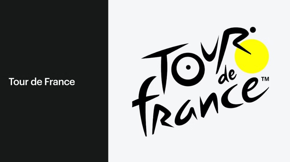
The official Tour de France logo is a skillfully designed emblem, synonymous with the most prestigious cycling events. If you look closely, this logo creatively depicts a bicycle rider. O “is the rear wheel of the bicycle, the yellow circle is the front wheel, and” R “is the image of the rider. With a yellow circle that is included within the bicycle wheel, it denotes the sun as well as a reminder that it is daytime where the race would be held.
Los Angeles Lakers
Los Angeles Lakers logo Bright purple and yellow colors make one of the sports logos most famous in the world. The Laker is the best in basketball and has entrenched themselves in repeated ways, among them baptizing NBA champions from time to time. Their regular successes and efforts for excellence have established a huge number of fans. Those bright purple and yellow colors do make you feel energetic and passionate.
Arsenal FC
Arsenal FC is a highly successful football club that has won various leagues and domestic cups. This club’s historical and traditional status is represented through the cannon-inspired emblem. Honoring Arsenal as having been adjacent to a very strategic military base, the logo deepens with an added theme of militarism. With its remarkable on-field success over time, this logo remains iconic to this very day.
F1
F1 is also known as Formula One and is the most famous car race event. The F1 logo is mainly white and red. White represents purity and speed, and red means energy, passion and excitement. The bold red reflects the full adrenaline nature of the F1 race, adding dynamic and vibrant elements to the logo. The white background enhances the visibility of the red element and makes it visually appealing and easy to recognize.
Part 5: How Arvin AI Helps for Team Logo Design
Perfect team logos design are exciting activity as it reflects the identity of your group, its values, or what they stand for. Whether it is a sports team or a business team, or really any kind of group, recognition and unity depend heavily on logos. Arvin AI makes this work streamlined and easy for users. Arvin AI has used artificial intelligence, through which anyone can design their team logos in seconds and yet boasts several features that deliver a professional quality finish.
Key features of Arvin AI
- Templates: Browse through a number of templates that cater to different types of teams, from sports to business and everything in between.
- Instant Design Suggestions Real-time: The Arvin AI offers instant design suggestions based on AI. Such smart recommendations mean you are well on track.
- Huge Icon, Fonts, and Colors Library: The interface allows access to a library of icons, fonts, and color options. It helps you to choose the most perfect symbols.
- Integrated Branding: Arvin AI does not create team logos but allows merchandise designs, profile pictures in your social media pages, banners, and the likes.
- Collaborative Tools: Share your logo designs with any teammate or collaborator in the most real-time manner possible.
Steps to Use Arvin AI for making Logo
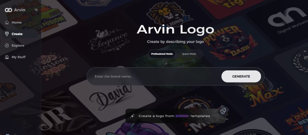
Step 1: Explore the Arvin AI Logo Creator
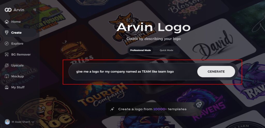
Begin by opening your web browser and navigating to the design page at Arvin Logo Maker. This platform will help you kickstart your team logo creation process.
Step 2: Input Your Team Details
Provide key information such as your team name and category. These details enable the AI to generate designs tailored specifically to your team’s identity.
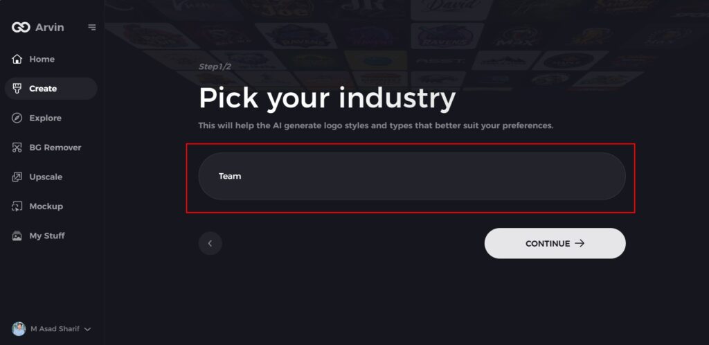
Step 3: Choose Your Industry
Select an industry or category from the available options. This step helps the AI refine the logo styles and designs to align with your team’s niche.
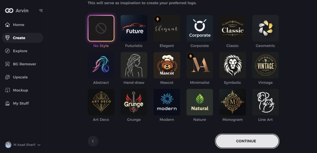
Step 4: Define Your Style Preferences
Browse the list of design styles and select one that resonates with your team’s vision. If none fit perfectly, you can skip this step and let the AI create designs based on its default settings.
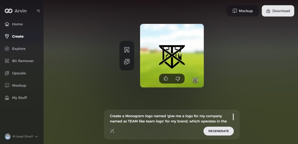
Step 5: Review Logo Concepts
The AI will present a range of logo ideas based on your inputs. Look through the designs and identify those that best represent your team’s spirit and goals.
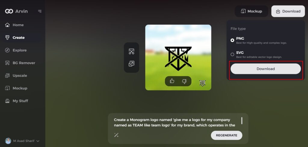
Step 6: Download Your Final Logo
Once you’re happy with the design, download the logo in formats like PNG or SVG. These formats are ideal for various applications, including social media, merchandise, and print materials.
Conclusion
A team logo is not just a symbol; it forms an important identity of your team. It helps communicate your values, mission, and vision to the world. Arvin AI is an absolutely indispensable design tool, reducing both time and hassle required to produce designs while maintaining features such as AI-powered design suggestions, broad template libraries, and extensive customization options. Whether the team logos are designed for a sports team or professional organization, the process is streamlined and kept within good quality standards. Try Arvin AI to get that perfect team logos for your team.
FAQs
What are the elements of a good team logo?
A great team logo contains memorable colors, readable typography, meaningful symbols, and simplicity.
Am I able to make a free team logo?
Yes, free applications like Canva and Hatchful allow an individual to make a simple team logos using free tools.
Why should I make a team logo with Arvin AI?
With Arvin AI, you have access to user-friendly templates and customizing features and AI suggestions that give the finishing touches for it to be professionally made.
How do I get my team logo to stand out?
Pay attention to uniqueness and maintain the integrity of your design aligned with what your team believes in, use contrasting colors, which increases its visibility.

