Iconic logos are when people are able to immediately note the logo. He worried that a logo becomes the example of values that a particular brand has. Do you remember Nike’s swoosh, Apple’s apple or even the writing of Coca-Cola? These logos are elegant, easy to remember and have the prolonged existence. A logo cannot be a design but instead a representation of the specific brand it belongs to. It plays a role in the formation of the bond with clients. Shapes, colors and fonts used in the logo are very effective in terms of how people feel about the brand. In this guide, you will learn what it is that makes a logo iconic and some techniques to create one.
Part 1: Evolution of Iconic Logos
Logos are an important part of a brand’s identity. Even the most iconic logos change with time to keep pace with changing trends, customer expectations, and technological advancements. These changes help brands stay relevant while remaining true to their core identity. Let’s explore the history and characters of iconic logos and the lessons they provide.
The History behind Some of the World’s Most Iconic Logos
The major brand logos of McDonald and IBM have gone through significant change over the years. Those changes prove how edition of the logo is the necessity to understand the time and connect to the target market.
McDonald’s
McDonald’s golden curves looked a little different when the company first started out. The curves themselves were actually introduced by the company in the 1960s to represent the architecture of their restaurants. Over time, the design has become simpler and less messy, yet the yellow curves remain. This development allowed the logo to stay both iconic and current.
IBM
Its logo during the early 20th century was quite complex with minute details due to the nature of its style in that period. Due to advances in technology and with its power internationally as a leading player, it adapted to a bolder and more horizontal bands signifying quickness and technology.
Characteristics That Make a Logo Iconic
Not every logo becomes iconic. Those that do share certain characteristics that help them stand out and remain relevant for decades:
Simplicity and Memorability
Simple logos are easily recognizable and memorable. For example, the Nike rustle is a curved line, but it communicates movement and energy. People remember it instantly because it is not too complex and these are cool logos.
Versatility across Mediums
Logos must work well in different designs, whether on a business card, a website, or a billboard. For example, Apple’s logo—a simple apple with a bite—is accessible and works perfectly in black, white, or color. Its design ensures it looks great on small devices and large displays alike.
Emotional Connection and Storytelling
A logo should either resound with the audience on an emotional level or tell a story about the brand. The Coca-Cola logo’s flowing script induces feelings of homesickness, happiness, and celebration, which is reflective of its long-standing association with family moments and celebrations.
Lessons from the Best
By analyzing some of the world’s most prominent logos, we can identify such common elements that make them long-lasting and impactful:
FedEx
FedEx an invisible arrow is embedded between “E” and “x,” thus giving it a sense of speed and accuracy along with forward movement. Such a design element would stand out slightly yet kindly.
Amazon
The smile from the “A” to the “Z” on the Amazon logo signifies satisfaction from the customers and a wide range of products the brand offers. This is simple yet thoughtful design that creates an emotional attachment in the minds of the customers.

Google logo uses exciting primary colors with a playful rotation. The green “l” breaks the pattern, showing the company’s willingness to think differently. Its simplicity, color scheme, and friendly design reflect Google’s advanced and friendly personality.

Part 2: Types of Logos
There are many different forms of logos all designed to fulfill specific branding purposes. A logo may focus on text, images, or a combination of both. This choice affects what customers feel about the brand. Awareness of the different types of logos serves as a guide for businesses seeking to find one that reflects their identity. Let’s break down each type in detail:
Wordmarks and Letter marks
These logos are strictly based on text and focus on the brand name or the initials. Success is all about design, color, and layout.
This is a wordmark using colorful letters in friendly, modern fonts. Simplicity is brought to the design so that the focus is put on the brand name; colors are associated with creativity and fun.

IBM
Letter mark is one way of simplifying the brand into three bold letters. The idea is represented by stripes for speed and innovation.

Pictorial Marks
Pictorial marks are logos that use a single image or symbol to represent a brand. Unlike text-based logos, they rely on visuals to communicate the brand’s identity. These logos can be highly effective because they are often simple, easy to recognize, and memorable.
Bird is an example of a pictorial mark. It means freedom, communication, and bonding between individuals with one another, as is the aim of Twitter: connecting people together with each other’s thoughts and ideas. It is easy to remember because of its simplicity.
Target
The red bullseye is another iconic pictorial mark. It directly reflects the brand name, making it easy for customers to associate the symbol with Target. Its clean and bold design ensures it stands out, whether on a store sign or in advertisements.
Why Pictorial Marks Work
Pictorial marks are powerful because visuals can communicate meaning quickly and without words. They are especially effective for global brands because images can excel language barriers.
Abstract Logos
Abstract logos are unique designs that use shapes, patterns, or symbols that do not represent real-world objects. Instead of showing something specific, abstract logos convey ideas or emotions. They are often more creative and open to understanding, allowing a brand to express something deeper or more complex without being tied to a real image.
Pepsi
The red, white, and blue spinning circle is an abstract design. Not representing a specific object, it represents movement, energy, and fun—qualities synonymous with the lively, youthful image of the Pepsi brand.
Adidas
The three stripes are simple yet strong. Not representing anything particular, they induce ideas of movement, strength, and self-assurance, which are important themes for Adidas in regard to sports and healthy performance.

Combination Marks and Symbols
Combination marks and symbols are logos that combine both text and images. They balance the use of a brand name and a visual element. The logos give brands the flexibility to use both aspects together or separately depending on the situation.
Burger King
The Burger King logo includes the brand name and the image of a burger. The visual element is clear and directly represents what the brand offers, which is very fun and easy to understand. Text and symbol together form a healthy identity.
Starbucks
Starbucks uses the image of its mermaid symbol next to the brand name in a circular shape. This is a logo that gives off a sense of cohesion, timelessness, and strength and recognizable, as the image and name are combined in one.
Uses
- Combination Marks: These are useful and can be used in a variety of ways. The text and image can both be used together or separately, depending on the context. For instance, Burger King may use just the burger symbol in some situations, like packaging or advertisements, while in others, it may use the full logo with both text and the image.
- Symbols: Symbols are a style in which text and images appear combined in one design, often in the shape of a badge or cover. These logos are ideal for firms that want a classic, formal, or significant look. Starbucks uses a symbol with its mermaid figure inside a circular badge in order to create that sense of tradition, yet contributes to its powerful, iconic nature.
Part 3: Iconic Logos across Different Industries
Logos play a very important role in the definition of brand identity across many industries. They help businesses stand out and connect with their audience, which leaves a lasting impression. Let’s look at how iconic logos have shaped brands in different industries:
Tech and Innovation
The logos in the tech and innovation industry are usually smooth, modern, and simple. They have to convey high-tech technology, simplicity, and trust.
Apple
The Apple logo is simple, yet strong. An apple takes a bite out of it to represent invention and creativity, the smooth appearance matching the brand’s style about elegant and user-friendly technology.
Tesla
Tesla uses an artificial version of the letter “T” to symbolize its brand name and also for electricity technology. This symbol presents a modern and future view since it symbolizes Tesla’s aspect in sustainability and invention.
Samsung
The Samsung logo is simple and strong in its design, with the company name written in a clean font. This gives off a sense of strength and consistency, which is vital for a global technology brand.
Fashion and Lifestyle
Logos in the fashion and lifestyle industry are very luxurious, stylish, and create a sense of style, status, and quality.
Chanel
Interlocking “C”s of Chanel symbolize luxury and cleverness. Such a simple yet timeless design is representative of the high-end fashion brand that is committed to style and quality.
Gucci
Gucci’s logo uses a simple yet stylish typeface with two interlocking “G”s, which represent the brand’s rich history and commitment to workmanship. It is instantly recognizable as a symbol of luxury and high fashion.
Nike
Nike’s swoosh is one of the world’s most iconic logos. The brand communicates movement, speed, and strength in arrangement with the company’s focus on sports and active lifestyles. It’s clean, simple, and powerful to be one of the world’s most recognizable logos.

Food and Beverage
In the food and beverage industry, logos often aim to be friendly, attractive, and instantly recognizable. They reflect the brand’s promise of quality and taste.
Coca-Cola
The symbol of the company has long been recognized as one of the most recognizable brand logos. His slow and smiling handwriting and gentle red color induce happiness, homesickness, and thirst-quenching sensations and are in harmony with the brand’s image of happy, thirst-quenching perception for a long time.
McDonald’s
The golden curves of McDonald’s are bright and simple with a universal recognition. They symbolize fast, affordable food, and in most cases, customers are often able to spot the logo of this brand from afar and hence identify any location of this company.

Starbucks
The logo has the Starbucks mermaid in a circle representing the brand’s sea roots and its coffee culture. The color is green, and the stylish design shows class and quality, so all customers would feel about the high premium quality of coffee.

Entertainment and Media
Logos of entertainment and media are bold, dynamic, and exciting, always managing to get one’s attention regarding the story or experience that the brand can deliver.
Disney
In contrast, Disney’s logo, mainly depicted by Cinderella’s Castle, has magical and stylish appeal that tends to create a feeling of wonder and childhood as part of its focus for being a family-friendly entertainment fantasy.
Netflix
Netflix logo is simple, bold, and modern. It is reflected with a red color and a clean design showing how the brand is strong to become a dynamic, easy-to-use entertainment platform while its simplicity is enough for it to be immediately recognized.
Warner Bros
Warner Bros. logo with a shield holding the initials “WB” is powerful and iconic. The brand symbolizes long-standing history in the film and television industries while symbolizing quality and authority in the industry.
Part 4: How AI Tools Revolutionize Logo Design
AI tools have completely changed how logo design goes about; it is quicker, more affordable, and creative. Using AI can create a logo in one-tenth of the time it takes to have it done conventionally, while these tools save costs due to the powering of much work, hence making expensive professional designs accessible to small businesses or startups. AI also offers wide varieties of customization options. Users can try different styles, colors, and layouts to get the perfect design.
Arvin AI: The New Logo Design
Arvin AI is a tool that can create logos in a quick and easy manner. It uses advanced technology to help you design logos that look professional and unique. Whether you’re starting a new business or rebranding, Arvin AI offers many customization options to create a logo that fits your style. It’s fast, cost-effective, and allows you to experiment with different designs until you find the one that works best for your brand. Arvin AI makes logo design accessible to everyone.
Key Features of Arvin AI:
There are following key features of Arvin AI:
- Easy interface: It is easy and simple; anybody can easily design a logo using it.
- Smart customization with AI suggestions: The feature of smart design suggestions enables users to customize their logo as easily as possible.
- Iconic designs in templates: It also features templates based on famous logos, so you have an excellent starting point.
- Support for high-quality downloads: Arvin AI allows you to download your logo in high quality and in various formats, which makes it easy to use anywhere.
- Real-time Preview: You see live updates of your logo design as you make changes to it, which helps you visualize the final product instantly.
- Variety of font styles: Arvin AI offers a wide range of fonts to choose from so that you can pick the perfect one that matches your brand’s personality.
Steps to Create an Iconic Logos with Arvin AI
Step 1: Sign Up and Log In to Arvin AI
Begin your journey by visiting the Arvin AI website. Create an account and log in to access its logo design features.
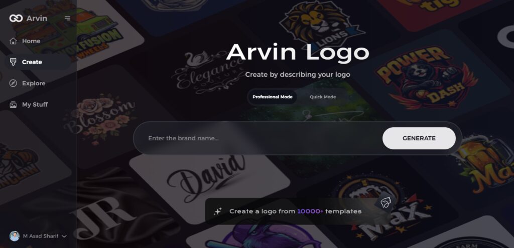
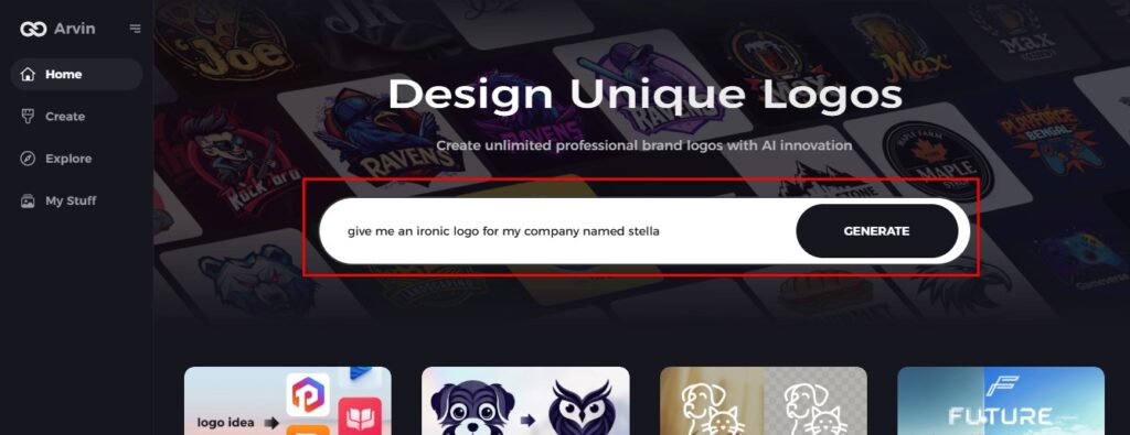
Step 2: Provide Your Brand Details
Enter your brand’s name, slogan, and industry. Share your design preferences, such as preferred font styles, color schemes, or image themes, to guide the AI in crafting a logo aligned with your vision.
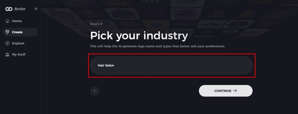
Step 3: Choose Your Industry
Select the industry that aligns with your brand. This helps Arvin AI tailor logo suggestions to suit your niche and target audience.
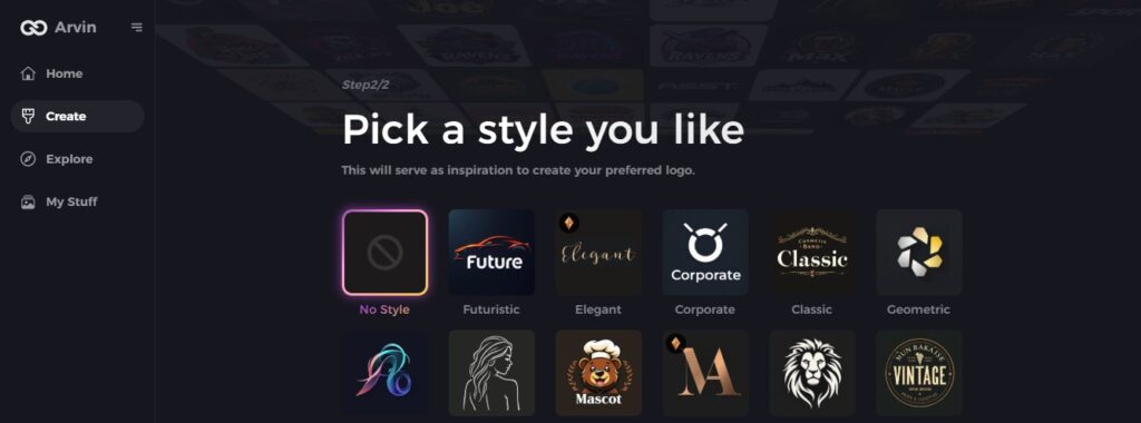
Step 4: Pick a Style
Explore various design styles and select one that resonates with your brand identity. This choice will serve as inspiration for generating your unique logo.
Step 5: Customize Your Logo
Once Arvin AI generates initial designs, use its customization tools to refine your logo. Adjust elements like font styles, layouts, and symbol placements until the design feels perfect.

Step 6: Download and save your logo
Preview the finalized design and download it in a high-resolution format. Your iconic logos will be ready for use across both digital platforms and print materials.

Part 5: Challenges in Designing an Iconic Logos
Designing a logo that stands the test of time is not without its challenges. A good logo should be simple, memorable, and relevant to the brand it represents. Let’s explore some of the key challenges in creating successful, iconic logos.
Avoid Over-Complexity
The most difficult aspect of logo design is avoiding over-complication. Logos have to be simple and recognizable. A messy logo with too many details or elements is hard to remember and even harder to use across various mediums.
Examples of failure for too messy logos
Most of the iconic logos try to present all and various with mess that cannot possibly be clear. For example, the older logos that appeared busy, messy, or complex might have made it not easily possible for people to directly associate themselves with the brands. Such logos failed in the simplest message and more in recognition.
Balancing Originality and Familiarity
A logo should be unique but familiar enough that people can connect with it. Balancing originality and familiarity is quite tricky. If the logo is too similar to others, it becomes generic and lacks a distinct touch. In case it’s too different or abstract, it will not connect with customers.
Why some logos are too generic
Sometimes brands opt for overly simplified designs or use common shapes, colors, or symbols, which makes these iconic logos seem to blend in among the others. These logos lack uniqueness; thus, they do not define an identity. For instance, many logos use standard shapes, lines, or letters that fail to provide an identity in terms of memorability and distinction.
Adapting to Trends While Remaining Timeless
Design trends come and go. A logo that looks trendy today may look old in a few years. The challenge for designers is how to make icpnic logos that are at once current and timeless. While there is temptation to follow the latest design trends, a logo must remain effective over time.
The danger of following fleeting trends
A logo that is too much of a product of current trends risks becoming irrelevant as trends change. For instance, a logo using trendy colors or fonts might look dated after a few years, forcing the company to rebrand. A timeless logo, on the other hand, remains strong and effective even as trends evolve. The challenge is to create something that feels fresh but also holds lasting value.
Conclusion
Iconic Logos which are popular mentioned to as logos are used by any firm as they symbolize the image or a company. Of course, the development of technology and availability of AI tools, such as Arvin AI, has helped to simplify the process. Such tools allow one to design professional logos in less time and at a relatively low cost. You will achieve a professional identity through the logo when you use Arvin AI to design it in a way that will arouse the emotions of your target market. Indeed this is an effective tool to apply and so do not waste time and start creating your own great looking logo now!
FAQs
What is the most iconic logos of all time?
Simple logos refer to those ones, which everybody can recognize and recall easily and which bear a strong association with the brand; it may be Nike, Apple, Coca-Cola and many others.
How do I create a logo that becomes iconic?
There are three critical things that need to be concerned when designing a logo – simple, flexible and emotionally resonate with the community or its audience.
Can AI design tools create professional logos?
Yes, Arvin AI can easily create professional logos using customizable templates and advanced design suggestions.
Why do some logos fail to become iconic?
Logos fail for being too common, too complex, or poorly executed.


