For the millions of people around the globe, Disney World stands as a symbol of happiness and imagination. Without a doubt, the logo or any major brand is a part of telling its story and a way to connect strongly with its fans. A logo, beyond the actual design, personifies the soul and essence of a business. We look into the history of the Disney World logo, see how it grows with time yet manages to live up to that magical spirit that never fades.
What is Walt Disney World?
An amusement park is Walt Disney World, created based on its anime and franchise by the world-famous Walt Disney Company. Today, this brand has its amusement parks everywhere in the world and pulls in millions of children and adults each day.
What does the Disney logo mean?
Such being the case, this Disney logo is indeed a popular icon, but it bears some meaning for those targeted. The mythological and fairy-tale looks of Cinderella Castle comprise the logo of the present times. This element represents what sort of entertainment business the brand is and who its target groups are. It just so happens to be a fantasy and magic sign that most people like to entertain themselves with.
Part 1: Disney Logo Journey and Evolution over the Decades
The Disney World logo journey and evolution over the decades are as follows:
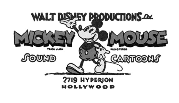
1929 – 1937 – An Introductory Logo
The original logo was designed to introduce cute logos for your brand. A huge Mickey Mouse is drawn, and the name of Mickey Mouse is written in large letters on both sides. This giant Mickey Mouse had classic manners from the 80s and was depicted as greeting fans.
1937 – 1948 – A Trimmed Wordmark
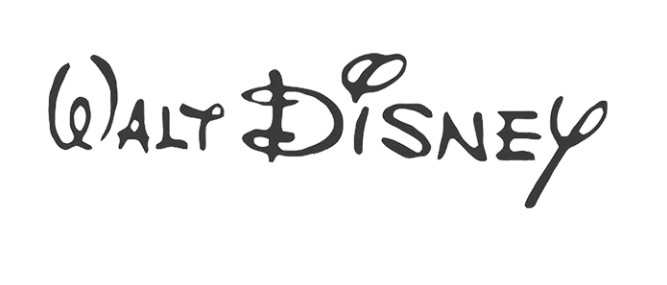
About seven years later, the company changed its logo to a new, thinner one. Only the name of the founder was written in an original script. Although it is a script font, it is still a readable name except for the letter “t” which looks like “y.” This is one of the iconic logos to promote branding.
1948 – 1979 – Stylish Company Name
The name of the founder is a script font. This time, however, artistic characters became bolder and more prominent. The style of characters also looked completely different. However, although the thickness of the letters was stylish and sophisticated, the readability was reduced.
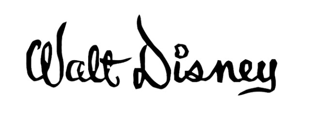
1972 – 1983 – The First Script Font Logo
Again, the designer returned to the previous logo design. However, the same character style appeared thicker and became a readable word mark. The designer added the characters “Productions” in the sans-serif typeface to make the contrast work.
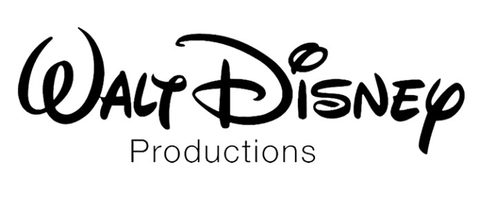
1983 – 1985 – ‘Pictures’ Included
At this time, the only change seen in the Walt Disney logo was the incorporation of the “Pictures” character on behalf of the “production” character. In addition, the character appeared in a larger line than the previous sans-serif.
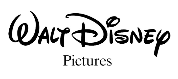
1985 – 2006 – Enters Cinderella’s Castle
The current symbol, Cinderella Castle, was first incorporated into the Disney World logo in 1985 and remained in use for fifteen years. Cinderella Castle was placed at the top of the Walt Disney name. The “Pictures” character was expanded to make the entire design look compact. The meteor later became an attractive feature of the company’s logo.
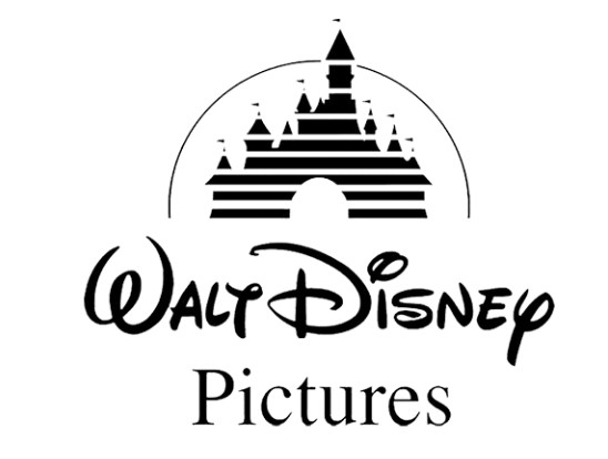
2006 – 2011 – A Refined Cinderella’s Castle
The company honed the design of Cinderella Castle. There was a tower, a bright room, and I could see the color shining. Another change brought about by the designers was the thickness of the company name and the letters “Pictures” and much smaller than the castle.
2011 – Present – Shortened Design
In 2011, Disney announced a shortened Disney Castle logo. A sophisticated castle was painted in a rectangular frame, and the width was reduced. The company name also became only one word of Disney. These changes allowed Disney to have the original Disney Castle in Paris. This image also mentions the characters of Peter Pan and other fairytales created by Disney Studios.
Part 2: Font and Color Palette of the Disney World Logo
A logo designs is more than just a shape or style, but also logo fonts and logo colors. All these help define and personify the logo. Disney World has changed logos over the years, each one chosen with a lot of thought towards exemplifying the value and magic that the brand embodies.
Review of Changes in Fonts in Each Version
The font in the Disney World logo has seen changes but never failed to evoke a fun, creative, and magical feel to them. In the early versions of the logo, more playful and whimsical letters are featured, relating to Disney’s concepts of imagination and joy connected to children. More modern and sleek fonts have resulted in later versions, which demonstrate the growth of the Disney brand across the globe.
Discuss the blue color scheme and its psychological effects.
The use of the color blue in the Disney World logo is not a mere coincidence but has further implications. Blue frequently represents trust, serenity, and reliability, which match well with the magic guaranteed by Disney in its realities. The shade of blue also brings about the feeling of the sky and dreams, fitting in with Disney’s theme of endless possibilities.
Part 3: Why Logos like Disney Worlds Are Timeless?
Some logos enter lives as only more than the mere symbol: the Disney World design is among them and always has remained such for generations, even today, so iconic, beautiful, and appealing.
The Role of Storytelling in Creating Iconic Logos
A logo is not just an image; it narrates a story. The Disney World logo, in association with the stories of magic, adventure, and happiness, reminds everyone of fairytales loved, thus emotionally arousing. A good story is what makes a logo distinctive and gives it a meaning so that it could easily connect with people on a deeper level, and that is the reason why the Disney logo became legendary over time.
How Timeless Logos Maintain Brand Recognition?
Timeless logos do not require frequent changes since they are meant to last. Disney World’s logo slightly modify over the years, but the main elements remain: the castle and magical font. This is the reason why the logo remains so recognizable even after decades. Since it remains faithful to its original design yet accommodates modern styles, Disney maintains its logo in relevance without losing its identity.
Things Business can learn from Disney World Logo
The Disney World logo teaches businesses that sometimes simplicity and consistency are powerful. A good logo should say what a brand stands for and have an emotional pull. Tradition balance with changes, so it remains fresh yet familiar. A business may learn that a logo is something more than the design; it’s a means of telling its story and achieving the trust of its audience with time.
Part 4: How to Create Magical Logos with Arvin AI
It doesn’t have to be difficult to create a logo that feels magical and special. With AI logo maker, you can design unique logos that really capture the spirit of your brand. Arvin AI does offer easy tools and creative options for letting ideas out and creating something unique. Whether bold and playful, this helps in bringing up a worthy logo, making it stand out. Let’s see how making magical logos could be simple and fun with Arvin AI.
Key Features of Arvin AI
There are following key features of Arvin AI:
- User-Friendly Tools: Simple and easy-to-use design tools for everyone.
- Customizable Options: Change colors, fonts, and shapes to match your brand.
- AI-Powered Suggestions: Get creative ideas based on your inputs.
- High-Quality Designs: Create professional logos that look polished.
- Fast and Efficient: Design a logo quickly without wasting time.
- Versatile Outputs: Export logos in various formats for different needs.
Steps to Utilize Arvin AI in Designing a Logo Based on Disney World’s
Step 1: Sign Up and Log In to Arvin AI
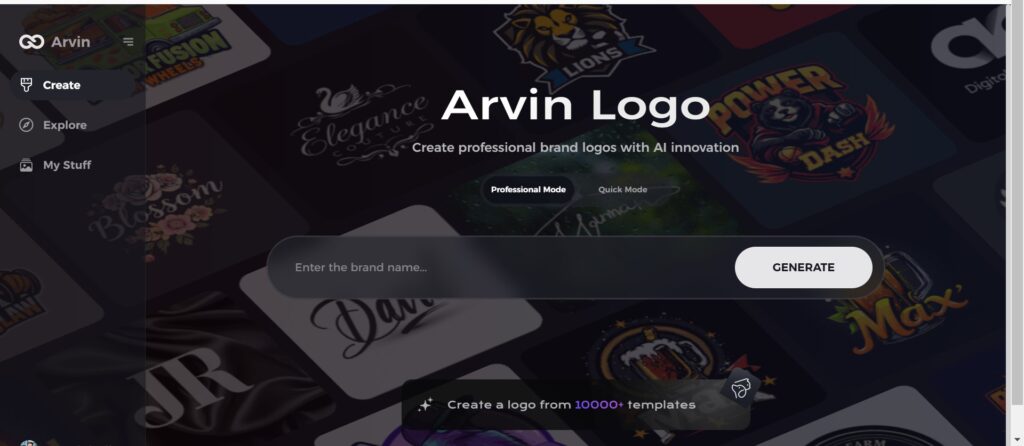
Go to the Arvin AI website, sign up for an account, and log in to get started with the logo design features.
Step 2: Enter Your Brand Details and Preferences
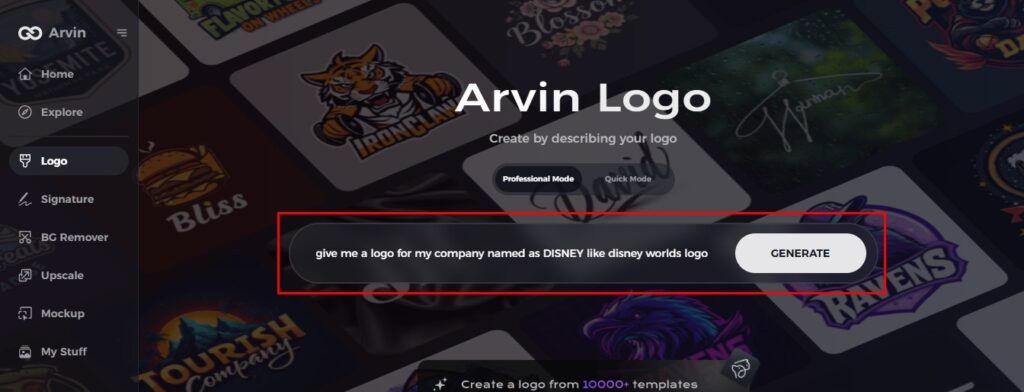
Input your brand name, slogan, and industry. Also, include your design preferences, such as fonts, colors, and themes that best describe your brand.
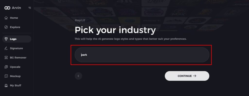
Step 3: Select Your Industry
Select the industry your brand belongs to. This will enable Arvin AI to tailor logo styles and suggestions to fit your niche.
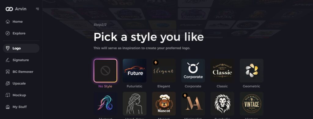
Step 4: Pick a Style for Inspiration
Browse through different styles and select one that matches the mood or story you want your logo to convey, just like Disney’s logo does with magic and imagination.
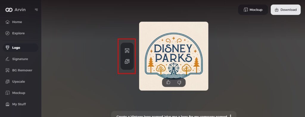
Step 5: Personalize Your Logo with Arvin AI Tools
Use the customizing editing capabilities of Arvin AI to craft your logo by changing font type, colors, layouts, or symbols.
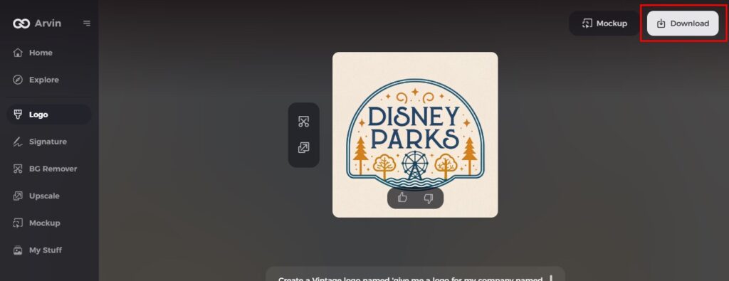
Step 6: Save and Download Your Final Logo
Preview your finalized logo and download it in the highest resolution ready for any media, whether in print or for digital.
Conclusion
A well-designed logo is the road to a more powerful brand, especially when it encapsulates your personality and resonates with your people. The Disney World logo is probably the best model for creativity in a logo since it shows what makes a great logo timeless. So, with all this power to create logos that stand tall, Arvin AI is going to be perfect for you. With the simple features and the innovation it provides, you can create your dream logo and make your brand impossible to forget.
FAQs about Disney World Logo
What does the Disney logo symbolize?
The Cinderella-based logo has been synonymous with the pillar since 1985. Its accurate replica of Walt Disney World’s Magic Kingdom, the castle represents all the imagination, magic, and creativity of any person regardless of age.
What does 33 mean at Disney World?
According to Disney, Club 33 is simply named after its address at 33 Royal Street in New Orleans Square at Disneyland.
What makes Arvin AI special for logo design?
A great thing about Arvin AI is the use of smart tools and easy features when helping you create professional and custom logos in no time.
How do I ensure my logo remains as timeless as Disney World’s?
Simple, telling a story through the design, and using colors that have a fit with your brand and connect with your audience.
