The crown logo has always been a symbol of power, prestige, and a little bit of untouchable elegance. You see it everywhere—from the heads of actual monarchs to fantasy realms, and even the logos of luxury brands.
For centuries, rulers have used crowns to distinguish themselves from their subjects. They symbolize supreme authority and often showcase the wealth and power of a kingdom through intricate craftsmanship.
The St. Edward’s Crown from the British monarchy, for instance, is more than a headpiece; it embodies centuries of heritage. Adorned with gemstones that have their own rich histories—some tied to conquests, others to diplomacy—it stands as a testament to the enduring legacy of the crown.
Don’t settle for ordinary—use our AI Logo Designer to craft a logo that’s as unique as your brand.

But the crown wasn’t just about status; it often carried spiritual connotations. In Christianity, the Crown of Thorns worn by Christ symbolizes sacrifice, humility, and redemption.

Ancient Greek and Roman leaders often wore wreath-like crowns made of laurel. These crowns symbolized divine favor and victory. They marked the leaders’ achievements as almost sacred.

Crowns have also played a major role in heraldry, where they denoted nobility and rank. They adorned coats of arms, signifying the bearer’s elevated position in society. The specific designs of crowns often indicated rank. The number of points or details showed if they were king, duke, or prince.
Beyond their traditional use, crowns have become enduring symbols of leadership and excellence. The phrase “heavy is the head that wears the crown” captures not only the allure of power but also the weight of responsibility it carries. This duality makes the crown a particularly evocative emblem, representing both privilege and sacrifice.
Crown Logo Meaning
A crown logo symbolizes power, prestige, and timeless authority. It is often chosen by brands projecting leadership and exclusivity.
Rolex’s sleek, stylized crown highlights their dominance in the luxury watch industry. It implies their products are enduring and refined.

Similarly, The Ritz-Carlton’s logo pairs a crown with a lion.
In sports, the Los Angeles Kings incorporate a crown to reflect dominance and their championship ambitions. Whether ornate like Royal Salute’s whisky emblem, which hints at heritage and opulence. Modern and minimalist like Supreme’s bold red crown, the symbol consistently evokes a sense of exclusivity. It bridges history and aspiration, offering brands a way to connect deeply with values of success, tradition, and elite status.
Take your brand to the next level with the AI Logo Designer. Your perfect logo is just a click away.
Crown Logo Design
The crown logo typically includes a visual depiction of a crown, making its symbolism clear and impactful. Styles vary widely, from intricate renderings like Royal Salute’s jewel-adorned crown to minimal designs like Rolex’s streamlined emblem.
Crown Logo Brand
1. Alfa Romeo
The car brand has inspired young dreamers, symbolizing speed, luxury, and belonging to something extraordinary.
Alfa Romeo’s storied past and innovative spirit resonate deeply. Its logo reflects a legacy tied to Milan’s history and culture.
The story begins in 1910 with Romano Cattaneo, a young illustrator, who worked alongside Giuseppe Merosi, an engineer at A.L.F.A. (Anonima Lombarda Fabbrica Automobili). Cattaneo, waiting for tram number 14 in Piazza Castello, was struck by the Biscione Visconteo on the Filarete Tower of Castello Sforzesco. This emblem, tied to the powerful Visconti family that once ruled Milan, immediately captured his imagination. “It was a moment of clarity,” he reportedly shared later, “where the city’s spirit met the essence of what this brand could become.”
Drawing inspiration from this historic symbol, Cattaneo and Merosi worked meticulously to create a design that would encapsulate both the brand’s identity and Milan’s rich heritage. The Biscione dragon, with its coiled serpent and dramatic stance, represented power and resilience, while the red cross on a white background, the emblem of Milan, stood for pride and civic strength. This blend of noble and civic elements established the foundation of a logo that would come to symbolize excellence.
Over time, the Alfa Romeo logo has adapted to changing eras without losing its essence. It has been subtly refined to reflect technological advancements and design trends while staying true to its origins. The logo not only celebrates Milan’s history but also serves as a tribute to the artistry and innovation that defined the early 20th century. As Alfa Romeo itself states, “Our emblem is more than a design; it is our soul, reflecting our past, present, and aspirations for the future.”
2. Hallmark
Hallmark is known for their heartwarming themes, predictable yet comforting plots, and idyllic settings.
The movies typically follow a familiar formula: a big-city protagonist returns to a small town, where they rediscover the joy of simpler living, mend family relationships, or fall in love under twinkling lights and snow-covered rooftops. Before every movie begins, there will be a flash of the iconic Hallmark logo, reminding viewers of what they’re watching.
The Hallmark logo, with its distinctive “crowned” design, features a handwritten-style wordmark that feels personal and approachable. The creation of this iconic logo traces back to 1949, when Andrew Szoeke, a New York-based lettering artist and designer, began working on the project.
Sitting proudly above the wordmark is a five-point crown, a symbol of excellence and prestige that suggests Hallmark’s leadership in the greeting card and sentimental entertainment industry. By 1950, the handwritten wordmark paired with the five-point crown was trademarked, marking the birth of a visual identity that would become synonymous with sentiment. The fluid and elegant script of the wordmark balances the regal nature of the crown, creating a design that is both refined and inviting. It wasn’t until 1954, however, that the company officially adopted the name Hallmark Cards, Inc.
3. Queen
The logo for the legendary rock band Queen, designed by Freddie Mercury himself, is a masterpiece that reflects the band’s identity, creativity, and legacy. Freddie Mercury, known for his larger-than-life persona both on and off stage, infused his love for drama and flair into the emblem.

Inspired by Mercury’s background in art and design—he held a degree in graphic design from Ealing Art College—the emblem is as theatrical and iconic as the band’s music. It incorporates astrological symbols for each band member, combining personal significance with grandeur.
The design, featuring a crown atop a heraldic shield, is unapologetically grand, paying homage to the band’s royal name while symbolizing their dominance in the rock world. Surrounding the shield are astrological representations of the band members: lions for Roger Taylor and John Deacon (Leos), a crab for Brian May (Cancer), and fairies for Mercury (Virgo). These elements are brought together by a phoenix, its wings spread wide in a bold display of resilience and rebirth—a fitting metaphor for a band that constantly reinvented itself.
4. Braga
The logo of Sporting Clube de Braga, commonly referred to as Braga, is a detailed emblem that reflects the club’s deep connection to its historical and cultural roots. The shield is divided into two halves: on the left, a red background features a medieval tower, while the right side, on a white background, mirrors this with another tower. These towers are symbolic of Braga’s rich architectural and historical heritage.
At the center of the shield stands an image of the Virgin Mary holding the Christ Child, a reference to the religious significance of Braga, often called the “Portuguese Rome” due to its historic role as a center of Catholicism. The inclusion of the Virgin Mary shows the city’s deep spiritual traditions and its connection to faith.
Above the shield, a golden mural crown with five towers represents Braga’s status as a city, as this heraldic symbol is often used in Portuguese municipal coats of arms. The upper section of the shield features the word “SPORTING,” flanked by three smaller shields, or escutcheons, each containing five blue dots—a motif from Portugal’s national coat of arms that symbolizes victory and resilience.
Encircling the base of the shield is the club’s name, “CLUBE DE BRAGA,” written in blue, tying the design together.
5. Starbucks
Did you know? Starbucks started as a single store in Seattle’s Pike Place Market in 1971, initially selling only coffee beans and equipment—not brewed coffee! Today, Starbucks operates over 35,000 stores worldwide, spread across 80+ countries, making it one of the largest coffeehouse chains globally. It’s logo, is equally (if not more) widespread with its famous siren at the helm.
The Starbucks logo, designed by Terry Heckler, is one of the most recognizable brand symbols in the world. Its core features—a mermaid, or siren, encircled by the company’s name—draw inspiration from the brand’s maritime roots and coffee’s global appeal. Heckler created the original design in the 1970s, using a two-tailed siren from a 16th-century Norse woodcut to symbolize allure and the far-reaching journey of coffee beans.
As Starbucks grew, the logo underwent significant redesigns to modernize its look and better reflect the evolving brand. During one major update, Heckler merged elements from two companies involved in Starbucks’ early expansion, refining the siren’s appearance to make her less intricate and more contemporary. The original brown color scheme was later replaced with green, symbolizing growth, freshness, and the company’s commitment to environmental sustainability.
The current design, introduced in 2011, removes the “Starbucks Coffee” text entirely, leaving only the siren as the focal point. This bold move underscored Starbucks’ confidence in its global recognition, as the logo’s simplicity and distinctiveness allowed it to transcend language and culture.
6. Emilio Pucci
Emilio Pucci is an Italian luxury fashion brand renowned for its bold, colorful prints and elegant designs. Often referred to as the “Prince of Prints,” Pucci revolutionized fashion in the 1950s by creating garments that combined high style with comfort and freedom of movement, an approach that was groundbreaking at the time. The brand specializes in women’s ready-to-wear collections, accessories, and swimwear, all characterized by vivid patterns inspired by Mediterranean landscapes, art, and Pucci’s personal travels.
Pucci’s designs became a symbol of modern luxury, embraced by icons such as Jacqueline Kennedy, Marilyn Monroe, and Sophia Loren. The brand’s iconic lightweight silk jersey dresses and resort wear set the standard for glamorous yet practical clothing.
The Emilio Pucci logo is a striking emblem that reflects the brand’s dynamic style and heritage. Designed by Emilio Pucci himself, the logo features an intricate crest crowned with regal detailing, encapsulating the brand’s luxurious and innovative spirit. Founded in the 1950s, Pucci’s designs became synonymous with bold, vibrant colors and striking patterns inspired by his travels and his love for nature, particularly the Mediterranean and the mountains where he skied.
A defining feature of the Pucci logo is the intertwined fish motif, which was recently updated to incorporate a stylized capital “P.” This modernized version draws inspiration from a label found in the 1953 Capri Sport archives.
In addition to his fashion legacy, Emilio Pucci’s design expertise extended to other fields by creating the logo for NASA’s Apollo 15 mission in 1971.
7. Correos
The redesigned Correos logo is a modernized representation of Spain’s national postal service, blending its rich history with contemporary design. At the heart of the logo is the post-horn, or cornamusa, an emblem rooted in the 18th-century tradition when postmen used horns to alert townspeople to collect their mail.
This iconic symbol, now simplified with wider counters and clean geometric lines, ensures readability and adaptability across digital and physical platforms. Above the horn sits a crown, symbolizing Spain’s regal heritage and the state-owned nature of Correos, while the cross adds a navigational element, emphasizing the service’s role in connecting people and places.
Summa’s creative director, Pablo Amade, explains that the cornamusa is a universal postal symbol akin to a red cross or parking icon, embodying recognition and utility. This refreshed logo is paired with a slightly darker yellow and navy-blue color palette, maintaining the brand’s recognizable identity while enhancing its visual impact. The logotype has been removed, leaving the horn and crown as a standalone icon, ensuring that even a simple yellow van or mailbox instantly conveys the brand.
This rebrand also includes a bespoke typeface, Cartero, developed with Monotype, to replace Soho Gothic. It is designed for improved legibility and warmth, and is applied across various mediums, including print and digital advertising.
8. Royal Canin
The logo for Royal Canin’s rebrand, designed by Thomas Hardwick. The design features a crown, a universal representation of prestige and excellence, paired with a subtle paw element, creating a connection to the brand’s focus on pets and their well-being. This thoughtful combination ties the regal concept of royalty to the idea of treating pets with the utmost care and providing them with high-quality nutrition.
The crown in the logo is stylized with soft, rounded elements that avoid appearing overly formal, ensuring the design remains approachable to a wide audience while still exuding a sense of luxury. The paw, cleverly integrated into the crown’s base, and the red color palette adds an additional layer of meaning, symbolizing passion, trust, and energy—key traits that align with the brand’s identity.
The typography complements the logo’s imagery with bold, modern lettering and the use of clean lines and consistent spacing. Together, the crown and paw encapsulates the brand’s core values of quality, care, and commitment to pets, ensuring that the visual identity resonates with its audience while reinforcing Royal Canin’s position as a leader in the pet food industry.
9. Premier League
The Premier League’s redesigned logo is a modern interpretation of its iconic lion emblem, reflecting a balance between tradition and digital-forward adaptability.
The design overhaul, created by DesignStudio, includes rounded sans-serif typography, a more versatile color palette, and a simplified yet striking lion icon. The adjustments address practical limitations of the previous design, such as issues with scalability and inversion. Stuart Watson, DesignStudio’s ECD, revealed that the team iterated through over 600 design variations to craft a logo that would retain the original’s recognizability while adapting to modern needs.
“The lion symbol already had global recognition,” Watson stated, “so the goal was to refine it for today’s digital needs.”
This digital-first approach allows the logo to work seamlessly as an app icon while preserving its iconic status across print and broadcast.
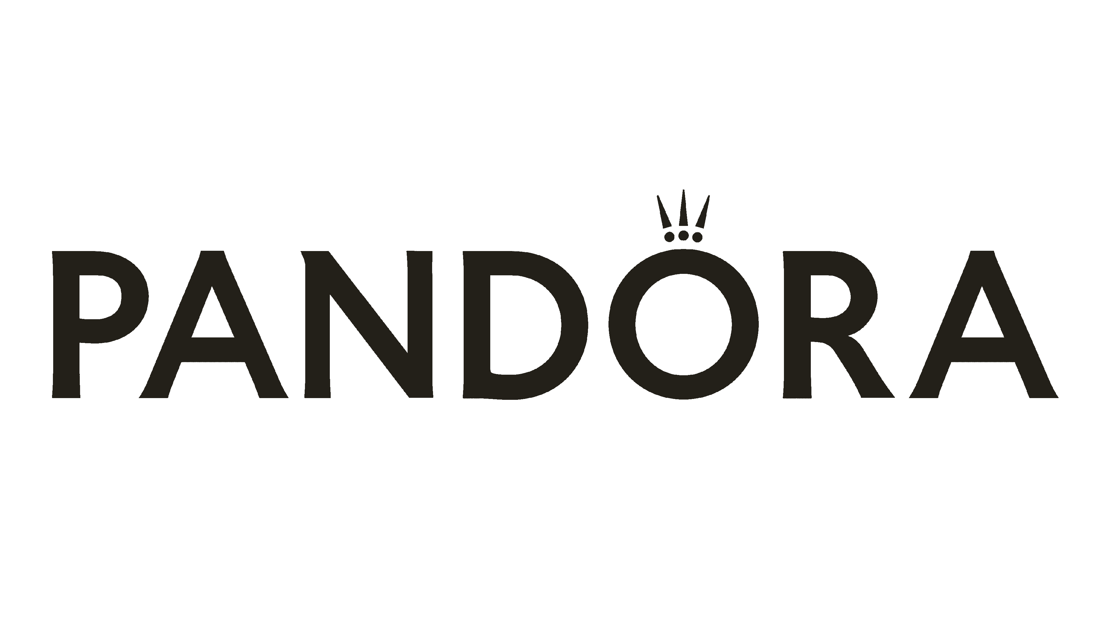
10. Pandora
The Pandora logo exudes elegance and simplicity, aligning with the brand’s association with affordable luxury and timeless style. Designed with a customized typeface similar to Optima Demi Bold, the logo is minimalistic yet impactful, embodying “everyday luxury.”
The original design went through multiple iterations, including red, purple, and brown versions, before adopting its iconic black-and-white look.
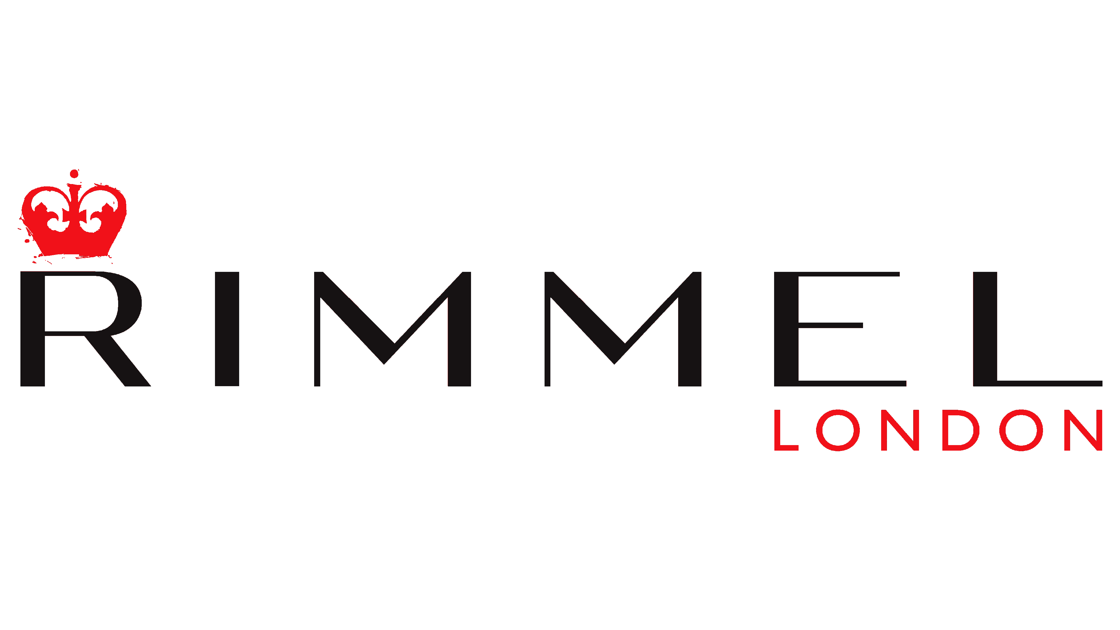
11. Rimmel
Rimmel’s logo prominently features a crown above the letter “R”, a fitting homage to the brand’s deep-rooted connection to London and its regal heritage. Founded by Eugène Rimmel in 1834 on Bond Street, London, the brand established itself as a pioneer in cosmetics.
The sleek typography paired with the crown creates a sense of modernity while honoring tradition. Now owned by Coty, Rimmel’s logo continues to symbolize quality and style, reflecting its history as one of the oldest cosmetics brands.
The crown enhances its visual identity and represents Rimmel’s mission to empower customers with products that boost confidence.
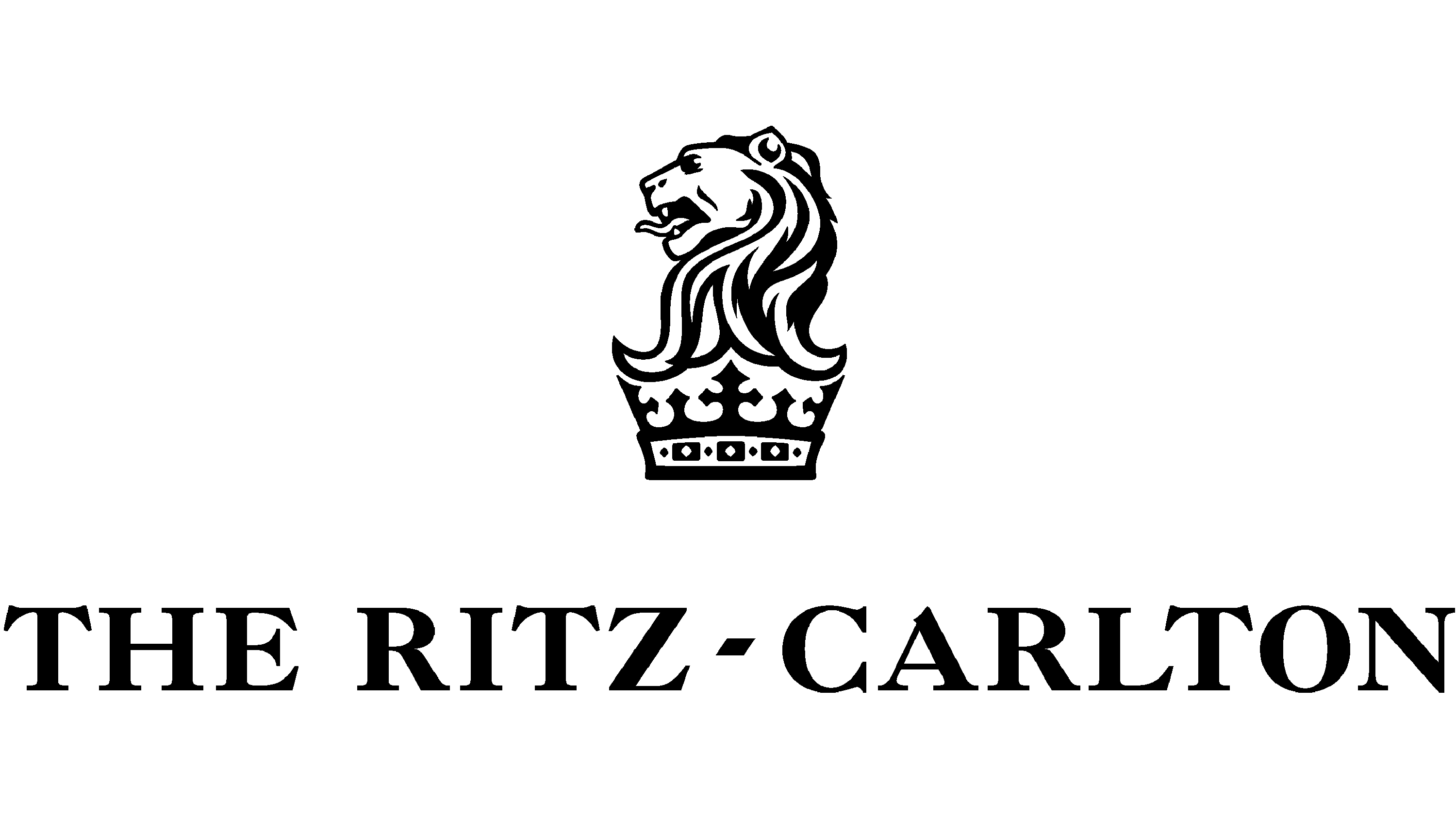
12. Ritz Carlton
The Ritz-Carlton logo combines two powerful symbols: a lion and a crown, encapsulating the brand’s commitment to luxury and excellence. Created under César Ritz’s vision, the logo combines the British royal crown with a lion, symbolizing strength, prestige, and financial backing.
The crown highlights the brand’s elite service status, while the lion underscores its legacy of power and regality.
This visual identity underwent multiple refinements before reaching its final form. The black-and-white color scheme adds to the logo’s elegance and timeless appeal, reflecting the sophistication of Ritz-Carlton hotels worldwide. The crown and lion together represent the brand’s commitment to hospitality fit for royalty and its impeccable service reputation.
The term “ritzy,” originating from César Ritz’s name, is now synonymous with opulence, emphasizing the logo’s crowned design.
13. Louis Philippe
The Louis Philippe logo is a striking blend of regal imagery and modern design, a visual identity that encapsulates the brand’s commitment to delivering timeless fashion. Sitting confidently at the top of the design is a stylized crown, a deliberate nod to royalty, excellence, and authority. Rather than being overly ornate, the crown’s minimalist aesthetic creates an understated yet powerful statement.
The logotype—bold and precisely spaced—commands attention without overshadowing the emblem. Its clean, uppercase letters reflect discipline and structure, mirroring the craftsmanship found in the brand’s clothing. What makes this pairing remarkable is how the crown elevates the typography, transforming what might have been a straightforward wordmark into a representation of prestige.
The Louis Philippe logo uses black-and-white hues to convey timelessness, with precise geometry that enhances its elegance.
Instead of relying on vibrant colors, the design focuses on balance and symbolism, allowing its sophisticated elements to take center stage.
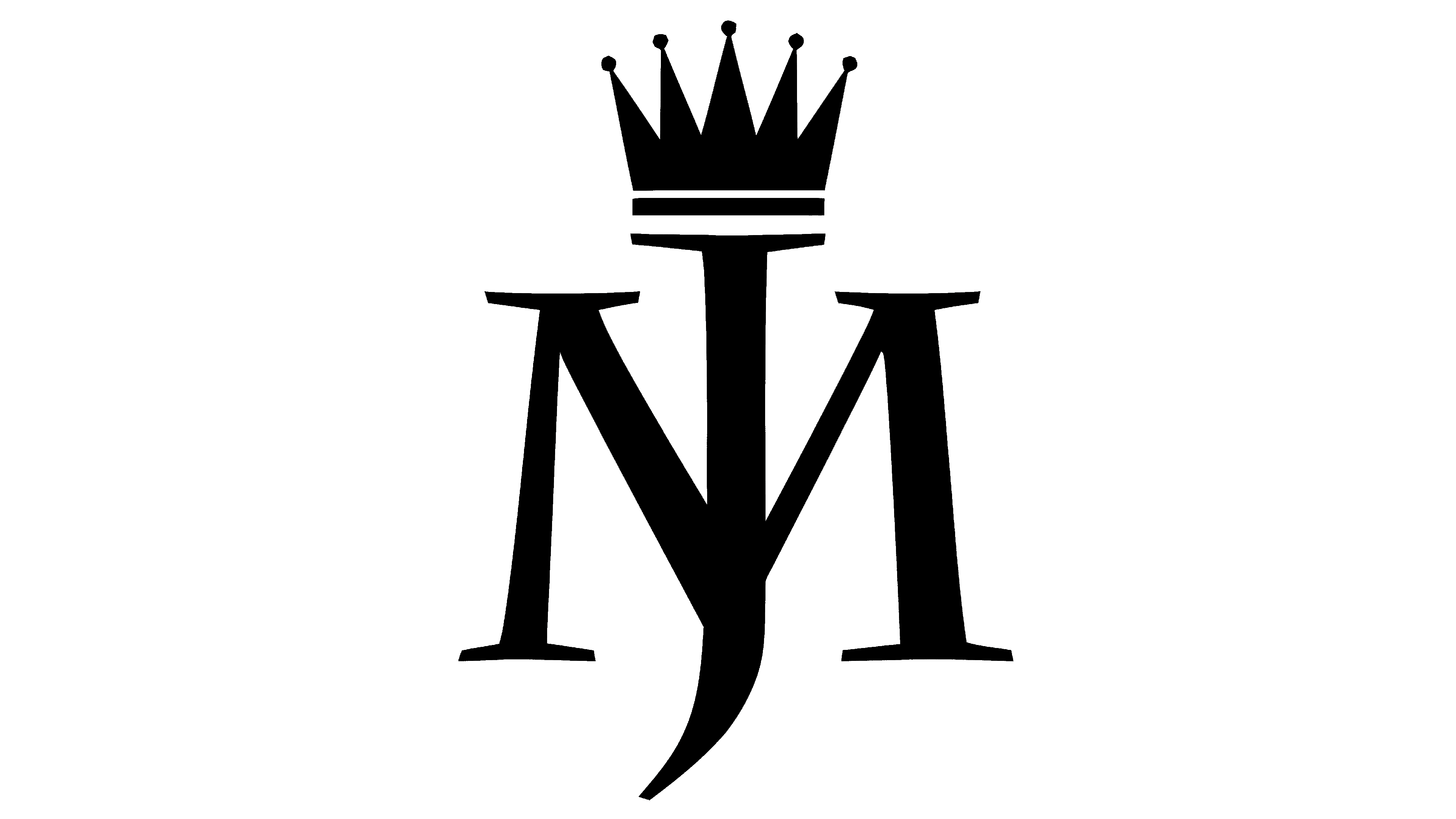
14. Michael Jackson
The Michael Jackson logo features a stylized crown, perfectly representing the legendary artist known as the “King of Pop.”
Positioned above the intertwined “MJ” initials, the crown symbolizes Jackson’s unmatched influence in music and his larger-than-life persona.
15. Clash Royale
The Clash Royale logo features a golden crown within a shield, reflecting the game’s themes of strategy, victory, and medieval conquest.
Unlike its predecessor, which featured a screaming character, this iteration of the logo leans into simplicity and symbolism. The shield, with its bold outlines and rich colors, provides a protective frame for the crown, mirroring the gameplay’s focus on defense and attack.
Stand out in a crowded market—let the AI Logo Designer help you create something extraordinary.
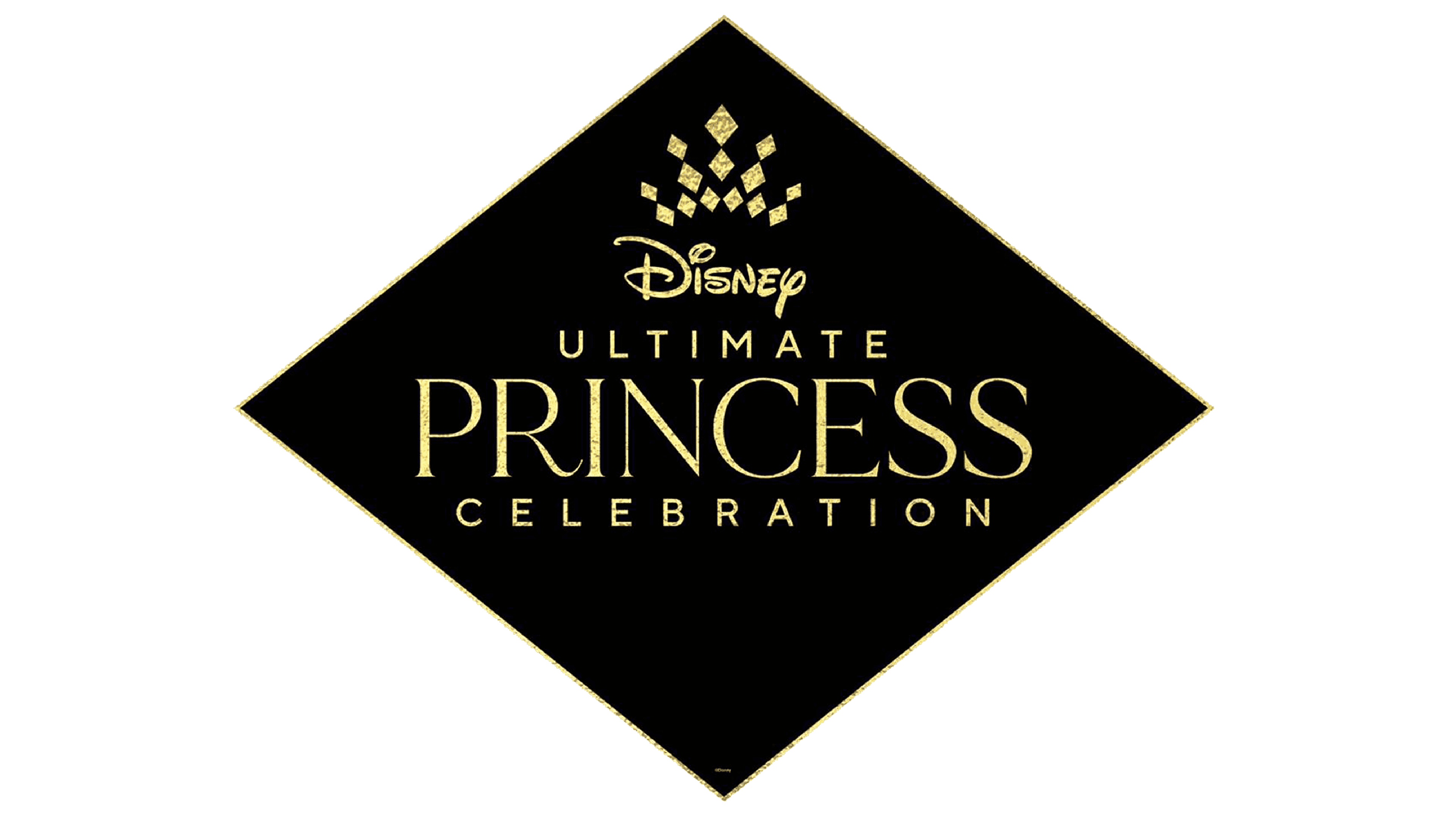
16. Disney Princess
Disney is an iconic corporation symbolizing childhood dreams, including the desire to be a prince or princess, making a crown perfectly fitting for its logo.
The Disney Princess logo embodies royalty with a cluster of diamond-shaped crowns, symbolizing the grace and individuality of each princess.
Arranged above the typography, the crowns form a tiara-like design, perfectly complementing Disney’s magical storytelling.
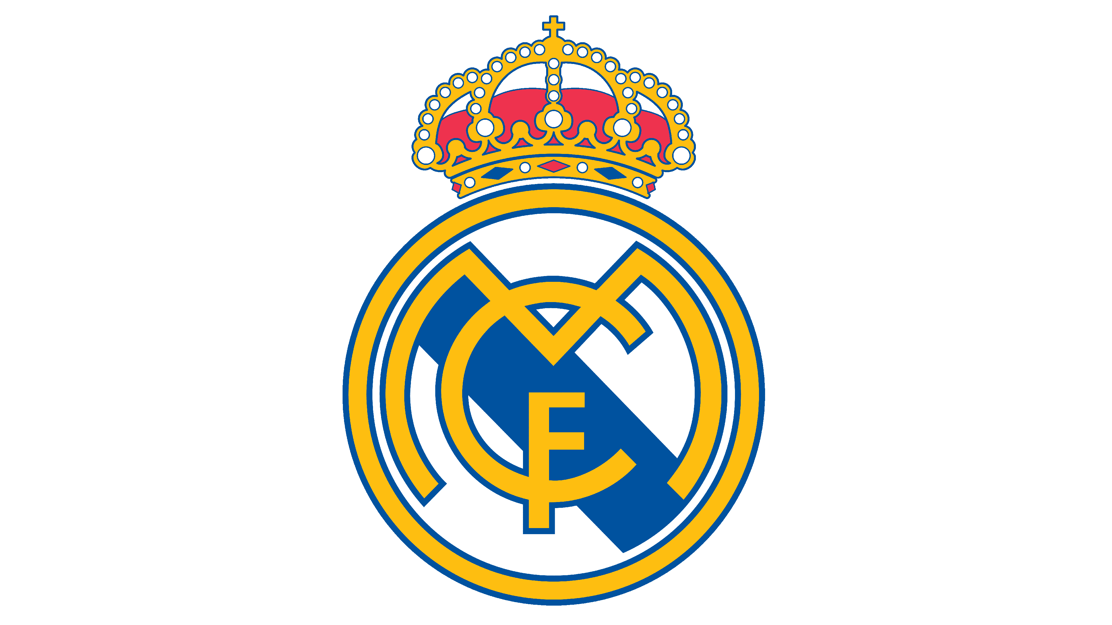
17. Real Madrid
The Real Madrid logo has evolved over time, but the crown granted by King Alfonso XIII in 1920 remains central.
Adorned with arches and jewels, the crown sits atop the circular crest. It complements the bold blue and gold palette, blending regality with modernity.The purple stripe running through the logo adds a nod to Castilla, tying the club’s identity to its Spanish heritage.
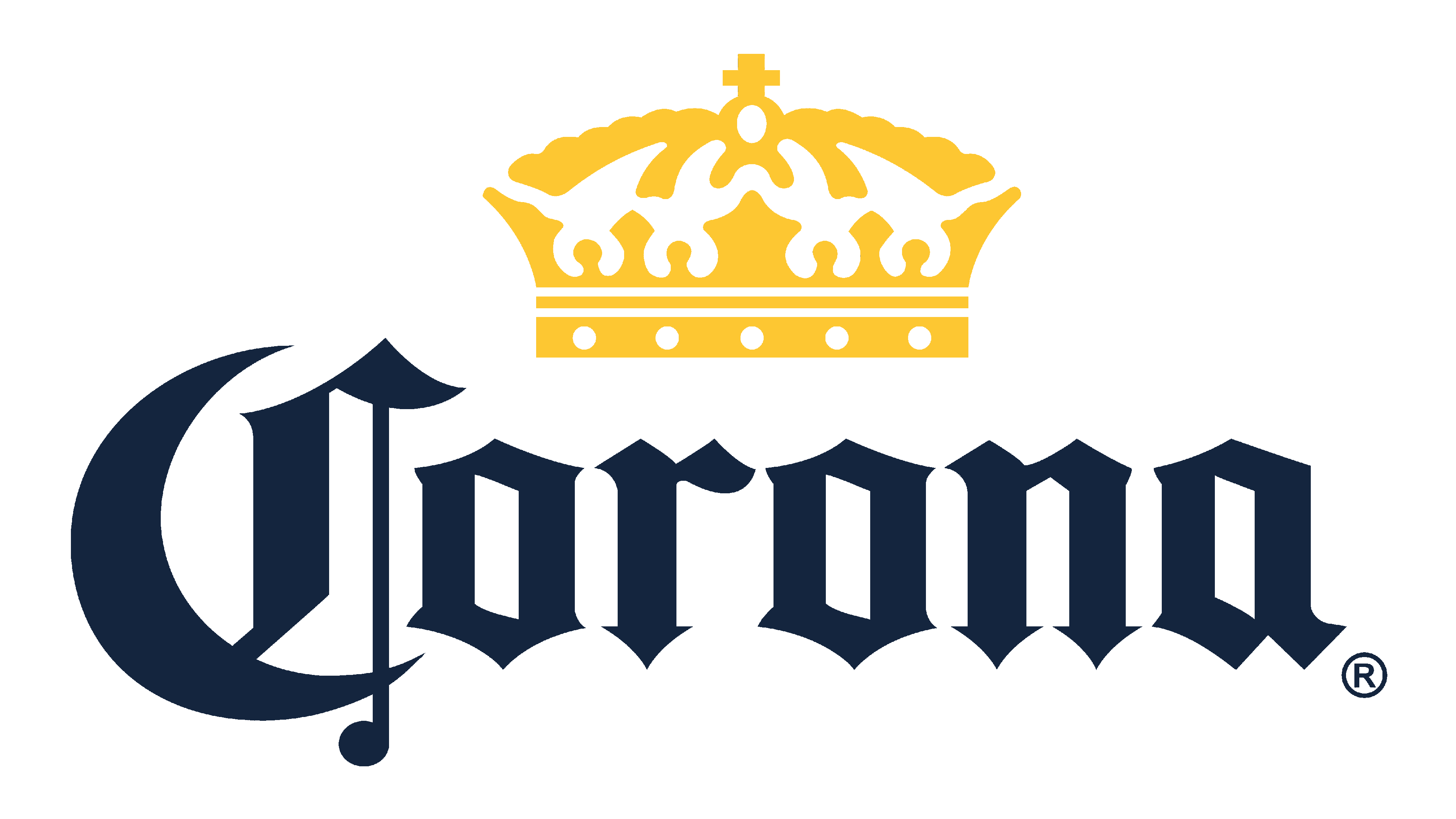
18. Corona
Corona’s logo features a golden crown atop the wordmark, directly reflecting its name, which means “crown” in Spanish.
The design is inspired by the Cathedral of Our Lady of Guadalupe in Puerto Vallarta. This connection adds cultural significance, highlighting the brand’s Mexican heritage.
The addition of griffins, mythical creatures combining the strength of lions and eagles, enhances the logo’s symbolism. The protectors flank the wordmark, symbolizing strength and guardianship. The deep blue and gold color scheme represents trust and tradition.
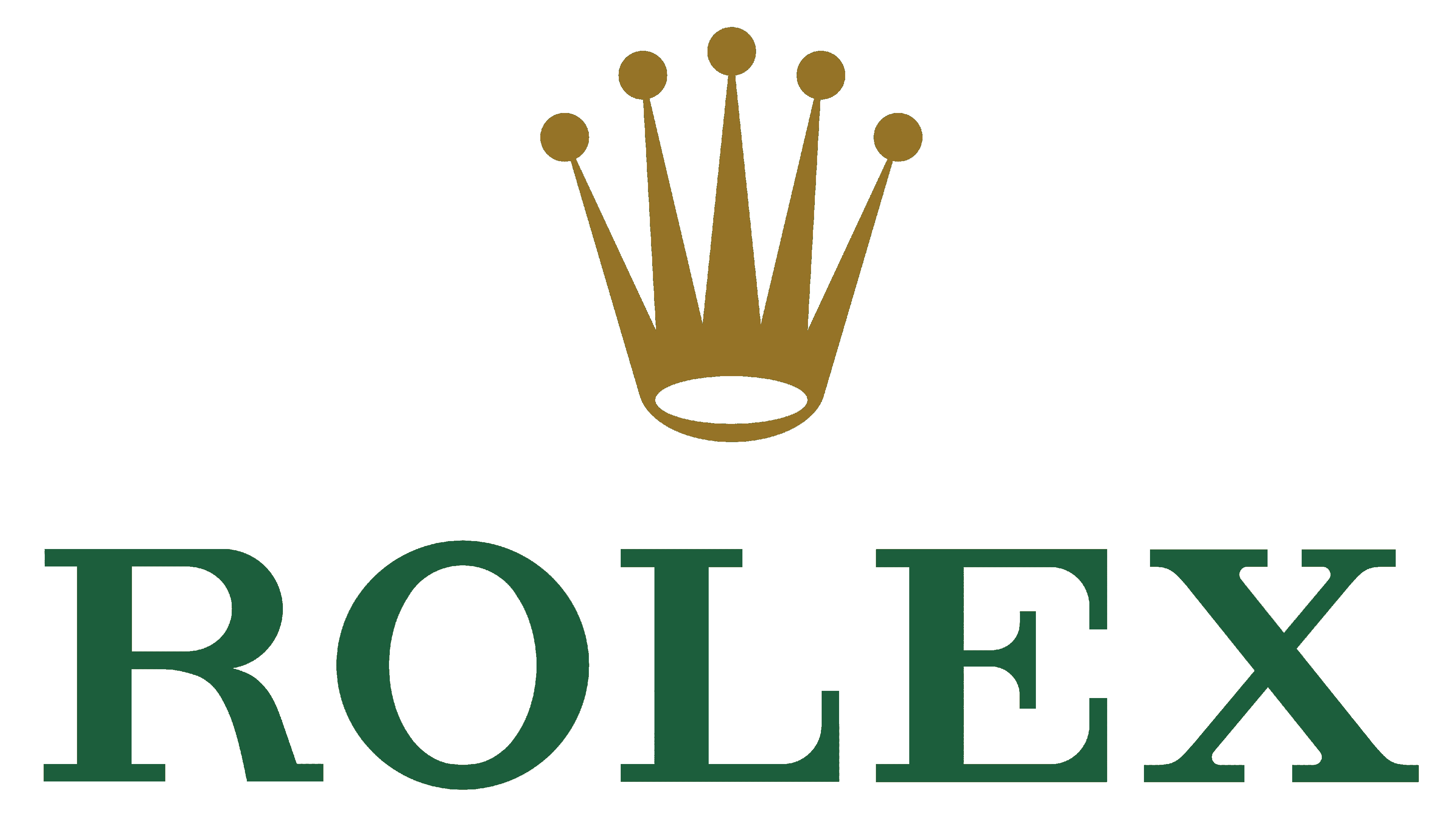
19. Rolex
The Rolex logo, with its iconic five-pointed crown, is a powerful symbol of the brand’s commitment to excellence and luxury. First introduced in 1925, the crown embodies achievement and prestige, perfectly reflecting Rolex’s reputation as a maker of world-class timepieces.
Rolex was founded in 1905 by Wilsdorf and Davis in London, aiming to stand out in the competitive watchmaking industry.
The crown logo was designed to achieve this distinction and is prominently displayed on every Rolex watch dial.
Over time, the Rolex crown has become one of the most iconic and respected symbols in luxury branding worldwide.
20. Moet Chandon Champagne
Few logos capture the essence of celebration as effectively as the Moët & Chandon design. The golden crown atop the logo symbolizes prestige, refinement, and centuries of heritage.
The typography itself, with its balanced proportions and understated elegance, complements the crown’s intricate details. A small star beneath the name adds a touch of distinction. The gold accents, paired with clean black lettering, create a design that feels luxurious yet accessible.
Toyota Crown Logo
The Toyota Crown is a notable brand within the Toyota family. It was launched in 1955 as a sedan-focused division with a unique logo.
Initially made for Japan, Toyota Crown cars later expanded to other Asian countries and Russia. Known for its prestige, the Crown is Toyota’s most awarded model, leading to its evolution as a standalone brand.
The Toyota Crown has a legacy spanning nearly seven decades and 16 generations, making it Toyota’s longest-running nameplate. It was initially introduced as the Toyopet Crown, starting as a family car and surpassing the popularity of the Masterline variants.
Over the years, its versatility has shone through. The Toyota Crown has been versatile, serving as a family car, station wagon, sports coupe, pickup truck, taxi, and police car. It even evolved into a limousine concept, showcasing its adaptability across various roles.
With its legacy spanning seven decades, the Toyota Crown embodies prestige and versatility, making it a symbol of innovation and excellence. Similarly, your brand deserves a logo that reflects its unique story and aspirations.
Design your own crown-inspired logo today using the Arvin AI Logo Designer. It’s simple, fast, and perfect for bringing your vision to life.
Final Words
The crown logo is one of the most iconic branding symbols. It evokes wealth, exclusivity, and quality—traits brands desire. Understanding your audience’s aspirations is crucial when designing a logo. Adding a crown can help capture their imagination effectively.

Create your own crown logo effortlessly with Arvin AI Logo Designer. With just three simple steps, you can design a logo that exudes royalty and sophistication—completely free!

FAQ
Brands with crown logos include Rolex, the luxury watchmaker, and Corona, the popular beer brand.
The Rolex crown is one of the most famous crown symbols, representing achievement and luxury.
Companies with “Crown” in their name include Crown Equipment Corporation (a manufacturer of material-handling equipment) and Crown Holdings (a global leader in packaging). Additionally, the Toyota Crown is a popular car brand.
The Crown Royal logo, featuring a regal crown and purple velvet bag, symbolizes luxury and Canadian heritage. It reflects the brand’s origin as a whisky crafted to honor the visit of King George VI and Queen Elizabeth to Canada in 1939.
The crown logo in Call of Duty: Black Ops 6 (BO6) often symbolizes achievement, prestige ranks, or unique in-game challenges, depending on the game mode or season.
Monogrammed crown logos with “CP” are often associated with luxury or custom design. They may symbolize personalized branding or exclusive products tied to royalty or high status.
The beer featuring a lion with a crown in its logo is Corona Extra. The crowned lion signifies royalty and aligns with the brand’s slogan, “La Cerveza Más Fina” (The Finest Beer).
