Bike logos are not just symbols; they are the identity and spirit of bike brands. They are stories of innovation, adventure, and craftsmanship. This article takes you through the history of bike logos, their symbolism, and what we can learn from some of the most iconic designs in the industry. Whether you are a designer looking for inspiration or a brand looking to create a standout logo, this journey through famous bike logo will ignite your creativity and deepen your appreciation for their impact.
Part 1: The Evolution of Bike Logos
Bike logos reflect changes in the industry of biking itself. From functional roots to today’s high technology, where the design involves art and innovation, there has been much evolution for bike logos. The symbolic representation of change in these logos not only speaks to technological change but also to social change. Learn more about the Logo Evolution as a Marketing Tool.
Early Designs and Functional Simplicity
Logos during early bike logo productions were very simple. They may have basic shapes, words, or simple sketches. Since bikes were highly functional at this time rather than being attractive, the essence of such products also reflected a more practical meaning of life. The bike frames themselves had such a mark and then stamped.
Cultural Impacts and Technological Shifts
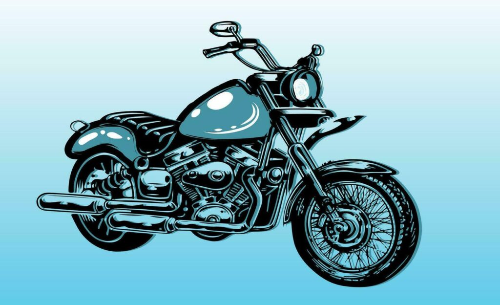
As bicycles gained popularity, cultural and technological changes influenced logo designs. In the mid-20th century, logos began incorporating bold typography and detailed illustrations. The rise of recreational cycling introduced playful and adventurous elements to the designs. Modern trends shape bike logo with advancements in printing and digital technology. If you like the square logos we have compiled a perfect guide for you.
How Modern Trends Shape Bike Logos?
Currently, bike logos are minimalist and flexible. The designers emphasize the creation of logos that are beautiful on everything ranging from bike frames to mobile screens. Popular trends are flat design, geometric shapes, and dynamic elements. Currently, bike logos are minimalist and flexible.
Part 2: What is the best Color Scheme for Logo Design?
If you create an effective design for a bike logo colour is your best friend. It’s an unsubtle narrator who prints into the minds of your consumer the message of your brand. Here are five colours of this bicycle logo design that take your brand to stylish mileage and make it stand out among cyclists in pelotons.
Colorful and Dynamic
Think bright reds, vivid oranges and electric blue. These colors scream energy, passion, dynamism. Suitable for any brand that would want to communicate speed, excitement and perhaps adventure. Downhill thrills and racing, they paint the picture of excitement.
Earthy & Raggid
For brands that imagine off-road bikes, mountain bikes, and outdoor adventures, earth colors like forest green, brown, and peaceful yellow are perfect. These colors reflect the steepness of the trail, connection with nature, and spirit of adventure. Talk to the soul of an adventurer who loves the feel of soil under the wheel and the scent of pine in the air.
Sleek & Modern
Monochromatic and black, white and grey create a sophisticated modernity to the atmosphere. This kind of palette is perfect for an urban bike brand as well as luxury bicycles that value a clean line, sophisticated atmosphere and futuristic senses. This one is so elegant and timeless especially for racing bikes.
Playful and Fun
If your brand values fun, community, and friendliness, then a bright, playful color is suggested. Think of the sun-like yellow, bright pink, and playful purple. These colors are friendly, friendly, and joyful. Perfect for family bike brands, community bike events, or brands that want to make riders smile.
Eco-friendly and Sustainable
For brands that stand for sustainability and eco-friendliness, green isn’t just a color-it’s a statement. Greys of different hues paired with earth tones and penned in blue can say how much the brand cares about the planet and how hard it focuses on eco-friendly endeavors. It’s like saying, “We care about Earth, and our bikes prove it”.
Part 3: Well-known Bike Logos and Their Stories
There is a story of design, vision, and branding excellence behind every iconic bike logo. These logos are not just symbols but, rather, the values, history, and aspirations behind the brands they represent. They ran from freedom to showcasing top-of-the-line technology for famous bike logos that left a mark in cycling history.
Analysis of Iconic Bike Logos
Logos are the face of a brand, and in the case of the bike industry, they carry a rich legacy of storytelling and symbolism. Iconic bike logos aren’t just representatives of their companies; they are all about freedom, innovation, and performance. Each one is carefully crafted to stand out in a competitive market while still resonating with its audience.
Harley-Davidson
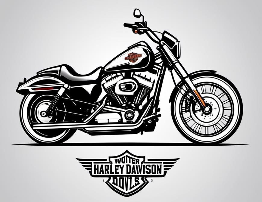
Harle-davidson is perhaps a good example of an incredibly strong brand. Bar and shield design epitomize strength, freedom, and the great American tradition. Through all these years, this firm and elegant typography, with those neat clean lines, has just reiterated that brand identity-the king of motorcycle brands.
Trek
Trek has updated its logo time and again to remain fashionable while not losing its brand identity. The present design represents a simple, minimalistic wordmark that emphasizes innovation and performance. This makes it easily recognizable across all media.
Cannondale
The logo of Cannondale features dynamic typography and bright colors. It shows off the future design along with a clean cut so that it exhibits the brand’s emphasis on the technology that is cutting edge. It speaks of precision as well as high performance in terms of the riders that are professional and casual both.

Giant
Giant‘s logo has smooth flowing lines that give the impression of movement and innovation. The wordmark is simple enough to be versatile, but the emblem accompanying it gives an impression of the brand’s commitment to developing advanced cycling solutions. Giant’s logo appeals to a wide audience, from recreational riders to professional athletes.
Schwinn
The Schwinn logo is so timeless because it has a star-shaped emblem that denotes excellence and heritage. Being one of the oldest bike brands, Schwinn’s logo manages to show a sense of nostalgia as well as a touch of modern updates. This makes it unique because of its link to history and quality.
Lessons From Famous Logos for Aspiring Designers
Aspiring designers can gather some valuable lessons from the following famous logos:
- Simplicity Matters: A simple design is more versatile and memorable.
- Reflect the Brand’s Values: Use elements that align with the brand’s identity and message.
- Stay Consistent: Consistency helps build recognition and trust over time.
- Think Versatility: A great logo should look good on bike frames, apparel, and digital platforms.
- Incorporate Emotion: Create a design that resonates with the target audience on a deeper level.
Part 4: Transform Your Bike Logo Vision into Reality with Arvin AI
Designing a bike logo that summarizes the essence of your brand can be a bit complicated if you are not so skillful in designing. Arvin AI is here to the rescue, providing a more intuitive, AI-powered platform for ease of logo design. The state-of-the-art features, with an easy interface to navigate, help bring ideas to life and create professionalism with uniqueness.
Key Features of Arvin AI
- AI-Powered Design: Receive smart, tailored logo ideas based on your brand’s personality and industry.
- Customizable Options: Modify logo fonts, icons, layouts, and colors to suit your vision and branding requirements.
- High-Resolution Outputs: Download your logo in professional formats such as PNG and SVG to be used with digital or print-based mediums.
- Easy-to-Use Interface: Even for someone with no design experience, it will be easy to navigate the design process.
- Time-Efficient Process: Quickly generate high-quality designs without spending hours brainstorming or learning design software.
- Affordable and Accessible: Create professional logos at a fraction of the cost compared to hiring a designer.
Steps to Use Arvin AI for making Logo
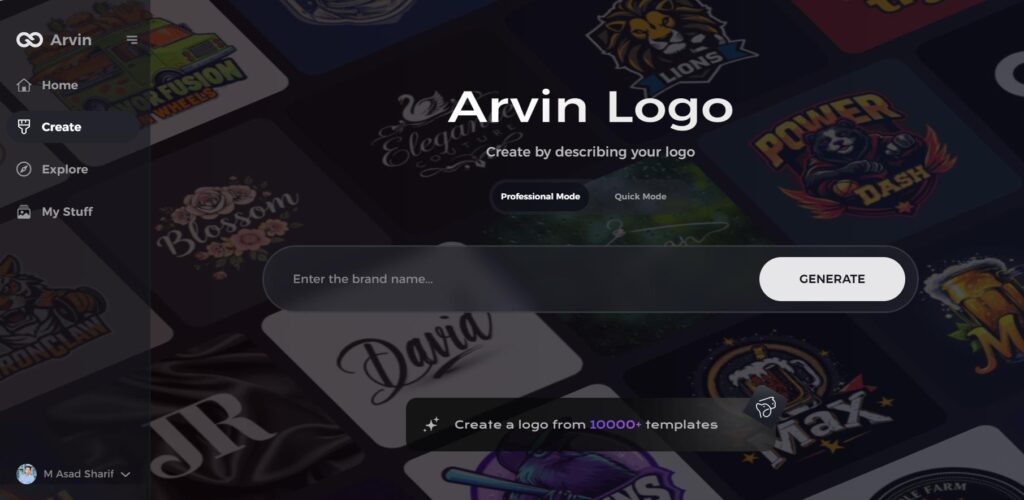
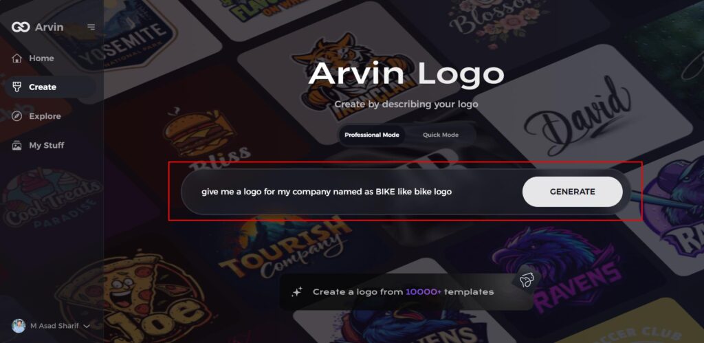
Step 1: Visit the Arvin AI Website
Open your web browser and head to the logo design page on Arvin Logo Maker to begin creating your custom bike logo.
Step 2: Enter Your Business Information
Provide essential business details such as your bike shop’s name and category. This helps the AI tailor logo designs that align with your brand’s identity.
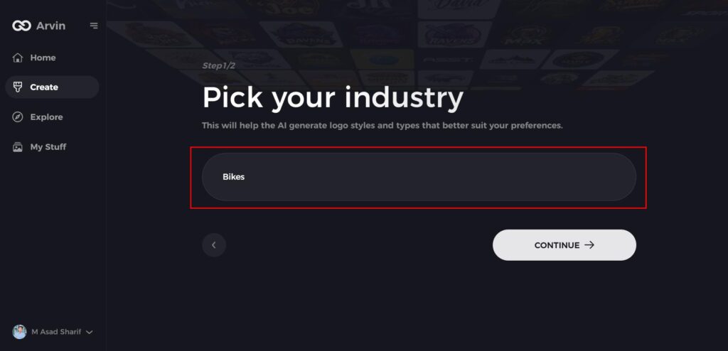
Step 3: Select Your Industry
Choose the “Bike” industry from the options available. This step refines the design process by focusing the AI on bike-related logo styles.
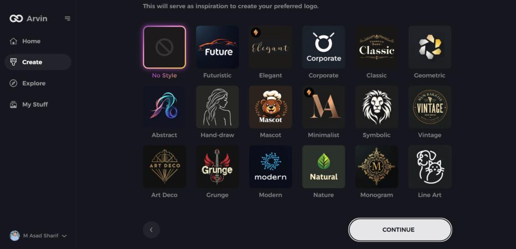
Step 4: Choose Your Design Style
Browse the list of styles and select one that best represents your bike brand’s vision. If unsure, simply skip this step and let the AI select a default style based on your inputs.
Step 5: Explore Logo Ideas
The AI will generate several logo designs based on the information you’ve provided. Review the concepts to find one that fits your brand’s image.
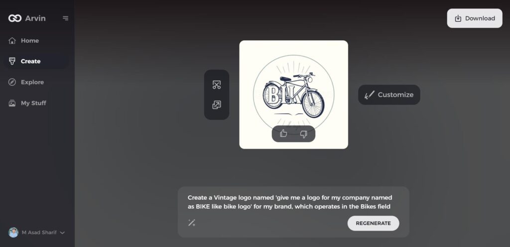
Step 6: Customize Your Logo
Personalize your chosen design by adjusting elements such as color, font, icon, and layout to better reflect your unique brand style.
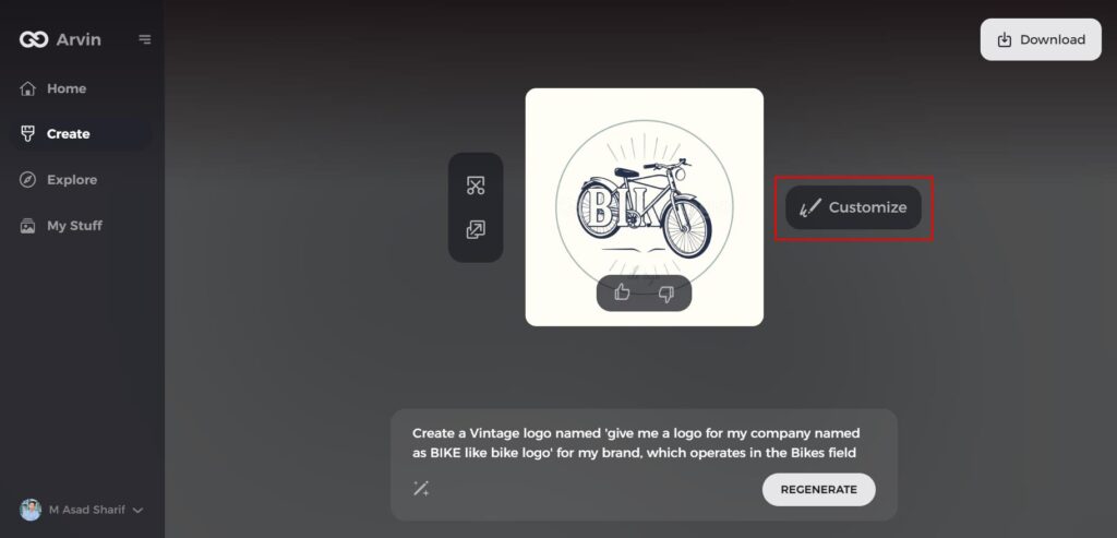
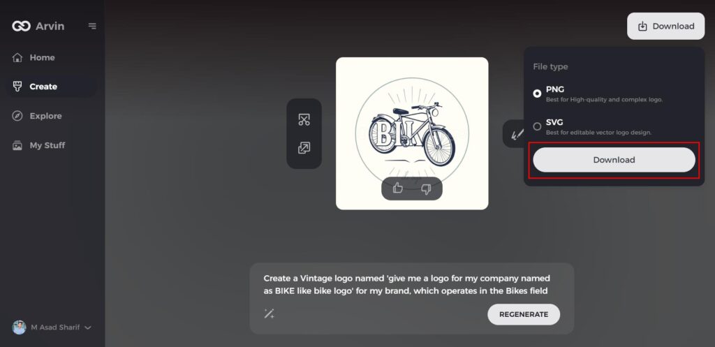
Step 7: Download Your Logo
Once you’re happy with the final result, download your logo in formats like PNG or SVG, ensuring it works seamlessly across digital and print platforms.
Conclusion
Bike logos are visual symbols of a brand encapsulated within the stories and ideas of adventure, innovation, and excellence. Not only have they been carrying on from their historical development to intricate symbolism, the influence that bike logos have to shape perception towards a brand cannot be denied. Creating a unique bike logo is no longer a problem with tools like Arvin AI. With AI-powered suggestions and customization options, Arvin AI provides professional logo design, easy and efficient for anyone.
FAQs
What Makes a Great Bike Logo?
A great bike logo has to be beautiful, meaning it represents the essence of the brand, communicates speed or adventure or quality, and must be simple and versatile at the same time.
Can I Make a Bike Logo Without Design Experience?
Yes, with tools like Arvin AI, anyone can easily create a professional bike logo using customizable templates and friendly interfaces.
What Should I Include in My Bike Logo?
Wheels and chains are common elements, such as bikes or abstract representations of speed and movement combined with themes that are specific to brands.
Why Do I Need Arvin AI for Bike Logo Design?
Arvin AI offers AI-powered insights, easy customization, and high-resolution downloads, making it a great tool for making logos without the need to know how to design them.

