A good brand identity is vital for any business or personal brand, and the logo plays a significant role in this process. Among the various kinds of logos, lettermark logos have been found to be timeless and effective. These designs highlight simplicity and clarity, which is very ideal for businesses that want to make a spot. In this article, we will explore what lettermark logos are, the benefits, and how to design one effectively.
Part 1: What Are Lettermark Logos?
Lettermark logos are popularly referred to as monogram logos. They incorporate the abbreviations or initials of a brand’s name. Unlike pictorial logos, which make use of images, or abstract logos that utilize a unique shape, lettermark logos focus on typography for communicating a brand’s identity. Here we also compiled a guide for about Minimalist Logo: Design Simplicity for Impactful Branding. They are clean, direct, and work well.
How Lettermark Logos Are Different from Other Logo Types?
While pictorial logos such as those of Apple or Twitter, use recognizable symbols and abstract logos such as Nike’s swoosh utilize artistic elements, a lettermark logo strictly adheres to letters. This is what will give them an easy representation of the brand’s existence, free from visual distortion. They are best utilized in brands with long or complex names.
Examples of Iconic Lettermarks
A lettermark logo, known as a monogram, reduces a brand’s identity down to one or two strong letters. While it focuses on typography, such designs highlight simplicity, professionalism, and memorability. Lettermarks logos are some of the most recognizable logos worldwide.
IBM
IBM’s logo uses bold, geometric letters that evoke innovation and technology. Dynamism and movement are imparted through the use of horizontal stripes in the lettering to the company because it has the reputation to be one of the best and most efficient companies in terms of computing and technology.

NASA
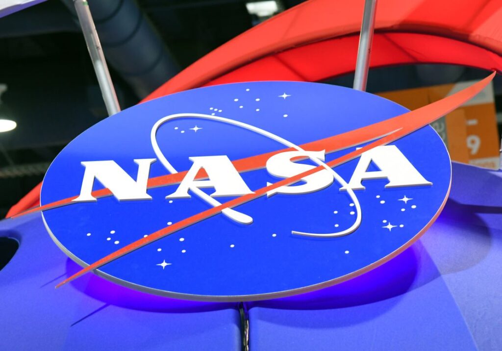
NASA‘s logo is quite minimalist and futuristic, relating directly to space exploration. This makes it simple enough that the logo can be interpreted as clear and versatile across various media, making it an iconic representation of human innovation and curiosity.
HBO
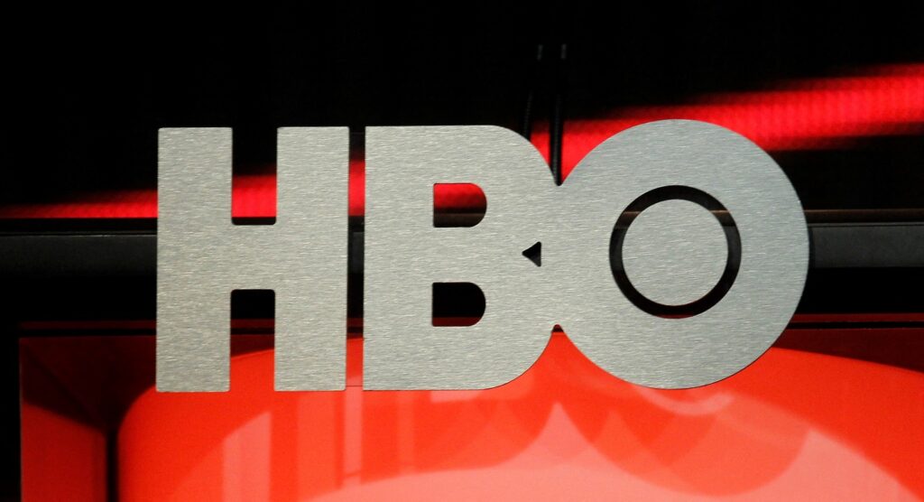
HBO‘s logo is simple and impactful, with the essence of a leading entertainment brand. The strong, black typography speaks for confidence and authority in the world of premium television, while the circular “O” element subtly adds distinction.
CNN
Another great example is CNN’s logo, which has used red letters with bold continuous lines. This design gives a feeling of urgency and authority to a global news network. The unbroken style of letters represents that the brand is devoted to providing continuous, reliable news coverage.
FedEx
FedEx is another masterly lettermark design with an incorporated hidden arrow in the negative space between “E” and “X,” which depicts speed and accuracy. This smart use of typographic language not only expresses the core of the brand but also lets the type speak much.
Why Lettermark Logos Work for Brands?
Lettermark logos are great for their uniqueness. They are memorable and recognizable. They rely on the name of the brand, so that people associate the logo with the business. Simplicity makes them suitable for different media, such as business cards and digital platforms.
Part 2: Advantages of Lettermark Logos
Lettermark logos, clean and simple with their use of initials or acronyms, are the strongest brand tools. Such logos help summarize the identity of a company into an easy-to-remember, compact visual; hence they work very well for businesses whose names are long or too complicated to be easily remembered. Here is the guide Luxury Brand Logos: Key Trends and Best Practices for 2024.
Simplicity and Versatility
One of the most significant advantages of lettermark logos is their simplicity. A clean and straightforward design ensures that your logo is easy to recognize at a glance. Whether it’s displayed on a billboard or a smartphone screen, a lettermark logo retains its impact.
Brand Recognition
Lettermark logos are memorable because they draw much attention to the brand’s initials or name. For instance, even if you do not know what “NASA” stands for, the logo is one thing that’s hard to forget. This way, focusing on typography makes these logos an essential part of how people identify and recall your brand.
Professional Appeal
Lettermark logos are considered professional, so most agencies, businesses, and personal brands appreciate them. It conveys the sense of authority and sophistication, thus giving confidence to their clients and customers. Potential for customization.
Typography
Typography offers infinite creative possibilities. Correct font, spacing, and color can create a unique lettermark logo for the brand. Lettermark logos can be designed to look minimalist or even dynamic and bold; choose as per your preference.
Part 3: Designing an Effective Lettermark Logo
Creating a powerful lettermark logo requires a balance of simplicity, creativity, and brand identity. Lettermark logos, composed of initials or typography, are uniquely suited for businesses aiming for a clean, memorable design. In this section, we’ll explore the key principles and steps for crafting a lettermark logo that stands out.
Choosing the Right Font and Typography
A lettermark logo has to be planned and designed with care. Here are some of the key things to consider so that your logo would look great and be effective. The choice of the font is what can make or break your logo.
Serif fonts
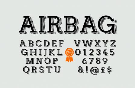
Serif fonts are those that make a sense of elegance, tradition, and timelessness. It features small decorative strokes at the ends of the letters giving it a refined look which will suit luxury brands and high-end retailers.
Sans-serif fonts
Sans-serif fonts have clean, simple lines, giving it a modern and minimalist look. Their simple look reflects clarity and professionalism, which makes it ideal for tech companies.
Script fonts
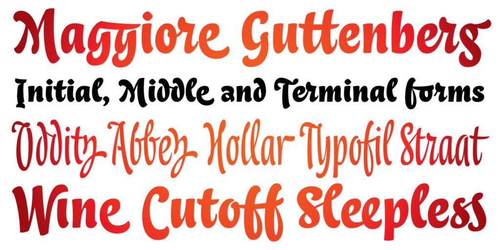
Script fonts are very creative, charming, and personal. With this, the script fonts, especially those handwritten, can go from elegant calligraphy to playful strokes, allowing more flexibility in expressing a brand’s personality.
Part 4: Lettermark Logo Trend in 2025
The world of logo design is constantly evolving, and 2025 is not an exception. Minimalist designs are becoming more and more popular, focusing on clean lines and uncluttered layouts that keep the focus strictly on the brand’s initials. These designs work well with modern crowds who appreciate simplicity and sophistication.
- Gradient-filled lettermarks: They are another growing trend. Creating a visually appealing effect that stands out on both digital and print platforms.
- Retro-inspired lettermarks: Retro-inspired lettermarks are coming back through innovation. Such designs tend to use vintage typography.
- Animated lettermark: logos are now the latest trends in this period. Brands are using movement to animate their logos in order to boost engagement on.
Part 5: Create Perfect Lettermark Logos with Arvin AI
With the advancement of AI technology, creating a lettermark logo has never been simpler. Arvin AI is the innovative platform that helps with the design of logos, offering various tools and features for designers regardless of their experience. Equipped with a natural interface and high-level technology, Arvin AI ensures your logo reflects the ideal identity of your brand.
Key Features of Arvin AI
- AI-Driven Assistance: Provides real-time suggestions to enhance symmetry and balance in logo designs.
- Industry-Specific Insights: Tailors design elements according to your industry and target audience.
- Live Adjustments: Offers instant modifications with a preview, ensuring your design looks professional and polished.
- Template Library: Includes a vast collection of customizable templates to match your brand’s uniqueness.
- Tools for Precision Alignment: Ensures every element is positioned correctly, avoiding imbalances in the design.
- Color Palette Optimization: Suggests harmonious color schemes to enhance the logo’s visual appeal.
Steps to Use Arvin AI for making Logo
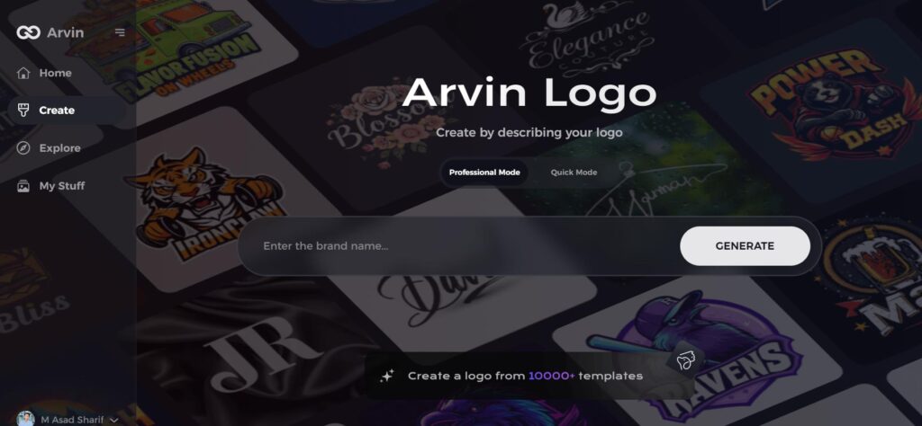
Step 1: Visit Arvin AI’s Logo Design Page
Open your web browser and go to the logo creation page at Arvin Logo Maker to begin designing your lettermark logo.
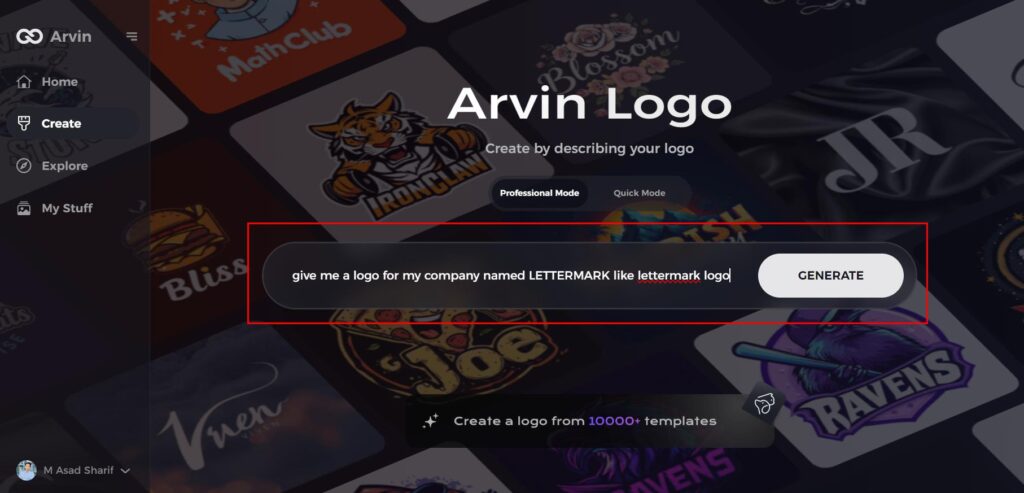
Step 2: Enter Your Business Information
Provide key details about your business, such as its name and category. This helps Arvin AI generate logo designs tailored to your brand.
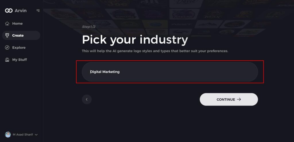
Step 3: Choose Your Industry
Select your industry from the provided list. This step allows the AI to refine logo styles that align with your specific business sector.
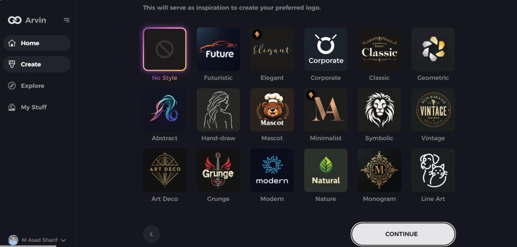
Step 4: Select Your Preferred Style
Browse through available design styles and pick one that resonates with your brand vision. If you’re unsure, you can skip this step and let the AI use its default inspiration.
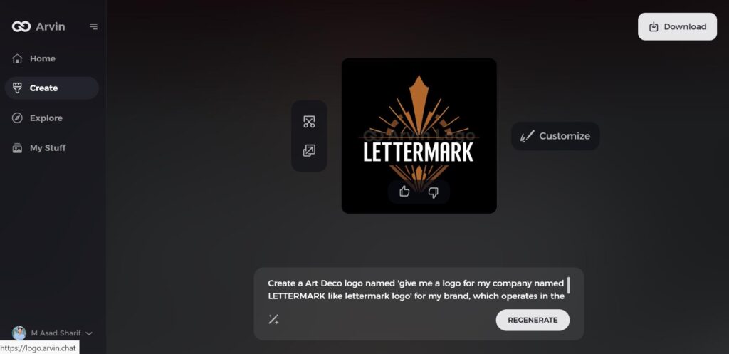
Step 5: Explore Logo Concepts
Arvin AI will generate multiple lettermark logo ideas based on your inputs. Review the designs to find the one that best represents your brand’s identity.
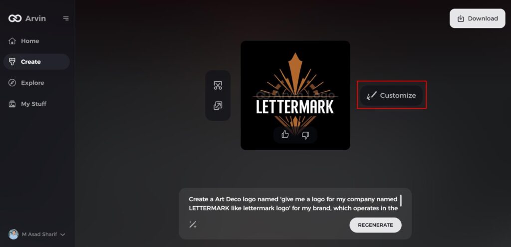
Step 6: Customize Your Logo
Fine-tune your selected logo by adjusting colors, fonts, icons, and layouts to align with your brand’s aesthetic.
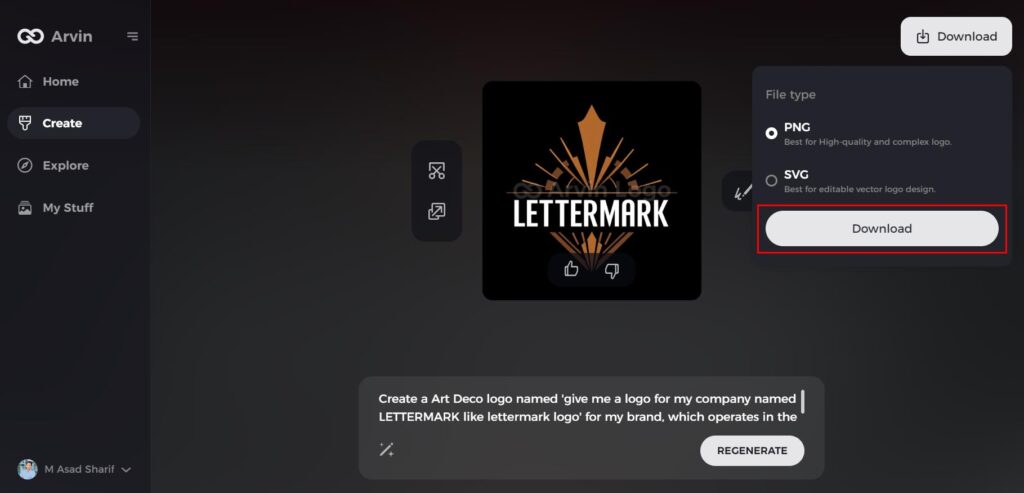
Step 7: Download Your Final Logo
Once you’re satisfied with the design, download your logo in formats like PNG or SVG. These are ideal for use across websites, social media, and print materials.
Conclusion
Lettermark logos are simply time-tested when it comes to making a strong brand identity. Because of their simplicity and flexibility, lettermark logos are very useful both for businesses and individual personal brands. With simple use of typography and creativity with design, you may find a lettermark logo to stand out and capture. With Arvin AI, create an awesome, professional lettermark logo easily. It is a great tool to develop your vision and raise recognition of your brand.
FAQs
What makes a lettermark logo effective?
An effective lettermark logo is when it is simple, memorable, and visually appealing, able to clearly represent the brand, and versatile across multiple platforms.
Are lettermark logos suitable for any type of business?
Yes, lettermark logos are versatile and could work for almost any business, particularly those with long names or having a strong focus on professionalism.
How do I make a lettermark logo without having any designing experience?
You can actually create a custom lettermark logo using tools like Arvin AI. The software provides you with AI-powered suggestions and the ease of customization.
What is the best color combination for a lettermark logo?
The best color scheme varies from brand to brand identity. Monochromatic schemes are highly elegant, while very vibrant colors express energy and innovation.
