Abstract logos have lately been highly popular with businesses who seek to communicate meaning and emotion in a more creative manner. Abstract logos are the very representation of more profound meaning and cannot depend on any sort of direct representation through symbolical elements to connect so much with an audience. We’ll guide you into the realm of abstract logos and why they are crucial in today’s branding and how you can make your brand a standout. We’ll cover all the different types of abstract logos, some design tips, and the advantages they can give to a business.
Part 1: What is an Abstract Logo?
An abstract logo represents a brand with the use of shapes, colors, and patterns. It does not depend on the representation of literal imagery or text. These logos are intentionally ambiguous; rather, they attract the viewer in terms of emotions and intellect.
Difference from Traditional Logos
Traditional logos often depict recognizable elements, such as objects, animals, or letters, that explicitly identify a brand. For example, McDonald’s “Golden Arches” directly represent the “M” in the brand’s name, while Apple’s logo is a literal image of an apple.
In contrast, abstract logos like the Nike swoosh or Pepsi’s circular symbol don’t directly reference the brand’s name or products. This can evoke movement or emotion or simply energy but allows abstract logos to be very adaptable and far from the merchandise sold. For that reason, these can transcend across the directions the company might need over time.
Creative Freedom and Deeper Meaning
Abstract logotypes totally liberate creative freedom. The designer is not held down by a literal representation or a direct idea, but is free to go bold with ideas and innovative forms. Such freedom allows for the logo to portray the nature of a brand in a very fresh, original way.
Abstract designs carry layers of meaning. Take, for example, the swoosh of Nike-which immediately communicates speed and movement-and the five interconnected Olympic rings, which symbolize unity and cooperation between nations. An abstract logo gives audiences an emotional resonance that remains long after the logos have faded by using symbolism over literal imagery.
Part 2: Why Choose an Abstract Logo for Your Brand?
An abstract logo is unique, versatile, and timeless, thus strategically used by brands that wish to stand out and connect emotionally.
Uniqueness in Design
Abstract logos set your brand apart by emphasizing originality. Unlike the generic designs, these logos are customized to reflect your brand’s personality.
Versatility across Platforms
Abstract logos are highly flexible. They work very well for any application: from business cards and websites to huge billboards. As their simple conceptual nature lets them work with any size in digital and print mediums.
Emotional Connection
The abstract aspect allows an emotional connection with the audience. Through strategic shapes, colors, and compositions, one can convey feelings such as trust, excitement, or sophistication.
Timeless Appeal
Unlike the latest fads, abstract logos are never going out of style. Being abstract, they represent concepts and remain fresh and exciting over time. They give your branding efforts a long-term value.
Part 3: Key Features of an Effective Abstract Logo
Effective abstract logos combine strong symbolism, color psychology, and harmonious typography to create designs that resonate with audiences and reinforce brand identity.
Strong Visual Symbolism
Strong visual symbolism is at the heart of every good abstract logo. In this, such icons hold complex ideas in one image. In this manner, they are instantly recognizable and memorizable.
For example, the Nike swoosh is an abstract representation of speed, agility, and athleticism-all traits that embody the personality of the brand. Similarly, the Adidas logo features three diagonal stripes that convey the idea of movement and endurance, thus resonating with its intended audience of athletes and fitness enthusiasts.
Color Psychology in Abstract Logos
Colors will be a tremendous tool in designing abstract logos for your brand, creating an impression within the minds of the viewers. Since each color speaks for a different implication and emotion it can be utilized strategically and applied towards developing a brand personality:
- Red: Conveys energy and passion and implies urgency. Most suitable for businesses that want to show excitement or aggressiveness.
- Blue: Represents trust, security, and professionalism. Most suitable for financial establishments and technology houses.
- Yellow: Symbolizes creativity, optimism, and warmth. Ideal for brands that need to look friendly and approachable.
- Green: Symbolizes nature, health, and sustainability. Suitable for eco-friendly or wellness-oriented brands.
Through color psychology, brands can create logos that evoke an emotional response from their target audience.
Typography and Layout Harmony
In typography, other examples of abstraction also apply -such as shape and symbol abstraction; all three go together by including use in font size as well as setting for neat appearance.
For instance, simple sans-serif fonts go well with clean geometric logos, while more elegant serif fonts are suitable with illustrative designs. Concerning balance amongst the constituents of the logo, harmony makes sure to accentuate the overall presence and readability of the logo.
Part 4: Different Types of Abstract Logos
Abstract logos take several forms, all of which have different visual and conceptual benefits. Abstract design, for instance, allows for the flexibility of creating logos that are not only aesthetically pleasing but also deep in meaning and varied. Below, we are going to try to find out the most prominent types of abstract logos and qualities that make them effective.
Geometric Abstract Logos
Geometric abstract logos use simple but dynamic shapes, such as circles, triangles, and squares. These forms are universally identified with stability and order and can give a feel of precision. For example, for instance, the three parallel stripes aligned in a triangle shape in Adidas symbolize movement and progression in life. Likewise, for Mitsubishi, this logo uses a set of diamonds connected to another to signify a sense of reliability and strength in connectedness.
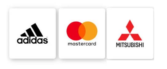
Geometric logos are very flexible because of their clean lines and structured appearance. They can be used at any scale and for different applications without losing their punch. Geometric logos are being used by companies in technology, finance, and manufacturing to give a feel of professionalism and trustworthiness.
Line Art Abstract Logos
A line art logo has minimalistic lines that create elegant and modern designs. This type of logo carries the simplicity of style but with an air of sophistication. The design usually looks light and uncluttered, and that makes it perfect for companies that want their brand to convey clarity and creativity.
For example, use line art to draw the abstract elephant face for a brand like Drunk Elephant: that the brand represents strength and memory, yet all is easy and friendly. The same way, one can make use of the clean linear form of the MK logo for the luxury fashion brand Michael Kors. Line art abstract logos are more popular in fashion, cosmetics, and lifestyle industries where elegance and simplicity serve to be an eye grabber in comparison with the target audience.
Symmetrical Abstract Logos
It has been used in design to illustrate balance, harmony, and stability. Such abstract symmetrical logos are very aesthetically appealing because the human eye is naturally drawn to composed and balanced forms of composition. These are applicable for those brands which want to indicate reliability and trust.
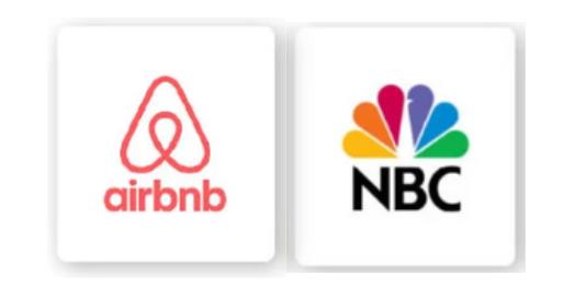
The “Bélo,” a heart combining the location pin representing place and “A” for Airbnb, is an excellent representation of symmetrical design as it is formed into a well-balanced, harmonious shape with a heart to symbolize love, a pin to represent location, and “A” as the first letter of Airbnb. The peacock with colorful feathers to symbolize diversity and vibrancy is the NBC example of a symmetrical logos.
Dynamic Abstract Logos
Dynamic abstract logos represent movement, energy, and flexibility. They are for the brands who will project images of innovation, creativity, and a forward-looking approach. In many cases, the logos take up flowing shapes, gradients, and evolving forms, which contribute to the effects of movement and change.
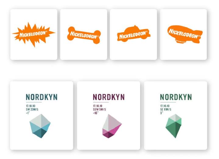
Nickelodeon’s splat-shaped logo is a dynamic abstract logo par excellence. These designs play to the fun, creative brand identity. Similarly, the Nordkyn logo inspires Arctic wind patterns with dynamic lines and gradients signifying constantly changing forces of nature.
Logos with Deeper Meaning
Abstract logos with deeper meanings include hidden elements or symbolism within the design. Such logos make people look closer and therefore increase curiosity and engagement while telling the story or values of the brand.
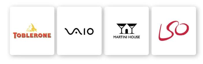
For example, Toblerone uses a mountain to symbolize its Swiss heritage and places a bear in the white space to represent the city of Bern. The Martini House logo presents a house merged with a glass of martini in an incredible way that relates to the substance of the kind of hospitality offered by the beverage brand. This type of logotype is only ideal for businesses that have narrations and have a desire for creating long-standing impressions.
Illustrative Abstract Logos
This combination of artistic creativity and abstract design creates an illustrative abstract logo. Sometimes, such logos tend to be very similar to small pieces of art, having fine features and innovative ideas. These are best for those brands that wish to convey a message of craftsmanship, uniqueness, and artistry.
For example, the logo of Starbucks is one such style. The siren is an intricate design inspired by Greek mythology, symbolic of allure and connection. Analogously, Night Jewelry’s logo features abstract illustrative elements to focus more on the sophistication and elegance that its jewelry line embodies. These abstract logos are more powerful in view but, assuming successful execution, they can also make perfect sense and reproduce.
Combination Abstract Logos
Combination abstract logos are when abstract and text elements or other design characteristics get used to form a logical yet flexible visual identity. It is mostly effective at conveying both the symbolic essence and the name of a brand, making it very identifiable.
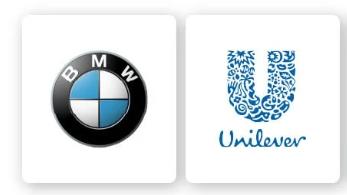
Logo of BMW is an abstract geometric combination of shapes and colors that are reminiscent of a spinning propeller. This logo symbolizes the origin of the brand as an aviation enterprise. In contrast, the logo for Unilever consists of several abstract icons in the shape of a letter “U” to represent the diversity found in the company’s products. Combining logos are the best of both worlds: creativity in an abstract design and clarity of a textual brand.
Part 5: Abstract Logo Design Tips
Choosing the Right Icon
The icon should match your abstract logo. Thus, choose an icon that symbolizes your business values and mission. Learn about your target market so that the design goes well with their preference and expectation.
Making Use of Negative Space
Negative space is the empty areas within or around the design. Creative application of it brings out depth and intrigue in your logo. For example, the FedEx logo has a secret arrow in it, which symbolizes swiftness and accuracy.
Experimenting with Variations
Abstract logos are flexible and appliance-friendly. Play around with colors, layouts, and typography to make sure your design flows well both on screens and merchandise.
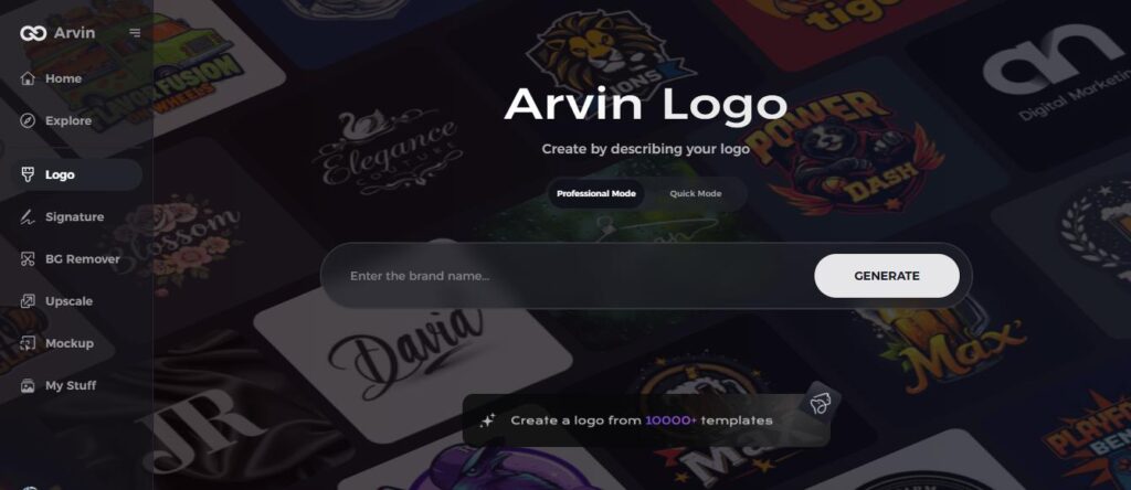
Part 6: How Arvin AI Helps in Designing Your Best Abstract Logo
Arvin AI is a next-generation platform, which makes logo designing very simple, efficient, and creative. Whether it’s a startup or an old business, AI logo maker helps you to generate fantastic abstract logos without much fuss.
Key Features
- AI Suggested Designs: Design ideas pertaining to the identity and goals of your brand.
- Customized Templates: Available templates that could be customized for use.
- Ease of Use Interface: Design quality logos without a single experience.
- Scalable Outputs: Your logo will look great on everything from websites to billboards.
Steps to Create an Abstract Logo with Arvin AI
Step 1: Sign Up and Log In to Arvin AI
Visit the Arvin AI website, create an account, and log in to access the logo design feature.
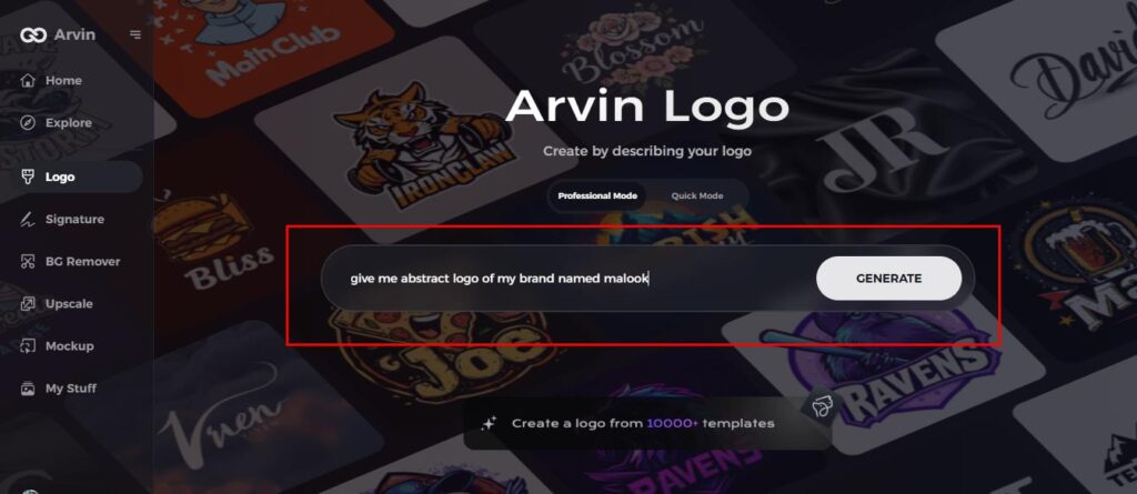
Step 2: Enter Your Brand Details and Preferences
Provide essential details about your brand, such as your brand name, slogan, and industry. Add your design preferences, including font styles, color schemes, or theme ideas.
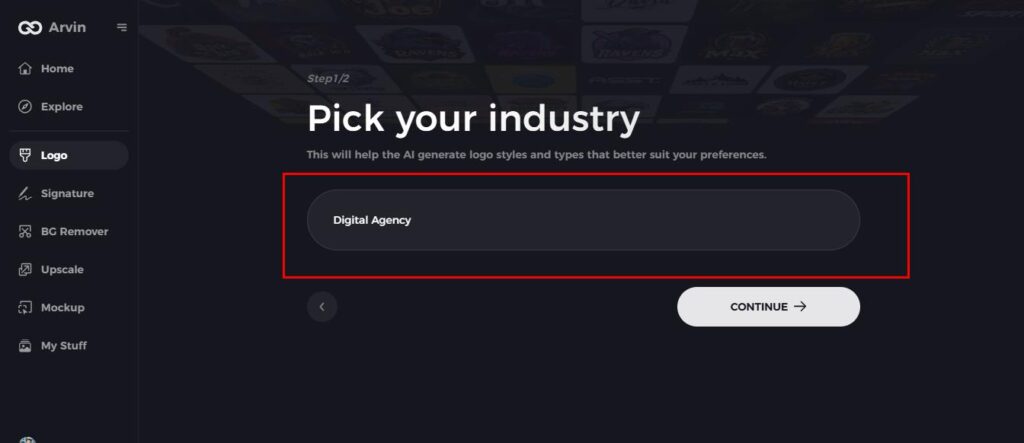
Step 3: Choose Your Industry
Select the industry that aligns with your brand niche. This step helps the AI generate logo concepts tailored to your specific sector.
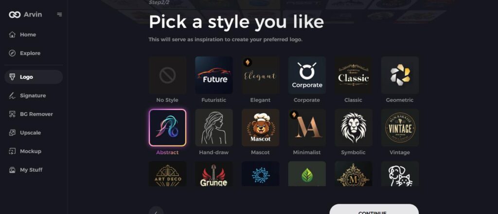
Step 4: Pick a Design Style
Choose a design style that resonates with your brand vision. This selection will inspire the AI to craft a logo in your preferred aesthetic.
Step 5: Personalize Your Logo Using Arvin AI Tools
Once the AI generates logo suggestions, use the customization tools to tweak elements like font styles, layout, colors, and symbol placement. Refine the design until it perfectly reflects your brand identity.
Step 6: Save and Download Your Logo
Preview the final design, ensure it meets your expectations, and save the logo in high-resolution formats suitable for both digital and print use.
Part 7: The Benefits of Choosing an Abstract Logo
Abstract logos have several benefits that make them a smart choice for branding:
- Uniqueness: Be different with a design that is unique to you.
- Scalability: Work well in a variety of sizes and mediums without losing clarity.
- Versatility: Good for all industries and platforms.
- Emotional Appeal: Connect deeply with your audience through thoughtful design.
Conclusion
Abstract logos are more than just a design option; they symbolize a chance to redefine the essence of your brand visually appealingly. The versatility, emotional appeal, and timeless appeal make it an excellent investment for businesses in all over the world. Try Arvin AI today and see your brand come alive. Whether startup or well-established business, Arvin AI simplifies logo design while maximizing creative impact.
FAQs About Abstract Logos
What makes an abstract logo different from a traditional logo?
Abstract logos rely on ideas and emotions with new shapes and symbols; on the other hand, a traditional logo relates to literal representation.
Can small businesses benefit from abstract logos?
Of course! Abstract logos can make small businesses stand out in the crowd, give them a unique identity, and make them connect to your audience on an emotional level.
How do I choose the right colors for my abstract logo?
Imagine your brand’s values and target. Use the concept of color psychology to choose the shades that create the right feeling.
Why should I use Arvin AI for designing my abstract logo?
Arvin AI provides users with intuitive tools, AI-powered suggestions, and customized templates for creating wonderful, professional logos without any hassle.
