Travel Logos is an essential part of attracting customers, establishing trust, and providing differentiation from competitors. A travel logo communicates adventure and reliability, whether it’s for a travel agency, airline or tour operator. This helps to convey the idea of travel and relates the brand to potential clients. In this guide, we will cover its significance, key design elements, popular styles and excellent traits of a good travel logo.
Part 1: The Importance of a Travel Logo in Branding
A travel logo is not merely an aesthetic piece, but a brand’s identity. It establishes a link with potential customers and is used to sway their decision-making process. Travel logos help to build familiarity and trust, making it easier for businesses to gain a credibility foothold with the public. For digital and print marketing, logos keep products in people’s minds to buy. The Airbnb travel logo, for example, is a widely recognized, iconic symbol that has become synonymous with the idea of travel.
Part 2: Key Elements of an Effective Travel Logo
The three most important aspects of a successful travel logo are its visual appeal, meaning, and adaptability. From colors to typography, symbols, and more, there are many crucial factors that make for a perfect design. Travel or hospitality logos must strike a balance between recognizability while giving visitors the impression.
Color Psychology in Travel Logos
Colors influence people psychologically. Blue is commonly used in the travel industry to convey trust, calmness, and reliability—all characteristics desirable for airlines and travel agencies. Green has a meaning of nature, sustainability, and adventure- which is perfect for eco-tourism brands. Red, stimulating and dynamic, is often used for adventure travel businesses. Selecting the right color palette allows brands to resonate with their ideal customers and elicit valuable feelings.
Typography and Fonts
When it comes to travel logo design, typography is extremely important. Serif fonts have a feeling of tradition and reliability and, therefore, luxury travel brands tend to use serif typefaces. On the contrary, the sans-serif fonts preserve a more contemporary and welcoming look, which is well suited for travel blogs and booking engines. Playful or script fonts create a sense of adventure and are a good option for tour operators and unique travel experiences. Choosing the right typography enhances a brand’s identity and influences how customers perceive the brand.
Symbols and Icons
Travel logos that include icons inform instantly about the brand’s purpose. Airplanes, globes, mountains, and compasses, are common travel-related symbols. These features immediately evoke travel, exploration, and adventure. Simple icons offers a clean and contemporary look, while complex symbols enhance the richness of a brand’s palette. An appropriate use of iconography can make all the difference in how well a travel logo communicates its message and resonates with the travelers.
Simplicity and Versatility
This can be smart, but also versatile — effective travel logos should be very plain but also universal at the same time. When design is cluttered, it feels overwhelming and has less power. Most logos are minimalist as it has clear lines and symbolic that can be easily recognized on different platforms. This helps make sure a travel logo is effective on websites, social media, merchandise, and business cards. The versatility of a logo increases brand presence, making it more effective for advertising purposes.
Part 3: Popular Travel Logo Styles
Travel logos differ, and each image represents its own brand. Be it minimalistic, vintage, adventure-oriented or playful, the right design helps businesses reach out to their target audience. Which best style to choose depends on target market, company values, and branding goals.
Minimalist Travel Logos
Travel logos should evoke a sense of minimalism and simplicity. They generate a classic and professional appearance, using few colours, basic shapes and straightforward typography. (Nothing like a declaration sounds effective because it makes it more readable to remember! Some popular brands such as Airbnb and TripAdvisor feature simplistic logos, so their brand identity can stay contemporary without sacrificing effectiveness. Remember, the secret of a successful minimalist logo is all about simplicity whilst expressing the essence and spirit of travel and recollection.
Vintage and Retro Travel Logos
Retro travel logos also help establish a nostalgic yet authentic vibe. They frequently exhibit classic typography, earthly colour tones, and hand-drawn elements which add to a timeless appeal. This aesthetic is ideal for brands that lean towards heritage, culture experiences and the old school side of travel. Road trip companies, historic destination traveling, or any classic travel service will often resort to old designs to help build trust and a sense of adventure.
Adventure & Outdoor Travel Logos
Adventure Travel Logos All adventure travel logos have elements that symbolize exploration and nature. A sense of adventure is often communicated through silhouettes of mountains, forests, waves, or compasses. Bold typography paired with rich earthy or vibrant complementary color palettes add energy and life to the brand. Additionally, this style fits outdoor activity services, hiking tours, extreme sports business, eco-tourism brands. It guarantees that the logo embodies the excitement of discovery and the splendor of nature.
Playful and Family-Friendly Travel Logos
And strive to make your travel logos more playful because bright colors, cartoonish icons and friendly fonts really grab families and younger travelers. Desirable for family vacation brands, kids’ travel clubs, and amusement parks, these are playful, engaging and inviting designs. Disney Travel and similar companies use colorful, playful designs to make the branding more enticing. This last style emphasizes a friendly, exciting, and inclusive tone, which connects with a wide range of audiences.
Part 4: How to Design a Travel Logo
Developing a Travel Logo Design A travel logo design should be created strategically so it can be a powerful identity for the brand. Everything from the colors and fonts you choose to the symbols you’re using, your design elements all need to be in line with the company’s vision. Logo: The logo must be versatile, recognizable, and a qualification of the brand values.
Defining Your Brand’s Identity
In short, a strong travel logo begins with a clear understanding of the brand’s identity. A proper target audience identification will help emphasize the correct design. Your tone should match your needs; luxury travel brands: elegance and sophistication, backpacking brands: laidback and adventurous. Design decisions are also made in conjunction with a company’s mission and values, so that the logo encapsulates the essence of the brand.
Choosing the Right Colors and Fonts
Different colors evoke different feelings so color choosing is the key in your travel logo design. Luxury travel brands tend toward gold, black or navy for that high end feel. Adventure brands use green, blue and brown to evoke nature and exploration. In contrast, budget travel services have colorful, welcoming aesthetic by using bright and happy colors. Similarly, you want the fonts you choose to help communicate your brand’s personality, whether that means a bold, adventurous type or a timeless, sleek sans-serif.
Incorporating Travel-Themed Symbols
Symbols complement the travel logos, but the creativity lies in how these are deployed. An overused icon — such as a generic airplane, a globe, or something else ubiquitous — can undermine a logo to the same degree as a clipart style. Instead, brands can choose custom illustrations that showcase their unique offerings. An safari company might feature an elephant silhouette, while a cruise brand could integrate stylized waves. This makes a logo unique and identifiable without being too complicated.
Ensuring Scalability and Versatility
A travel logo design should work from multiple angles. It must present well on a business card, website, social media profile and large-scale billboards, too. By eliminating unnecessary detail, these designs are easy to read even at small scale. Logos should use digital and also print formats, which prepares them to align with other branding materials. This trend of a logo that adapts enhances brand awareness and brand identity across all media.
Part 5: Best Travel Logos and What Makes Them Great
A visual identity of a brand, a travel logo is not about just an image, it is a communication material that helps showcase the trustworthiness, professionalism, and promise a brand has to offer. Outstanding travel logos make such visual connections with the respective audience, adding trustworthiness and memorability to the brands. Successful travel logos resolve colors, fonts, and symbols that elicit a sense of adventure, luxury, or excitement, from airlines and hotels to travel bloggers.
Top Airline Logos — Their Branding That Rises High
Airline logos are meant to instill a sense of safety, trust, and global connection. Airlines employ bold typography, aerodynamic shapes and imagery of wings, globes or birds to suggest movement and flight.
- Emirates – The Emirates logo has a sophisticated Arabic calligraphy model that reflects its cultural roots. The bold red resonates with passion and energy, while the classy font adds a touch of luxury.
- Delta Airlines — Delta’s triangle logo is inspired by the Greek letter “delta”, symbolizing accuracy and reliability. The red and blue color palette is likely to evoke a sense of professionalism and trust.
- Lufthansa – The logo of the German flag carrier, the bird symbol in a yellow circle, is an ideal illustration of flight and freedom. The clean and minimalistic design makes Lufthansa one of the most recognizable airline logos.
These logos do an excellent job of communicating their brand’s identity without being overly complex and work seamlessly across all branding materials.
Hotel and Resort Logos – Luxury and Comfort in Visual Form
Logos for hotels and resorts are designed to embody sophistication, tranquility, and high-quality service. They use slick typefaces and gold or dark blue colors, as well as waves, palm trees, and architecture.
- Hilton Hotels – Hilton’s logo uses a simple and professional font which portrays its identity as a global luxury hospitality leader. Such a simplistic design makes it easy for recognization at multiple locations.
- Four Seasons – The Four Seasons logo uses a delicate tree symbol to portray the transition of seasons, representing timeless luxury and natural beauty.
- Marriott International — The bold “M” in the Marriott logo is clean but powerful. The red color communicates energy and warmth, whilst the minimal style allows for versatility when using it for both digital and print branding.
The best hotel and resort logos are elegant, memorable, and adaptable enough to appear on everything from signage to digital ads.
Travel Blog and Influencer Logos – Personal Branding That Stands Out
With the proliferation of social media and the emergence of content creators, travel bloggers and influencers have also adopted unique personal branding in the way of creative logos. These logos often feature playful fonts, bright colors, and niche-representative symbols.
- Nomadic Matt – Nomadic Matt is one of the most celebrated travel bloggers around, and his laid-back style for this logo via simple and casual font aligns really well with his budget travel outlook.
- The Blonde Abroad – A feminine and elegant script font can be found in this travel influencer’s logo, perfectly attuning to a personal and stylish feel.
- Expert Vagabond – This logo is unique, with designs featuring bold typography and adventure-themed elements to showcase the brand’s emphasis on extreme travel and exploration.
When it comes to influencer logos, the success lies in how well they match the influencer’s personality and niche, since this helps them create unique online profiles that instantly draw in followers.
Part 6: Case Study: How a Strong Travel Logo Boosts Brand Recognition
Not just a symbol, a great travel logo helps establish brand recognition, inspires customer trust, and in turn, generates long-term success. How the Most Recognizable Travel Brands Used Their Logos as Branding Mechanism — Explained
Airbnb Travel Logo
Airbnb is one of the more recognizable brands in travel. Its iconic, but simple Beyoncé, symbolizes belonging, adventure, and connection. The design combines portions of a location pin, a heart, and an abstract form of the letter “A” to create design elements that pay homage to the brand’s identity. Argued that the soft red and pink hues gives warmth and hospitality, involving the world of travelers to its brand. This is how even a simple logo can build a lot more emotional connection with users.
Expedia
Expedia right before and after the change right | Image source: Expedia, viks167 techtalk on YouTube – Our design has changed many times over the decades to reflect modern day branding. And its logo once included a huge globe and airplane symbolizing international travel. Expedia settled for a more minimalist look in its latest redesign, going with a yellow and navy color scheme with a simple icon. This evolution shows how your brand can refresh travel logos while retaining the essential elements of its identity.
National Geographic
For much of the last century, National Geogaphic has been a brand associated with adventure and exploration. Its yellow rectangular logo has become instantly recognizable, symbolizing the viewfinder of a camera or one’s window into the world. The design is simple, but elegant; a timeless design that proves a great travel logo does not require too much added complexity, rather just a strong concept and connection to the travel brand’s mission.
How These Examples Relate to Your Travel Logo
So no matter if you’re creating a luxury hotel logo, a travel influencer brand or an online travel agency logo, simple, unique and relevant is the way to go. With tools such as Arvin AI, you can create a logo that represents your brand’s values and connect with your target audience.
Part 7: How to Create a Travel Logo with AI
Arvin AI is a powerful logo design tool that makes it easy for users to design beautiful travel logos. It offers an intuitive interface with adjustable themes, color palettes, and typography options. So, whether you’re designing a logo for a high-end hotel, a whimsical travel blog, or a bold and daring airline, Arvin AI delivers a design process that is smooth and customized to your brand’s requirements.
Arvin AI from Traveling logos – Key Features:
- AI-Driven Personalisation – Creates bespoke travel logos within seconds.
- Massive Icon Library – Thousands of travel-related icons including plane, globe, mountains, and compass
- Professional-Quality Graphics – Supplies you with high-resolution logos for both digital and print branding.
- Easy-To-Use Interface — No design experience needed; drag and drop customization for quick editing.
- Various Format of Export – PNG and SVG, Vector formats for all your branding needs.
Steps to Use Arvin AI for making Logo
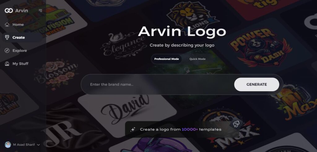
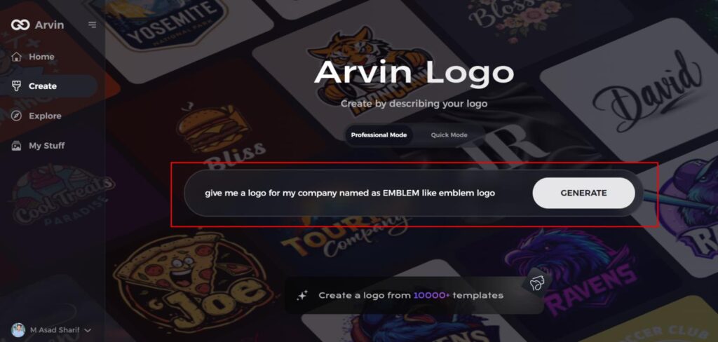
Step 1: Visit the Arvin AI Website
Open your web browser and navigate to the logo design page at Arvin AI to begin crafting your emblem logo.
Step 2: Enter Your Business Details
Provide essential information about your business, including your business name and category. This helps the AI tailor designs that are aligned with your specific brand identity.
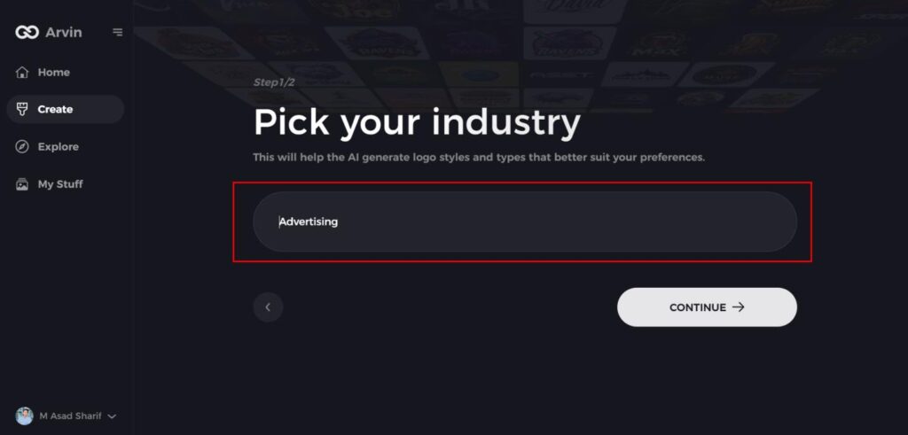
Step 3: Select Your Industry
Choose the industry your business operates in from a list of options. This step ensures that the AI refines the logo styles to match the trends and aesthetics relevant to your field.
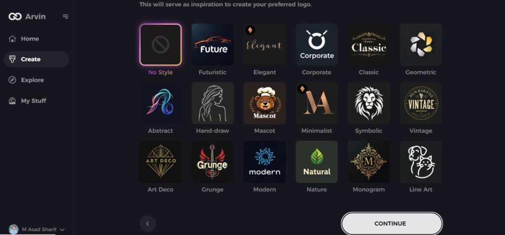
Step 4: Choose Your Design Style
Browse through the available design styles and select the one that best represents your brand’s vision. If you’re unsure, you can skip this step and allow the AI to generate logo ideas based on default inspirations.
Step 5: Review Logo Concepts
The AI will generate a selection of emblem logos based on the details you’ve provided. Take your time to explore the options and select the ones that best reflect your brand image.
Step 6: Customize Your Logo
Fine-tune your chosen logo by adjusting elements such as color scheme, font, icons, and layout to perfectly match your brand’s style and tone.
Step 7: Download Your Final Logo
Once you are satisfied with your emblem logo, download it in high-quality formats like PNG or SVG. These formats ensure your logo is ready for use across websites, social media, and print materials.
Conclusion
A travel design logo in an attractive way establishes trust, reconciling your brand and a feeling of journey. Logos create brand identity — through colors, fonts, and icons that resonate with united audiences — from airlines to travel blogs. Arvin AI is a perfect choice for the travel industry that allows you to create awesome, professional travel logos in a matter of minutes with its AI-driven customization, large number of icons library, and hassle-free interface. Try Arvin AI now to create a travel brand identity like no other and start building your future!
FAQs
What are the best colors for a travel logo?
Blue, green, and orange are highly employed in tourist logos to elicit trust, adventure, and excitement.
Can I design a travel logo without any graphic design experience?
Yes! Tools like Arvin AI make it easy to create professional travel logos with AI-powered customization.
How do I choose the best font for my travel logo?
Consider your brand’s personality. Modern travel brands use sans-serif fonts, while luxury travel businesses often prefer serif fonts.
What file formats should I use for my travel logo?
For best results, save your travel logo in PNG for web use and SVG for scalability in branding materials.