
One of the most recognizable logos in the realm of technology is HP. Hewlett-Packard has been a pioneer in hardware, software, and IT since it was founded in 1939. Over the years, the HP logo has transformed to reflect the company’s commitment to innovating technology while still keeping a close link to its roots. This iconic logo represents HP’s legacy of success, as well as its progressive nature in the fast-changing tech world. HP logo is a symbol of trust, innovation and sophistication.
The History and Evolution of the HP Logo
The HP logo has undergone a dramatic transformation since its inception in 1939. Mirroring the growth of the company and technological innovations. This section highlights major design developments, demonstrating the evolution of the logo into the recognizable symbol.
1939 – 1954
The first logo introduced by HP dates back to 1939, but it was simple and effective. Emblazoned with the initials “HP” in italicized lowercase letters in a white monogram on a solid black circle, it expressed the early computing services focus of the company. The black and white color scheme was stark and corporate, a sign of the company’s commitment to modernization. That original logo would go on to become the seed from which HP’s evolved identity would grow, reflecting the strength of its tech heritage while maintaining a minimalist and timeless quality.
1954 – 1974
In 1954, HP further simplified its logo to look more modern and neat. They removed the “Hewlett-Packard” name and made the design simpler. The bold black monogram, now framed in a thin white circle, was a departure towards a more logomaker type, a more grown-up, professional and polished type. The change marked the shift at HP from a software company to one that was starting to breakthrough in the hardware. This period of clean design reflected the company’s growing prominence in the tech world.
1974 – 1981: The Return of the Text
In 1974, the reintroduction of the “Hewlett-Packard” name next to the iconic “HP” initials marked yet another major change in HP’s logo. The serif typeface used was bold italic to give it a more classy feel and authoritative look. It was a balance between black and white. This logo reinforced HP’s expanded focus on the personal computing and hardware space, in line with its goals for broader reach and intentions.
1979 — 2008: Blue And Black Palette
From 1979 to 2008, HP used simple and professional colors like blue and black to look trustworthy and business-friendly. It had a white circle with blue “HP” initials set on a rounded rectangle. The splash of blue broke the monotonous and made things more sophisticated and current, signaling HP’s stronghold as a global leader in the technology space. The clean lines and muted palette reflected the company’s precision in hardware and growing product portfolio.
1999 – 2012: Simplified Version Of The HP Logo
HP simplified its logo in 1999 by eliminating all additional text and making its design elements relying on blue and white only. The simpler “HP” letters stood without detail or complication. This minimalistic look complemented an international trend in business branding and indicated the brand’s desire to streamline its identity. The move also highlighted HP’s move to assimilate its operations and more effectively address an international marketplace.
2008 – 2014: Modernization
Between 2008 and 2014, HP modified it for a cleaner and more modern logo. The background changed from blue to white, and the lettering darkened. This change improved the logo’s legibility on various backgrounds, making it bolder and more dynamic. Replacing the logo’s serif letters with a sleeker, more modern typeface also lent the logo a professional edge, helping to establish HP’s identity as an innovative tech company. This design reflected HP’s move to cloud computing and IT services — and other 21st-century technologies — beyond its hardware offerings.
2012 — Today: Current HP Logo
Adopted in in 2012, the modern-day HP logo strikes a balance between tradition and modernism. It keeps the minimalist blue and white design but with a lighter blue colorway for a friendlier tone. It is important to mention that creating a simple and understandable logo helps achieve a better brand identity and consistency in percentage in various platforms. This post-modern HP logo is a reflection of the company’s focus on high-tech innovation — but ensuring user-friendly experiences and worldwide reach in all products.
2016 – Present: Premium Products Logo
In 2016, HP unveiled its simplified logo for high-end products. This variant employs vertical slashes to form lowercase “h” and “p” letters with blunt, clean lines. The design is ultra-advanced and generally suites high-end tech products like laptops and professional solutions. The lack of background circle shows how bold HP is in making a leap with high-end futuristic technology. This modern, low-profile design is aimed at attracting a discerning high-performance tech audience.
Part 2: Meaning Behind the HP Logo Symbol
An HP logo symbol means so much more than a company logo; it means the soul of HPE and HP products. “The logo at its core represents HP’s continued focus on innovation, simplicity, and quality.” Every part of the logo represents how the company continues to evolve in the fast-moving tech world. Beyond being a symbol, it reflects the company’s commitment to lead in technology, from hardware and software to IT services.
Minimalist Design Principles
The contemporary HP logo speaks to its philosophy with simplicity in design. It is sleekly designed with geometric shapes and clean lines that make it look ageless and streamlined. HP’s progressive mind is reflected in this design, showing how you might be simple yet never uncool. The simplicity of the design ensures that the logo remains versatile and flexible, easily adaptable to various formats and platforms, be it on physical products or online marketing.
The clean lines and geometric shapes symbolize
Another characteristics of the HP logo is the use of clean lines and geometric shapes. And the simplicity of these forms is reflective of the company’s focus on clarity and precision of its products and services. The sleekness of the design demonstrates HP’s focus on modern-day technology and simplified, effective technologies. This crisp visual identity reflects the company’s ambition to build products that are accessible, while maintaining extreme precision and robustness.
Part 3: The HP Emblem: A New Identity
The HP Emblem in the context of Hewlett Packard Enterprise HP Emblem The HP Emblem is used to represent Hewlett Packard Enterprise Hewlett Packard Enterprise (HPE) adopted the HP emblem to denote its separate identity from the classic HP logo. Designed to reflect the enterprise division of HP, specifically in response to IT services and hardware solutions, it made a heavy emphasis on independence. In contrast to the classic HP logo, which focuses on personal computing, the HP logo speaks to a wider range of business and technology audiences.
Design Elements and Their Significance
The HP logo is simple and strong. It consists of four slanted diagonal lines at 13-degree angles, and they create abstract representations of the letters “HP.” These slash creates a archetypical, sleek and swift look, representing a movement and a progress. The design shows HP’s intention to stay innovative and adaptable in today’s world of technology.
Part 4: The Color Palette of HP Logo
Two of the main colors of the original HP logo were monochrome colors; black and white which gave an essence of professionalism, and simplicity. In the graphic redesigns that came later, its hues became more pronounced, predominantly blue and green, to convey the business’s growing emphasis on tech and innovation. These colors demonstrated another dynamic transition away from simply hardware, toward all-encompassing IT solutions.
Impact of Blue and Green in the Logo
The HP logo saturates with blue, a color typically linked to the concepts of trust, reliability, and stability. These are values that are at the heart of the tech brand’s identity. When used as an accent color, green represents growth and sustainability, reiterating HP’s continued dedication to sustainable innovation and environmentally friendly technology.
Part 5: HP Logo Font: The Angular Typeface
Another great example of aesthetic logo design that uses a simple, modern sans-serif typeface is that of HP. The crisp, precise letters align perfectly with HP’s mission to provide quality technology with adequate horsepower. The design is minimalistic with the readability intact and professional touch maintained.
A Move from Serif to More Modern Sans-Serif Fonts
HP used serif fonts signifying tradition and authority. But this company updated its logo in 1999 with a sans-serif font to create a cleaner, more modern look. The redesign was intended to modernize HP’s image to suggest simplicity and convey a message of technology advancement.
Part 6: Arvin AI as an AI Logo Maker
Arvin AI is a sophisticated AI-driven platform that is specifically programmed to design professional logos for clients within hours. Utilizing state-of-the-art machine learning algorithms, Arvin AI creates personalized and original logos based on user input, designing each logo specifically to fit the identity of the brand. This revolutionary tool eases the process of logo creation, making it simple for companies to have a professional and visually stunning brand image without much struggle.
Key Features Of Arvin Ai
- AI-Driven Logo Design: Utilizes advanced artificial intelligence to generate professional and unique logos.
- Customization: Offers a wide range of customizable options to tailor logos to your brand’s identity.
- User-Friendly Interface: Simple and intuitive platform, making logo creation accessible for all skill levels.
- Fast and Efficient: Quickly generates high-quality logos, saving you time and effort.
- High-Quality Output: Produces logos with precision, sharp details, and industry-standard design elements.
- Multiple Style Options: Allows users to create logos in various styles, from minimalist to complex designs.
Steps to Use Arvin AI for making Logo
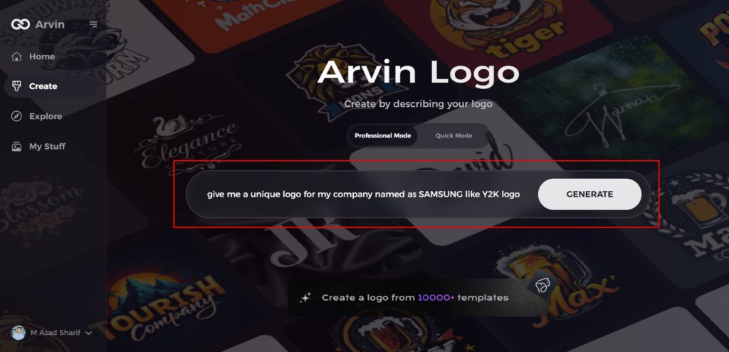
Step 1: Access the Arvin AI Website
Launch your preferred web browser and navigate to the logo creation page at Arvin logo maker to begin designing your retro Y2K-inspired logos.

Step 2: Provide Your Business Information
Enter your business details, including the name and industry, to help the AI generate logo designs tailored to your specific brand and its unique identity.
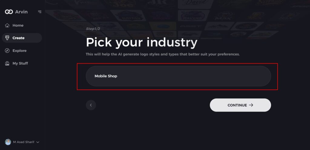
Step 3: Select Your Industry
Choose an industry from the provided list. This step allows the AI to filter logo styles and concepts based on your business sector, ensuring a more relevant design.
Step 4: Choose a Logo Style
Explore the available logo styles and select one that resonates with the vibe of your brand. If none of the options match your vision, you can skip this step and let the AI draw inspiration from its default style suggestions.
Step 5: View Logo Ideas
The AI will generate multiple logo concepts based on your inputs. Take time to evaluate the options and choose the one that best aligns with your retro brand image.
Step 6: Customize Your Logo
Enhance your selected logo by adjusting elements such as color, fonts, icons, and layout. Make these tweaks to ensure the design perfectly reflects your brand’s unique style and retro aesthetic.
Step 7: Download Your Final Logo
Once you’re satisfied with the logo, download it in formats like PNG or SVG. These file types are versatile and ready for use on websites, social media, and print materials.
Conclusion
In this article, we are going to track HP logo history to see its design, significance as well as vital role of typography and color which contributed towards establishing brand identity. HP logo signifies the heritage of the company in technology and innovation. If you’re inspired by iconic logos like HP, Arvin AI is an excellent tool to create a custom logo tailored to your brand. Start using Arvin AI today to design your unique logo with precision, simplicity, and innovation.
FAQs about HP Logo
What is the meaning behind the HP logo?
The HP logo represents the company’s dedication to innovation, reliability, and high-performance technology with a simple design.
How many times has the HP logo changed over the years?
The HP logo has seen a number of redesigns, with the major changes taking place between 1939 and 2016, moving towards a contemporary, minimalist design.
What is HP logo for?
Perhaps the most commonly asked question about the HP logo is, “What does HP stand for?” It is an acronym used to refer to the original name of the organization, Hewlett Packard. HP has remained an integral part of the company’s logo since it first emerged in 1939.
Can I use Arvin AI to create a logo like the HP logo?
Yes, Arvin AI can help you create a logo with a similar minimalist design to the HP logo using advanced AI features.
