The Denver Broncos are one of the most popular teams in the NFL, having a large number of fans and a great history. This has significantly impacted their identity and made them easily identifiable. Over the years, the Denver Broncos Logo has been a trend in newer era trends while maintaining its strength and boldness. Sports logos are well beyond mere signs; they are identified with the teams and help them to bond with their fans on a stronger loyalty basis. A great logo can become etched in the memory of sports history.
Part 1: The Genesis of the Denver Broncos Logo
The Denver Broncos established in 1960 as part of the American Football League (AFL) before merging with the NFL in 1970. As a newly established team, they required an identity that could distinguish them.
Creation of the Denver Broncos in 1960
The Denver Broncos founded in 1960 as one of the original eight teams in the AFL. At that time, the league was competing with the NFL and therefore wanted every team to establish an identity for themselves. The Denver Broncos located in Denver, Colorado. Denver considered to be the state with most lovers of sport and outdoor adventures.
Need for a Strong Visual Identity
Every football team needs a powerful visual identity, and the Broncos were no exception. The team logos becomes a proud symbol for the player and the fans. The team brand relies heavily on the logo which appears on both uniforms and safety equipment and commercial items available for purchase.
First Ever Logo Design
The first logo for the Denver Broncos released in the year 1960. This featured a bucking horse with a cowboy on top. It symbolized Colorado’s Western heritage and the toughness of the Broncos as a football team. Brown and yellow were used in this initial logo, a far cry from the colors currently used by the team.
Part 2: The Evolution of the Denver Broncos Logo over the Years
The Denver Broncos logo has undergone changes several times since its initial formation. From the Broncos simple design to its modern and sleek look, its evolution tells a story of a team ready to always face the next task.
1960 — 1961
The original logo, designed in 1960, features a footballer riding a Bronco horse. It was a bright image of yellow and brown, and only remained on the team for a year. A man wearing a football uniform sits quietly on the back of a horse, closing his eyes and smiling. The brown T-shirt featured a large yellow “B” character.
1962 — 1967
The logo was renewed in 1962 to increase intensity and strength. A footballer stands behind an orange horse. She wears an orange, white and blue uniform and has orange football in her hand. Both the Bronco and the players look brutal and aggressive, reflecting the spirit of the match and the team.
1968 — 1992
In 1968 the rider was removed from the logo and the emblem became a current line and configuration. The emblem consisted of a red capital letter “D” and a Bronco horse appearing vertically from it. The horse was painted white and had a black outline. The negative space is painted blue, creating a good contrast as a horse background.
1993 — 1996
In 1993, the Denver Broncos logo became smarter and cleaner. The contours of all elements were refined and enhanced, and some lines became thick and smooth. The steam from the mouth of the horse was drawn in white, and the outline was drawn in black without extra lines.
1997 — Today
In 1997, a new emblem added to the team. The visual identity of this famous football club depicts the horizontal face of a horse facing right toward the future. The Bronco’s head, which is based on white, has a dark blue outline and accent, and the mane and eyes are colored in orange.
Part 3: Meaning and Symbolism of the Denver Broncos Logo
Colorful Logos are more than simple designs; they are imbued with deep meaning and represent the spirit of a team. Let’s learn more about what makes the Broncos logo so meaningful.
Color Psychology
The three logo colors depicted in the Denver Broncos logo include orange, blue, and white. Each color represents a special meaning that implies the team’s personality and energy.
- Orange: It embodies a color for eagerness and vibrancy as shown by enthusiastic playing and supportive standing.
- Blue: It indicates reliability, power, and confidence through determination and perseverance in overcoming challenges. Many sports teams use blue for it offers a sense of stability and strength.
- White: It is mostly associated with purity and greatness. In Broncos, white helps to make a neat and clean appearance and also plays the role of counterbalancing the strength of orange along with blue.
Horse Represents in the Team’s Identity
The horse is the central element of the Denver Broncos logo, an element that has been part of the design since the team was founded. The team display characteristics of speed and power and freedom in their playing style which matches the attributes embodied by horses.
- People commonly recognize horses as athletic beasts that demonstrate comparable strength and stamina to dedicated football athletes.
- The wild and untamed nature of a bronco (a free-roaming horse) symbolizes the team’s determination to never back down from a challenge.
- The team symbolizes progress and advancement through the horse’s forward direction presented in the logo.
Relation between Logo and Aggressive Style
It’s not only good-looking, but it has something to say about how this team plays in terms of sports.
- The sharp edges and strong lines of a horse’s head give it a raging stare that indicates that the Broncos are tough, a determined team.
- For the Broncos team forward movement of the horse defines their playing style since it indicates both their speed and strength.
- Emblazoned with strong colors and precise design the overall impression becomes threatening which conveys an unstoppable powerful team.
Part 4: The Role of Graphic Design in Sports Logos
A sports team’s logo is one of the most important parts of its identity. Through the years graphic design activities have substantially contributed to sports logo development. For instance, the Denver Broncos. With each change in design and advancement of technology, teams update their logos to keep abreast with times.
Minimalism
While, in logo designs, minimalism means keeping everything simple yet dramatic, a good sports logo shall be easily viewed from a great distance, with or without great details, through the helmet and jersey or giant billboards around.
- Simple and bold lines: These may make a memorable logo. Those designs that create a lot of detail are simply not easy on the eyes sometimes, especially once viewed from very far away.
- Fewer colors: They will make it maintain clarity. Most sports logos use a few number of colors only to keep the design clean and strong.
- Timelessness: A minimalist logo will hardly appear outdated. While, changes in minor details can keep the logo fresh. Simple design lasts longer and doesn’t require to be updated constantly.
Trends in Sports Logo Design Have Evolved Over Time
Sports logo designs have changed much over the years, influenced by both artistic trends and technology.
- Early sports logos (1960s-1980s) – These logos were often very detailed illustrations, featuring mascots or symbols with lots of elements. They were designed for print materials and didn’t always look great on smaller surfaces like helmets.
- Modern sports logos 1990-present – Logos today are simpler and more daring, having clean, bold, and powerful, simple shapes with great printing or digital outputs. Most teams also changed their very complex drawings for a much leaner and more stylized look of the mascots or symbols.
- Utilizing dynamic shape and motion- Several modern logos that include the one of the Denver Broncos now embody movement and power, hence creating a lively effect.
Impact of Digital Tools on Logo Rebranding
Technological advancements made it easier to create and modify logos. Design tools in digital form allow refinement of logos by teams and making sure they will work well in different platforms.
- Vector design software, such as Adobe Illustrator, ensures that the logos can be resized without a loss of quality. This means that the logo will look sharp on everything from large banners to small phone screens.
- AI design tools help the designers test out different color combinations, shapes, and layouts for finding the right balance.
- Digital media has already utilized 3D and animation effects in logos. This makes a modern look fitting for social media, videos, and broadcasting.
Part 5: The Future of the Denver Broncos Logo
A logo is part of a team’s identity, but it doesn’t have to stay the same forever. In fact, the Denver Broncos have updated their logo several times in the past years to fit the new design trends and to make their brand look fresh. Let’s think about what the next new version might look like and how new technology could influence their next version of their logo.
Rumor on Potential Redesigns
The Denver Broncos have utilized their current logo since 1997, so it is one of the longest-running designs in team history. Although the logo still looks great and modern, many teams change their branding every few decades in order to stay with the latest styles.
- A slight refresh – The Broncos might keep the current horse design but make slight changes, such as adjusting the colors, sharpening the lines, or adding minor details to make the logo look even more dynamic.
- Return to classic elements – Some teams return to older logo styles, but with a modern twist. The Broncos might go back to their classic “D-horse” logo of the 1970s, but update it to a more sleek and updated look.
- A completely new design – Less likely, the team might introduce an entirely new logo, perhaps incorporating new design elements or a new art style on their bronco symbol.
Trend in Sports Branding and Modernization
Sports teams tend to update logos frequently to ensure that they comply with modern trends in branding. Some of the biggest trends observed in recent times include:
- Minimalist designs – Many teams have opted to strip the extra design from their logos and to cleaner, bold shapes that are visible on all forms of merchandise.
- Bold typefaces – Some teams employ stylized letters or custom fonts to add some individuality to their logos. The Broncos could try a new font as a complement to their horse design.
- Old-time designs – In sports branding, nostalgia is on the rise; some teams revert to elements in their older logos. A more modern take of the classic “D-horse” logo could appeal to some long-time Broncos fans.
- More aggressive and dynamic poses – Many teams are making their logos seem more aggressive and powerful with starker lines and a stronger expression. The Broncos could improve on their horse design to look more aggressive.
Such trends show that even the small changes in logo designs are enough to give big impacts, as logo updates do not really necessarily signify big changes.
Technology Influence Future Changes
Digital technology advancement has made the logo design even more creative and flexible. The Denver Broncos, if they plan to change the logo, would be able to use modern tools to create an innovative, quality design.
- AI-assisted design: AI tools can analyze the previous logos, fan preferences, and design trends to suggest the best possible update. This helps designers create a logo that would appeal to the new and old fans.
- 3D and animated logos: Many sports teams and brands are using their logos in a 3D and animated way to use on digital content. The Broncos may develop a motion-based version of their logo to use in online promotions.
- Augmented reality (AR) and virtual reality (VR): With the rise of AR and VR, teams are finding new ways to engage with fans. A redesigned logo could be made to interact with AR filters, allowing fans to see special effects when viewing it through a smartphone app.
Part 6: Arvin AI – A Smart Way to Analyze and Create Logos
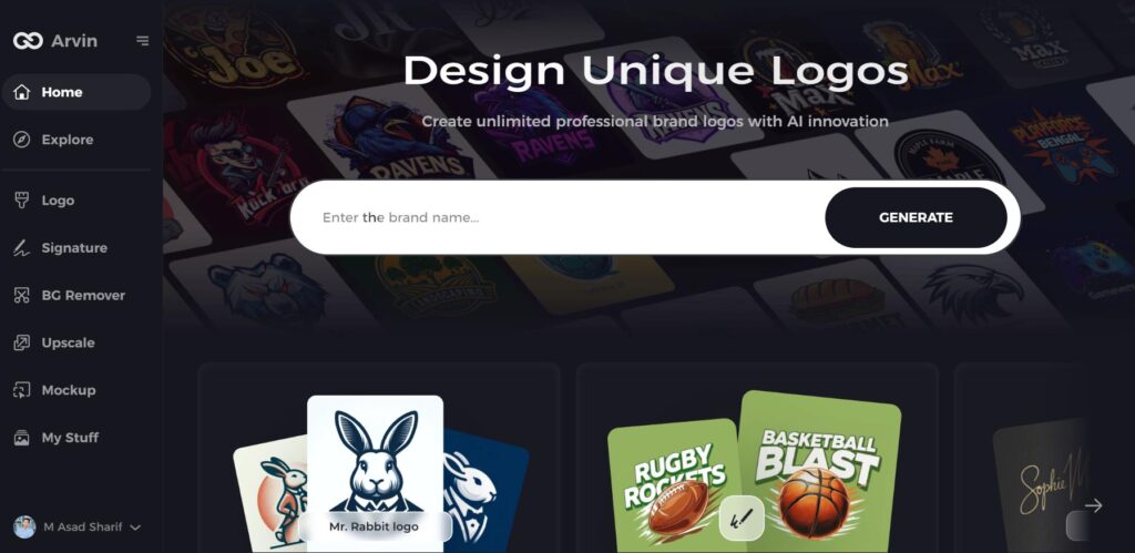
Arvin AI is a very powerful tool that makes it easy for users to design and analyze logos. Advanced technology suggest improvements, create new designs, and ensure that logos look professional. Whether you want to modernize an existing logo or create one from scratch, Arvin AI makes the process simple and efficient. Modern Design Maker provides users with a simple interface which enables non-design professionals to create high-quality logos. With Arvin AI, it is easy to create a strong and unique brand identity.
Key Features of Arvin AI
There are following features of Arvin AI:
- AI-powered logo enhancement and redesign: Improve existing logos or create fresh designs using smart AI technology.
- Customizable templates: Choose from a variety of templates to create a logo that fits your brand.
- Smart color and font suggestions: Get expert recommendations to make your logo stand out.
- Easy-to-use interface: No design skills needed; anyone can make a professional logo in minutes.
- High-resolution downloads for all platforms: Get your logo in different file formats for websites, social media, and print.
- Instant previews and real-time edits: See changes instantly and adjust your design until it’s perfect.
Steps on How to Utilize Arvin AI for Logo Design
Step 1: Register and Login
Visit the Arvin AI website, make an account, and login in order to design your logo.
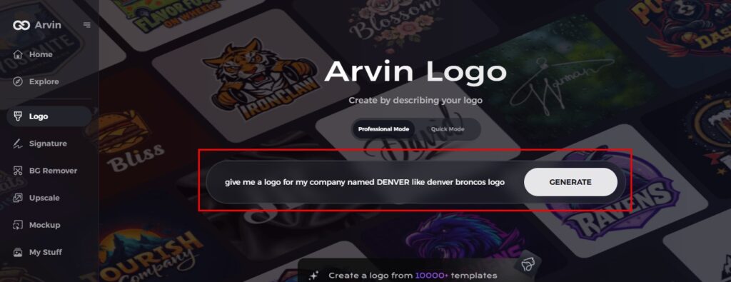
Step 2: Enter Brand Details
Add your brand name, slogan, and industry. Define your preference on designs in terms of font, color, and themes.
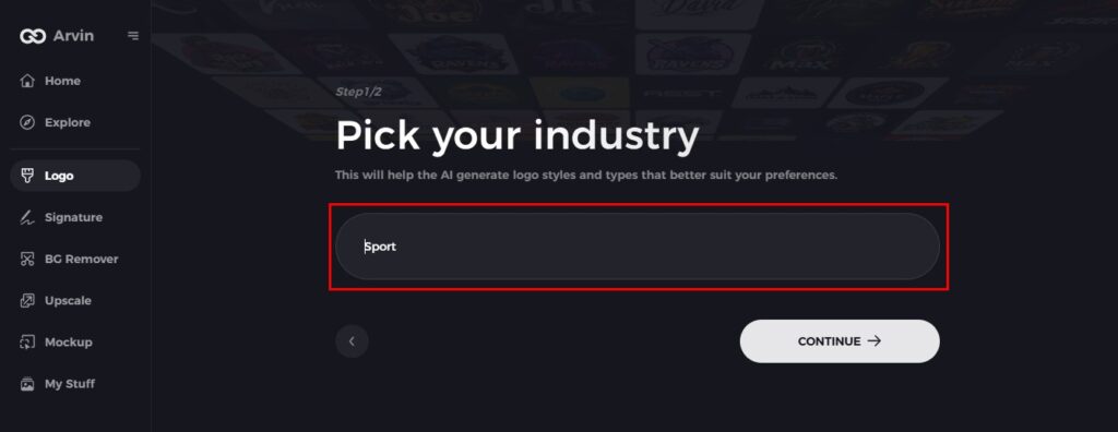
Step 3: Choose Industry
Select an industry so AI will come up with the right styles for a logo in line with your industry.
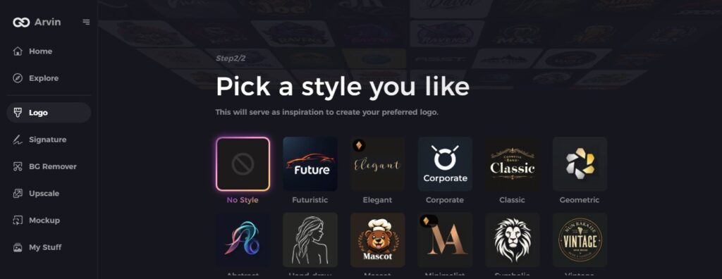
Step 4: Choose a Style
Choose a logo style that fits your vision. This will guide the AI in creating a relevant design.
Step 5: Customize Your Logo
Modify fonts, layouts, and symbols using Arvin AI’s tools. Adjust the design until its perfect.
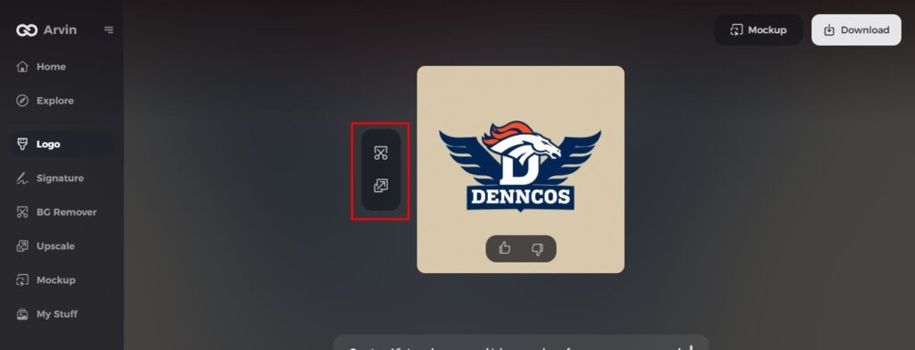
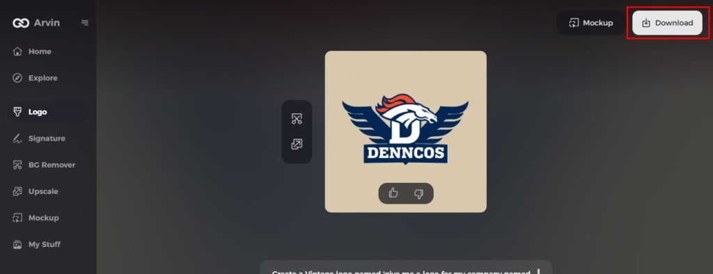
Step 6: Save and Download
Preview the final logo and download it in high resolution for both digital and print use.
Conclusion
The Denver Broncos logo modified with time, as the growth of the team and the brand changes. A good logo stands as one of the main elements for building team identity while connecting it to fan base relationships. Logos have been easier and effective with the advent of AI-based tools today. Arvin AI is the best tool to create improve and analyze logos with smart features and user-friendly options. If you want to design a strong logo, then exploring AI technology is the best way to start.
FAQs
Did the Denver Broncos change their logo?
The Broncos changed their helmet design and logo to their iconic Bronco in 1997, and also switched their home jersey to navy at that time. In 2012, Denver kept its navy helmet and Bronco logo, but changed its primary home jersey color to orange.
What does the Denver Broncos logo signify?
Due to its representation of strength and quickness with determination the horse emblem fits perfectly with the competitive attitude of the team.
Is the present Denver Broncos logo the most liked by the fans?
The fan favorite in Pontiac Trans Am history belongs to the redesign from 1997 for its aggressively bold design.
Can I use Arvin AI to make a sports logo similar to the Denver Broncos?
The smart toolset from Arvin AI allows users to create high-quality sports logos because it incorporates AI features.
