One of the most recognized pharmacy chain across the United States, Walgreens has roots dating back over a century. Walgreens was founded in 1901 by Charles R. Walgreen Sr. Those elements that define Walgreens’ success at the most basic level seem to be branding; maintaining the Walgreens logo. The logo represents a company’s brand, values, mission, and customers. Over the years, the Walgreens logo has changed to align with the brand’s identity and growth. This article will go through its history, significance, and how it impacts the success of a brand
Part 1: The Significance of a Strong Logo
A good-looking logo creates brand recognition and trust. The logo is a touchstone for customers who, over their decades as a pharmacy, have come to expect good pharmacy service and good healthcare from Walgreens. A logo that does not stray far from the past ensures that Walgreens expands upon its competitive advantage. With each decade the Walgreens logo evolved, keeping up with brand trends yet remaining familiar, trusted and true. Its updated typography, color scheme, and even its design showcase the company’s growth and its responsive adaptation to modern branding needs.
Part 2: The History Behind the Walgreens Logo
The Walgreens Logo (Meaning and Inspiration) Walgreens logo is the result of the company’s early struggle to create a strong brand identity. The initial design conveyed professionalism and trust, paving the way for branding evolution.
Founding of Walgreens in 1901
In 1901, Charles R. Walgreen Sr. opened the first Walgreens store on the North Side of Chicago, Illinois with a belief that his store could provide the best pharmacy service with the highest quality of customer care. As the business grew and became more successful, creating a brand identity that was memorable and recognizable became important. This necessity gave rise to the Walgreens logo, which would gradually adapt to convey the company’s commitment to trust, reliability, and innovation within the pharmacy sector.
The First Walgreens Logo
The first version of the Walgreens logo was simple and effective. We used typography logo with clean, professional lettering, focused on clarity and sophistication. The color palette was muted, frequently employing colors such as black or dark blue, which represents trust, stability, and reliability, which many pharmacies naturally stand for. In the early days. This logo also matched with Walgreens’ core messaging and supported its evolution into this stereotype pharmacy we all more or less know. Such a simple, yet elegant design set the foundation for the brand’s long-term identity and future iterations.
Part 3: History of the Walgreens Logo
Over the years, the Walgreens logo has changed its look to keep up with prevailing branding styles. Each redesign represents a chapter in the company’s growth, from classic handwritten styles to a more modern minimalist logo.
1920s: The First Official Logo
In the 1920s, the first official Walgreens logo appeared alongside the company’s branding as “Walgreen Co.” The logo featured a handwritten font that added a personal touch to the pharmacy, highlighting its commitment to community. The typography was classy but still had a professional vibe that appealed to customers. This script-like logo was meant to differentiate Walgreens from its competitors and emphasized the personalization involved in care. The handwritten font established a warm and welcoming image that significantly fostered customer trust at the company’s early stages of expansion.
1930s: Modernization and Brand Development
Walgreens was rebranded in 1930s from “Walgreen Co.” to “Walgreens.” “By changing the brand image, we wanted to make our brand more approachable and recognizable,” she said. The logo used a flowing script that gave movement and personality to the brand name. This rebranding effort allowed Walgreens to be more memorable and attractive to customers. This marked the first step in creating a cohesive modern brand, allowing Walgreens to maintain consistency and recognition as they opened more stores across the United States.
1940s-1950s: The Conception of the Famous Red Logo
In the 1940s and the 1950s Walgreens adopted the red color scheme seen in the company’s branding nowadays. Pharmacy chains often use red as it is a color associated with energy, urgency, and trust. These clinics along with the bold colors used by Walgreens to stand out in the increasingly competitive market, kept Walgreens in customers minds. And the design was simplified, because easy recognition and memorability are key to any logo. The swift change to a red-only logo to further develop Walgreens into a national chain identifier was also a major step.
1960s-1980: Expansion of Ingredients
Between the 1960s and 1980s, Walgreens tried out some extra elements in its logo design. Symbols like the pharmacy mortar and pestle emerged during this time, signifying the company’s pharmaceutical heritage and commitment to healthcare. There were variations of the logo featuring slogans too, underscoring customer service, wellness and trust. These design choices were a nod to the company’s intention to reinforce its identity as a community-driven pharmacy. In fact, these factors placed Walgreens as a widespread trusted pharmacy chain which ultimately helped it build brand recognition as well.
1990s-2000s: A Shift Toward Minimalism
When branding trends got more minimal in the 1990s and early 2000s, Walgreens went along. The logo was simplified, offering an improved version of the cursive typeface that kept a sense of sophistication yet made it easier to read. Also, the simplicity allowed Walgreens to create a consistent brand image in different areas and on advertising materials. An adaptation of the logo that was refined was used by the company to maintain its corporate identity in both print and digital marketing initiatives, thus creating a quick identification tool.
2020: The Latest Logo Update
The Walgreens logo was last updated in 2020. Much of the same script-style typography was included in this update but the spacings and boldness were enhanced to make it look neater. Due to this digital shift, they had to adapt for improving the brand presence on increasing number of platforms including, mobile apps, websites, and brick and mortar stores. These slight yet meaningful changes allow Walgreens to keep the logo relevant in our fast-paced digital ecosystem while retaining the brand’s historical identity and heritage.
Part 4: Significance of the Walgreens Logo Design
Walgreens Logo represent Company’s Personality It conveys trust, energy and reliability in its color, font and design choices while maintaining a consistent experience of brand messaging over decades.
Importance of the Red Color: Energetic, Urgent, Healthcare
Color is a very important aspect of branding and so is the red color choice of Walgreens. The red signifies urgency, energy and passion, all things appropriate in the healthcare and pharmaceutical sector. Red logo has many associations, including alertness and medical help, making it a color that suits when the pharmacy brand. Red color script typography and simplicity. In addition, Walgreens logo color being bright red helps further its recognizability, ensuring that it pops amidst competitors in glass also as online branding.
The Psychology of Script Fonts
Depending on the typography used in a logo design, it can greatly affect how customers see a brand. The Walgreens logo is a script-style font that feels friendly, trusted, and personal. The flexible lettering provides a friendly and approachable look that contrasts with the corporate-feeling fonts that are stiff and formal; it doubles down on Walgreens’s mission to serve customers. Striking a balance between tradition and modernization is instrumental for Walgreens in retaining a strong bond with its loyal customers.
A Logo Evolution Drives Consistency In Brand Messaging
The successful brand is nothing but a balance of consistency blended with the touch of modernity. And this is what is reflected in the evolution of the Walgreens logo. The logo, although refined and updated over the years, has retained the same basic elements: red color, script typography and simplicity. This form of reliability in branding strengthens recognition and trust between consumer and brand. The customers can easily relate the quality and healthcare with a competent logo, ensuring that Walgreens stays a household name for the audience in the pharmaceutical domain.
Part 5: Walgreens Logo in Care and Wellness
Our most trusted, recognized logos are as strong as you are. Walgreens logo for marketing campaigns is used consistently, both in stores and online as well as in advertising, which not only creates a unified brand identity but also builds positive connotations, which makes customers able to identify it easily.
The Logo as an Advertising Campaign Tool
And with the Walgreens logo, it is the ultimate branding device, plastered on commercials on TV, social media and in paper. Bold red and script typography make the logo instantly recognizable and reinforce Walgreens branding in all its campaigns. The logo, whether it appears on a billboard or in a digital ad here, is a symbol that gives a visual cue to customers, a reminder of the brand’s focus on health and wellness.
Consistency of the Logo
Brand consistency is important to help create a lasting identity, and Walgreens makes sure its logo is the same, no matter where you find it. By maintaining the same style throughout, customers develop a sense of trust and familiarity, feeling assured that they are dealing with a genuine and reputable company. The logo is a consistent marker of service quality, whether a customer visits a Walgreens store or finds what they need while browsing online.
Customer Perception and Brand Recognition
A good logo enhances customer perception and brand recognition. Walgreens’ logo’s clean but effective design leaves a lasting impression on the customers. The use of a script font and the red color have become so familiar, they provide a sense of reliability and tradition, helping to reinforce Walgreens in the collective mind as a pharmacy and retail destination. The logo has been associated with access and quality health care all over the world for several decades now, so it offers anactive service for consumers and they are very faithful to the brand.
Part 6: AI and Logo Design – Arvin AI as a Logo Generator
With advancement of technology, artificial intelligence (AI) is taking a bigger part in the realm of design and branding. AI tools provide businesses with the capability to generate their own high-quality logos in a cost-effective and time-efficient manner. Businesses across industries, from retail to medical, are harnessing artificial intelligence to develop unique, appealing brand personalities.AI-powered logo designers, like Arvin AI, do a lot of the technical heavy lifting involved in designing, so that quality branding becomes attainable for companies of any size.
Key Features of Arvin AI:
- AI-Powered Design Suggestions: Generates logo concepts based on industry trends and branding insights.
- Customization Options: Allows users to modify fonts, colors, and symbols to create a unique logo.
- High-Resolution Logo Outputs: Provides crisp and professional-quality logos for both digital and print use.
- Easy-to-Use Interface: User-friendly platform that enables quick and hassle-free logo creation.
- Cost-Effective Solution: Great low-cost solution compared to traditional logo designers, well suited for startups & businesses.
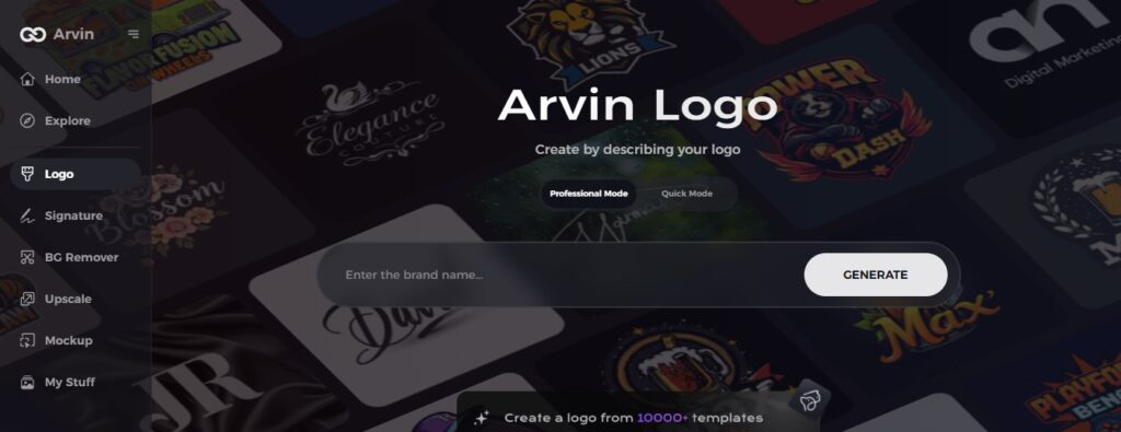
Steps to Use Arvin AI for Making a Logo
Step 1: Create an account and log in on Arvin AI
Visit Arvin AI’s website, create an account, and log in to access the logo design feature.
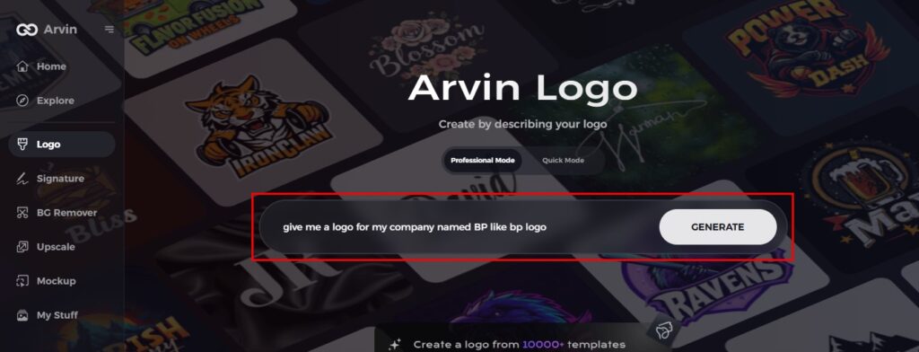
Step 2: Input your brand information and preferences
Enter your brand name, slogan, and industry. Specify any design preferences, such as font styles or image themes.
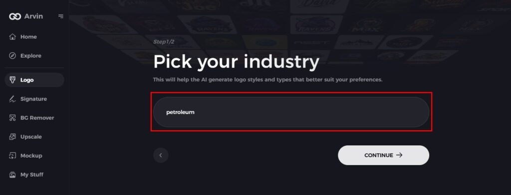
Step 3: Pick your industry
Select an industry of your niche. That way, the AI will produce logo styles that will suit your brand.
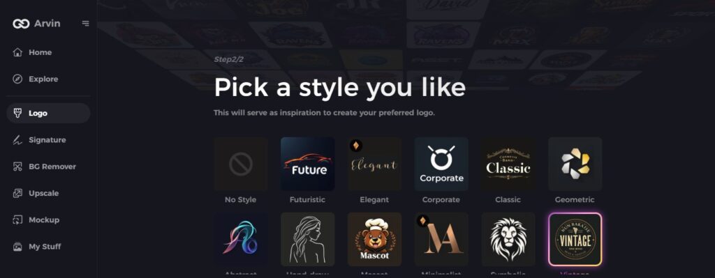
Step 4: Choose Style
Choose a style of a logo you like. That would be your inspiration of making the preferred logo.
Step 5: Personalize your design using Arvin AI tools
Once Arvin AI has created your logo. You can fine-tune it with the use of different fonts, layouts, and symbol positioning. Experiment with a few designs until you find the one that best suits you.
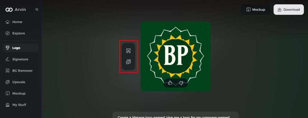
Step 6: Save and download the final logo
Preview your final logo, then save it in a high-resolution format for both digital and print use.

Conclusion
The Walgreens logo evolution can be a lesson in branding. This has become an integral part of Walgreens identity, proving that a good design is the first step towards building trust with customers. That elegant blend of brand cohesion and agility is an important lesson — the sort of thing any company hoping to build a lasting brand identity could learn from. Arvin AI is the ideal logo-making tool for business owners who need a trustworthy and effective solution for brand development. Try out Arvin AI here and see the future of logo design for yourself.
FAQs About the Walgreens Logo
What is the current Walgreens logo design?
The current Walgreens logo features a bold, red cursive font with slight refinements for a modern look, maintaining its iconic branding identity.
Why did Walgreens change its logo over the years?
Walgreens updated its logo multiple times to stay relevant with design trends, enhance readability, and strengthen brand recognition.
What does the red color in the Walgreens logo represent?
The red color signifies urgency, energy, and healthcare—key aspects of the Walgreens brand identity.
How can AI tools like Arvin AI help in logo design?
AI tools like Arvin AI offer automated, professional logo design solutions with customization options, making branding easier and more efficient.