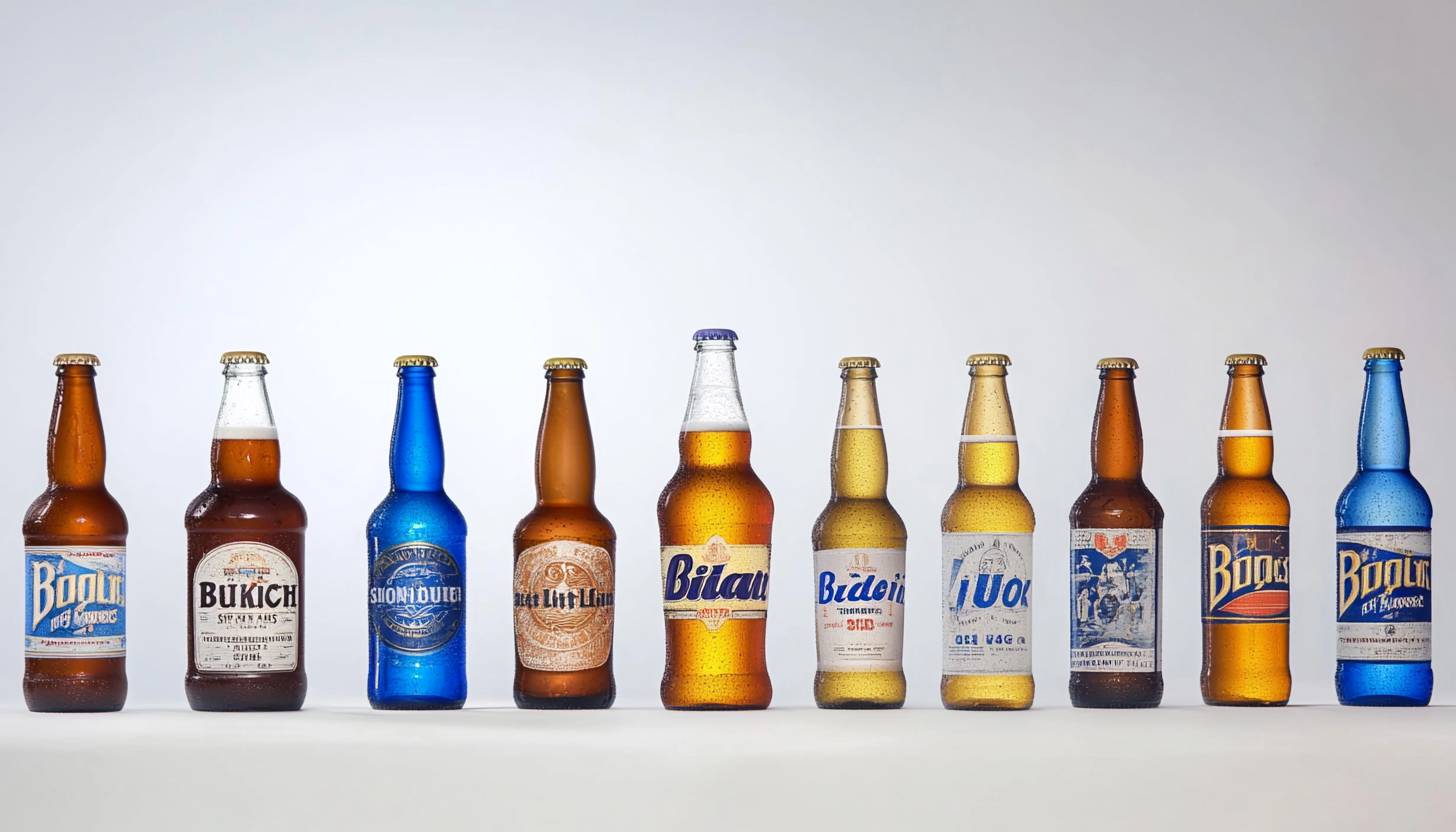
It is a low-calorie alcoholic drink representing Budweiser. There are 4 raw materials. That’s it! The only ingredients for Bud Light are hops, barley, water and rice. Bud drinks are sold across the country as more affordable beers. By the way, Anheuser-Busch is the first beer bottle in the world to display not only the shelf life but also the production time. As a result, customers liked the company’s open attitude and increased the sales of Bud beer. Let’s take a look at the journey of Bud Light Logo.
Part 1: Meaning and History
Proof of this is that the history of Czech Budweiser beer dates back to 1531, when it was also served by Frederick I. As a result, the beer controversy has continued for nearly a century and will not end soon. The American version of Bud beer was originally called Budweiser, featuring Emblem Logos that distinguished its branding. The brewery that produced the beer was founded in 1852, 43 years earlier than Czech companies, by Adolphus Bush, son of a German brewer, and his father-in-law Eberhard Anheuser. Anheuser-Busch. “
1982 – 1983
The logo emphasizes the classic representation of Budweiser Light Beer and the traditional light version of Budweiser. The ellipse, which elongated horizontally in the center, surrounded by double edges, and the outer part is a thin black line, while the inner part is a thick red line. Inside the ellipse, the letter “Budweiser” arched along the top in blue bold of the serif.
1983 – 1984
A bold and simple logo announced in 1982. The name printed in two lines of the same width. This means that the character of the second line has grown considerably. At the same time, the logo became a balanced appearance. A rounded red frame adds a confident touch. This logo will not get lost.
1984 – 1990
First of all, this logo has set a new era in the history of the brand. The concept remains unchanged and the font remains intact, but this version looks very different. Since the name shortened, both lines have the same character size. The strong red is gone, and the blue is not so thick.
1990 – 2008
The shape of the logo is oval and the frame with a three-dimensional feel is thinner towards the right. Designers incorporated Colorful Logos with similar thick sans-serif typefaces to enhance brand awareness. The red color revived, used as a shadow line, and the text had a volume.
2008 – 2013
Although not substantial, the font changed again. However, the red shadow disappeared and it became a simpler and cleaner impression. The oval frame becomes even thinner on the right and looks flat here. This version first appeared in Two and a Half Men as part of an ad campaign.
2013 – 2016
The new design features more complex and advanced design techniques. The oval frame has a metallic finish and a red line added. The inscription painted in white using different logo fonts and features a shadow that gives a volume feeling.
2016 – Today
In 2016, the company revived its minimalist logo. The same font as the 1990 logo used, but the letters printed straight. The inscriptions are blue in familiar shades, and the rectangular frames in round corners painted in bright shades of blue.
Font and Color
The Bud Wright logo used in various shades of blue based on white throughout history. Blue is a symbol of stability, confidence and reliability. The latest logo uses a bold sans serif logo fonts called Universe Next, drawing a linear and clean line. The font created by Adrian Frutiger and released by Linotype Design Studio in 2010.
Emblems and Symbols
All the background and contours were actually for companies and marketing. The character part of the can was almost intact throughout history. Moreover, since the can was blue, I repainted it white to make the letter stand out.
Part 2: Arvin AI – A Powerful Tool for Branding Insights
Companies now can utilize AI tools such as Arvin AI to enhance branding. Arvin AI analyzes logo trends, tracks design shift, and provides suggestions to help companies stay competitive. It studies market trends as well as the preferences of customers in order to deliver useful suggestions. The software also helps companies compare logos with those of other companies. With AI insights, companies are able to design logos that are straightforward, efficient, and appealing.
Key Features of Arvin AI
- Monitors Branding Trends: Observes the way logos change with time.
- Design Recommendations: Provides AI-based suggestions based on customer tastes.
- Competitor Branding Comparison: Compares competitors’ branding with yours for strategic recommendations.
- Market Adaptation Insights: Assists companies in adapting branding to trends in the market.
- AI-Driven Creativity: Offers creative ideas for logos based on data insights.
Steps to Use Arvin AI for making Logo
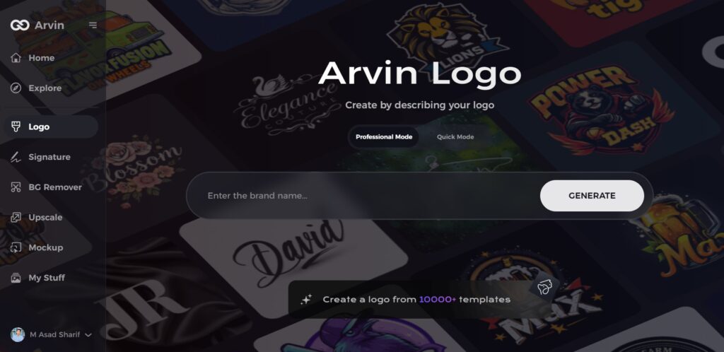
Step 1: Visit Arvin AI’s Logo Design Page
Open your web browser and go to the logo creation page at Arvin AI to begin designing your logo.
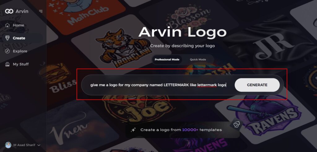
Step 2: Enter Your Business Information
Provide key details about your business, such as its name and category. This helps Arvin AI generate logo designs tailored to your brand.
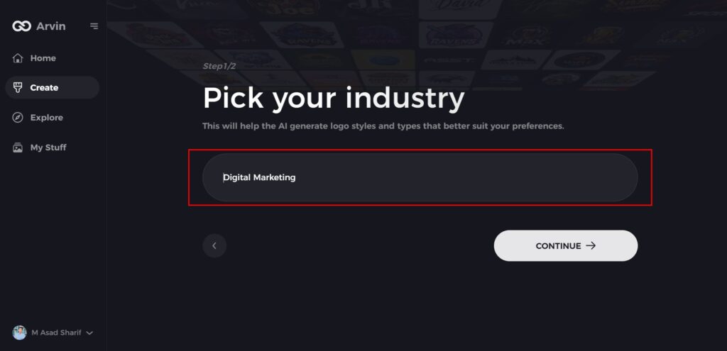
Step 3: Choose Your Industry
Select your industry from the provided list. This step allows the AI to refine logo styles that align with your specific business sector.
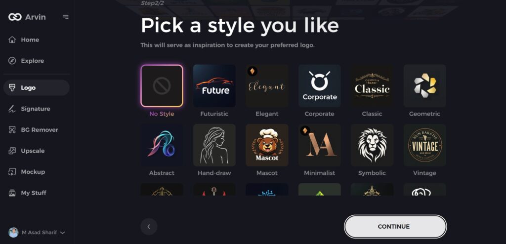
Step 4: Select Your Preferred Style
Browse through available design styles and pick one that resonates with your brand vision. If you’re unsure, you can skip this step and let the AI use its default inspiration.
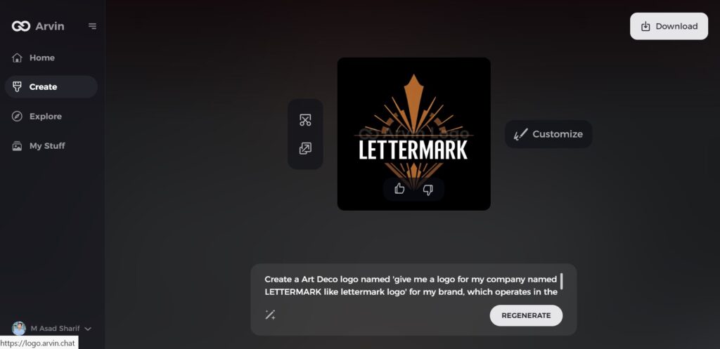
Step 5: Explore Logo Concepts
Arvin AI will generate multiple logo ideas based on your inputs. Review the designs to find the one that best represents your brand’s identity.
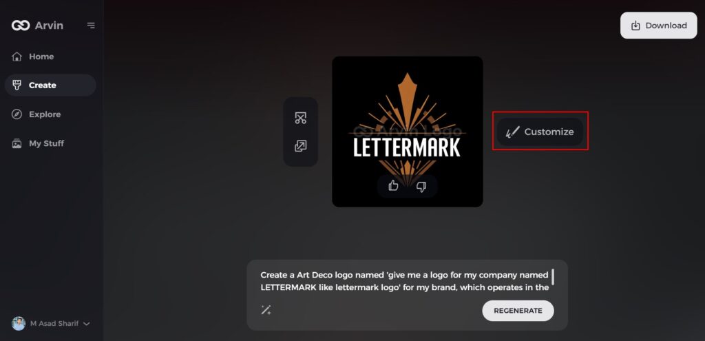
Step 6: Customize Your Logo
Fine-tune your selected logo by adjusting colors, fonts, icons, and layouts to align with your brand’s aesthetic.
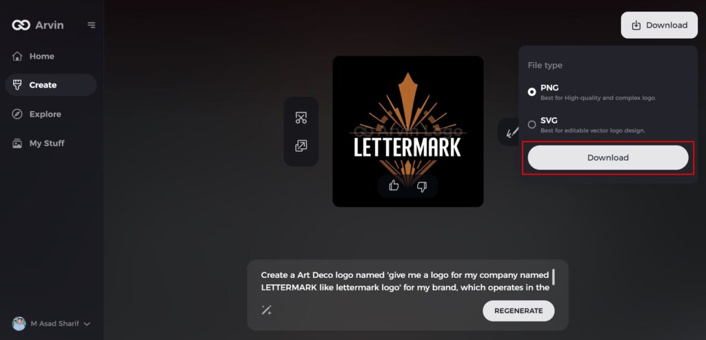
Step 7: Download Your Final Logo
Once you’re satisfied with the design, download your logo in formats like PNG or SVG. These are ideal for use across websites, social media, and print materials.
Conclusion
Bud Light logo revamps indicate that brands must change but remain the same. Bud Light has incorporated new and old over the years, thus becoming a very trusted brand. Logo.design revivals can help a brand remain topical and desirable. Companies can take a leaf out of this by employing AI technology such as Arvin AI to analyze trends and create logos. That are desirable. Brands are guided by AI insights on how to come up with desirable logos that catch customers’ attention.
FAQs
Why has Bud Light changed its logo multiple times?
Bud Light has rebranded its logo to keep pace with changing design trends, consumer trends, and advertising styles.
What is the most significant change in the Bud Light logo?
The most prominent change was the 2016 revamp that welcomed minimalism as well as brought back classic brand features.
How does the Bud Light logo impact brand recognition?
An effective logo is what makes the company easily recognizable and trustworthy even after all these years, even during periods of modification in its look.
How can businesses analyze logo trends effectively?
Companies can make informed logo design decisions with the help of tools such as AI-based Arvin AI that give insights into branding trends through AI.
