Colorful logos have a very crucial role in the modern branding game. They’ll catch the eye of your target audience, stir up some feelings, and most importantly, be powerful branding instruments that define identity. From bright and energetic colors to soft, harmonious ones, the proper colors will help make the logo memorable and easily recognizable. Standing out in today’s highly competitive marketplace is a necessity, and colorful logos are the way to achieve this. Through Arvin AI, an all-purpose design tool, anyone can create striking colorful logos that can capture the heart of a brand. In this article, we will see how colorful logos can improve your branding strategy and trigger creativity.
Part 1: Why Colorful Logos Matter in Branding
Importance of Colors in Logo Design
Colors are more than a simple aesthetics, and have an immense psychological influence. A human brain perceives color way quicker than the perception of any text or images; therefore, color is considered an important message conveyor and attitude influencer. Here are a few examples:
- Red: Used to convey passion, energy, and urgency; such brands like Coca-Cola and YouTube.
- Blue: Symbolizing trust, calm, and professionalism, used by the logos of companies like Facebook and IBM.
- Yellow: A positive color and relates to a positive mood; that is, McDonald’s and Snapchat use this.
These meanings are not coincidental; they derive from cultural and psychological research which posits that colors can induce or influence emotions and behavior. When selecting a logo color scheme, it becomes easy to align a brand’s visual identity with the emotional state intended by using the correct color combination.
Iconic Colorful Logos
- Google: The colorful, bright Google logo defines innovation and creativity. It is a playful yet professional brand with a message of accessibility and diversity.
- NBC: The peacock logo uses the multiple bright colors for symbolizing variety and diversity. The peacock symbolizes being the leader in entertainment and media for NBC.
Benefits of Using Colorful Logos
A colorful logo has many basic benefits in addition to looking pretty. Here are the contributions of colorful logos toward the successful realization of any brand:
Attract Attention
In a busy world, a product needs attention. Colorful logos are always seen in markets; therefore, they can make a brand easily memorable for consumers. Bright, shining colors automatically capture the eye of an observer, which increases visual appeal and can bring a prospective customer to that brand.
Enhance Brand Recall and Storytelling
Colorful logos work well to remember a logo because they produce a strong response on memory retention. The consumer is going to remember a logo more easily, if he sees a color palette. More, colors may say a story concerning the brand personality and values. For example, a green logotype could convey the sense of being an “eco-friendly,” and purple-a luxury and imagination. Therefore, the colors of a logo can become a part of a brand’s story that will help it connect more strongly to the audience.
Part 2: Best Colorful Logo Designs to Spark Your Creativity
Color is one of the key ingredients in the design of a logo that would deliver personality and give a sense of tone to the brand. A colorful logo is able to stand out, emotional, and imaginative. Here are some of the best colorful logos across various industries, and the design trends that are making waves.
1. Vibrant Logos in Technology
Innovative and progressive features are often seen in technology companies through bold and dynamic colors. Bright colors used in the logo of technology companies can symbolize creativity and smartness along with forward movement.
Examples:
- Google: This is one logo that shows how Google is unique, accessible to all, and reachable everywhere by using multi-colored letters.
- Slack: Slack uses bright, playful colors in its logo as an approachable and fun brand for teamwork and communication.
- Microsoft: The window design is set in four-color design, emphasizing stability and the adaptability needed to show wide products and services the tech giant has.
Key Trends in Tech Logo Designs:
- Color Blocking: Blocks or segments of color that one uses to bring a structured, yet dynamic, look.
- Gradient Effects: Smooth transition from one color to the other, represents integration of technology into life as well as being modern.
- Bold Simplicity: Tech logos often make use of vibrant color in minimalistic shapes to keep the design clean and easy to understand.
2. Bold and Bright Logos in Food & Beverage
Food and beverage brands always lean towards bright, bold colors since they tend to arouse appetite and emotions. A colored logo immediately establishes an emotional connection with customers, introducing the fun, energetic, and delicious offer of the brand.
Examples:
- Skittles: Skittles, with the slogan “Taste the Rainbow”, focuses on an assortment of colorfulness by using bright and multicolored logos to emphasize its varied assortment of flavors.
- Fanta: Fanta’s orange color logo speaks freshness and playfulness.
- Burger King: Red and yellow colored Burger King has an energetic, warm, and indulgent feel.
How Playful Palettes Enhance Appetizing Appeal:
- Bright Colors for Bold Flavors: Bright, eye-catching colors are associated with bold and pungent flavors. Thus, it becomes an ideal combination for food brands.
- Psychology of Color: Red, yellow, and orange are frequently used in food branding because they trigger the hunger feeling, warmth, and excitement.
3. Colorful Logos in Fashion & Lifestyle
Most of the fashion and lifestyle brands use multicolor logos in order to produce the feel of luxury, modernity, and sophistication. Here, a multi-colored logo represents individuality, style, and luxurious fashion.
Examples:
- Versace: Versace logo is almost in color black and gold, though minimal color difference presents richness with luxurious or high fashion ambiance inside.
- H&M: The logo of H&M is bold and simple as it majorly uses colors representing current fashion trends or seasonal collections.
- Chanel: While Chanel is often traditional and black and white, it used color in its variety for limited edition collections to showcase how sophisticated use of color can celebrate the brand.
Part 3: Trends in Colorful Logo Design for 2025
In 2025, colorful logo design will continue to evolve; these following are some of the key trends that will figure in the designs of tomorrow:
Gradients and Multi-Tonal Palettes
Gradients are the order of 2025 when it comes to logo designs. These smooth transition colors are rendering logos modern yet fluid, with multi-toned palettes. Which add some depth and richness to the whole visual identity.
Pastel and Muted Color Combos
While bold colors have been trendy in the recent past, 2025 could be more pastel and mellow color trends. Softer colors tend to evoke feelings of calmness, subtlety, and approachability, and therefore better suit minimalist and fine brands.
Bold Neon and Fluorescent Colors
Neon and fluorescent colors are trending especially in tech, fashion, and entertainment. The colors carry energetic, creative, and youthful appeal. They would best suit bold and forward-thinking brands.
Colorful Minimalism
For the year 2025, colorful elements should come together with minimalist design principles for logos. In this regard, simple shapes with bold colors, clean aesthetic can be very striking and memorable while focusing on clarity and impact.
Part 4: How to Create Stunning Colorful Logos Using Arvin AI
Designing a logo with bright and sparkling colors has never been easier in the world. Arvin AI has many more options that make it as simple as possible and from these produces bright and gorgeous color logos for one to love, regardless of how advanced one may be on the beginner end compared to the established professional. Simplification, creative ability, innovation are a bit beyond all complexity; these characteristics we have at this juncture covered using the service as shown within the logo.
Key Features of Arvin AI for Logo Design:
- Intuitive Interface: Anyone can simply start designing on the platform even without any past experience.
- AI-Powered Color Suggestions: Arvin AI provides its users with perfect color palettes based on what their brand means and whom their target audience will be, ensuring it is relevant, yet beautiful enough.
- Customizable Templates: Select from numerous templates that can be adapted to your particular brand, giving the option for a range of design options without starting from scratch.
- Automatic Resizing: Your logo will automatically be resized to fit different formats and applications, from social media profiles to print materials.
- High-Quality Export Options: Export your final logo in various high-resolution formats, perfect for both digital and print use, ensuring your design looks great everywhere.
Steps to Use Arvin AI to Create Vibrant, Colorful Logos
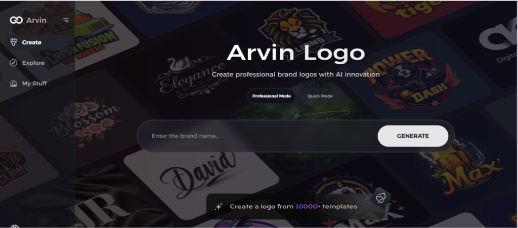
Step 1: Access the Arvin AI Design Platform
Start your creative journey by visiting the logo creation page at Arvin logo through your preferred web browser.
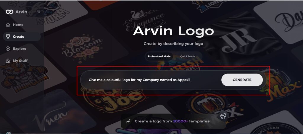
Step 2: Provide Business Details
Enter essential information about your business, including its name and category. These inputs help Arvin AI tailor vibrant designs that reflect your brand identity.
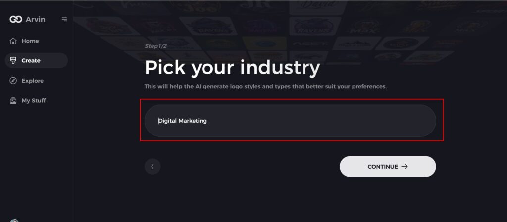
Step 3: Select Your Industry
Choose an industry from the available options. This step enables the AI to refine logo styles and themes, ensuring they align with your sector’s trends and aesthetics.
Step 4: Choose a Design Style
Browse through the array of logo styles offered. Pick one that complements your brand’s personality, or skip this step to let the AI generate designs inspired by its creative algorithms.
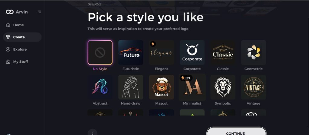
Step 5: Customize Your Logo Design
Unleash your creativity by fine-tuning the selected design. Modify colors, fonts, icons, and layouts to craft a logo bursting with vibrancy and uniquely suited to your brand.

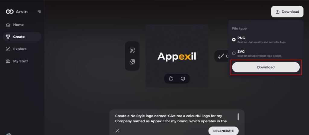
Step 6: Download Your Logo
Once your masterpiece is ready, download it in versatile formats like PNG or SVG. These formats are perfect for showcasing your colorful logo across websites, social media, and print materials.
Part 5: Common Mistakes to Avoid with Colorful Logos
A colorful logo represents a brand vividly. Still, while bright hues may make your logo stand out, there are some common mistakes people tend to commit when using colors in logos. The avoidance of such mistakes is going to give you an effective and timeless logo. In the next section, we will focus on the critical mistakes to avoid while designing a colorful logo.
1. Overcomplicating the Design
While it may be tempting to use many elements and intricate patterns to create a complex design, simplicity is the key to logos. A logo should be easy to recognize, scalable, and versatile across different platforms. Focusing on clean lines, minimalism, and clear visuals ensures that your logo communicates your brand’s message.
2. Ignoring Accessibility and Contrast
Another big error is picking out colors for the logo that neglect accessibility and contrast. A logo has to stand out enough so that every viewing audience can get a good enough look at the logo. Based on color blind or other disability. In any logo, strong contrast between two colors does more than make your logo pop – it makes your logo readable, accessible, across various media types and devices, by using correct contrast to really enhance readability while making your logo more inclusive.
3. Using Too Many Colors
Using many colors might look great, but overloading your logo with too many hues will make it chaotic and distract from your brand identity. Therefore, the best color palette is one with two or three primary colors that go well with each other. This creates a more cohesive and professional look and ensures that your logo remains memorable and easily identifiable. Stick to a simple yet vibrant color scheme for maximum impact.
4. Neglecting Cultural Context
Colors have diverse meanings and provoke different emotions among different cultures. For instance, red may signify passion and energy in Western countries but luck and prosperity in Asian countries. In this regard, one should think about the cultural implications of the color choice in order not to offend or alienate some groups of people inadvertently. Be sensitive to the cultural context of your target market in order to make sure that your colorful logo rings well across borders.
Conclusion
Colorful logos can do much for your brand in terms of recognizability, emotional attachment, and aesthetics. However, there are some pitfalls to avoid: overcomplicating of the design, ignorance of accessibility, too many colors, and cultural context. Tools like Arvin AI help make it easier to create colorful logos that are bright, professional, and do not sacrifice quality or impact.
Frequently Asked Questions about Colorful Logos
Why are colorful logos so effective for brands?
Coloured logos are very effective for brands as the colors catch one’s attention and make one emotional to the brand; it makes recalling such brands very vibrant. Their conspicuous nature helps in bringing about a long-lasting effect, hence reinforces a brand’s identity.
How would you choose colors for your logo?
Consider your brand’s identity, audience preferences, and the psychological impact of colors to select the most suitable palette. Understanding how different colors affect emotions can help convey the right message for your brand.
Can I design a colorful logo without design experience?
Yes, tools like Arvin AI make it easy to create stunning logos with user-friendly features and AI-driven customization. You don’t need professional design skills to craft a visually appealing and effective colorful logo.
What are the latest trends in colorful logo design?
Present-day trends are in gradient effects, pastel shades, bright neon colors, and minimalist designs that add a punch of color to the presentation. Each of these styles tries to push forward simplicity in an effective means of color to portray a fresh, modern dynamic brand image.

