In the constantly changing world of graphic design, logo development has witnessed many changes toward minimalism and streamlined branding. Square logos with straight lines and perfect geometry have been seen to form a decent logo style for today’s firms. Thanks to the demands for simplicity and flexibility of today’s visual language, square logos have enjoyed great popularity across industries from high-tech corporations to luxury fashion brands. Over the course of this article, the reader will be guided through what a square logo is, how it has developed over the years and why it has seemingly become an essential tool in modern day logo design.
Part 1: What Are Square Logos?
A square logo is just a logo that fits the shape of a square form. Unlike circular or freeform logos, square logos contain sharp edges and equal proportions. In addition to their aesthetic appearance, they are very handy. The reason why the square logo is important is because its simplicity allows for great recognition in different media.
Popularity of Square Logos in Various Industries
Square logos have been embraced by many industries since they are sleek and versatile in nature. Tech, fashion, and branding industries have always adopted square logos for their modern outlook. Tech giants like Instagram, Facebook, and Microsoft have used square logo designs because of their modern appeal. Many luxury brands in the fashion industry, such as Chanel and Yves Saint Laurent, embrace square shapes in their brands.
Benefits of Using Square Logos in Today’s Design World
Square logos have several advantages that make them highly effective in the current fast-paced digital environment. These include:
- Versatility: A square format can easily be resized and adapted across different applications, from business cards to mobile app icons.
- Clean Aesthetic: The symmetrical nature of square logos makes them visually balanced and easy on the eyes, which translates to better brand recall.
- Simplicity: The square logo, usually complemented by minimalist design, is very sleek and modern, thus appealing to today’s audience.
Part 2: The Evolution of Logo Design
Logo designs have experienced many transformations throughout the years. Logos used to be detailed, with elaborate illustrations and complex typography. Brands found that they needed to have a stronger impact, and hence started to use simpler logos that were more recognizable. The shift towards simplicity was motivated by the need for faster recognition, and logos have continued to evolve towards abstract and minimalistic.
The Shift toward Minimalistic and Versatile Designs
With advancements in technology, logos began to prefer flexibility over detail. With the introduction of the new formats of disseminating digital media such as mobile applications and social networks, logos have become essential to be viewed across various devices displaying screens of different resolutions. Out of all trends, it was possible to identify a peak in the minimalist trend, in which rounds and fewer details were preferred. The emphasis shifted towards ensuring that logos were scalable and impactful, irrespective of the device on which they were displayed.
The Role of Square Logos in This Evolution
Square logos have become the epitome of the evolution into this form. A geometric form gives a sense of structure and simplicity, exactly what fits the minimalist design philosophy which has dominated the last few decades. Square logos, through symmetry and simplicity, show the epitome of shift toward functionality and clarity in modern branding. They offer a timeless appeal while still being adaptable to new media and technologies.
Part 3: Why Square Logos Work Well in Modern Branding
The square logo is also very popular due to its inherent simplicity. With the square shape, one need not draw complicated lines or curves; the design comes out to be clear and direct. Such simplicity guarantees that the logo is recognized, even when it appears at a smaller size. This clarity offered by the square logo makes it very appropriate for the fast-moving digital environment, where the first impression counts, and brand identity must be communicated in a glimpse.
Easy Adaptability Across Different Media
The strength of square logos is that they can easily be scaled to fit any medium, whether it is for websites, social media, or print materials. When logos are shrunk down for digital platforms, where the icons in apps or the profile pictures on social media may appear, square logos retain their integrity and do not become distorted by the resizing. The same logo can be used effectively on large-scale billboards or marketing materials.
The Timeless and Professional Appeal of Square Logos
A square shape gives an impression of timelessness and professionalism. Whether it’s a clean line of a logo from a tech company or a geometric design of a high fashion brand, a square logo creates a sense of polish and confidence. That’s why this timelessness is attractive to brands that want to project trustworthiness and reliability, and it’s why square logos are so popular among companies that want to stay around for a long time.
Part 4: Key Elements of an Effective Square Logo
Creating a square logo is more than just squeezing a design into a box. A good square logo captures the essence of a brand in a compact form while still being versatile and simple. The following are key elements that contribute to a successful square logo:
Focus on Simplicity and Versatility
Simplicity is the essence of a memorable and effective logo design, especially in square format. With limited space, a complex design may seem cluttered and less recognizable. A simple design makes sure that the logo remains easily identifiable even when scaled down for various uses, such as social media avatars or business cards. Versatility is equally important. A great square logo should work on various mediums, whether it is a website, product packaging, or signage.
The Importance of Color, Shapes, and Typography
- Color: Colors have a lot to do with communicating your brand’s personality and message. Select colors that appeal to your target audience and are in tune with the values of the brand.
- Shapes: Shapes in square logos should complement the overall message of the brand. For instance, circular shapes give an impression of inclusiveness and unity, whereas angular shapes convey strength and stability.
- Shapes: The font should be legible, even when it’s scaled down. The typography should represent the personality of the brand, whether it is modern, traditional, playful, or serious.
How to Achieve Balance and Symmetry in Square Logo Design
Balance and symmetry are basic considerations in a square logo in which the total visual appeal becomes balanced and appealing. This would mean the logo becomes quite easy to understand at an instantaneous glance where no aspect overpowers others.
- Symmetry: Often, symmetry contributes toward the aesthetic stability of an appearance in a logo; although an asymmetrical logo will make just as effective if it helps demonstrate motion or dynamism-a matter of whether to drive a message for brand identification.
- Spacing: Ensures spacing around the items set in the square. There ought not be crowding inside such designs because that interferes with people’s processes through the logo, resulting in poor performance.
Part 5: Trends in Square Logo Design for 2024
In 2024, square logos are becoming increasingly popular due to their adaptability to digital spaces. The trends that emerge this year reflect evolving tastes in aesthetics, technology, and societal movements.
Popular Color Palettes and Typography Choices
Minimalist Color Palettes: Neutrals with bold accents or monochrome designs are popular. A minimalist approach to color is simple, allowing the logo to be timeless and flexible in any medium.
Bold and Playful Typography: Many brands are now using bolder and more expressive typography. Custom fonts and modern sans-serif styles are commonly used, which provide a clean and contemporary feel. Others are opting for unique, hand-drawn fonts that provide character and differentiation.
Influences from Technology, Sustainability, and Global Design Trends
- Technology: As digital platforms and mobile-first branding are on the rise, square logos are becoming more and more tech-centric, with sharp edges and futuristic fonts. The use of gradients and shadows is mimicry of digital interfaces and apps.
- Sustainability: Sustainability is a theme that brands often take up, and they add earthy colors, organic shapes, and eco-friendly symbolism to their logos. Square logos in 2024 reflect a conscious effort to symbolize green practices through their design, often using nature-inspired palettes.
- Global Design Trends: Square logos are reflecting the influences of cultures around the world. From minimalism in Japan to the Scandinavian design elements, square logos are taking on a simplified, balanced look that matches the globalization and connectivity.
Examples of Successful Square Logos in Modern Brands
The following are some modern brands that have used the square logo, which are themselves iconic. These examples show simplicity, balance, and creativity working at its best:
- Instagram: The use of the square shape combined with vibrant gradients creates a modern and approachable feel, aligning perfectly with the platform’s user-friendly and visually engaging experience.
- Spotify: Its square logo, featuring simple typography and green accents, is instantly recognizable. The design is minimalist but unique, reinforcing the brand’s focus on music streaming and digital entertainment.
- Apple: While not strictly a square, the use of squared edges within product design and logo iterations in Apple demonstrates how well square forms can be integrated into an overall brand identity.
Part 6: How Square Logos Impact Brand Identity
Square logos, when done right, play a very important role in shaping a brand’s identity. From creating a memorable presence to influencing consumer perceptions, square logos have a big impact.
Establishing a Strong, Memorable Brand Presence
A square logo helps in having a clear and consistent brand presence. The company can be more uniform across all touch points-from websites to the products that are physical-by sticking with one shape. A strong structure is conveyed by a square, which indicates stability and reliability. These are great qualities for brand recognition and consumer trust.
Enhancing Recognizability and User Engagement Through Square Logos
Memorability along with engagement is achieved through a square logo. It is not very difficult to recognize these kinds of logos, and on multiple platforms, especially mobile applications, they are very consistent-thus keeping the brand more in the user’s thoughts. Easy identification and interaction by a user with a brand that boasts an effective square logo makes users engage more with the brand.
The Psychological Appeal of Square Logos in Consumer Perception
The square shape itself is synonymous with stability, order, and trust. These characteristics are essential when a brand wants to convey professionalism and reliability. Psychologically, people are drawn to symmetry and structure that the square shape offers automatically, making it a perfect choice for brands that want to create confidence and reliability.
Part 7: Unlocking Creative Potential with Arvin AI for Logo Making
A fast-paced world of branding and design demands that a logo should be unique and effective for establishing an identity. Arvin AI gets the best technology and puts it to use in creating logos by offering its users with an interface that is at once intelligent and easy to use in creating logos. It does not matter what type of designer you are: a small business owner, an entrepreneur who has recently started a new business, or an experienced designer, Arvin AI creates incredible opportunities for perfecting the results, increasing efficiency, and tailoring the process to everyone.
Key Features of Arvin AI:
- AI-powered logo design with intuitive customization: Automatically generates logos with easy-to-use tools for adjusting colors, fonts, and icons.
- Quick generation of square logos: Produces high-quality square logos in optimal resolution and formats, perfect for digital use.
- Integration with modern design tools: Works well with popular tools, such as Adobe Illustrator and Photoshop.
- Advanced logo editing capabilities: Tweak your logo to fit the fine-tuned editing to achieve your brand identity.
- Generate logos based on brand values: Create a logo that fits specific goals or messaging of a brand.
How to Use Arvin AI to Create a Square Logo with Simplicity and Style
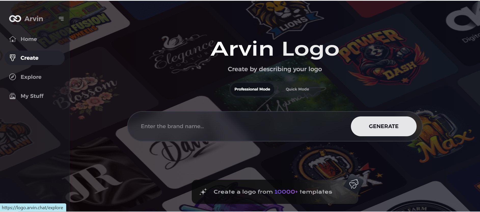
Step 1: Sign Up and Log In
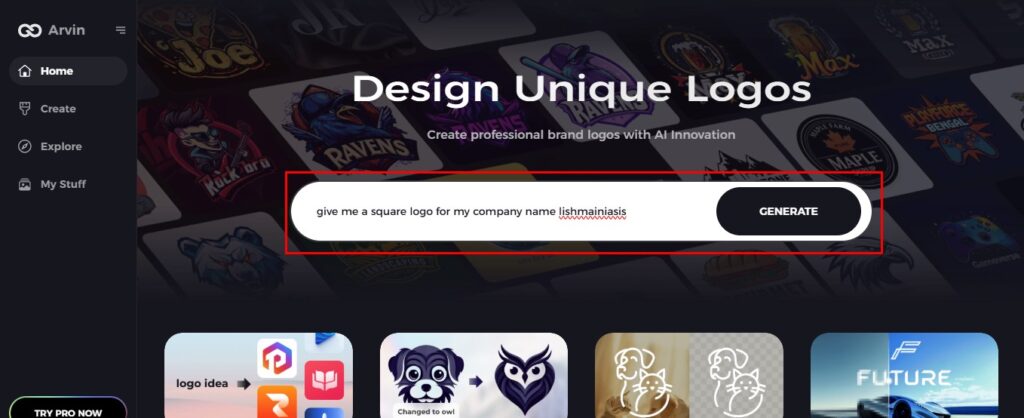
Go to the Arvin AI website, sign up for an account, and log in to access the square logo design feature.
Step 2: Enter Your Brand Information
Enter your brand name, slogan, and industry details. Highlight your preferences for clean, symmetrical, and simple design elements suited for a square logo.
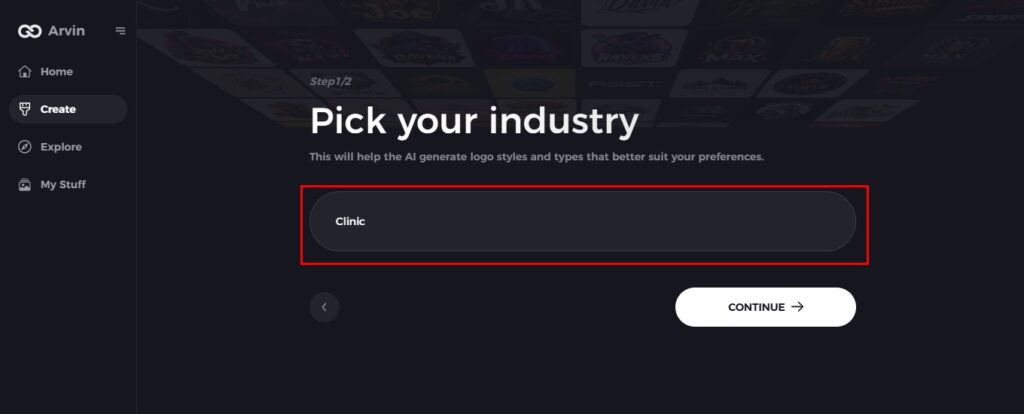
Step 3: Industry Selection
Select your industry or niche to enable the AI to create square logos that are in line with your brand identity and strike a chord with your target audience.
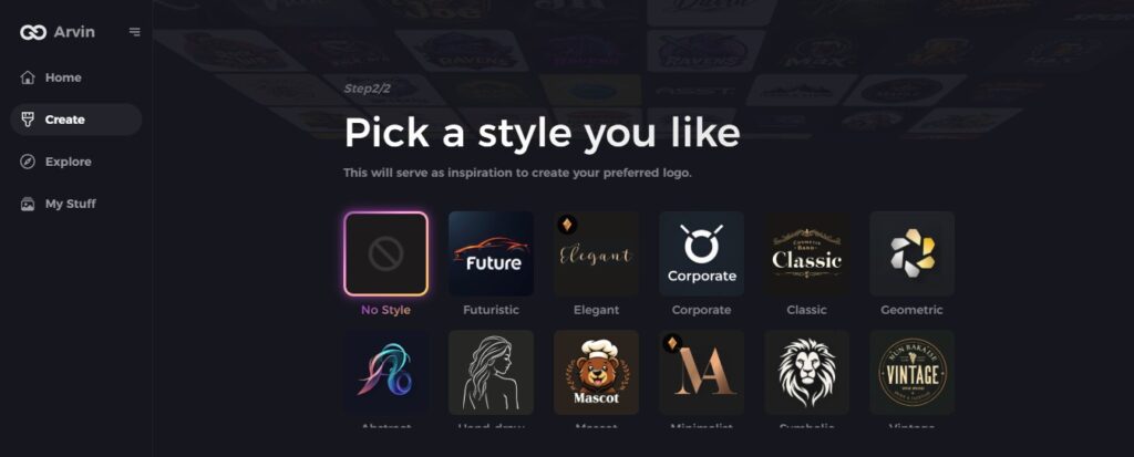
Step 4: Square Design Style
Choose a square logo style that reflects the personality of your brand. It will help the AI to create designs that focus on simplicity and balance.
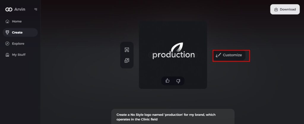
Step 5: Personalize Your Square Logo
Once Arvin AI gives initial designs, customize them using the editing tools. Change the font style, symbol placement, and layout to a well-designed and impactful square logo.
Step 6: Save and Download Your Logo
Preview your finalized square logo and download it in high resolution, ready for both print and digital use, ensuring a lasting impression with minimalist elegance.

Conclusion
Instead of going out and hassling with graphic artists, Arvin AI has combined Artificial Intelligence with basic customization features to redefine this idea of square logos design. Many professionals and beginners will find it easy to create high quality logo from the square logo creation ability that works at unbelievable super-fast speeds and compatibility with other popular design platforms. As the need for, and trends towards digital logos increase, Arvin AI will be one of the primary means of square logos making in the future to help businesses achieve an understanding of the technology to create symbolic and appealing logos.
FAQs:
What are the advantages of using square logos in branding?
Logo squares are universal, formal and optimal for different media spaces and digital networks, especially social networks, website and print, which ensures firstly brand identity associated with its recognition.
How can I customize my square logo using Arvin AI?
Arvin AI allows users to make modifications to their logo including color, fonts, and icons. These are augmented by AI suggestions that improve your design, putting it into alignment with your brand image.
Are square logos more effective for social media platforms?
Yes, square logos are perfect for social media because they are so well-proportioned, fitting perfectly in profile images and ensuring a clear, consistent brand presence across all devices.
Can I create a logo in multiple formats with Arvin AI?
Yes, Arvin AI enables you to export your logo in various formats like PNG, JPG, and SVG, so it’s flexible enough for digital or print uses.
