An app logo is a small image that represents an app. It creates an identity of an app and supports the users to identify the app without much strain to their memory. A good application icon is unique and sets your application apart from the competition by creating a positive first impression in the mind of the users. This article will describe why logo design is so critical in branding, and how app logos enhance consumer identification and memory. It will also offer helpful advice and best practice on design for a logo which is easily understandable, simple yet memorable with your target group. In short, correct logo makes all the difference.
Part 1: Importance of App Logo
App logos are more than simple pictures; they have the biggest role in how a user views and remembers the app. A good logo can make your app shine, attract attention, and leave a lasting impression in the minds of users.
Role of Logos in Branding and Identity
Logos are like the face of an app. They give users a quick idea of what your app is about. A good logo makes your app easy to recognize and builds its identity. For example, think of popular app logos like Instagram or WhatsApp. Their unique and simple designs make them instantly recognizable, even without the app name written next to them.
Psychology behind app logos
Colors, shapes, and designs in a logo affect how people feel about an app. Colors can generate emotions—blue is calming, green feels fresh, and red catches attention. The shape of a logo matters too. Round shapes feel friendly, while sharp edges seem bold. Modern app logos are very simple and clean. Small designs are more memorable and more professional.
The Connection between Logos and User Trust
A good logo does more than look nice. It also indicates experience and makes the app look reliable. Users tend to download and use an app if its logo is polished and well-made. A messy or unclear logo may make users think that the app is unreliable. For instance, apps such as PayPal and Dropbox achieved users’ confidence partly due to the good and professional logos they created.
Part 2: Designing an App Logo
Designing an app logo is received with a significant number of launching an app. But a good logo must look good, stand for the app, and you – the user. This type of map should be easy to read no matter the size or arrangement, and clarity should not be compromised with size.
1. Key Principles of Effective Logo Design
A good app logo follows some basic rules:
- Simplicity: A simpler logo is easier to distinguish and memorize. There are lots of designs where complexity creates confusion or seems confused if the logo will be reduced in size.
- Scalability: Logos have to be accessible since they might be printed in size of the smallest app icons or a giant banner so that their design is crystal clear in any case.
- Memorability: A memorable logo sticks in users’ minds. This helps them recognize your app quickly in a crowded marketplace.
- Balance of Creativity and Functionality: The logo should be unique and creative, but it also needs to fit the app’s purpose. A playful app might use bright colors.
Tools and Software for Logo Creation
Not very complex logo ideas require an expert designer’s hand. There are more than enough tools to look for free options or put some money into premium versions.
- Adobe Illustrator: Used for creating detailed and scaly logos. It comes easily to experienced users but quite a learning curve.
- Sketch: Perfect for creating clean, modern logos. It is very popular among professionals for digital designs.
- Free Tools: GIMP or Inkscape are perfect for those who are on a tight budget. They offer many features without the cost of premium tools.
Common Mistakes to Avoid
It is easy to make mistakes when designing a logo. Avoiding them can save your time and effort: overcomplicating designs, adding too many elements, colors, or details, which make the logo hard to read. Simple designs are more effective and versatile. Ignoring Audience Preferences: Your logo should be appealing to your target audience. For instance, an app for gaming will have a bold and fun design, while an app that deals with finance will require a professional and trustworthy outlook.
Part 3: Trends in App Logo Design (2024 Edition)
App logo designs are always changing because the style and preferences of users keep changing. Updating oneself on the latest trends will keep your app modern and attractive. For 2024, some popular themes include simplicity, bold colors, and movement in logo design.
Minimalist Designs
Minimalist designs have been very popular for app logo since they are simple, easy to recognize, and memorable. A clean and basic logo looks professional and works well in crowded app stores without confusing users. Examples like Google, Instagram, and Airbnb show how simple shapes and clean lines can create a strong impression.
Gradient and Vibrant Colors
Gradients and bright, bold colors have become popular in logo designs in 2024. Gradients make the logo look more interesting, while the use of vibrant colors is eye-catching and makes the logo modern. To do it right, gradients should enhance the design but not dominate it, and bright colors should be balanced with simple logo shapes. For instance, Instagram uses a gradient in its logo to give it a fresh and exciting look. Bright colors are also helpful for logos since they are easily noticeable on smaller screens like smartphones.
Dynamic and Animated Logos
With technology improving, dynamic and animated logos are now being used more often. For example, Snapchat and Spotify have used animated logos to make their designs more interesting and engaging. For instance, Snapchat’s ghost logo moves or shakes, which is very funny. These animated logos capture attention and are remembered for a long time, thus making the experience fun for users, which may make them feel more connected to the app.
Part 4: Tips to Make Your App Logo Stand Out
A logo that would bring attention to your application will be important for it’s success. It must call for attention, create recall, and resonate with the target audience. Key information on how to get such a logo is provided in steps below.
Understand Your Audience
Knowing to whom your app is targeted to goes a long way in your developing a logo that suits and appeals to the people concerned. Your logo should match the interests, preferences, and values of your target audience. For example, a logo for a children’s app might use bright colors and playful shapes, while a logo for a financial app might look more serious and professional.
Testing and Feedback
Make sure that you test your logo against real users before finalizing it. A/B testing will help you compare the performance of two different logos, seeing which one gains a better response from the target audience. This would assist you in determining which of the two designs is the more memorable and appealing.
Future-Proofing Your Logo
When designing your logo, think about how it will look in the future. Your app might grow, change, or add new features, so it’s important that the logo can adapt. A great logo is scalable-that is, it can be resized without loss of quality-so it looks great both on small app icons and large banners. Your logo should also not be so closely tied to a trend that may go out of fashion over time.
Part 5: How to Create a Logo for Your App Using Arvin AI
Arvin AI is a site that helps you make app logo easily. It relies on artificial intelligence to help design logos based on the needs and preferences of the individual. The AI will be able to guide you through, providing various options that fit the style of the user. Using Arvin AI makes making logos fast and easy even for those who have no experience in designing. Its unique approach uses the smart technology of generating logotypes. This is definitely a great tool for professionally and uniquely creating app logo in no time.
Key Features of Arvin AI for Logo Design
Most Important Features of Arvin AI for Logo Design
- User-friendly interface: The webpage is easy to use through clear steps, which makes a logo without design skills.
- AI-powered customization options: The AI will help you in adjusting the design, colors, and style of your logo according to your vision.
- Variety of templates and styles: There are numerous templates to choose from, be it a logo for a tech app, a business, or a creative project.
- Quick export options: You can easily download your logo in whatever format you prefer once you are satisfied with it – PNG, JPG, or SVG – to be readily used online or in print.
- Instant Preview: Changes you make are immediately reflected so you can see how it looks, giving you the liberty to tweak it until it looks just right.
- Affordable Pricing: Arvin AI offers reasonable pricing plans, making it accessible for people who want a professional logo without a high cost.
Steps to Use Arvin AI for Creating a Memorable App Logo
Step 1: Sign Up and Log In
Visit the Arvin AI website, sign up, and log in to access the logo design feature.
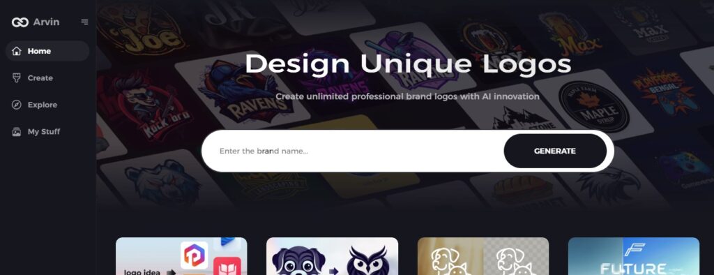
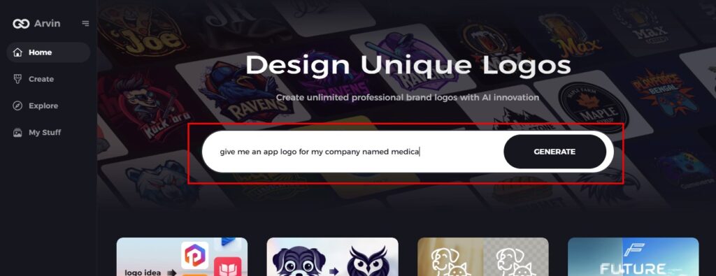
Step 2: Enter Brand Details
Provide your brand name, slogan, and industry. Share your design preferences, like font styles or image themes.
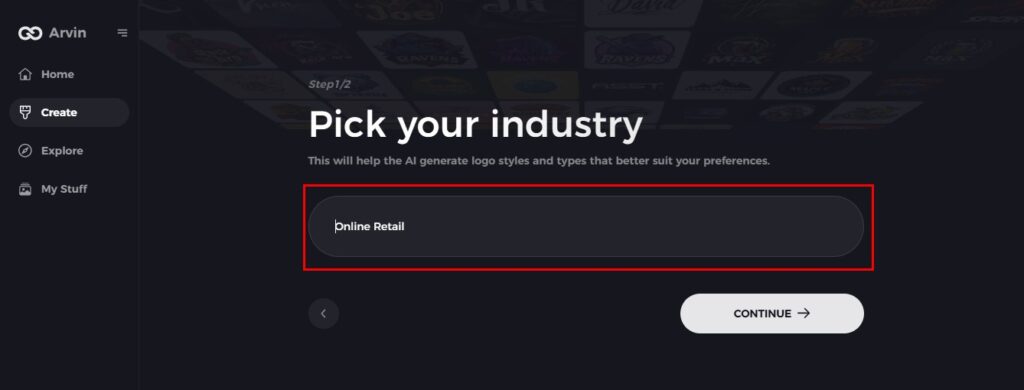
Step 3: Choose Your Industry
Select your app’s industry to help the AI suggest logo styles that align with your niche.
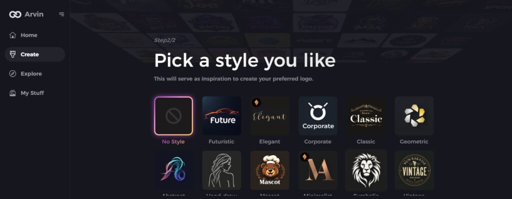
Step 4: Pick a Style
Choose a design style that inspires you. This will guide the AI in creating your logo.
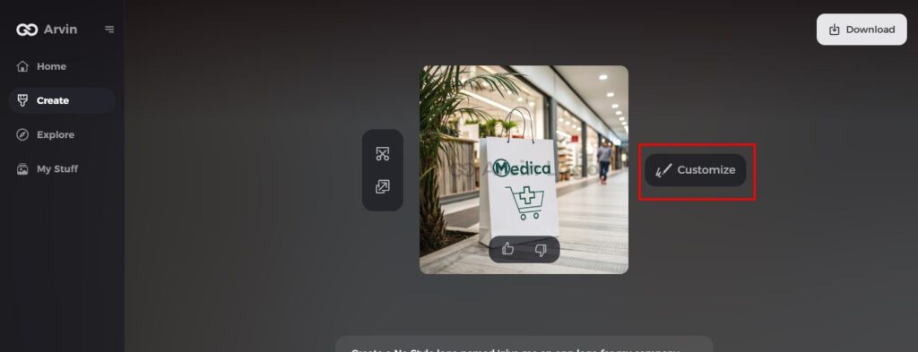
Step 5: Customize Your Logo
Use Arvin AI’s tools to personalize the design. Adjust fonts, layouts, symbols, and colors until you’re satisfied.
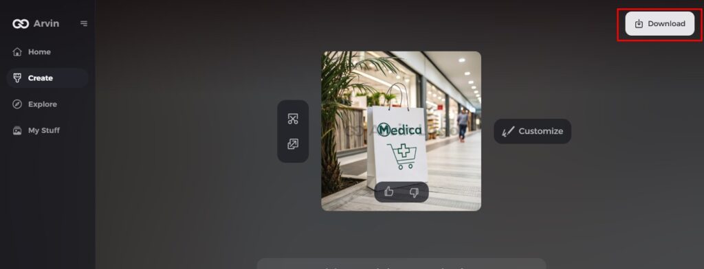
Step 6: Save and Download
Preview your logo, save it, and download it in high resolution for both print and digital use.
Conclusion
Designing an effective logo for an application is quite important when developing a brand and when you would like your application to be easily identifiable. It helps to remind the users about your app and in the same process it also helps in branding of the app. Arvin AI has provided a way through which you can easily develop app logo using artificial intelligence assistance. If you don’t want to pay anyone to design a logo, or don’t have the money to hire a designer, that’s not a problem. Logged into Arvin delivers you simple graphic design tools and multiple customizable choices to achieve an individualized logo for your app while giving your app the much-needed attention in the congested app store.
FAQs
Why is an app logo important for branding?
An app logo also helps the users to be able to recognize your application quickly. It represents an identity of your application that can make your application a winner among the competitors, and a strong logo does build trust and leaves a wonderful impression.
How do I choose the right color scheme for my app logo?
Choose colors that match your app’s purpose and appeal to your target audience. For example, blue is calming and trustworthy, while red is bold and attention-grabbing.
Can I create an effective logo without design experience?
Of course, you can. There are tools that will guide you through the process of making a logo, even when you don’t have a design background. AI-driven platforms like Arvin AI help you customize logos with zero design experience.
What file formats should I use for my app logo?
Common file formats for app logos include PNG, JPG, and SVG. PNG is great for transparency, JPG is good for general use, and SVG is perfect for scaling without losing quality.

