Audi is a German luxury car manufacturer belonging to Volkswagen AG Group. Founded in 1909, it has been a symbol of luxury and excellence. The four-ring Audi logo recognize worldwide. Symbolizes brand identity and has a rich history of evolution. The four iconic rings represent the merger of four automakers Holch, Audi, DKW. In this article, we research into the changes in the Audi logo in chronological order and introduce the main changes made over the years.
Part 1: 1909: Origin of Audi Logo
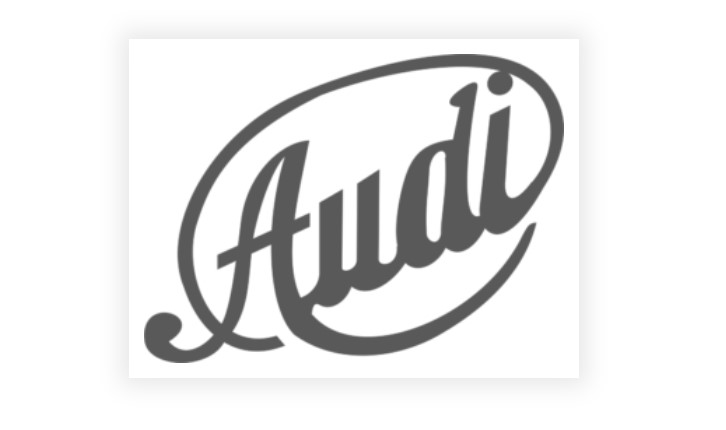
The audi logo before Audi was officially inaugurated was like tilting a stylish wordmark in a dark gray-based oval outline. The tail of “i” was elongated to wrap the word mark from the left. The tail of “A” also curves to the right and appears to be enclosing the wordmark with an underline. The symmetry of this is vey clear to its branding
Part 2: Time Wise Evolution of the Audi Logo Design
Decades of fascination go into shaping the audi logo of this brand, reflecting the progress and growing adaptation into changing automotive industry trends. This section covers the timeline of Audi’s four-ring cute logo, showing how its origins and symbolic meanings.
(1909-1910)
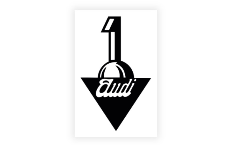
Shortly before Audi officially launched, this audi logo evolved into a number “1” above the half-circle and an inverse triangle below it. Inside the triangle, the character “Audi” was written in italics. This design highlighted Audi’s ambition to be at the forefront of the automotive market.
(1910-1932)
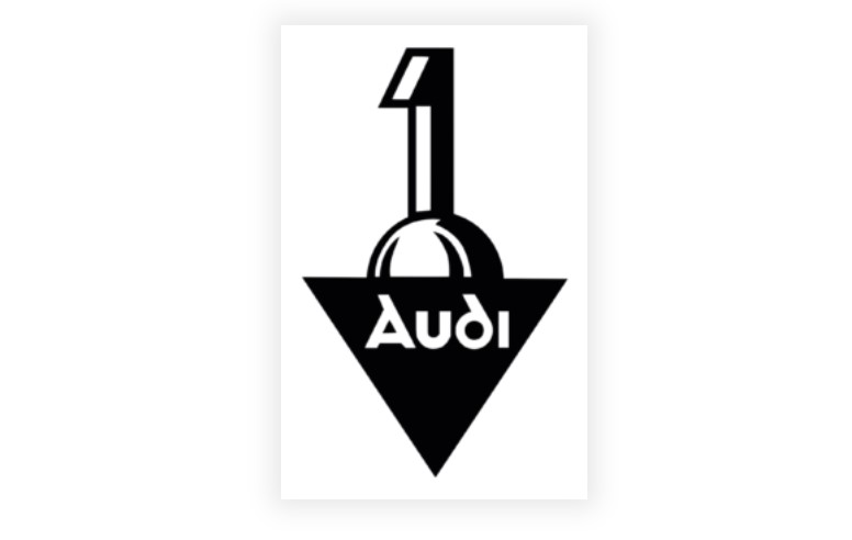
In 1910, Audi’s first official logo announced. The font of the company name became clear as it was. This audi logo used until 1932, when Audi changed significantly with the formation of the Automobile Union.
(1932-1949)
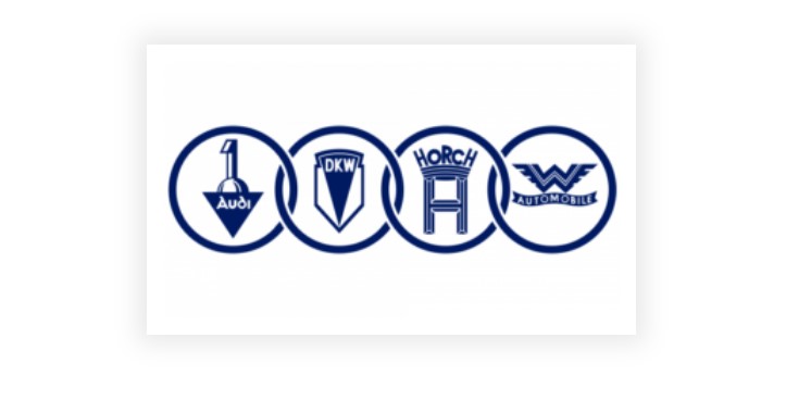
In 1932, four rings were introduced to symbolize the unity of the four founding companies. In the blue ring, this audi logo of each brand was painted in blue. The individual brands displayed in the logo were Audi, DKW, Holch, and Vandaler Automobiles. For the first time it changes its logo color from black to blue.
(1949-1969)
In 1949, the complex logo was simplified and individual logos were removed from the black ring. The new design shifted to a brand identity with a surplus horizontal rectangle with a simple white sans-serif typeface and “Auto Union” characters.
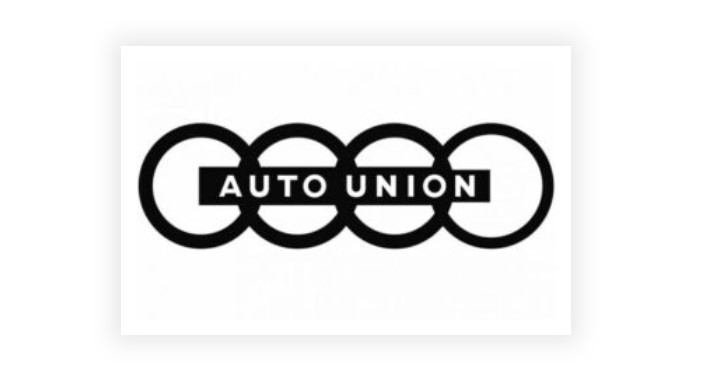
(1969)
In 1969, the NSU Motorenwerke AG became part of the Auto Union and the logo changed again. Instead of four rings, a large black rectangle introduced, and the letters “Audi NSU” drawn in a white sans-serif typeface.

(1969-1995)
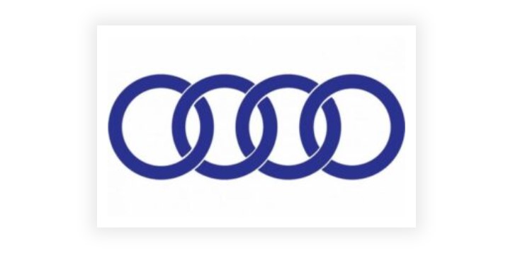
In 1969, Auto Union became Audi and the design of the badge logo changed. As a result, the badge of audi logo was a series of four thick blue rings. The four rings symbolize strength and confidence.
(1978-1995)
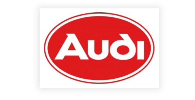
The 1978 logo had a red oval with a white sans-serif word mark. The double white and red outlines were also to ensure better contrast and make the logo look bright.
(1995-2009)
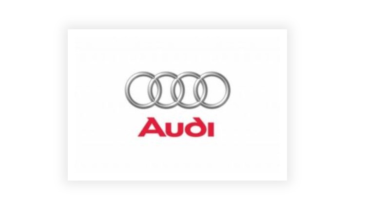
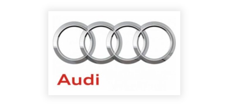
In 1995, the audi logo changed significantly, and the ring changed to silver. And the accompanying word mark was changed to ultra-thick red, and placed under the ring. This revamp marked Audi’s new era and reflected advances in.
(2009-2016)
In 2009, to celebrate Audi’s 100th anniversary, the logo further refined by giving the ring a three-dimensional feel. At the same time, the word mark was bright red, and it was small in the lower left of the ring. This design aims to balance elegance with contemporary beauty.
(2016 – Present)
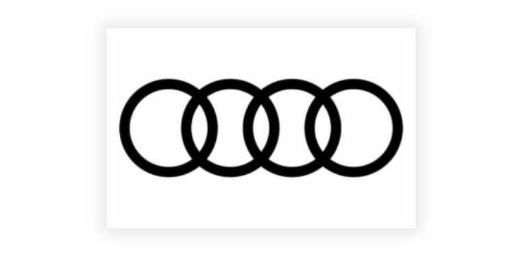
The most recent evolution occurred in 2016, when Audi removed the three-dimensional effect of the ring and wordmark and simplified the logo. The four rings expressed in a flat black design to emphasize a clean and modern aesthetic sense.
Part 4: Using Arvin AI – A Logo Design Understanding Tool
A good logo through insight and creativity which leads to precision. Audi logo is essential to well express what your brand embodies or represents in the most straightforward but most possible precise manner. At Arvin AI, the idea that will bring out beautiful logos through insightful input and action that can followed to make intricate processes merely one click.
Key Features of Arvin AI
- AI Design Recommendations: Arvin AI offers brand-specific design suggestions according to the industry, values, and mission of your brand.
- Real-time Feedback: You try all kinds of design elements, and you get real-time feedback from Arvin AI on issues such as symmetry, balance, and visual.
- Customization Options: You can play with so much with regard to spacing, proportions, and even typography.
- Trend Analysis: Arvin AI tracks all the emerging design trends and keeps updating to ensure that your audi logo remains relevant and competitive in the market.
Steps to Use Arvin AI for making Logo
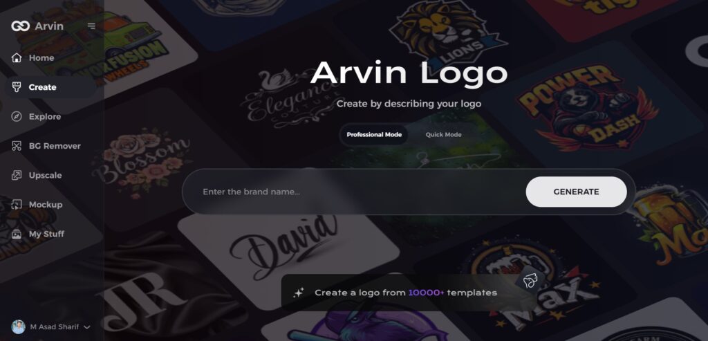
Step 1: Access the Arvin AI Design Page
Open your web browser and navigate to the logo creation page at Arvin Logo to begin crafting your logo.
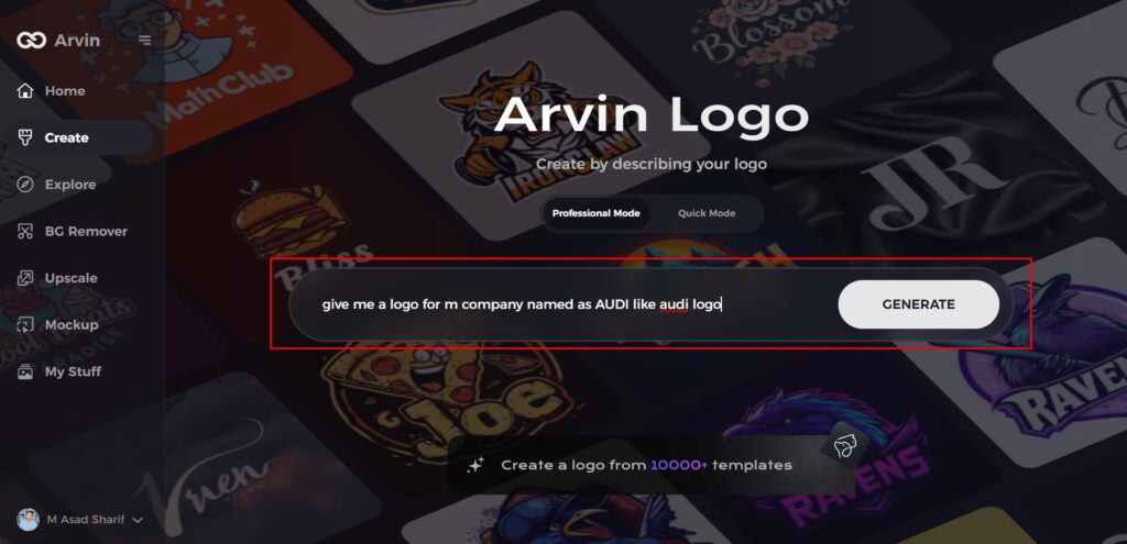
Step 2: Enter Your Business Details
Provide key information like your business name and category. These inputs help the AI tailor designs that align with your brand’s identity.
Step 3: Specify Your Industry
Select your industry from the provided list. This allows the AI to focus on styles and themes relevant to your sector.
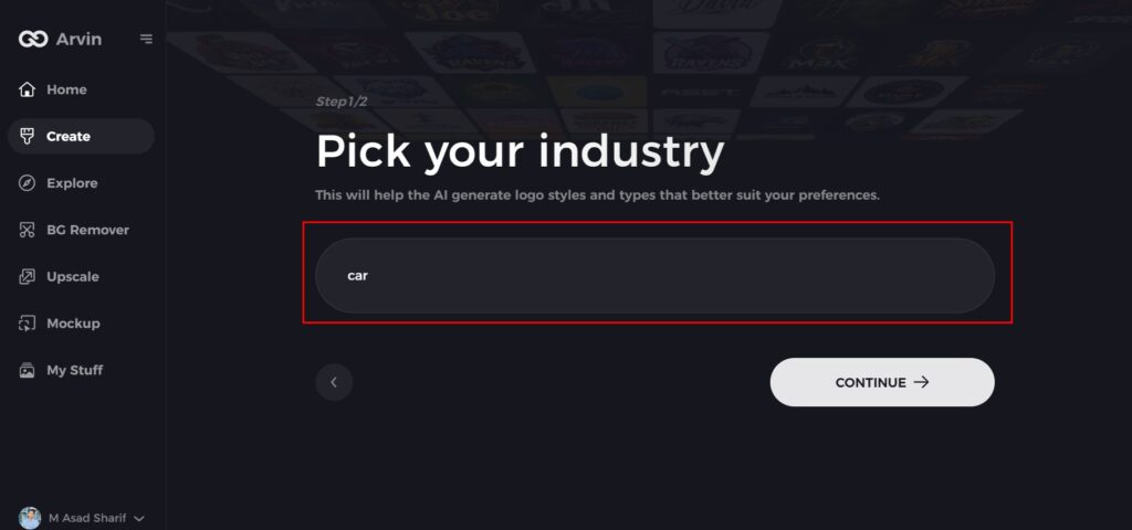
Step 4: Choose a Design Style
Browse through the available styles and pick one that resonates with your brand’s vision. If you’re unsure, skip this step, and let the AI generate designs based on its default inspirations.
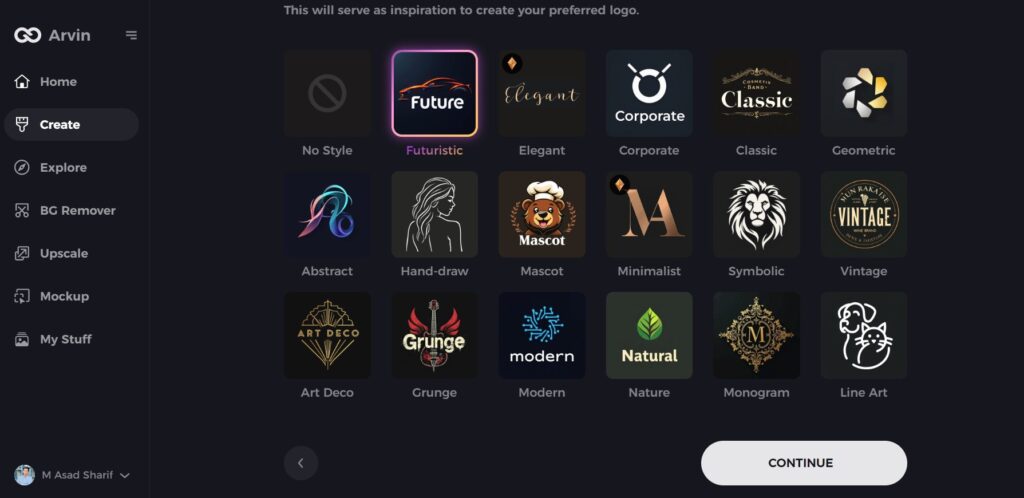
Step 5: Explore Logo Concepts
Review a variety of logo ideas generated by the AI based on your inputs. Select the concepts that best reflect your brand’s image.
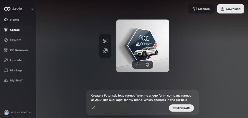
Step 6: Customize Your Logo
Fine-tune your selected design by adjusting elements like colors, fonts, icons, and layouts to create a unique representation of your brand.
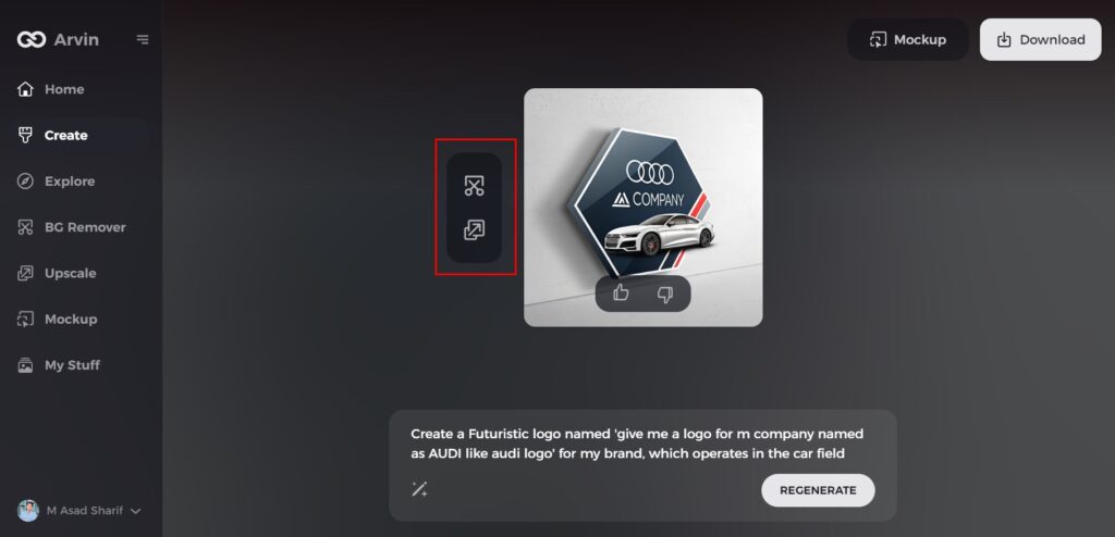
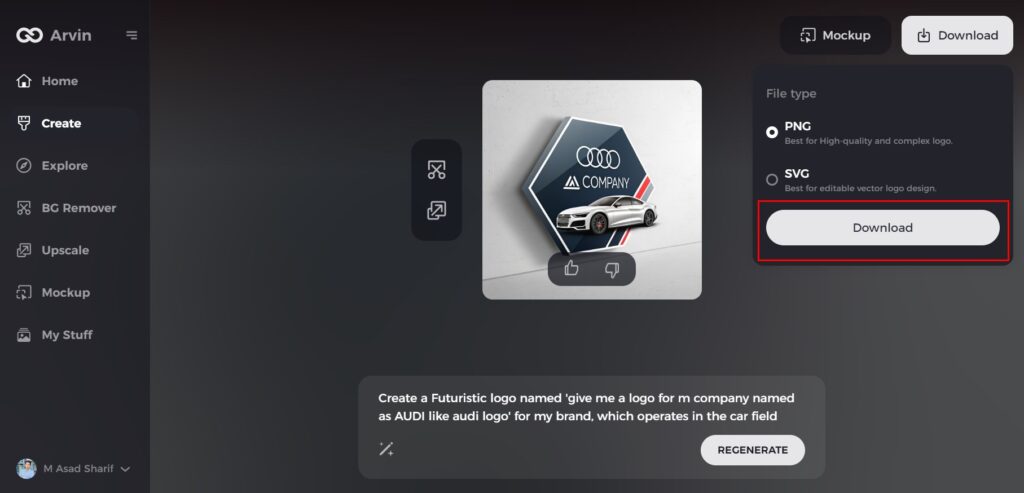
Step 7: Download Your Final Design
Once satisfied with your logo, download it in high-quality formats like PNG or SVG, ensuring it’s ready for use across digital platforms and print materials.
Conclusion
From commitment to excellence, innovation, and luxury, the Audi logo symbol of a heritage built on precision and performance through history. The four rings from humble beginnings in Auto Union to its modern design stand for the best of legacy in the car-making world. Tools like Arvin AI transform the way of logo design. What Arvin AI does is it makes possible the merging of artificial intelligence with design.
FAQs
What do the four rings in the Audi logo symbolize?
The four rings stand for the four companies that began Auto Union, namely, Audi, DKW, Horch, and Wanderer.
Why does the Audi logo vary across various eras?
Audi revamped its logotype to convey innovation, luxury, and sustainability. The same values became the core of the brand, as well as what the market expected from the brand.
In which manner does the logo of Audi exhibit innovative spirit of the brand?
The sleek modern style of Audi logos symbolize state-of-art technology and the high performance level.
Can I create my custom-made logo using Arvin AI?
Yes, as tools in the designing of Arvin AI on the basis of color, type of font and other visual aspects provide insights and gives a stronger brand identity.


