The Power BI logo is not just a simple graphic. It is an integral part of the branding and identity of Microsoft’s powerful Business Intelligence (BI) tool, Power BI. Power BI is an analytics service that delivers insights to businesses by visualizing and reporting on data. The Power BI logo represents these core values — whether it’s the transformation of raw data into actionable intelligence or simplifying complex information. Here are the evolution, symbolism, and impact of Power BI logo in the coming paragraphs.
Part 1: What is Power BI?
Microsoft Power BI is a set of business analytics tools from Microsoft to convert raw data into useful insights. Power BI helps you create interactive reports, dashboards, and data visualizations by connecting to various data sources. It offers live analytical capabilities and visual narrative to help businesses, development departments, etc. in making data-driven decisions. Today Power BI is so crucial for organizations to analyze their data and boost their business.
Part 2: The Evolution of the Power BI Logo: A Historical Overview
The Power BI logo has changed quite a bit since the beginning, just like the software itself. Every such redesign reflects the changing trends in branding and design patterns, and each version has been carefully developed in the context of Microsoft’s identity and Power BI’s rising role in the business intelligence and analytics sector.
2011-2013
Everything started in 2011 when the first iteration of the Power BI logo was created along with the tool itself. This logo was relatively basic but got the message out well. The original design was based on the idea of a table, with some bars aligned to form the grid. The clean look of the logo represented that period in Power BI’s evolution, which was during the years when the platform was primarily about basic data visualizations.
2013-2016
The Microsoft Power BI logo received a major overhaul in 2013. The design got more dynamic, featuring chunky yellow bars in front of a white background. The logo became a more abstract shape which reflects that Power BI is able to convert raw data into insightful visualizations. Choosing a colour like yellow was also strategic, as it calls to mind energy, optimism, and clarity — attributes that are aligned to the Power BI platform’s mission of making data analysis easy.
2016-2020
The mid-2016 overhaul was more polished and corporate, placing more emphasis on a cleaner, starker feel. The bars in the logo became rounded and the grid-like design was removed. The new version was an upgrade — version 14 — that offered a more refined appearance in keeping with the maturity of the software and the growing sophistication of many of its capabilities. The use of a white and minimalistic design also reflected larger trends in design and branding in the tech sector.
2020-Present
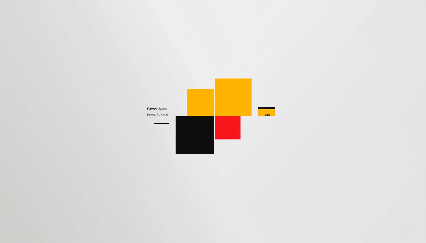
The last version of the Power BI logo was introduced in 2020, when Microsoft started an overall design transformation. In it, classics columns styled in various shades of yellow overlap and conform to one another like a highly optimized set of data points from different databases, talking about the same subject. The logo design is some clean professional design relevant to cutting-edge capabilities of Power BI. There is an emphasis on simplicity and clarity, which aligns well with the Power BI mission statement of transforming complex data into actionable insights.
Part 3: Exploring the Symbolism Behind the Power BI Logo Design
The Power BI logo is more than just a design. From each brush stroke to line in the logo, everything has been deliberated upon and crafted to reflect the mission and vision behind the software. Now let’s dig a little bit into why certain animals were designed to look the way they were.
Geometric Shapes and Bars
The Power BI logo makes use of geometric shapes, most notably the bars and columns, to represent data in the most basic way possible. Bars, graphs or tables are often used to present data, but these shapes succinctly represent Power BI’s raison d’être: to help people visualize and analyze complex data. The vertical bars depict growth and advancement, which ties into the software’s purpose of aiding businesses in their growth through informed decision-making.
Yellow and Gray Color Scheme
The color palette of a logo always supports the composition of the software message. Yellow, the main color, is a color of energy, optimism, and clarity. Simplifying data analysis into these are the values that Power BI aims to deliver to end users. All the versions have the logo in gradient gray color, which stands for professionalism, sophistication, and depth, demonstrating Power BI’s capacity to manage extensive, complex data and transform it into valuable business insights.
Minimalist Design
The logo’s minimalist design mirrors the intuitive design and user-friendly interface of the Power BI software. The clean lines and tiering columns show the joining of multiple data sources into one cohesive concepts. The simplicity of the logo also contributes an aspect of accessibility, implying that Power BI offers a means of bite-sized data analysis.
Part 4: Power BI Logo’s Font and Color Scheme Explained
The font and logo’s color are important in reflecting the message of the brand. For example, if we were carrying out the tasks you mentioned for Power BI, any design decisions we made were made to convey clarity, energy, and professionalism.
Font Style
There’s no lettering in the emblem of Power BI sign, the graphic stylization is enough to explain the brand. However, the pairing with the company’s official font, Segoe UI gives the overall aesthetic a modern, clean, and approachable look which is in line with the user-friendly spirit of the tool.
Color Scheme
The previous explanation still stands, but, Power BI essentially uses a much bigger yellow design in its logo. Yellow a color often associated with positivity, energy, and clarity — all prominent characteristics of the Power BI software. The use of gray gradients that were foreshadowed in earlier renditions of the logo, lend a level of professionalism and sophistication while keeping the logo grounded and authoritative, but clean and inviting.
Part 5: The Power BI Logo in Branding and Recognition
The Power BI logo is a key part in the overall branding of Microsoft’s business intelligence tool. A good logo is not merely a decorative element but rather an embodiment of the firm’s principles, goals, and usability.
Brand Recognition
But you can view the Power BI logo which is unique and colorful. This recognition plays a crucial role in establishing trust and credibility among users. A single, memorable logo allows the users to immediately connect the software with its functionality, creating brand loyalty.
Visual Identity
The clean and professional logo enhances the visual identity of Power BI and embodies the innovative tool that simplifies complex data. Additionally, the logo reflects the larger Microsoft brand as a whole, stealing the design language from other Microsoft products and services.
Part 6: Why the Power BI Logo is Essential for Its Brand Identity
A logo is usually the first element a customer engages with when they are exposed to a brand. As with Power BI, a good logo is an integral part of the company’s image and promotes recognition and consumer trust.
Consistency in Branding
Keep in mind that logo design must be consistent and will help in building the identity of your brand. The Power BI icon has never changed much, so the new look, sets it nicely apart for Microsoft’s business intelligence platform. This helps to solidify the software’s prowess and credibility.
Trust and Expertise
The Power BI logo is an emblem of experience and trust within the business intelligence arena. The design is professional and authoritative in nature, and this is important for a tool employed by companies and organizations in order to base decisions on facts.
Part 7: Design Your Professional Logo
Designing a logo is a vital element of developing a business’s identity. However, when you are designing a logo with Arvin AI that captures your brand’s values, you’ll be on your way to achieving that goal. Arvin AI is an artificial intelligence-powered logo maker that helps you design logos in minutes without needing any design skills.
Key Features of Arvin AI
- User-friendly Interface: Arvin AI designed to be accessible to both beginners and professionals. Its simple interface allows users to create custom logos without any design experience.
- Customizable Designs: Whether you’re looking to create a logo similar to Power BI’s or a completely unique design, Arvin AI offers a wide range of customization options to meet your needs.
- AI-powered Creativity: Arvin AI uses advanced algorithms to generate creative logo ideas based on your input, offering suggestions and inspiration as you design.
- Versatile Logo Styles: With Arvin AI, you can experiment with various logo styles, from minimalist designs to more intricate logos, ensuring that the final product aligns with your brand’s identity.
Steps to Use Arvin AI for making Logo
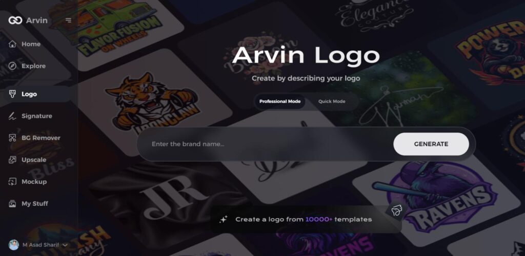
Step 1: Visit Arvin AI’s Website
Open your browser and navigate to the Arvin AI logo design page at Arvin AI to begin crafting your logo.
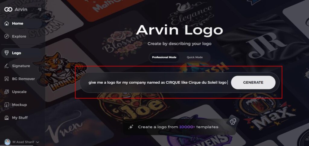
Step 2: Enter Your Business Information
Provide key details such as your business name and category. This helps the AI tailor the designs to match your brand’s identity.
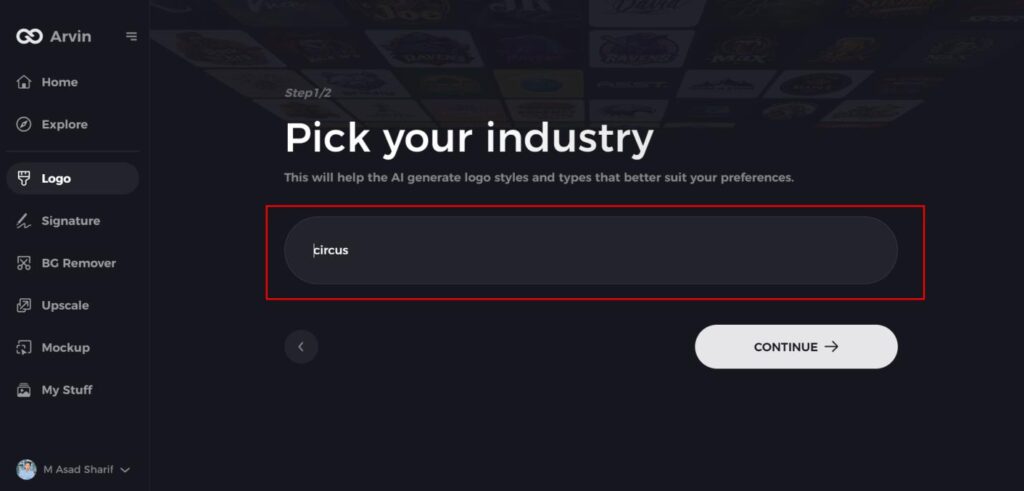
Step 3: Choose Your Industry
Select the appropriate industry from the list. This will help the AI focus on logo styles and options best suited for your field.
Step 4: Select a Logo Style
Browse through the available styles and pick one that aligns with your brand’s vision. If unsure, you can skip this step, and the AI will suggest a default design.
Step 5: Generate Logo Ideas
The AI will create a variety of logos based on your inputs. Review these options to find the one that best represents your brand.
Step 6: Customize Your Logo
Refine your selected design by adjusting elements like colors, fonts, icons, and layouts to fit your preferences.
Step 7: Download Your Logo
Once satisfied with the final design, download your logo in formats like PNG or SVG. These formats ensure your logo is ready for use on websites, social media, and print.
Conclusion
The Power BI logo is greater than an icon; it encompasses the journey of the software, design tenets, and aim of empowering everybody with data insight. From its previous versions till its contemporary minimalistic style, the logo represent clarity, energy, and professional. Arvin AI is a state-of-the-art AI logo maker that you can use to make a custom logo just for your brand. Arvin AI Sign the best professional logo for your brand identity.
Frequently Asked Questions (FAQs)
What Power BI is used for?
Microsoft Power BI is a data visualization and reporting platform that is used by businesses and professionals every day.
How has the Power BI logo evolved throughout the years?
The Power BI logo transformed from a basic design to a minimalist, contemporary logo, showing the evolution and refinement of the software.
Can Arvin AI help me create a custom logo like Power BI’s?
Yes, Arvin AI allows you to create custom logos, including designs inspired by Power BI, with various customization options to suit your brand’s needs.
What do the colors in the Power BI logo represent?
The yellow in the Power BI logo represents energy and optimism, while gray adds a sense of professionalism and depth, aligning with the software’s mission.