Aldi is one of the most popular brands in the global retailing industry. Here is how the logotype of Aldi helps it reach that success: an outline of the evolution of the Aldi logo, explanation of its meaning, and identification of its main features. Throughout the years, the logo has changed with respect to the core values of the company: commitment to the quality of goods sold and a modern approach. The background, design evolution, color psychology, and meaning of the Aldi logo are all discussed in this article.
Part 2: The History and Evolution of the Aldi Logo
The Aldi logo has undergone several transformations since its very inception. Understanding such changes gives one insight into how the company developed its strategic brand evolution. The European supermarket chain, Aldi has three distinct visual identities, but the color palette is still being maintained by the brand today only with minor variations. The proper color usage with interesting geometric lines from the Aldi logo gives off a loud, powerful, yet bright impression.
1948 – 1957
The square logo has an excellent red tone. The bold red background draws attention immediately and becomes a strong assertion. On the front side, the letter “Albrecht” is written in pure white, contrasting with the red. The font is simple yet modern, and each character is placed at proper distances. Above the brand name, the words “Karl” and “Lebensmittel” are gently placed opposite the polar. This is a very minimalist design but gives you confidence and reliability. The dominant colors with simple typography give it a feeling of reliability and solidity, which can found with long-established brands.
1957 – 1963
On the canvas, there is a dominating red rectangular framework that is as classic as modern touch. In the center of this red frame, it displays the brand name “Albrecht” in innocent white letters. The typography is elegant yet assertive and certainly inscribed in the hearts of the viewer. From the curve of A “to the rugged base of” t, “each letter expressed accuracy. A design that strips off unnecessary graphics and details, giving more prominence to the brand name. The very evident approach reflects the brand’s confidence in its identity, and minimalism spells sophistication with finesse.
1963 – 1968
The ALBRECHT logo quickly draws attention with its bold typography and clean design. The rectangle has in the background in capital letters “ALBRECHT.” White font on rich royal blue is a good choice to create sharp contrast, so that it will be visible even from afar, and readable. The rectangular shape is stable and reliable, but the blue color reminds us of trust and trust. The very simple design makes it suitable for any sort of media presentation – digital, print, and signage.
1968 – 1975
There is again, in the version of ALBRECHT, almost slight nuances, however the same good design element was carried forward. Once again, ALBRECHT’s strong all-cap typography takes over the visual field and makes for a very strong brand awareness. The deep purple color used for the background is luxurious, refined, and prestigious. Bold white characters emphasize clarity and accuracy in contrast to this stately background. The minimalist approach focuses on brand names, remains in memory, and is readily recognizable.
1975 – 1982
The original Aldi logo was designed in 1970, and the simple white logotype was placed in a bright purple banner with a white thin outline. The word mark lettering is a thick sans-serif typeface, characterized by thick lines and linear character cuts. The contrast between white and purple made the modest logo bright and impressive, showing that it is a strong and professional company.
1982 – 2006
In a 1982 development change, Aldi obtained a graphical mark that accompanied the white word mark. The new composition features a vertical purple rectangle in a thick frame of orange and coral red. The white word mark is put at the bottom of the mark, underneath the light blue icon, and the left side of the letter “A” is drawn with a light blue line.
2006 – 2017
In 2006, the shape of Aldi’s logo and the logotype was a modern, fashionable, new, thin font. For the graphical element, part of the stylized letter “A” made up of three diagonal lines and three horizontal light blue lines was still used. But the gap is wider. The orange border replaced with a yellow border, and the whole composition became clearer and fresher.
2017 – Now
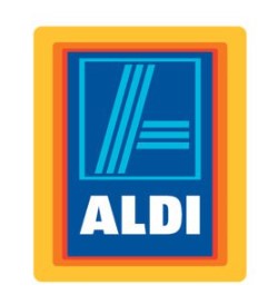
In 2017, Aldi overhauled the visual identity of the brand, repainting stripe A using a smooth gradient ribbon. The style of lettering also evolved to a smarter, softer typeface that features rounded corners and edges. The color palette of the logo maintained through this style, making the whole image look brighter and stronger.
Color and Background
The first logo of the network was a combination of red background (dynamics, brain) and white font (suppression, nobility). In the 1960s, the main color was already blue, and white fonts remained in the background. For the first time in the 1980s, logo creators realized that no color needed. And the logo became a vertical rectangle.
In the frame of the blue background are white logos and blue symbols, that is, three blue stripes diagonally across the field of the logo, and elements of a characters, consisting of three horizontally arranged similar bands. Over the next few years, minor changes made, such as fonts, colors and line thickness, but no fundamental changes made to the logo.
Part 4: The Significance of Simplicity in Aldi’s Logo Design
Simplicity is at the heart of Aldi’s logo design. Minimalism, not only making the logo memorable but also easy to adapt to and scalable for various mediums. At a time when information overload and advertising assaults bombard the minds of consumers, an easily distinguishable logo leaves an impact. The clean lines and basic colors used in the logo of Aldi make sure it is visible at all stages-from billboard boards to mobile phone screens.
Part 5: How Arvin AI Can Help You Enhance Your Brand’s Visual Identity
Just like Aldi has utilized design principles to create a solid visual identity, businesses today can use innovative AI tools such as Arvin AI to create their logos. Arvin AI utilizes advanced algorithms that generate professional logos tailored to your business needs so that your brand’s identity speaks to your target audience.
Key Features of Arvin AI
- Easy User Interface: Arvin AI offers an easy and intuitive interface for users to design professional logos without requiring a single ounce of designing skills.
- Customization: Using a broad industry-specific template, Arvin AI helps the user in personalizing their logo according to business needs and adding that personal touch to any brand.
- Color and Typography: Arvin AI offers a rich palette of colors and font styles. This allows the user to try different combinations that can best reflect the brand identity.
- Instant Logo Previews: Users can preview their logo designs on various mediums, from business cards to websites, ensuring that the final logo looks great across all platforms.
Steps to Use Arvin AI for making Logo
Step 1: Create an account and log in on Arvin AI
Visit the website of Arvin AI open an account, and log in for the logo design feature.
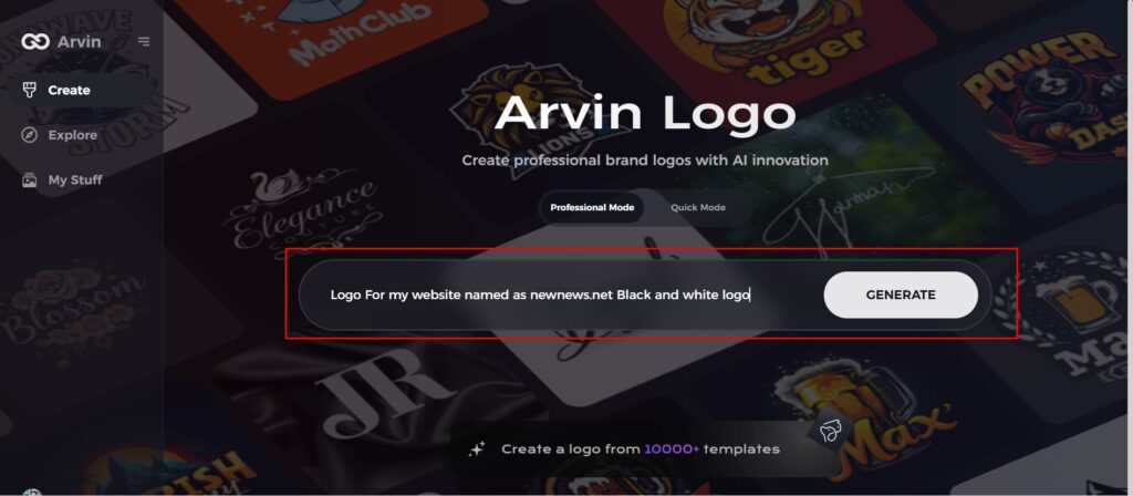
Step 2: Input your brand information and preferences
Input your brand name, slogan, and industry. Specify all your design preferences, which may include font styles or images themes.
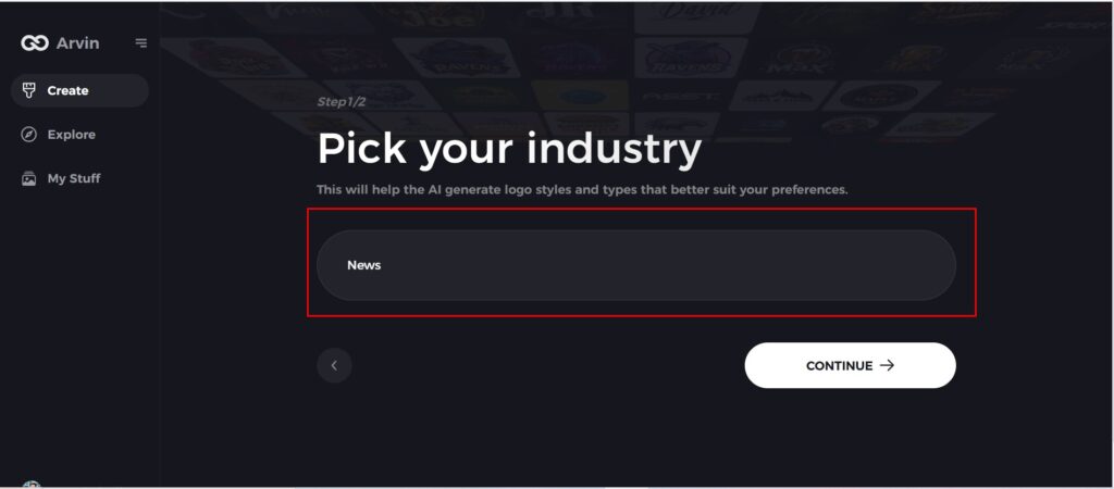
Step 3: Pick your industry:
Now select your industry related to your niche. This will help the AI generate logo styles and types that better suit your preferences.
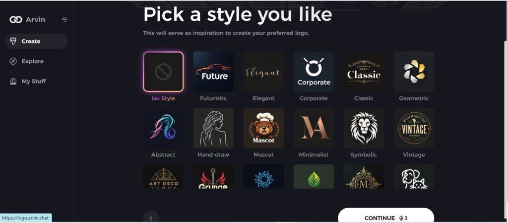
Step 4: Select Style:
Now select a style which you would like and continue. This will serve as inspiration to create your preferred logo.
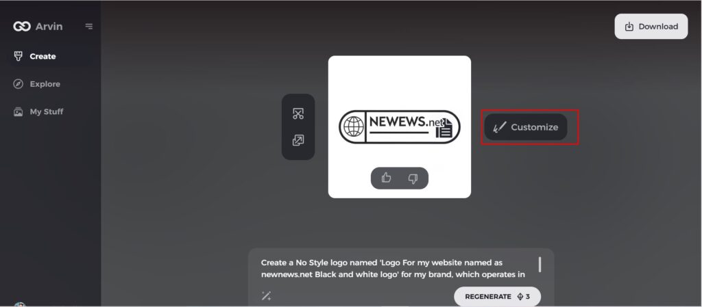
Step 5: Design Personalize through the tools of Arvin AI
After Arvin AI gives create your logo, you can customize those logos with the tools that have elements such as font style, layout, and the positioning of symbols. Experiment on different designs until you like what you see.
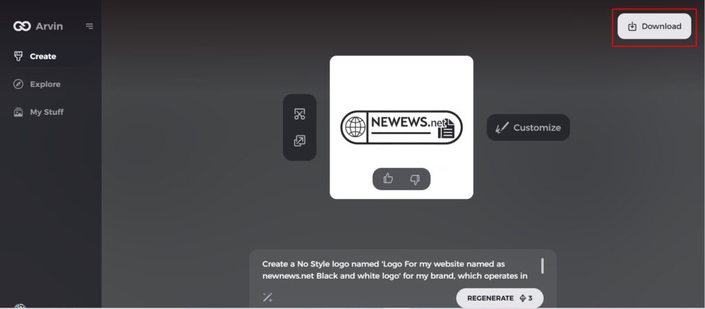
Step 6: Save and download the final logo
Preview the finished logo and save it in a high-resolution format for both print and digital uses.
Conclusion
The Aldi logo has seen transformations over decades, reflecting a brand that not only grows but also never deviates from the quality and price considered across the zone of its reputation. From very simple beginnings in 1948, their logos have transformed to fit modern designs and are an integral part of the company’s success. If you want your own brand to have its own Logo that has the potential to increase its visibility and recognition then get Arvin AI for your logo designing now!
FAQ about Aldi Logo
Why does Aldi have two logos?
Aldi was actually split into two different companies following a feud between the founding brothers about whether to sell cigarettes at the store or not. Aldi Sud is the store Australians are used to, it also operates in China and much of Europe, including the United Kingdom and Ireland.
Why has Aldi Changed their Logo?
The first important design made in 1957 with a red background and more accurate typography. It demonstart evolving capabilities and long standing commitment to serve customers.
How has the Aldi logo evolved over the years?
It was a black and white simple logo in 1948, changing into the one we see nowadays as modernized and streamlined and changing in 1957, 1963, 1968, and 2006.
How can I use Arvin AI to create a logo for my business?
Simply access Arvin AI’s platform, input your brand preferences, choose from customizable templates, and let the AI generate a logo that suits your business needs.
