Speaking about the world’s best fast food chain, the name of Chick Fil A comes to mind immediately. It is a famous fast food chain in America. Therefore, the Chick Fil A logo is popular with many Americans, especially those who like fast food with chicken. It refers to companies that have been active in the American market since the 1960s. This blog details the history of the Chick Fil A logo. We will inform you how the logo was created and changed from time to time for various reasons.
Part 1: Meaning and History of Chick Fil A Logo
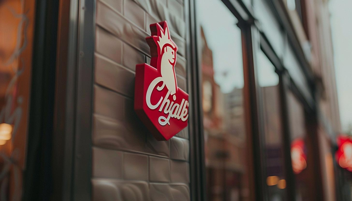
The visual identity of Chick Fil A logo is based on a combination of red and black rhythm but powerful logo colors that can make any character or image modern and powerful. The cool and friendly emblem of this brand is quite powerful in itself, but not many times in the company’s history, it is a stunning example of how redesign enhances the image without losing individuality and reflects the progress and growth of the brand.
1960 – 1963
It was a fun and stunning badge consisting of a black and red chicken lateral face placed on the left side from the handwritten logotype. The chicken turned right and was painted in a cartoonish way with a smiling face and cunning eyes.
1963 – 1964
The new Chick Fil A Logo leaves all elements of the previous version. However, the head of the chicken was not so large and placed in a low position. The letter “Best Thing That Ever Happened to a Chicken,” written in bold at the bottom, is gone. In addition, two red hyphens were entered, one “L” disappeared from the phrase, and the letter “A” became larger and colored red. By adding red elements, the visual identity of the balanced brand was completed.
1964 – 1975
The 1970 design change made Chick Fil A is one of the iconic logos known all over the world today. The new logo was recognizable thanks to the same tone and chicken head illustrations. In the latter, the capital letter “C” styled into chickens and became part of the inscription. On the right side of the stylized letter “C,” there is a black open beak, inside it is a small red eye, and on it there are four solid red ellipses, constituting the horizontal face of the bird.
1975 – 1985
The previous Chick Fil A Logo version has only minimal changes. The black characters used the same custom typeface with rounded shapes and smooth lines thickened. The updated version is easy to see even from a distance and becomes a more confident logo with a foot on the ground.
1985 – 1998
In 1985, the color palette of the Chick Fil A Logo changed slightly by darker red shades. This did not affect the appearance or recognition of the emblem, and it became a more balanced professional logo.
1998 – 2012
In 1998, the company began drawing the Chick Fil A Logo in red and placing it in white. There is no black detail left on the emblem, the new red and white palette gives a strong and passionate impression, expressing the love and warmth that the brand tends to give its customers.
2012 – Present
In the 2012 redesign, the outline of the iconic Chick Fil A Logo refined and the chicken beak closed. The new emblem looks fresh, stylish, and very modern today, and reflects the essence and purpose of the company.
Part 2: Design Elements of Chick Fil A logo
Design are very important for branding of a good logo. Following are the main elements of Chick Fil A logo:
Old Mascot
The original mascot of the chain was a personified chicken called Doodles. Later, it replaced by a cow, but it still appears as part of the “C” logo.
Emblem and advertising controversy
The Chick Fil A chain is notorious for its ultra-protective policies on branding and is called “corporate bullying.” In particular, the use of the phrase “eat more,” which is part of Chick Philla’s slogan “eat more chicken,” resulted in a significant number of companies receiving exclusion orders from the company. Interestingly, the company successfully protested over 30 opponents using the phrase eat more.
Font
Have you ever noticed that the Chick-fil-A logo stands out among many logos? Many of them relate to the unique typefaces they use. These are not ready-made logo fonts, but a custom-made font specifically designed to reflect the brand’s personality.
Part 3: What You can Learn from the Chick Fil A logo
Through all the changes, the Chick Fil A logo gives us many valuable lessons. This is why this brand has been recognized for many years.
Adaptation to Modern
The long-standing evolution of the Chick-fil-A logo demonstrates the ability to adapt to the changing times while maintaining the brand’s core identity. The logo has not changed in many ways, but the colors, designs, and artwork have all changed according to the times, giving the brand a fresh impression. A gold bowtie bearing chrome accents symbolizes both Chevrolet’s historic roots alongside its innovative nature together with its dedication to top-quality products.
Branding consistency
Many brands see the logo completely different from the original, but Chic Fil A does not. Even though the logo has been changed many times, Tic Fila maintains consistency in branding elements, from color scheme to font selection to mascot. Even the original logo made in the 1960s is similar to that used today. This consistency creates brand awareness and demonstrates loyalty to core values and history.
Effective Marketing Campaigns
The iconic Eat More Chicken campaign, featuring rebellious cattle defending chicken consumption, demonstrates the power of creative and memorable marketing strategies. Doodles tried to be creative and new when it seemed that the traction of the brand as expected gone. By leveraging humor and storyline, Chick File A effectively attracts viewers and enhances brand messages.
Part 4: Impact of the Check Fil A logo
A logo is not only a symbol—a symbol of the brand’s values, reputation, and identity. Chick-fil-A’s red signature color and playful chicken-themed letters are now instantaneously recognizable. How has this shaped customer attitude, brand commitment, and commercial achievement? This section will outline the effects of the Chick-fil-A logo and why it has been successful.
Resonant Logo
The Chick-fil-A logo deeply rooted in symbolism and timeless design, creating the empathy of millions. It is a testament to the brand’s passion for quality and taste, and for serving delicious chicken.
Be loyal to your brand
The logo perfectly reflects the essence of the brand. Bold, unique and all chicken. Like Chick-fil-A. So, if you see this logo on a sign, a bag for takeaway, or a façade of a restaurant, you should feel fun.
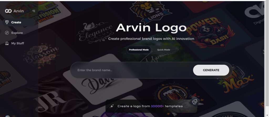
Part 5: Arvin AI: The Future of Brand and Logo Insights
Logos are imperative for businesses, and an analysis of logos can help to a company growth. Arvin AI is a smart program that is designed to help businesses evaluate and upgrade their branding. It provides feedback on logo awareness, competitor identification, and optimizing brands. With Arvin logo maker, businesses can discover how their logos perform in the marketplace and make knowledgeable changes to stand out. This section will address the most critical aspects of Arvin AI and how it aids in brand analysis.
Key Features of Arvin AI
- Logo Recognition: Scans logos and provides feedback on performance.
- Competitor Analysis: Compares branding strategies to competitors.
- Brand Improvement Insights: Suggests changes to enhance the appeal and recognition of the logo for the brand.
- Color and Font Analysis: Evaluates the effectiveness of the color hues and font in branding.
- Market Trend Prediction: Utilizes data to predict future branding trends and keep businesses ahead.
- Customer Perception Insights: Analyzes how customers perceive a brand’s logo and identity as a whole.
Steps to Use Arvin AI for Logo Creation
Step 1: Visit the Arvin AI Website
Open your web browser and go to the Arvin AI logo maker page to begin designing your logo.
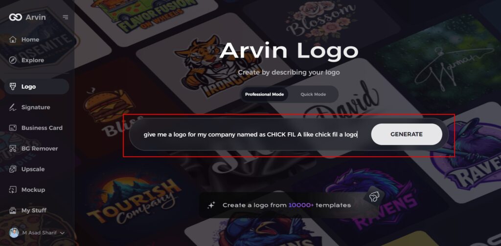
Step 2: Enter Your Business Details
Provide essential information like your business name and category. This helps the AI generate logos tailored to your brand.
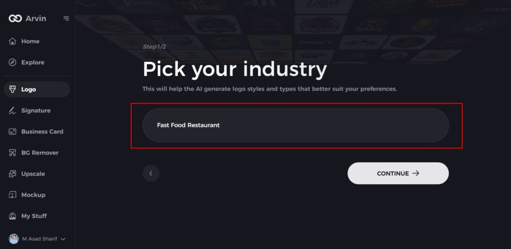
Step 3: Select Your Industry
Choose an industry from the available options. This helps the AI refine logo styles based on your business type.
Step 4: Choose a Style
Browse through different logo styles and select one that matches your brand’s identity. If unsure, skip this step, and the AI will generate a design based on default inspiration.
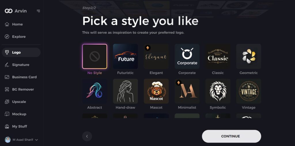
Step 5: Explore Logo Ideas
Arvin AI will create multiple logo concepts based on your inputs. Review the options and pick one that fits your brand image.
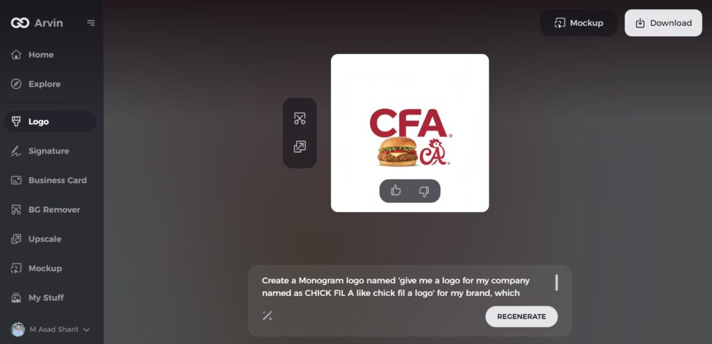
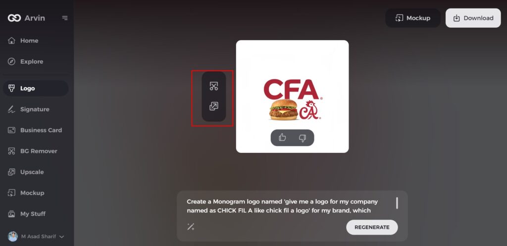
Step 6: Customize Your Logo
Adjust colors, fonts, icons, and layouts to align the logo with your brand’s style.
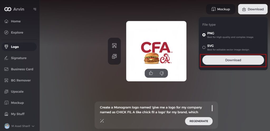
Step 7: Download Your Logo
Once satisfied with the design, download your logo in formats like PNG or SVG for use on websites, social media, and marketing materials.
Conclusion
The Chick Fil A logo evolved over time but is consistent in its fundamental identity. A reliable logo assists both customers in recognizing the brand while increasing company commitment and enabling profitable advertising campaigns. A proper branding process empowers Chick Fil A logo to achieve memorability through creative development and persistent implementation of their logo. Chick-fil-A demonstrates an effective branding method which other organizations can adopt. Technology like Arvin allows companies to check out their logos, compare them to competitors, and make smart design changes.
FAQs
Why did Chick-fil-A change its logo over the years?
The famous fast-food chain Chick-fil-A reworked its logo to match contemporary design standards yet maintain its original unique features.
What does the Chick-fil-A logo mean?
The logo represents hospitality, warmth, and great food. The application of red color, script lettering, and the chicken-shaped ‘C’ represents the warm nature of the service and dedication to delicious chicken food.
How is Chick-fil-A’s logo different from others?
Chick-fil-A’s logo stands out because it is professional and playful. Contrary to McDonald’s or KFC, which are face or symbol-oriented, Chick-fil-A joins a chicken factor in the text.
How can Arvin AI help brands improve their logos?
Customers can conduct effectiveness checks on logo performance and benchmark competitor branding through Arvin AI alongside getting design recommendations.
