Speaking of Forbes brands, many people may think of the list of wealthy people who appear regularly in the magazine. The magazine has also authoritative ratings, writing on entrepreneurial success and failure talks, new ideas for business and investment. Forbes has access to CEOs, politicians, and opinion leaders to obtain information from the most knowledgeable sources.This simple logo communicates daily with rich and influential corporate executives around the world. These emblems reach these transformers on magazine covers, websites, social media handle names, and other targeted promotional channels.
Part 1: History of the Forbes logo
Forbes magazine founded in 1917, and a year later the first millionaire list published. Bertie Charles Forbes created this list. He was born in a Scottish tailor’s house in 1880 as the sixth of ten brothers. Thanks to his talent and diligence, Bertie became the most famous financial journalist in America.
1917-1918
By the time B.C. Forbes founded the magazine, Europe and the United States were thoroughly industrialized. Forbes-lauded business leaders made life more convenient and products more accessible. However, many people felt that mass-produced products were less quality than traditional handmade products. In the late 19th century, the Art and Crafts Movement promoted a return to handicrafts. This movement influenced printing and typography.
1918-1922
Forbes did not maintain the original logo for long. Although global events did not delay the magazine’s debut, it seems to have influenced the colorful logos. Within 12 months of the magazine’s inception, World War I, then known as the War to End All Wars, ended, and the devastating 1918 flu pandemic swept the world. With shells, mustard gas, and disease, the world has seen, in a short period of time, unthinkable deaths.
1922-1924
When the US entered the twenties, Forbes magazine added a decorative touch to the logo, though not as much as the first one. The curved lines at the end of the letter remind me of a more modest swash. The magazine also reversed the color palette. Instead of black letters, the black rectangle uses white letters, and two parallel white lines edge the top and bottom of the mark.
1924-1925
The white logo on the black rectangular emblem had advantages and disadvantages. While the logo has the advantage of being always readable, the choice of cover design was limited. The cover must always be designed around the logo, and the emblem itself looks disgusting. Forbes slimmed the logo by replacing the rectangle with a thin black outline around the white letters. This makes it a versatile logo that is easy to read on any background without taking space.
1925-1930
For the remainder of the twenties, Forbes stuck to the clear white letters of the outline, but the corrections continued. A year later, they improved the typeface, taller and thinner, and shorter crossbars. This was probably inspired by the art deco design craze of the decade that emphasized vertical lines.
930-1934
Until 1930, America was in the midst of the Great Depression. When many people lost their jobs and businesses, they didn’t want to read the trends of big American business. The logotype used by Forbes during the peak of the recession returned to the black beta character characterized by sharp angles. Overall, the typeface had a very industrial appearance reminiscent of a local newspaper.
1934-1937
In the late 1930s, Forbes suddenly led the logo in a completely new direction. It changed from a solid all-cap lettering to a more delicate writing logotype. Not only did the Forbes logo incorporate lowercase letters for the first time, the entire word mark is made of a thin black line. Over the years, many people have noticed that this version of the Forbes logo is very similar to the Ford logo.
1937
In 1937, Forbes experimentally used Paul Renner’s Futura font. Futura is a modern sans-serif typeface inspired by the Bauhaus design style. Futura is simple, easy to standardize and designed to be reproduced almost anywhere. The use of complete geometric shapes such as the full circular “O” was to distinguish this severely mechanized font from scripts that attempted to imitate personal handwriting.
1937-1938
The Futura logo did not last long. Within the same year, Forbes revived the logotype of the handwritten script, this time a little thick and bulky line.
1938
It wasn’t long before Forbes decided to change the logo again. However, this time the effect of drop shadow was added, and the impact increased.
1938-1939
In 1938 alone, Forbes made three logos. The contours of white letters are enclosed in black and drop shadows are put in the play, but this time the letters are high, thin, and the contour belt is added. This logo, which emphasized the outline in particular, again reminded me of the sense of Art Deco design.
1939-1953
Nearly 20 years later, in 1939, Art Deco finally fell behind. In the same year, World War II began in Europe, but the United States entered the war more than two years ago. However, looking at the blocked, industrial stencil style of the Forbes logo, which debuted in 1939, you can’t imagine a similar lettering style used in military applications.
1953-1966
In 1953, when the United States fully embraced the post-war era, the brand discontinued the stencil logotype, but maintained a similar silhouette. Overall line thickness became lighter than before, but continued to use the black letters of the all-cap serif with thick downstrokes and light crossbars. This version of the logo made an impact by making “F” larger than other characters.
1966-1973
In the 1960s and ’70s, graphic design favored clean and simple sans-serif fonts. At the same time, Forbes began to break away from the serif logo. In 1966, Forbes released a new logo based on the Univers font. Univers, like Helvetica, was part of the Neogrotesque font group. Neo-grotesque fonts are simple, versatile and have consistent parts and shapes, and are designed to be used in a variety of production methods.
1973-1977
Throughout the late seventies, Forbes continued to prefer simple sans-serif fonts, following graphic design trends. In 1973, they completely removed the lines from the wordmark, but almost all other logos remained intact.
1977-1978
The logo used from 1977 to 1978 is one of the simplest logos in Forbes history. The previous logo made experimental attempts to change the thickness of the line in the word mark, but the lines of this block-shaped black logo were consistent throughout. The slight curve of the R foot also replaced by a straight line, making it as reasonable as possible.
1978-1999
In 1978, Forbes finally introduced the logo that most of us know today. For the first time since the writing logo of the 1930s, lowercase letters used. Forbes also retreated most of the design choices he had made throughout the 1970s, again adopting the rounded form of the serif and tapered lines.
1999 – Present
In 1999, Forbes made only minor changes to the logo. Most notably, the black used since the magazine’s founding has been turned into a dark peri-wink blue. However, a white or black variant of the logo still used to make the photo on a specific cover. It also made the serif more dull and increased the space between the letters.
Part 2: Key Design Elements of Forbs Logo
The Forbes logo is relatively simple. As many magazines do, Forbes has no additional image, only a monochrome word mark. Over a century of history, Forbes has relied on color palettes and typography to convey professionalism.
Color
For more than 80 years, Forbes has used a simple black and white logo. In 1917, monochrome printing was the fastest and most cost-effective printing method. Black generally regarded as a serious and professional color, and most legal and business documents still printed in black. However, black is also a very divisive logo colors for brands.
Forbes Logo Font
It is well known how architecture, fashion and art have evolved over the decades, but few people focus on graphic design trends. Forbes, however, is an interesting case study showing how the sense of design unique to the times influences typography. Forbes, a business magazine, wants to convey professionalism and authority. Today, it means using chic and simple serif logo fonts reminiscent of Times New Roman.
Part 3: Why does the Forbes logo work?
1. Forbes logo is consistent
Some may think the Forbes logo has too many updates. This is true, but the change does not affect the general outlook or core values. For about ten years, the Forbes logo has maintained a graphic element of wordmark and color.
2. Forbes logo is easy to read
It is a serious error that a brand that sells “meaningful words” cannot read. The Forbes logotype is easy to read on any channel, such as magazines, websites, and social media. Don’t miss out when popping up!
3. Forbes logo clean
In the writing and publishing industry, cleanliness and attention to detail are essential. Forbes reflects this quality in its famous emblem. The design of the logo reduces graphic elements and achieves modest status. With only fonts and two colors, the Forbes logo is outstanding.
4. Memorable Logo
Once you see the Forbes logo, you can always remember it without stress. This is one of the powerful features common to symbolic symbols around the world. The simplicity of the Forbes logo is why it is easily remembered among dedicated readers and stakeholders.
5. The logo is scalable
The Forbes logo works because it meets one of the basic requirements of good logo design. With few elaborate graphic elements, this emblem is versatile in any marketing medium. In other words, without losing the size, shape, color and other important features of the logo, you can make it look good on the promotional channel.
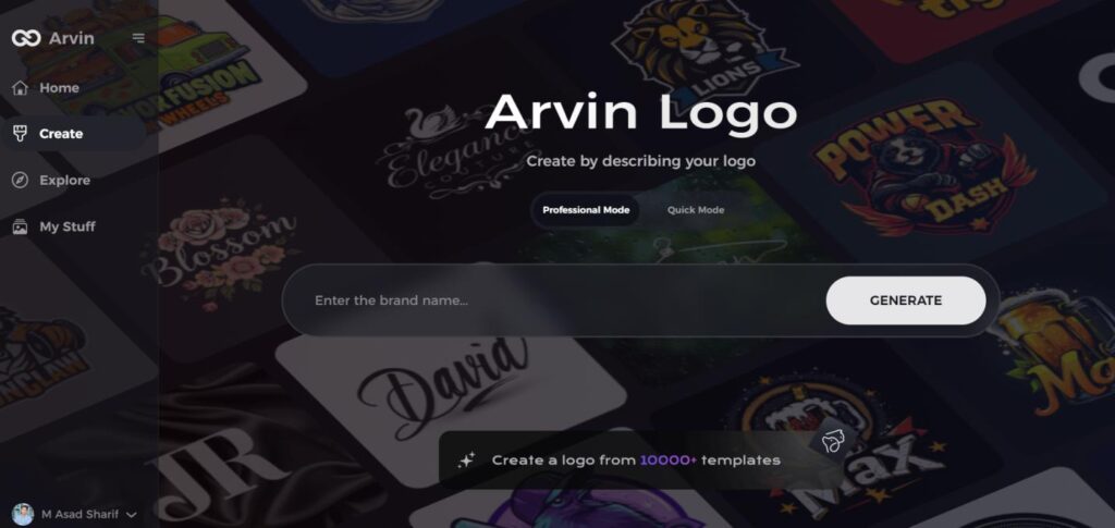
Part 5: Arvin AI: Making Logo Design Easier Using Artificial Intelligence
We will explore how Arvin AI is making it easier to design a logo using artificial intelligence. Whether a newbie or an experienced designer, Arvin AI will create the logos that suit the brand identity.Its easy-to-use tools and smart suggestions make the AI take away much of the hassle that comes with designing a logo so that businesses can come up quickly with a professional look..
Key Features
- AI-Driven Support: Presents real-time suggestions to refine logo symmetry, balance, and overall design.
- Industry-Specific Knowledge: Elements of design that suite your industry and intended audience will be presented.
- Live Adjustments: Make the changes and preview your design in real-time to ensure it’s perfect before finalizing.
- Library of Templates: Access an array of pre-designed templates that can be customized for your brand’s unique identity.
- Tools for Fine Tuning of Alignment: All the things will perfectly be in line and be balanced so that the image is sleek, professional-looking.
Steps to Use Arvin AI for making Logo
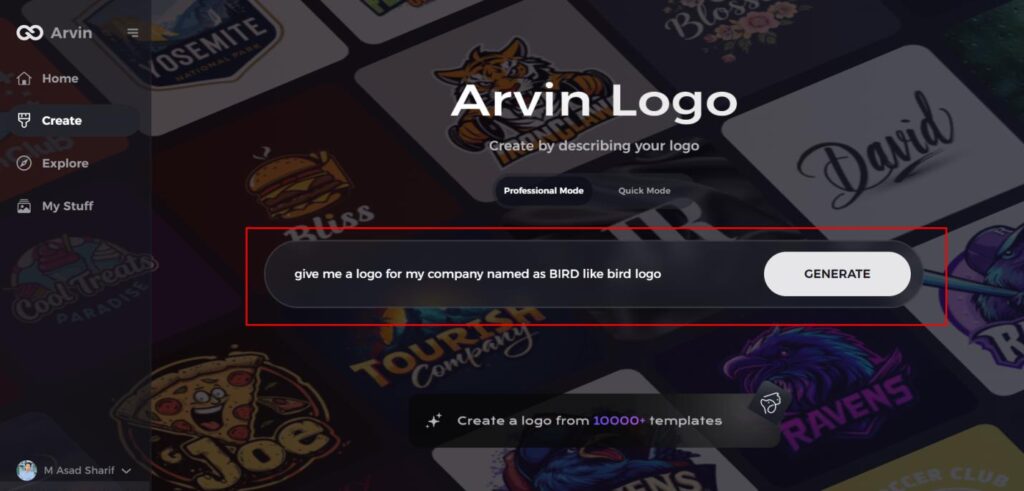
Step 1: Visit the Arvin AI Website
Begin by opening your web browser and navigating to the logo creation page on Arvin AI to start crafting your bird-themed logo.
Step 2: Enter Your Business Details
Provide essential business information such as your company name and industry. This step helps the AI generate logo designs tailored to your brand’s identity.
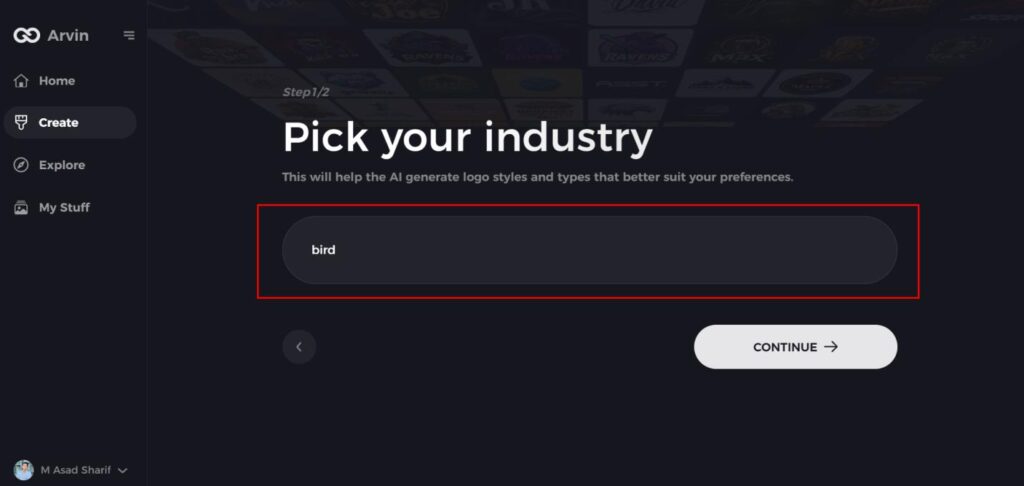
Step 3: Select Your Industry
Choose the relevant industry from a list of options. This allows the AI to narrow down design styles and offer ideas that best match your sector.
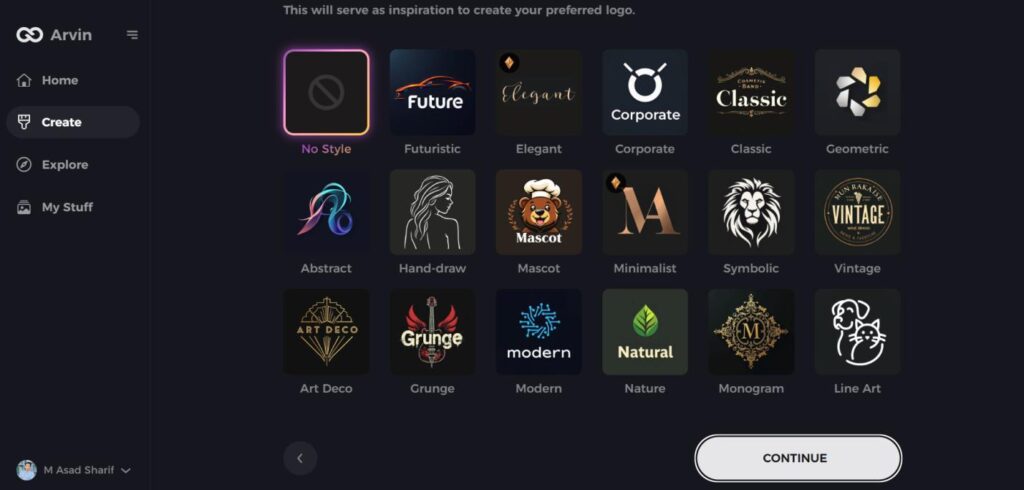
Step 4: Choose a Style
Browse through the available style options and select one that aligns with your brand’s vision. If you’re unsure, simply skip this step, and let the AI suggest a style based on default preferences.
Step 5: Explore Logo Concepts
The AI will generate a variety of bird-inspired logo concepts based on your inputs. Review the designs that resonate with your brand’s image and goals.
Step 6: Customize Your Logo
Personalize your selected design by adjusting elements such as colors, fonts, icons, and layout to make the logo truly your own.
Step 7: Download Your Logo
Once satisfied with your customized bird logo, download it in formats like PNG or SVG, ideal for use on websites, social media, and print materials.
Conclusion
Today, people around the world see Forbes logo as trustworthy, authoritative, and wealthy. This brand is profitable and exciting. Every day, the brand and Forbes logo inspire millions of people around the world to take realistic steps to change the world. Forbes’ visual assets are transformers and commendable ambassadors. You can design a logo for your brand that well defines it and connects with its audience. Tools like Arvin AI make it easier to follow this process by letting you explore your creativity and even design the perfect panda logo effortlessly.
FAQs
Can I use the Forbes logo?
For use in your owned marketing materials only and may not be used with 3rd parties, in paid advertising or paid promotions through any media without further license from Forbes
Has the Forbes logo undergone significant changes?
The Forbes logo evolved over time but maintained a classic and authoritative look to maintain its brand identity.
What does the Forbes logo symbolize?
The Forbes logo represents prestige, credibility, and influence as a business journalism brand.
How does the Forbes logo adapt to digital media?
The Forbes logo is also versatile in nature and therefore fares well on digital media like websites, social media, and mobile applications.