Rolex is widely considered one of the most prestigious watch brands in the world, known for making high-quality watches that are luxurious and innovative. Founded in London in 1905 by Hans Wilsdorf and Alfred Davis, Rolex quickly became the standard against which other luxury watches were measured. Today, the brand represents status, precision, and excellence. From Hollywood stars to business tycoons to national leaders, Rolex watches adorn the elite, further reinforcing Rolex’s reputation as a status symbol of wealth, power, and prestige. This article will explore the history of Rolex logo and discuss how it became the Symbol of prestige.
Part 1: The Role of the Rolex Logo in the Brand
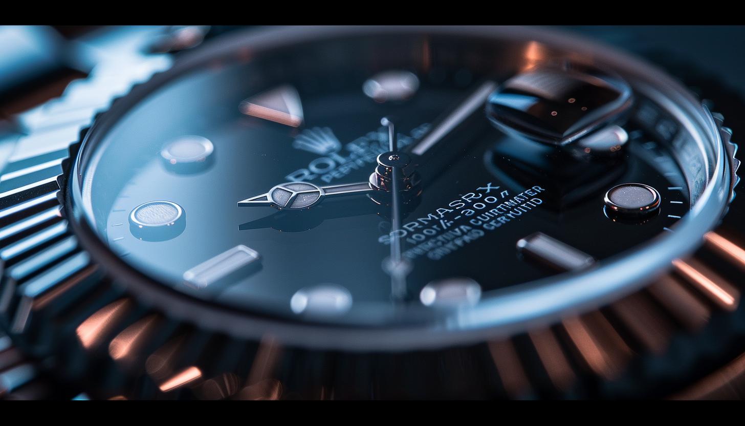
Rolex logo has a gold crown, instantly signifying power, success, and exclusivity. In summary the logo itself is a very simple one. But the way it crafted with extreme sophistication made it one of the most well-known emblems in the luxurious watch industry. The Rolex symbol display on watch dials, marketing materials, and legitimate documents, serving to enhance the brand image.
Prestige, Quality, and Craftsmanship
The Rolex logo is not just a symbol, it carries the brand’s values. The golden crown also stands for superiority, and the green color means prosperity and high status. They select with the elite Rolex client in mind. The font used in the Rolex wordmark is simple yet elegant, signifying the brand’s dedication to quality and precision.
Part 2: The Rolex Logo — History and Evolution
Discover how the Rolex logo has evolved since its inception in 1905. Discover what minor refinements contributed to its emergence as a luxury brand symbol and a everlasting representation of the brand’s refined sophistication and quality.
1905 – 1965: The Initial Logo of Rolex
Rolex established in 1905 and one of its earliest designs used a golden crown on top of the word Rolex written in an elegant serif font. And the crown was not a random pick. It represented the brand being at the top of the luxury watch categories. The 5-pointed crown was a symbol of success & victory. But also represented the artisanship and excellence that lay in the foundation of Rolex’s ethos, highlighting the brand’s focus on the utmost in quality & prestige.
Refinement of the Rolex Logo: 1965 – 2002
In 1965 Rolex refined its logo slightly to appear more sophisticated and elegant. The iconic golden crown symbol stayed the same while the font got a minor change. The letters tweaked to be a little more proportional, giving it a cleaner, more balanced aesthetic. And they got rid of the outline and shadow around the wordmark, resulting in a simpler but more elegant logo. These changes helped give a more modern, refined feel that Rolex has now.
2002 – Present: Modern Rolex Logo
When Rolex slightly updated its logo in 2002, it instantly added to its prestige. It drew on its wealth and exclusivity, deepening the green color. The golden crown got a little darker, rendering it a richer and more elegant aspect. It also put a bolder and more assertive serif font on the wordmark, which was a clever move, giving it more presence and a sleeker but still vintage feeling.
Part 3: Meaning and Symbolism
Discuss the importance of the signature features of the Rolex logo. The golden crown and green color reflect wealth, success, and exclusivity. The hallmarks of luxury, prestige, and exceptional craftsmanship on which the brand was founded and by which it continues to be defined.
The Golden Crown
The most recognizable element of the Rolex brand logo is the golden crown in the center, which represents majesty, power, and luxury. With its long association with leadership and excellence, this emblem is well-suited for a best-in-class luxury watch brand. Watch models like these Rolex watches are often gifted to world leaders and high achievers, reinforcing the crown’s connection with success. The crown stands as a symbol of Rolex’s dedication to excellence and luxury.
The Green Color
Green — The Rolex logo also strongly incorporates the color green, which is closely linked to wealth, success, and prosperity. (Plus, for many Western cultures, green is the color of money and financial wealth—definitely one of the right associations for a luxury brand like Rolex). The exact color of dark forest green used for the logo complements this impression, giving it an aura of luxury, exclusivity, and premium quality that raises the brand’s status.
Part 4: What Makes The Rolex Font So Special?
The Rolex emblem depicts the name of the brand in an elegant and classic font that has hardly changed over the decades. Rolex employs a serif typeface, or one with decorative features on its letters that are supposed to make them look more sophisticated and authoritative. Its definition as a symbol of opulence. The meticulously crafted lettering gives this brand a high-end touch, striking a balance between distinctiveness and removing any notion that most of these watches would ever be in the same category as a basic center-branding watch face (where you can easily forget the name of the brand).
Rolex wordmark influenced by Garamond
The Rolex typeface draws heavily from a serif font known as Garamond, which is generally used for its elegance and sophistication. The elegant letterforms and balanced proportions of Garamond suit Rolex’s luxurious brand identity and solidify its position as a premium watchmaker. This unique typeface lends the Rolex branding a classic and commanding appearance which has become immediately recognizable all around the globe. The font portrays accuracy, artistry, and continuity similar to Rolex watches which would assist the logo maintain the stature to be an icon of privilege and status that will never lose its sheen through the ages.
Font Modified Specifically to Create a Unique Look
Rolex has made some distinctive changes to its Garamond-inspired font to set it apart. Letters are a tad taller here for a more elastic appearance and the bold, but measured strokes give it strength and poise. The gap between letters is perfectly fitted to maintain a clear and good-looking logo even in smaller sizes. These small but significant changes render the Rolex logo distinctive. Being a major factor in ensuring that it is kept in luxury and enabling it to continue as a symbol of prestige and quality within the watchmaking sectors.
Part 6: The Global Recognition Behind the Iconic Rolex Logo
Rolex logo is now one of the most iconic logos in the world. Through strategic placements and consistent branding, the crown emblem serves as a representation of excellence, which in turn has lead to making Rolex synonymous with prestige, success, and timeless quality.
Branding in Rolex’s Success
The visual identity of a brand is a key contributor to its global recognition, creating an essential first impression. Due to the cohesive and luxurious aspects of its logo, colors, and typography, Rolex has mastered the art of branding more than most. That is why the spirits branding elements help to immediately identify the brand, but also promote its reputation. Consequently, Rolex remains the heavyweight champion of the luxury watch world, still the most prestigious watch maker in the world.
Consistency in Logo Design
Many brands often have an update or redesign of their logo, but Rolex has never strayed from the original design. Aside from minor tweaks, the logo has remained unchanged since the five-pointed crown and serif wordmark created in 1905. It maintain the essence of the logo through the decades. This thematic cohesion creates trust among consumers since the design creates trust among consumers. Further solidifying Rolex as a brand that is synonymous with tradition, excellence and things that last.
Part 7: Design Your Professional Business Logo
Arvin AI will help you design a logo that closely resembles the iconic and prestigious look of Rolex. Since it has sophisticated features, Arvin AI enables you to personalize all elements of the logo so that it conveys the luxury, elegance, and timeless value that Rolex brands are famous for. Whether you’re looking for a traditional or contemporary feel, Arvin AI offers the resources you require to create a logo that captures the spirit of your brand with accuracy and elegance.
Key Features Of ArvinAi
Arvin AI has several advanced features that can assist businesses and individuals in designing custom high-end logos:
- AI-powered design suggestions: Generates logo ideas based on your brand’s style and vision.
- Customizable tools: Modify fonts, colors, and symbols for a personalized design.
- High-resolution downloads: Access your logo in multiple formats, including PNG and SVG.
- Instant previews: See how your logo looks on different branding materials.
- User-friendly interface: Easy-to-use platform with a seamless logo creation experience.
Steps to Use Arvin AI for making Logo
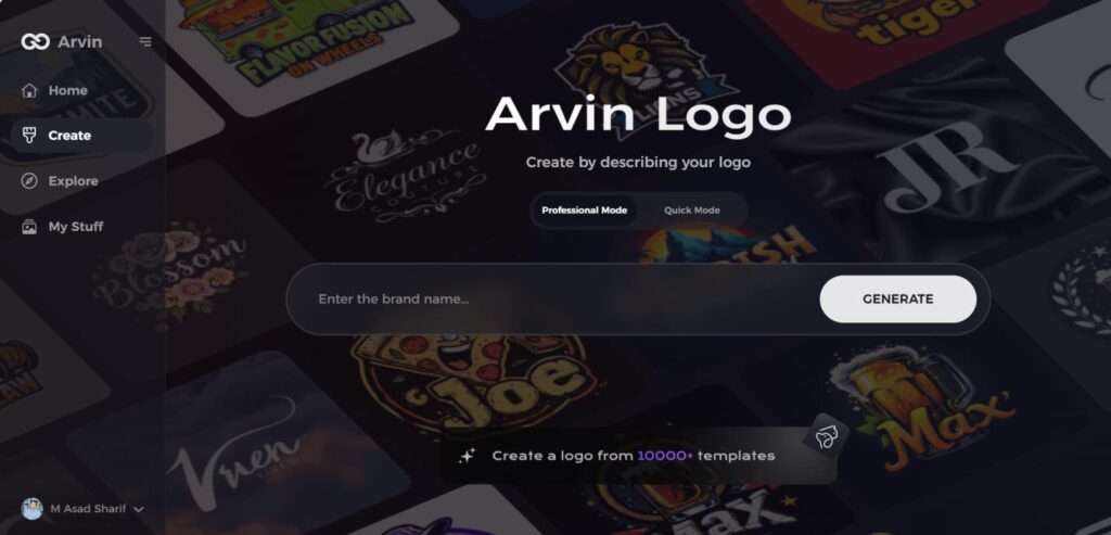
Step 1: Visit the Arvin AI Website
Open your web browser and navigate to the design page at Arvin Ai logo maker to begin the process of creating your band’s logo.
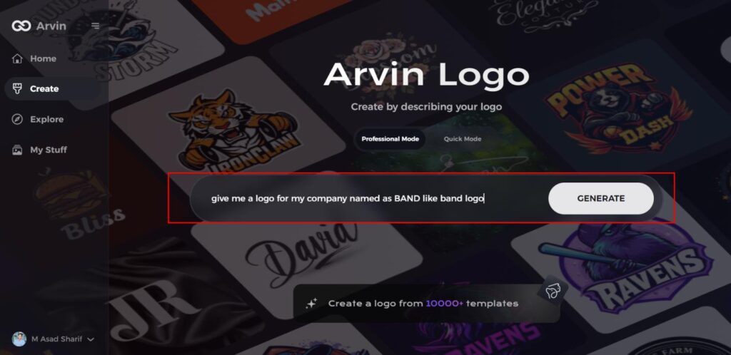
Step 2: Fill Out Your Band Information
Enter essential details such as your band’s name and music genre. This information helps the AI generate logo designs that align with your band’s identity and style.
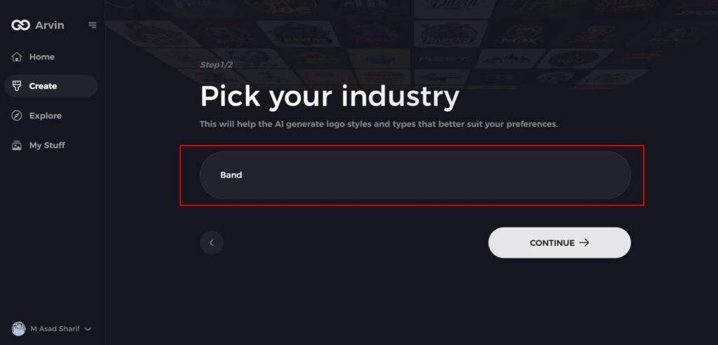
Step 3: Choose Your Genre
Select a genre from the list provided. This helps the AI refine the logo styles and designs based on your band’s specific genre and aesthetic.
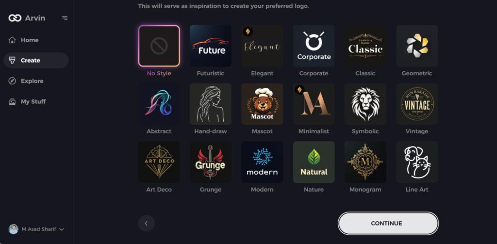
Step 4: Pick the Design Style
Browse through the available styles and choose one that best represents your band’s image. If you’re unsure, you can skip this step, and the AI will generate designs based on default inspiration.
Step 5: Review Logo Ideas
The AI will generate a variety of logo concepts based on the information you’ve provided. Review the ideas and select the ones that best capture your band’s spirit.
Step 6: Personalize Your Logo
Refine the selected design by adjusting elements such as colors, fonts, icons, and layout to match your band’s unique style.
Step 7: Download Your Logo
Once you satisfy with your logo, download it in formats like PNG or SVG. These formats ensure compatibility for use across websites, social media platforms, and print materials.
Conclusion
The Rolex logotype is a timeless symbol of luxury, prestige and craftsmanship, with its golden crown, elegant serif font, and iconic green color all representing excellence. It’s standardized branding made it one of the world’s most recognizable symbols. Arvin AI: For Elegant and Exclusive Brand Identity If you wish to develop a high-end, professional logo, Arvin AI provides AI-based design tools. Start with Arvin AI design now and give average look to your brands!
FAQs
What is the meaning of the Rolex logo?
The gold crown on the Rolex logo symbolizes power, prestige, and luxury. Green, being the color of money and wealth, also signifies exclusivity.
Has the Rolex logo changed over time?
The Rolex logo has undergone only minor refinements since its introduction in 1905, maintaining its core elements while enhancing its elegance.
What font does the Rolex logo use?
The Rolex logo uses a customized form of the Garamond typeface, with modifications to achieve a distinctive and elegant appearance.
Can I create a luxury logo similar to Rolex?
Yes! Using Arvin AI, you can design a high-end logo with premium fonts, colors, and elements that reflect luxury and elegance.
