Minimalist logo design is the epitome of modern branding. The need for clarity and simplicity dominates modern branding. At a time when brands fight for attention, logos become the face of the company and reflect the identity of the brand in a single visual element. The minimalists logos clean, and simple in their designs, are becoming increasingly popular because they can speak essence without words. The function and form are balanced to such an extent that it creates an attraction for the modern audience.
Part 1: What Is a Minimalist Logo?
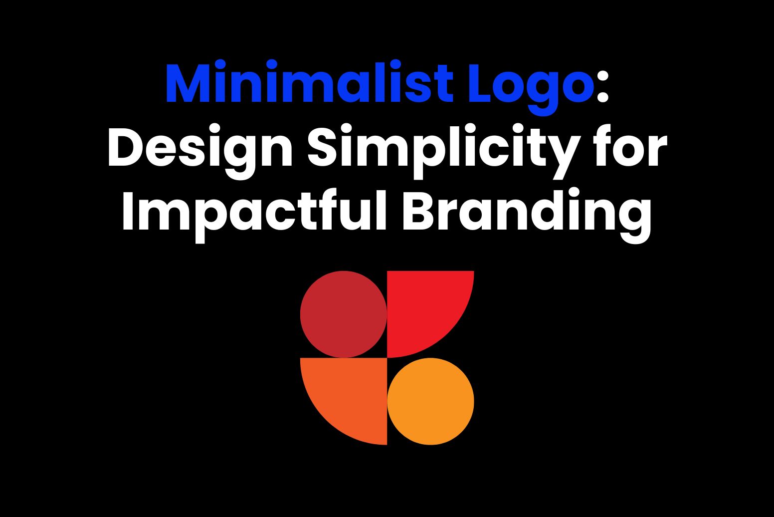
The minimalist logo is a design approach focusing on the removal of redundant aspects, simplicity, and clear messages. It employs a number of basic shapes and few colors or clean lines to help one deliver a timeless and flexible brand identity. These logos prefer functionality while being able to maintain visual appeal by having them in line with current necessities of modern branding practices.
Focus on Simplicity, Shapes, and Clean Lines
Minimalist designs do not have clutter, but rather focus on leaving space; hence, it makes the logo look impressive and understandable. This kind of approach focuses on balance and proportion, so that the logo will always appear effective on any medium and at any size. It also promotes flexibility, as such designs will be effective both on digital and physical platforms.
Examples of Popular Minimalist Logos
- Apple: The silhouette of an apple is a work of art in simplicity, which represents innovation and grace.
- Nike: The swoosh conveys motion and athleticism with a single, elegant curve, symbolizing perseverance and excellence.
- Google: While colorful, Google’s minimalist wordmark relies on clean typography to remain memorable, promoting accessibility and diversity.
Part 2: Why Minimalist Logos Matter for Branding
Minimalist logos communicate a brand’s essence without distractions. With the elimination of details, the focus is solely on the core values and mission of the brand to make sure the message is straight to the point and potent. These logos serve as visual shorthand that transposes brand philosophies into an instantly recognizable form, easy for the audience to relate to.
Psychological Impact of Simplicity
The human brain is attracted to simplicity; thus, minimalist logos are more attractive and easier to process. Clean and simple designs evoke feelings of trust, reliability, and sophistication that help to create consumer confidence. This design principle reduces the cognitive load, making it easier for audiences to internalize and recall the logo over time.
Advantages for Brand Recognition and Memorability
- Recognition: A minimalist logo will become more recognizable at a glance or even from a distance. It has a level of simplicity that makes the brand more conspicuous in an overcrowded marketplace, clear amidst noise.
- Memorability: A simpler design, by avoiding clutter and complexity, becomes more likely to stick. This promotes a greater sense of connectivity between a brand and their audience, further increasing recognition and subsequent interaction.
Making a Lasting First Impression
First impressions matter and a minimalist logo ensure a brand’s initial visual impact is strong and positive. By focusing on clean, thoughtful design, minimalist logos convey professionalism and innovation, making them ideal for modern branding. These logos often symbolize efficiency and forward-thinking, aligning perfectly with contemporary consumer expectations.
Part 3: Elements of a Perfect Minimalist Logo
1. Key Design Principles
Simplicity
Simple, because minimalist logo designs require taking out unnecessary elements and maintaining only the essentials, then, and only then is a clean and uncluttered look achieved with such an approach, adding aesthetic value to the image as well as memorability and longevity.
Scalability
A minimalist logo should be effective at every scale. Whether it is being displayed on a small business card or a large billboard outdoors, the design should be sharp and readable at any size. Scalability is about being versatile and usable for different applications.
Versatility
Another important principle is adaptability. The logo should be usable in all types of media, whether in print, digital, or in merchandise. It should look good in monochrome and on many different backgrounds, thus maximizing the usability.
2. Colors
A minimalist logo is created with a limited colour palette, giving it an appearance of cleanliness and high-class sophistication. Neutral like black, white, and gray are very much in use to portray refinement and professionalism. A specific accent color can also be used to highlight specific parts of the logo and boost brand recognition.
3. Typography
Typography is the most important part of minimalist logos. The fonts should be simple, sans-serif, as this enhances readability and matches with the cleanliness of the design. A font that works well should mirror the personality of the brand but should remain clear and elegant.
4. Iconography
Iconography in minimalist logos focuses on simplicity and recognition. Basic shapes and symbols are often used to represent the brand’s essence. The icons should be recognizable, and they should be able to portray the message intended without any support from other elements.
Part 4: How to Create a Minimalist Logo
Step 1: Understanding the Brand
It all starts with thorough brand identity, values, and targeted audience. This in-depth knowledge of what the brand signifies helps in coming up with a logo that embodies the soul of the brand.
Step 2: Brainstorm Concepts
Once the brand’s profile is understood, thoughts for ideas that depict characteristics can be brainstormed. Such concepts involve themes, symbolism, and visual aspects for that particular brand, and so forth
Step 3: Sketching and Finalizing Ideas
Sketching enables the use of different design concepts. One can begin with rough drafts and then develop them further, eliminating unnecessary details while focusing on essential elements.
Step 4: Selecting the Right Colors, Fonts, and Shapes
Choose a limited color palette that supports the brand’s personality. Combine it with simple and readable fonts to clarify the design. Add shapes or icons that are related to the brand’s identity, ensuring that they are minimal yet powerful.
Step 5: Finalize and Test the Design
Once the design is finalized, test how scalable and adaptable it is with various mediums. Ensure the logo still performs well at different sizes or on different backgrounds. Fine-tune the design if needed before finalizing it.
Part 5: Arvin AI: Revolutionizing Logo Design with Artificial Intelligence
Given the growing speed at which branding takes place, the one single identifiable mark or symbol that is a logo is critical in branding. Arvin AI is one of the few companies that actually implement the use of artificial intelligence in logo design to elicit desirable results. It services both the professionals and the newbies when it comes to offering basic features that enable one to design simple minimalist logos that are suitable in any brand new identity liberation processes. Arvin AI easily integrates flexible templates with AI-enhanced tools along with a friendly interface and is changing the way logos are designed.
Key Features of Arvin AI
- AI-Powered Note-Taking: Generates and organizes notes automatically from meetings, lectures, and other audio inputs.
- Smart Summarization: Provides concise summaries of long-form content, such as articles or meetings.
- Natural Language Processing (NLP): Analyzes and understands human language for context-based actions.
- Customizable Templates: Provides customizable templates for different types of notes to ensure consistency and efficiency.
- Task Management Integration: Integrates with other task management tools to manage productivity and follow-up action.
- Real-Time Collaboration: Allows numerous users to collaborate on note taking and content creation in real-time.
How to Apply Arvin AI for Effective Brand Building Using a Simple Logo Design
Step 1: Log In
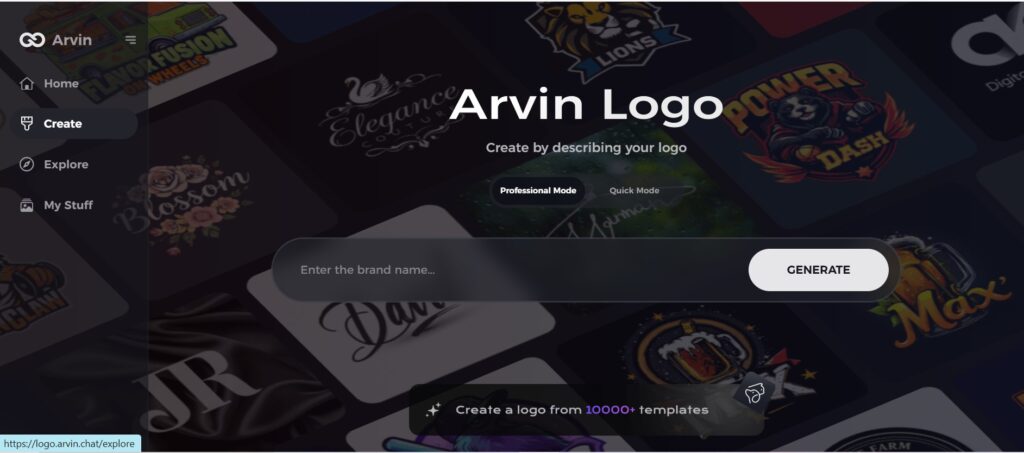
Visit the Arvin AI website and create a login account, then continue to unlock the feature for developing a minimalist logo.
Step 2: Enter Information about Your Brand
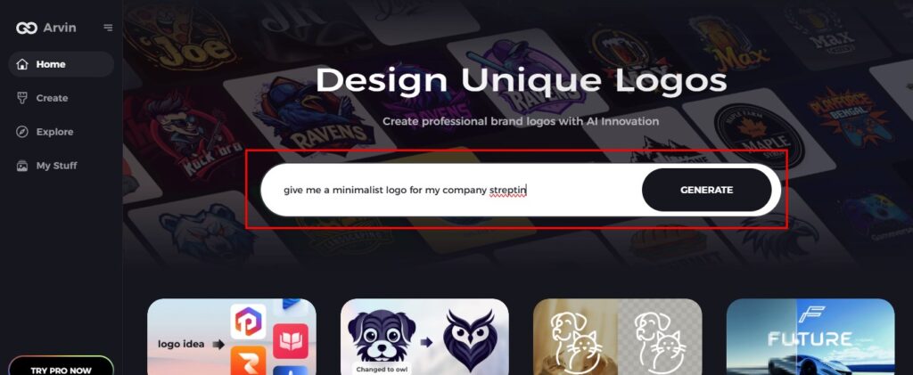
Share your brand’s name and slogan. Provide industry data. Enter any preferences toward simplicity through clean lines or neutral tones and specific types of writing styles.
Step 3: Choose Your Industry
Choose the industry type that applies to your brand. This stage will enable the AI to design a logo concept that’s simple yet connected to your niche.

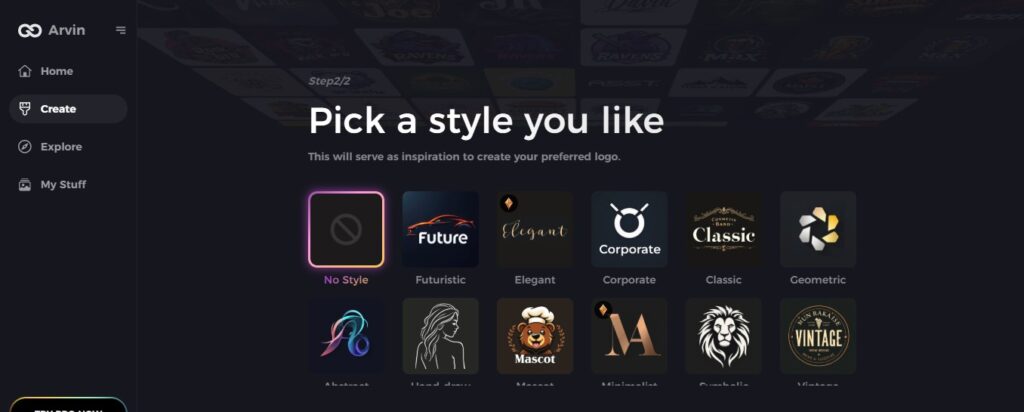
Step 4: Select a Minimalist Design Style
Choose a minimalist design style from the various options. This will give the AI inspiration for the design of a logo that captures your brand’s nature through its simplicity.
Step 5: Customize Your Logo
Once Arvin AI designs your minimalist logo, edit it with customization options. Use options like text size, space, and other arrangement elements to make your minimalist logo still powerful enough but with less complexity.

Step 6: Save and Download Your Logo
Preview your perfected minimalist logo and save it at a high resolution to print or digitally use for making impressions on people.

Part 6: Common Mistakes to Avoid in Minimalist Logo Design
While minimalist logos can be very effective, several common mistakes can undermine their impact. Understanding and avoiding these pitfalls is crucial to creating a logo that truly represents the brand and stands the test of time.
Over-Simplifying to the Point of Losing Brand Identity
One of the biggest mistakes in minimalist design is to make a logo so simple that it loses its connection to the brand. A minimalist logo should still reflect the essence of the business, its values, and its mission. Stripping away too many elements might result in a design that’s visually clean but lacks character or fails to communicate the right message.
Using Trendy Designs That Might Quickly Become Outdated
Minimalism in logo design sometimes results in elements that are too trendy, which at the time of design are modern but soon become outdated. Design trends change very fast, and what is fashionable today will not be tomorrow. If your logo is too dependent on current trends, it may be irrelevant in a few years. A timeless design is what will make it last.
Ignoring Scalability for Different Platforms
Minimalist logos are defined by several traits, but one of them is often overlooked: scalability. Logos have to look effective not just on a website or social media, but also in print or on merchandise. Failure to test how the logo will look in different sizes or formats can result in a design that is unclear or loses its impact when scaled up.
Misusing Typography or Colors That Don’t Align with the Brand
Typography and color are the two basic elements of minimalist logo design. Most of the time, a common mistake is the use of fonts or color schemes that don’t relate to the brand identity. A luxury brand’s logo, for instance, would be undermined by a playful, casual font or overly bright colors. The typography must be clear and legible, and the colors must evoke the right emotions and resonate with the values of the brand.
Part 7: Future Trends in Minimalist Logo Design
Minimalist logo design is on the move due to technological development and changes in design tastes. Here’s a glance at the exciting future trends shaping the world of minimalist logos.
Integration of Motion and Animated Minimalist Logos
The growing use of motion in minimalist logos is being widely implemented, as digital media has a significant hold over today’s media landscape. An animated logo will give that additional depth to a brand and, indeed, does wonders in the digital platform. Motion can be applied subtly, say by having simple transitions or even simple color changes. The impact it makes is highly dynamic, thus more memorable.
The Rise of Monochromatic Palettes in Minimalist Branding
Monochromatic schemes are also becoming popular in minimalist logo design. Varying shades of one color will give a sleek and united look, yet differentiation is still achievable through subtle contrasts. This way, the design becomes even simpler while still maintaining interest. Monochromatic color schemes emphasize simplicity and consistency and particularly well suited for sophisticated, elegant brands.
How AI-Driven Tools Are Shaping the Future of Minimalist Design
Artificial intelligence has changed the design world and minimalist logos. AI-driven tools can now create a logo based on user preferences and brand characteristics. Using these tools, one is able to analyze design principles within a very short period and provide color schemes, font options, and layout variation suggestions to make the designing of logos faster and efficient.
Minimalist Logos in Augmented Reality and Virtual Reality Spaces
With the advancement of augmented reality (AR) and virtual reality (VR), minimalist logos are finding new applications in these immersive environments. AR and VR technologies require logos that are not only simple but also adaptable to 3D or interactive formats. In these spaces, minimalist logos must be recognizable from multiple angles and under different lighting conditions.
Conclusion
Minimalist logo plays a crucial role in modern branding, offering clarity, adaptability, and timeless appeal. Their focus on simplicity and clean design helps businesses stand out in an increasingly crowded marketplace. Whether you’re launching a new business or simply revamping your brand identity, minimalist logos are guaranteed to be professional and versatile in their visual representation. With the aid of tools like Arvin AI, it becomes even easier to design impactful logos with ease. Let the power of minimalism create a lasting impression for your brand’s logo.
FAQs About Minimalist Logos
What Is Considered a Minimalist Logo?
A minimalist logo is simple, with clean lines and minimal details that are not necessary. The focus is on using fewer design elements to communicate the identity of a brand. Removing clutter in a minimalist logo ensures clarity, elegance, and versatility.
Can a Minimalist Logo Be Used for All Types of Businesses?
Yes, minimalist logos can fit most businesses because they can go well with virtually any company. Even though they find more relevance with technology firms, luxury and high-fashion brands, modern brands, or anything like these, minimalism can let them pass through a different industry’s gate.
How Can I Really Determine That My Logo is Minimalist?
You can determine whether your logo is minimalist or not by measuring its design elements. It should state your brand’s identity in as few design elements as possible. Also, it should appear to be clean, uncluttered, and in balance, yet holding that message.
How can Arvin AI help me come up with a minimalist logo design?
Arvin AI is an excellent application to use when you want to design a simple minimalist logo for your business and do it in a short amount of time. In its functionality, it incorporates an AI layout with design features permitting the users to test various placements of objects, kinds of fonts, and colors.
