
Chase Bank is a large and well-established bank globally. The logo of the bank is legible and evokes financial safety and trustworthiness. A bank requires an outstanding logo as it creates trust, attracts clients, and gives the brand its identity. Chase logo has created a robust visual image over the years that is clear and simple and easy to memorize. Through plain and simple design, Chase makes its logo practical and easy to recognize by all people worldwide.
Part 1: Meaning and History of the Chase Logo
It began as the Manhattan Company in 1799, became the Chase National Bank in 1877, then changed its name to Chase Manhattan World Wide Banking in 1955, and became the Chase Manhattan Bank in 1961, eventually becoming the Chase. This is why each change in the bank name requires a new logo, and six different emblem logos created throughout the history of the chase.
1799 – 1877
The original logo, created in 1799, was a traditional badge decorated with elegant old-style lettering of various typefaces. On the top stage, it was heavily inscribed “Bank of the Manhattan Company,” with the date of establishment and address below it. It was a simple monochrome with no edges or emblems, and was with the bank for almost a century.
1877 – 1955
The name of the bank changed to Chase National Bank in 1877 and the logotype also redrawn. Also here, with a simple lettering, it assembled in three steps, and at the top was a bold and solid nameplate expressed in a streamlined serif typeface, all capitalized catchphrases, and at the bottom a bank address of the same capital letters.
1955 – 1961
The logo, designed in 1955, has a rounded square frame with a globe on it, centered on the outline of the United States. On top of the globe, it was written “World-Wide Banking” in all capital letters of the lightweight sans-serif typeface, and the “Chase Manhattan” in the serif typeface was enlarged and placed white in the American image. This is the first logo to use graphics.
1961 – 1976
The symbolic octagonal symbol we see today first appeared in 1961. This logo, created by the Design Bureau of Chermayeff&Geismar&Haviv, had four upper letter inscriptions of the sans serif and a multi-color emblem on the right. The emblem is octagonal with a white square in the center. The frame of the emblem consisted of four rectangular trapezoids: black, lilac, tea, and light green. Each shape is separated by a white thin line.
1976 – 2005
In 1976, the logo color palette changed and the letters shortened to match the new bank name “Chase.” The white character mark placed on a rectangle, the upper part was blue and the lower part was red. The white emblem placed on the left side of the character inside the rectangle. The new tone reflects the patriotism and power of the bank and shows that it is a reliable and powerful bank.
2005 – Present
In 2005, the chase logo was simplified and painted in new colors. Black word mark on white ground, light blue emblem on the right. The letters of the chase in the sophisticated modern sans-serif typeface are cut diagonally at each end, sharply express progress and movement. The light blue and white emblem is slightly smaller than lettering, giving an elegant and gentle impression, symbolizing loyalty and reliability.
Bank Logo
When Chase National Bank acquired by Chemical Bank of New York (1996), the logo changed again. The bank name shortened to “Chase” and the logo was also subject to change. The octagon was intact, but the color changed to white.
Part 2: Design Elements of Chase Logo
Design elements are very important for the branding of a logo. Following are the main design elements for chase logo:
Font
The main badge of the Chase features an elegant wordmark of the title case expressed in a sophisticated serif typeface. This typeface is characterized by medium weight strokes and elongated lines, representing sophistication and elegance. Similar logo fonts to the Chase logo include Baskerville No.2 Std Roman, Song ASC Traditional Light, and M Sung PRC Light.
Color
Chase’s visual identity uses black for its characters. The emblem uses blue and white. These three logo colors express professionalism, reliability and expertise, and reflect qualities such as trust, security and confidence.
Part 3: Cultural influences and media presence
In today’s world, you can’t miss the widespread penetration of the Chase logo in movies and TV shows, but this adds a layer of realism and is deeply embedded in popular culture. This symbolic symbol plays an important role in portraying Chase as a trusted financial partner, not just a background. The name enhances the brand identity and reliability of banks and is a staple of visual storytelling in the financial sector.
A Symbol in Popular Culture
Outside the screen, the chase logo is a familiar sight at sports events and local gatherings, highlighting the bank’s dedication to community participation and corporate responsibility. The following are three ways that the chase logo affects popular culture:
- Media Presence: Frequent appearances in movies and TV shows have solidified its role in modern storytelling.
- Community Participation: Sponsorship at sports events highlights Chase’s commitment to community participation.
- Cultural significance: The association with local events adds credibility and depth to the expression.
Part 4: Future prospects and adaptations
The chase logo will continue to balance tradition and innovation. The core elements, such as the symbolic octagon and the characteristic blue color palette, remain unchanged and ensure that the historical significance of the brand is maintained. However, more dynamic and digital logos are expected to appear. These changes are tailored to technological advances and consumer preferences
To adapt to changing market trends and increase customer confidence, Chase may implement the following strategies:
- Enhance your digital presence: Enhance your digital presence: Optimizing your logo for your digital platform will help Chase improve engagement with technology-savvy customers.
- Interactive design: Incorporate interactive elements into your logo to create a more personalized banking experience and strengthen your relationship with your customers.
- Sustainable practice: By working with design companies and incorporating environmentally friendly elements, we can gain the empathy of environmentally conscious consumers.
Part 5: Arvin AI and Its Role in Logo Creation and Design
In the today’s competitive world, an effective logo goes a long way in developing a successful brand. Arvin AI is a cutting-edge tool that assists firms in designing great and catchy logos. Using the power of artificial intelligence, it combines design tendencies, color psychology, and font styles to generate logos that stand out. Beginning from the ground up, Arvin AI provides helpful insights so that a logo will be suitable for the brand image.
Key Features of Arvin AI
- AI-Based Design Recommendations: Employs improved algorithms to recommend logo designs according to branding trend.
- Color Psychology Analysis: Examines color combinations to make sure they reinforce brand identity and are customer-friendly.
- Font Analysis: Suggests fonts that improve readability and professionalism.
- Customization Options: Enables companies to personalize logo elements to develop a distinctive and unique appearance.
- Brand Consistency Checks: Aids in ensuring that the logo does not clash with already developed branding characteristics to ensure a consistent image.
Steps to Use Arvin AI for making Logo
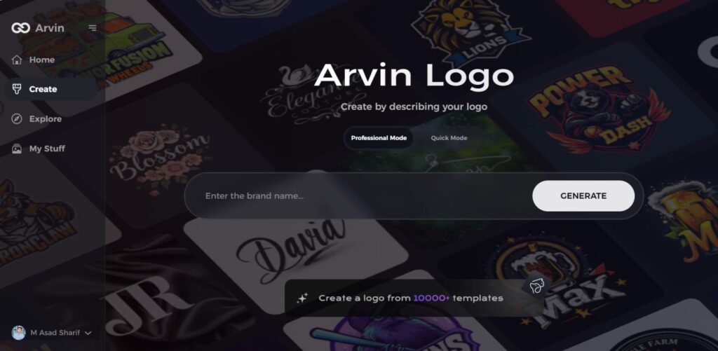
Step 1: Visit the Arvin AI Website
Begin by navigating to the logo creation page at logo maker, where you can start designing your unique fast food logo.
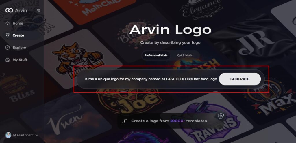
Step 2: Provide Business Details
Enter essential information about your fast food business, including its name and category. This helps the AI tailor logo designs specific to your brand’s identity.
Step 3: Select Your Industry
Choose the fast food industry or another relevant category from the list. This will help the AI refine logo styles and design suggestions based on your industry.
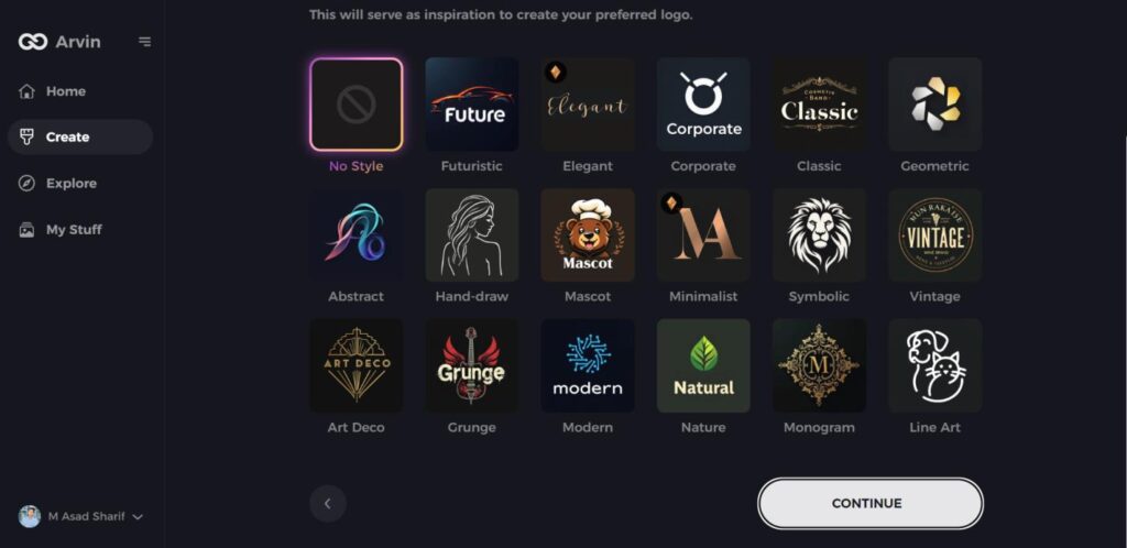
Step 4: Choose a Design Style
Browse through the available design styles and select one that aligns with your brand’s vibe. If none stand out, you can skip this step and let the AI suggest a style.
Step 5: Review Logo Ideas
The AI will generate multiple logo options based on your inputs. Evaluate the designs that resonate with your brand’s image and message.
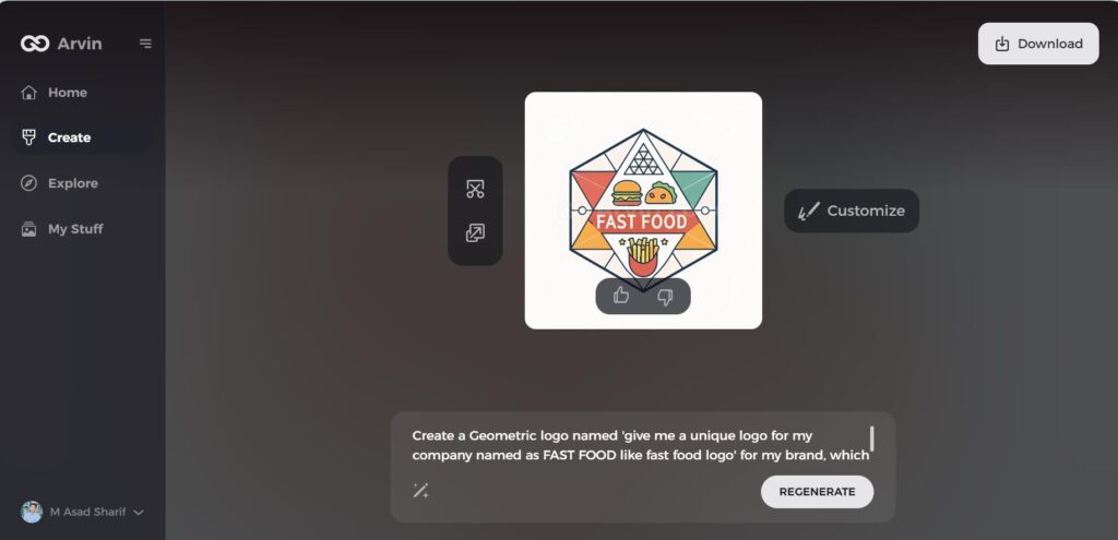
Step 6: Customize Your Logo
Personalize your selected logo by adjusting colors, fonts, icons, and layouts to match your fast food brand’s visual identity and style.
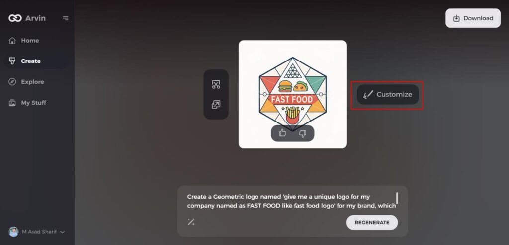
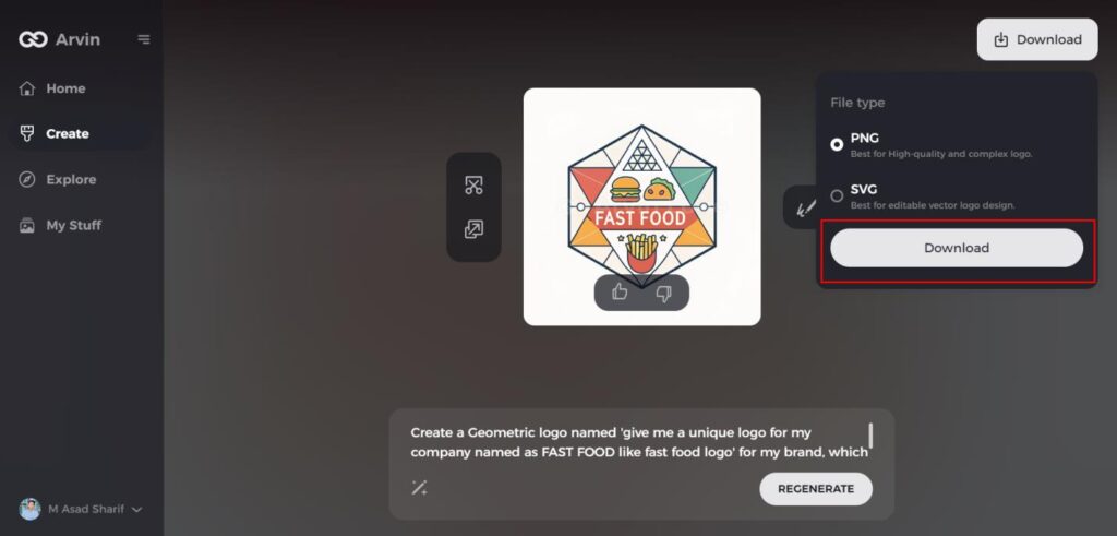
Step 7: Download Your Logo
Once satisfied with your logo design, download it in high-quality formats like PNG or SVG for seamless use across websites, social media, and marketing materials.
Conclusion
The Chase logo has changed over time but has not weakened or become less recognizable. A good logo is crucial in the banking sector since it earns trust, promotes credibility, and makes a firm recognition. Firms can learn from Chase by designing logos which feature simplicity alongside memorability as they allow adaptability. The tool Arvin AI helps companies produce both functional and beautiful logos through its assistance. The manner through which customers remember brand names and develop prolonged company dedication depends heavily on logo quality.
FAQs
When was the Chase logo first introduced?
The original Chase logo was first seen in 1877. Since then, it has been redesigned several times to look modern and contemporary.
What does the octagonal shape in the Chase logo represent?
The octagon is the symbol of movement, forward progress, and trust. It symbolizes the role of the bank to offer financial stability.
Has the Chase logo changed significantly over the years?
Yes, it has changed from classic text logos to the current modern geometric sign.
How does Arvin AI help businesses with logo analysis?
Arvin AI offers business artificial intelligence insights to help them enhance branding and logo design. It makes businesses design better and more rememberability logos.
