As one of the most powerful animation studios in film history, DreamWorks Animation has produced some of the industry’s most iconic animated films. Over the years, the studio has solidified its standing as an animation powerhouse with hits like Shrek, Kung Fu Panda, and Madagascar. Its famous logo, a boy fishing while sitting on a crescent moon, is a significant part of its brand. This article covers DreamWorks logo history, how it has grown and why it is important—the way it has come to define the identity of the studio.
Part 1: What is DreamWorks?
DreamWorks Animation is an iconic Hollywood studio responsible for creating some of the biggest animated films in history. This was in 1994 and it was founded by Steven Spielberg, Jeffrey Katzenberg and David Geffen, with a company mission to change animation. DreamWorks has churning out series of blockbusters like Shrek, How to Train Your Dragon and The Boss Baby that were both loved globally. And the DreamWorks logo symbolizes creativity, imagination, and storytelling, all of which go hand in hand with its brand.
Part 2: The DreamWorks Logo History and Evolution
You’ll be shocked by all the changes to the dreamworks logo since it was created in 1994. Each update improved a basic hand drawn image into a modern film portrait, improving the visual story telling each time but balancing with an icon refresh while keeping as much as possible to the initial design.
The origin story of the DreamWorks logo (1994)
The DreamWorks logo was conceived by Steven Spielberg, who designed it with a classic Hollywood feel. We were supposed to be doing a CGI version of it but the idea quickly became a hand drawn painted animation. They commissioned the artist Robert Hunt, who was known to have an impressive repertoire in his portfolio, and the resulting girl and boy sitting on the crescent moon fishing have become the most definite logo of DreamWorks as the representative symbol of the company. It represented the dream of stories and adventure.
The First Official Logo (1998)
The Prince of Egypt (1998) featured the first official DreamWorks animated logo. The animation was a beautifully rendered sky, with clouds drifting, as if in a dream. Pale blues and notes of gold as the color scheme gave a sense of warmth and nostalgia. That logo consummately captured Spielberg’s notion of classic Hollywood charm, and it became an indelible part of DreamWorks’ personality.
Logo Updates from 1999 to 2006
The DreamWorks logo improved lighting, animation level and backgrounds were improved between 2006 and 1999. In 2004 the company adorned the logo with a gradient blue background making the logo even more exciting. Some of the most popular movies utilizing these new versions include Madagascar (2005) and Shrek 2 (2004). The innovations allowed these make DreamWorks to keep a fresh and modern look while remaining loyal to the traditional design.
The 2007 DreamWorks Logo Update
In 2007, DreamWorks upgraded its logo to HD to keep par with advancements in animation. It had more definitive evolution, a more elaborate color palette and smoother clouds. The studio retained the boy on the moon as the focal point but imbued the background with more life. The new logo appeared on films like Kung Fu Panda (2008) and How to Train Your Dragon (2010), to maintain the studio’s reputation of quality animation.
The 2016 Logo Revamp
After NBC Universal bought the studio in 2016, the DreamWorks logo’s biggest evolution gave a more modern and active approach to its animation, using 3D assets and a cinematic approach. However, the intro felt somewhat more engaging due to an improvement in lighting that created a magical and immersive environment. It was a reflection of DreamWorks’ determination to innovate, updating the logo for a new generation of filmgoers.
The Current DreamWorks Logo (2022-Present)
In 2022, DreamWorks unveiled an all-original logo that acknowledges the animated figures with the studio’s most name recognition. The newly redesigned logo has the boy on the moon traversing a universe of characters from DreamWorks, including Shrek, Po from Kung Fu Panda and the Hatchlings from Trolls. “This modification was designed with to respect the studio’s legacy while embracing this fun action-forward storytelling style. The first film to carry this logo was Puss in Boots: The Last Wish (2022).
Part 3: DreamWorks Logo Meaning and Symbolism
DreamWorks logo meaning: Each part of the movie logo has a meaning. The boy reeling in a fish on the moon embodies storytelling, creativity, and imagination. Its color and design choice convey adventure and wonder, making it one of the most recognizable logos in animation.
The Meaning of the Boy on the Moon
A boy on the moon is perhaps the most identifiable and recognizable element of the DreamWorks logo, symbolizing childhood fantasy, imagination, and boundless potential. This image gets across how story can draw people into volumes of fantasy and vista. This logo is so recognizable and engaging with the audiences as a brand.
The Meaning of the Crescent Moon
It is very symbolic, the crescent moon on the DreamWorks logo. A moon represents dreams, imagination and infinite possibilities across all cultures historically. A boy fishing on the moon tells the nature of storytelling and creativity beautifully through the logo. It symbolizes that due to DreamWorks deciphers and makes dreams come true through the fun animation and masterpieces movies that captivate audience worldwide.
The Fishing Rod’s Place in the Logo
The fishing rod part of the DreamWorks handle is a potent metaphor for creation, discovery and patience. Just like a fisherman patiently waits for that perfect catch, filmmakers and animators craft, nurture, and refine their stories with care This symbol is a representation of DreamWorks’ dedication to artistic quality, showing the studio’s passion for storytelling and creative animation.
Part 4: Branding and Marketing
The DreamWorks logo is more than a piece of art — it’s a marketing force. From opening credits in movies to products to theme parks, the logo contributes to building the brand trust, recognition, and emotional bond with consumers worldwide.
DreamWorks Logo in Movie Introductions
Each film kicks off with the DreamWorks logo, which firmly establishes brand recognition. There is wordless dialogue and an animation of the sky with moving clouds and visual trickery leading to an exciting crescendo to fire-up your movie-going excitement! By consistently delivering logo animations of high quality, by appealing storytelling, and through engaging entertainment, this mechanism reinforces brand loyalty while allowing viewers to associate the logo with high-quality animation, an engaging story and cannot forget entertainment.
The DreamWorks Logo as a Trust Signal
A confident logo is an important component of creating trust and credibility in a brand. The DreamWorks logo is an instant signal to the viewer that they are in for a high quality story experience with stunning visuals and thrilling content. And such instant recognition is a reassuring signal to viewers that they’re in for a well-crafted, mischievous night at the movies. A freed up brand trust is essential to experience consistent success within the cut-throat movie industry.
The Future of the DreamWorks Logo
For the future, DreamWorks may update the animation, visual effects and presentation of its logo to a contemporary and interactive version. That said, the underlying design is likely to remain familiar, deeply rooted in studio heritage and story craft. Now, future versions could encompass interactive animations or augmented reality elements or even even customized branding for streaming media and digital content.
PART 5: The DreamWorks Logo’s Impact on World Audiences
The DreamWorks logo is recognized worldwide, symbolizing creativity and storytelling. As DreamWorks films reach global audiences, the logo strengthens its presence across cultures, making it a trusted emblem of high-quality animation and entertainment.
A Worldwide Symbol of Storytelling
It serves as one of the best logo in the world, as in addition to being a visual identity, it is also a symbol of worldwide creativity and imagination. The animated logo is now synonymous with the exceptional storytelling of DreamWorks Animation’s films, which delight audiences around the world. Its cross-cultural and language-neutral appeal means it is instantly recognizable, enabling audiences from varying backgrounds to relate to the studio’s films and animated characters.”
Global Recognition Through Films and Merchandise
The DreamWorks logo has penetrated globally due to the studio’s success in the international markets. Whether it’s through blockbuster movies, merchandise, theme parks, or marketing campaigns, the logo is inescapable. Moon boy — tied to iconic animated films — pulls in global fans that promote the appeal of DreamWorks as a top-tier animated film studio. Even more, on toys, posters or computer content, this icon establishes its global impact.
Expanding Impact in the Digital Age
As DreamWorks adapts to new technology, the logo’s reach has only increased. Thanks to streaming platforms and digital media, DreamWorks has been able to reach beyond theaters. In an ever-changing industry, its on-demand services, online content and interactive experiences continue to keep the logo relevant, moving away from wear ables to consumables. Although the brand has evolved significantly with the emergence of the digital age, the DreamWorks logo continues to be a strong and well-known icon in global animation.
Part 6: The DreamWorks Logo Vs Other Studio Logos
DreamWorks’ logo stands out among animation companies, but compare it to that of Disney, Pixar, and Warner Bros. While all the studios have different logos with their own stories, DreamWorks’ mix of classic and contemporary makes it a unique visual brand.
DreamWorks vs. Disney Logo
Disney and DreamWorks are two giants in the animation industry but both have different in-house themes on their logos. The Disney castle logo signifies fantasy and magic, a fairy tale of enchantment. On the other hand, DreamWorks´ moon boy represents imagination and stories, which focus on creativity and adventure. While Disney’s logo has essentially remained visually unchanged, DreamWorks has evolved its style and animation over the years. DreamWorks leans more toward a contemporary, cinematic aesthetic — traditional, nostalgia-based Disney continues to cement its heritage.
DreamWorks vs. Pixar Logo
The animated look of Pixar’s Luxo Jr. lamp is a simple, yet powerful branding icon, instantly recognizable across the business. That said, DreamWorks is slightly more film focused with elaborate animation and storytelling elements in its logo. While both companies emphasize creativity and innovation, Pixar’s image tilts toward a technology-driven one, drawn from the fact that it was founded on computer animation. DreamWorks’ logo is more polished and visually challenging, while Pixar’s is simpler but just as powerful in its conjuring of brand.
DreamWorks vs. Warner Bros. Logo
The Warner Bros. “logo: a classic shield-shaped logo, emblematic of Hollywood’s golden period and corporate might. Warner Bros. has a standard branding strategy, focusing more about its studio pedigree than about storytelling. DreamWorks’ moonlit imagery in its logo evokes an aura of adventure and fantasy distinct from Warner Bros.’ a more formal, constructed emblem. Although Warner Bros. redesigned its brand and DreamWorks has modified its old moon boy gumdrop concept with a consistent and graphical style.
Part 7: The Typography and Font of the DreamWorks Logo
As for the DreamWorks logo, typography plays an important role in their branding. The font was meticulously crafted over the years without letting go of its familiar and elegant nature. This movie typography supports the DreamWorks brand and is used uniformly across different films and promotional materials.
An Evolution of DreamWorks Logo Font
DreamWorks logo font contributes its branded company name. The studio used a strong serif font when it first opened, giving the logo a more classical, filmic quality. Over that time, it would develop, being made both simpler and sharper, but yet still keeping its aged aesthetic. The move reflects DreamWorks’ innovation in animation and branding through modern typography. Despite these updates, the core font has not changed meaning strong brand identity and confidence.
The Characteristics of the DreamWorks Font
The DreamWorks title is a serif font with soft curves and balanced letter spacing, creating a cultivated and creative aesthetic in line with the theming of the studio’s films. Capital letters confer prestige and gravitas on the logo, analytics of the minutiae of the font augmenting its legibility and poise. As opposed to the fonts of other production studios which are written or with simple scripts and clear letters, DreamWorks stays within a classic yet current typographical aesthetic.
The Typography’s Role in Brand Identity
Typography is an important part of the brand identity; DreamWorks font choice is a translation of their creative and storytelling-oriented spirit. A robust and well-executed font makes sure that brand continuity stays through films, posters, and marketing applications. Whereas most of the competition has settled on minimalist logo, DreamWorks retains its sophistication and filmic attributes. In this way, the studio can uphold its own unique identity in a field rife with competition.
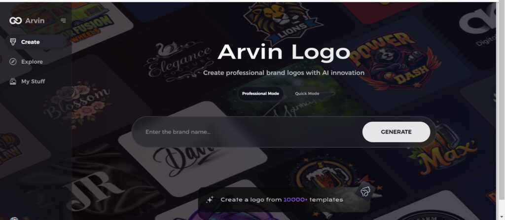
Part 8: Design Your Own Logo Similar to DreamWorks
Create a Professional Quality Logo Instantly With its advanced AI algorithms, Arvin AI produces custom, brand-quality designs, which range from styles based on imagery from movies and from the studio DreamWorks. Shaped to deliver creative choices, editable themes, and designs based on the recommendations of AI, it makes logos immediately, easily, and aesthetically. For arvin ai branding or marketing purpose, the outputs are impressive.
Key Features of Arvin AI
- Dynamic Logo Templates: The industry templates that customers can select from to match their brand needs.
- Intelligent AI-Generated Design: The AI monitors user inputs and provides intelligent suggestions for the logo designing maxim.
- Arvin AI Outputs: Unlike many other artificial intelligence, Arvin AI keeps and creates clean, high quality logo files for branding and advertising.
- Friendly Interface: It’s a user-friendly site for novices and to seasoned designers alike.
- Prompt Logo Generation: users can select the design among multiple options as AI generates them in seconds.
Steps to Use Arvin AI for Logo Creation
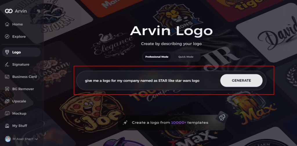
Step 1: Visit the Arvin AI Website
Open your web browser and go to the Arvin AI logo maker page to begin designing your logo.
Step 2: Enter Your Business Details
Provide essential information like your business name and category. This helps the AI generate logos tailored to your brand.
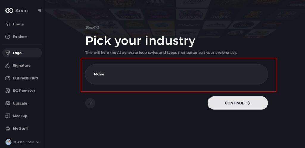
Step 3: Select Your Industry
Choose an industry from the available options. This helps the AI refine logo styles based on your business type.
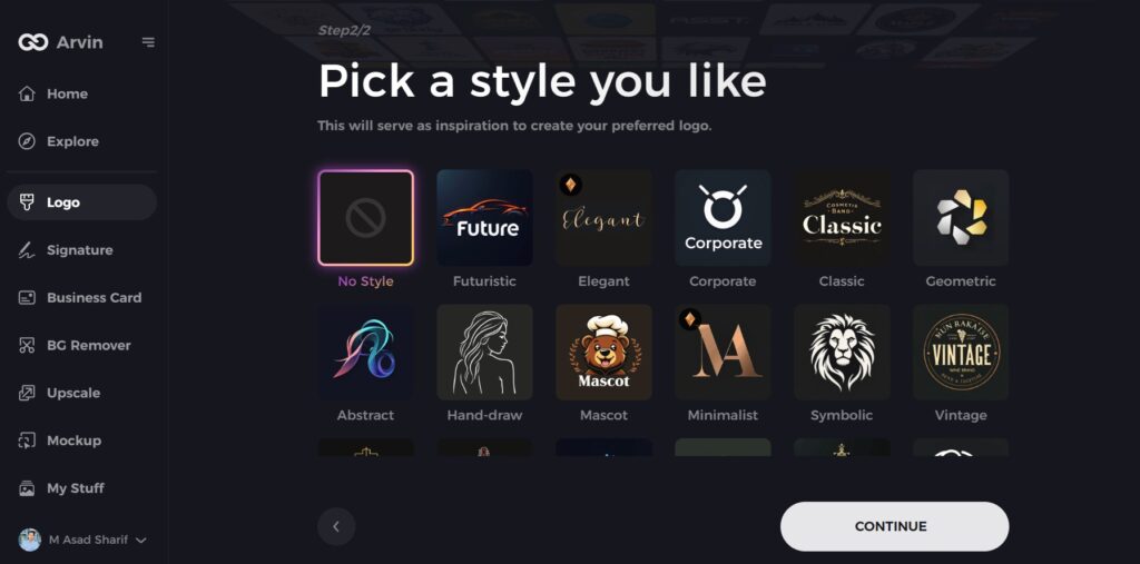
Step 4: Choose a Style
Browse through different logo styles and select one that matches your brand’s identity. If unsure, skip this step, and the AI will generate a design based on default inspiration.
Step 5: Explore Logo Ideas
Arvin AI will create multiple logo concepts based on your inputs. Review the options and pick one that fits your brand image.
Step 6: Customize Your Logo
Adjust colors, fonts, icons, and layouts to align the logo with your brand’s style.
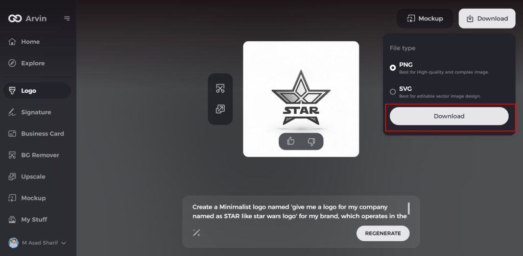
Step 7: Download Your Logo
Once satisfied with the design, download your logo in formats like PNG or SVG for use on websites, social media, and marketing materials.
Conclusion
While the DreamWorks logo has evolved over the years, it remains one of the most recognizable emblems in film. Staying true to itself rather than mimic studios, DreamWorks fuses cinematic storytelling with artistic typography and modern animation. In the meantime, competitors like Disney, Pixar and Warner Bros. adopt their own methods. Through Arvin AI, companies and designers who want to create a top-notch logo can rely on an AI-oriented solution that ensures a professional design with an artistic touch. Whether you want a movie-like, simple, or fantasy-style logo, Arvin AI has got the tools to turn your dreams into a reality.
FAQs
Who created the DreamWorks logo?
The DreamWorks logo was created by artist Robert Hunt on a concept Steven Spielberg had put forward.
Why is there a boy fishing on the moon in the DreamWorks logo?
The boy on the moon represents imagination, creativity, and storytelling, which are at the heart of DreamWorks’ brand.
Has the DreamWorks logo undergone changes over the years?
Yes, the DreamWorks logo has changed several times since 1994, with changes in animation, colors, and cinematic elements.
Can I design a similar logo using Arvin AI?
Yes! Arvin AI provides AI-based logo creation tools where you can create professional logos with distinctive branding elements.