The popular language learning site is Duolingo, that is now one of the most visited sites in the world, giving its users an entertaining and easy way of learning new languages. Whether for the beginners who explore a new language or for the advanced learners who want to hone their skills, millions use it every day. The most important symbols for a brand are logos. It represents the identity of a company with its values and purpose in the form of visuals. For Duolingo, it is more of a personality logo.
Part 1: The Duolingo Logo: A Brief History
The Duolingo logo is much more than just a symbol-it is the actual representation of the mission of the platform to make language learning accessible and enjoyable for people all around the world. From the initial design choices up to its evolution, the logo has played a significant role in shaping the identity of the brand.
Origins of the Duolingo Logo
The company, Duolingo, was founded in 2011 with the idea of making a language accessible to everyone without costing a penny. Any new business requires the definition of its image, and thus, creating the logo is one of the initial activities. The authors wanted the logo to reflect their idea for the global public at the same time.
Part 2: What the Duolingo logo means
The owl central to the Duolingo logo is not just a cute creature. It holds a deep meaning associated with the purpose of the platform. Prior to discussing the subtlety of the owl icon, one must know why the owl icon was created while considering a mascot. An owl is not only a logo; it is a reflection of the brand personality and the promise of funny learning that it delivers.
Owl and Learning to Communicate
Owls, in many cultures, symbolize wisdom and learning. It has provided a very fitting approach to the basic concept by Duolingo’s owl mascot: learning and growth. The approach through the owl character, however, evokes friendliness, which allows the platform to invite learners of all ages.
Color Psychology: Why Green?
The color in the middle of the Duolingo logo is green. Green, according to color psychology, represents growth, renewal, and energy. It’s also a very attention-grabbing color that gives distinction to the logo in the already crowded app store. In Duolingo, green symbolizes the development of the self and the rebirth one feels when he learns a new language.
Design Elements
The eyes of the owl are large, focusing the attention. They are quite expressive and look almost human-like. Design elements seems to be friendly and is appealing to the user. It reflects Duolingo’s objective to make language learning look personal and exciting. The welcoming and non-threatening design will easily attract the attention of the user to engage with the website.
Part 3: Evolution of the Duolingo Logo
As Duolingo gained popularity, so has its logo been updated several times. These were not done just to look trendy but to keep the logo abreast of changes in growth within the platform as well as with an evolving user base. The logo of any company must adapt to new trends in design, technological needs, and what a user might be expecting from such a company.
From Abstract to Refined
The original was a bit quirky and playful but not actually polished. By time, it becomes cleaner and more modern. The shape of the owl becomes more defined and, by this, made the whole design more symmetrical and balanced, which changed its versatility for usage on different platforms and sizes.
Key Changes Over Time
The most apparent change is that the owl has simpler features. The new version of the design will depend on clean, sharp lines and flat style to follow the modern trend. It will be an iconic and easily recognizable owl at any size, such a very important characteristic for mobile applications.
Reactions and Critiques
Each change has involved the feedback of designers and users. Most of the critics have said it is much modern and flexible now, but on the other hand, people like the quirkiness that went with the initial design. Therefore, most people have enjoyed this change and love the way playfulness meets professionalism.
Part 4: The Duolingo Logo in Branding and User Engagement
The Duolingo logo is more than just a simple visual element. It is actually a very important component of the branding strategy of the platform. A logo is the gateway to a brand’s identity, and for Duolingo, its logo does most of the heavy lifting in connecting with users. It represents the platform but is also an emotional touchpoint for the.
Building Trust with Users
A good design of a logo can instill trust and credibility. The approachable, friendly design of the Duolingo logo reassures the user that the platform is inviting and supportive-very important for a language learning app in which users may feel vulnerable when faced with new challenges.
Improving Brand Recognition
It is very simple yet unique to make it quite identifiable. If the app has appeared in the store, its logo appears in social media and any form of advertisement; all those bring an easily memorable recognition for Duolingo. All this contributes to ensuring users are connected to quality and fun experiences offered on the platform through constant branding identity.
Part 5: The Design and Modern Trends of Duolingo Logo
The Duolingo logo can therefore be very suitably described as the perfect definition of how any brand thrives through its visual identity in this digital space. Simplicity, playfulness, and a friendly demeanor speak more of what the visual communications are; elements that would provoke further investigation for the positioning of the Duolingo logo pertaining to modern-day designs principles.
How the Duolingo Logo Relates to Modern Design?
In a world that has been drenched with images, the Duolingo logo stands out quite immediately and embodies some of the main design trends of today, such as minimalism, simplicity, and character-driven design. The owl-a representation of wisdom globally directly relates to the core mission of the brand in assisting people learn their languages.
Simplicity behind the Logo in order to success
The beauty of the Duolingo logo is in its minimalism. It is clean, uncluttered, and easy to understand. Consumers today do not have time to decipher complex logos; they need to understand them at a glance. The owl of Duolingo is created with just enough detail to convey personality but is simple enough to remain versatile across different mediums.
Part 6: Arvin AI Logo Design and Branding Enhancement Tool
Arvin AI is a state-of-the-art AI-based designing tool that presents businesses with much ease and efficiency when creating and refining logos. Fitting into the modern trend of branding, this artificial intelligence applied in the designs’ generation can help companies come up with a unique and memorable identity. It is through these very friendly interface and robust features that Arvin AI makes the creation of logos accessible to businesses of any size.
Key Features of Arvin AI
- AI-based Design Ideas: Perfect logo ideas based on the industry and brand values.
- Logo Analysis and Optimization: Assess and improve the effectiveness of logos
- Real-time Feedback: Get instant feedback to keep refining the logo.
- Customizable Templates: There are different types of customizable templates based on the respective industries as well as styles.
- Branding Tools: Ensure that logos are uniform in all the marketing materials.
Steps to Use Arvin AI for making Logo
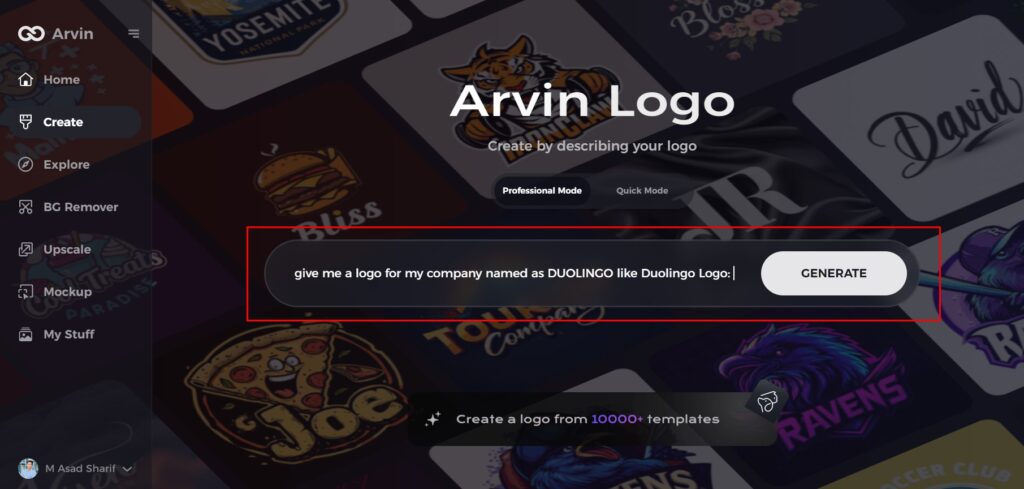
Step 1: Visit the Arvin AI Website
Go to the logo creation page on Arvin Logo Maker website to begin your design journey.
Step 2: Enter Business Information
Provide key details like your business name and category to help the AI tailor designs to your brand.
Step 3: Select Your Industry
Choose your industry from the provided list, allowing the AI to focus on logo styles that fit your sector.
Step 4: Choose a Style
Pick a logo style that matches your brand’s vision, or skip this step and let the AI generate designs based on default preferences.
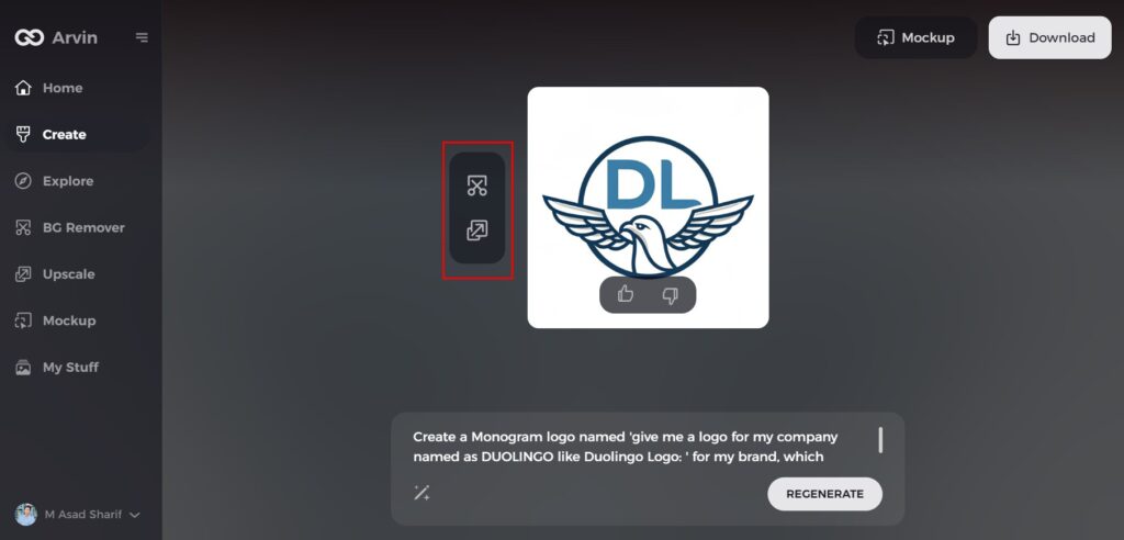
Step 5: Explore Logo Ideas
Review the AI-generated logo options created from your inputs and select the designs that best represent your brand.
Step 6: Customize Your Design
Fine-tune your chosen logo by adjusting elements like colors, fonts, icons, and layouts to suit your preferences.
Step 7: Download Your Logo
Once finalized, download your logo in versatile formats like PNG or SVG for seamless use across digital and print platforms.
Conclusion
The Duolingo logo is an exceptional case of logo design creating effective branding. Due to its simple theme with the utmost utilization of graphical content. This company has maintained great importance over Duolingo as a brand of language-learning programs. The importance of an excellent and well-recognizable logo is higher today than ever in the business world. Tools such as Arvin AI simply make it easier and efficient to create a logo that means something and impacts brands well.
FAQs
Why did Duolingo go for the owl?
The owl is a symbol of wisdom and learning, just like in Duolingo’s mission.
What does the green color of the Duolingo logo?
Green signifies growth, health, and trust to become acquainted with some of the brand’s personal growth directions.
Has the Duolingo logo changed over the years?
The logo is subjected to a small update while keeping the overall impression of an owl and color green.
How to Design an even Great Logo of Your Brand by using AI?
Arvin AI will come with design ideas to optimize with the process to use real-time feedback for developing a great memorable logo.
