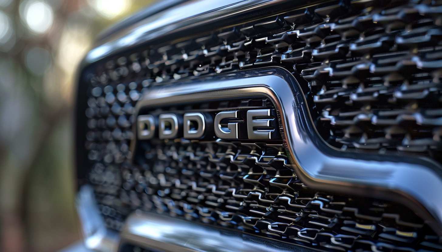
Dodge is a legendary American car brand that has been equated with toughness and performance for decades. During branding activities logos play an essential role because they communicate business identity to consumers effectively. The Dodge logo has evolved through time but consistently been a depiction of the company’s emphasis on toughness, high-performance capability, and innovation within the automotive industry. This article will discuss the evolution of the Dodge logo and what it stands for today.
Part 1: The Origins of the Dodge Logo
Dodge was started in 1900 by two brothers, Horace and John Dodge, as an auto parts supplier. Their first car came out in 1914 and the Dodge Company was born. The initial Dodge logo had a minimalist design but with strong and bold letters. This logo showed that Dodge based its self-identification on producing dependable products of high quality. It is one of the iconic logos which contributed to building a reputation for reliability which made customers choose Dodge cars for their strength and performance characteristics.
Part 2: The Development of the Dodge Logo
As Dodge evolved and changed with the times, so did its logo. The logo has undergone several transformations throughout the years which reflected both company value direction and market positioning within the automotive sector at their respective periods. We will analyze the multiple logo modifications in this segment to determine their impact on the brand identity.
1910 – 1914
The original Dodge logo developed in 1910 and remained in use for several decades. It included a stylized representation of a bearing, which was an important aspect of the company’s early activities in the automobile parts business. Within the bearing, the letters “DB” were inscribed, representing “Dodge Brothers,” the company’s founders.
1914 – 1928
The first redesign of Dodge’s visual identity occurred in 1914, when the new emblem consisted of a monochrome circular emblem. The DB character was in the middle of the badge, drawn in white and black contours. The main lettering of the uppercase sans-serif painted in white around a black circular frame.
1928 – 1955
In 1928, Dodge’s logo simplified into a rounded, serif-typeface capitalization, with letters expressed in very thick, stable lines. It was a simple and powerful emblem with classic, timeless tones.
1955 – 1962
In 1955, the logo was changed, and instead of a blue and red bronze monochromatic solution, a figure strongly reminiscent of space satellites appeared. It was a motif of two triangles removed from the inside (the shape became dynamic by this feature) or two “birds” rotated right from the audience seat. The symbol of this logo is speed, focus on the future, and reliability at the same time.
1962 – 1968
In 1962, Dodge’s logo became a monochrome again. At this time, the foundation of the logo became three “triangle angles” separated from each other. Formally, the logo became the most stable shape of a triangle, but the free space inside it added dynamics and freedom to the logo.
1964 – 1993
In 1964, the brand began using the Scarlet Red logotype and represented in a modern custom sans-serif typeface title case.
1980 – 1993
In 1980, the logo of Dodge made a significant change. This time, it was made in a double pentagon form. The outer pentagon was colored in bold red, and a small white star was inserted inside the outer figure. This new look was modern and more noticeable than previous designs.
1994 – 2010
1994 was a very important year for the brand, with a stylish lamb head on the logo. The main color was still red, but the brand name prints also appeared, and classic black was chosen for the font color.
2010 – Today
In 2010, Dodge’s main logo was transformed into a brand silver font with two red lines located diagonally at the top. However, “ram” remains a symbol of Dodge.
2022 – Now
The 2022 redesign introduced a new Dodge brand logo. It is based entirely on the geometric logo used by the company since the 1960s, but this time three elements forming a triangle are contoured with neon red and placed on a solid black background. The new badge looks very mysterious and powerful. Reflects brand growth and progress.
Part 3: Main Components of the Dodge Logo
A logo is not just a symbol; it embodies a brand’s values and identity. Dodge uses important design elements in its logo to ensure it remains both powerful and memorable to viewers. The main elements of the Dodge logo will be analyzed under this section alongside their role in developing brand image.
Font and Typography
The Dodge logo features a strong and clean font style, which is minimalist but powerful. The sharp and direct lines of the logo fonts help in conveying strength and precision, qualities which are essential for a motor vehicle brand like Dodge. Brand exposure to reliability and confidence values depend on the chosen font style for the logo.
Colors and Shapes
The red, silver, and black colors of the Dodge logo are specifically selected to convey strength, energy, and performance. Red is also representative of power and energy, and the black and silver logo colors have a professional, streamlined look. The combination of these three distinct colors bestows upon the logo its rugged appearance which matches the brand reputation of Dodge’s reliable automobile products.
Simplicity in Design
One of the reasons why the Dodge logo is so successful is how simple it is. The bold, clear design of the logo makes it easy to see and remember. It doesn’t have any unnecessary details that are going to take away from its strong, confident message. The minimalist style also ensures that the logo will be nice on any type of media, ranging from car badges to advertisements, to make the Dodge brand unique and consistent.
Part 4: The Symbolism of the Dodge Logo
The Dodge logo is not just a graphic; it has significance. The individual elements of the logo specifically the ram symbolize essential elements about the company. The paper critically looks at Dodge’s logo symbolism then discusses its relationship with the business enterprise.
Symbolism of the Ram
The ram in the Dodge emblem is a strong symbol of strength, ruggedness, and durability. Rams are hardy animals that can survive in harsh conditions, which fits well with the attributes Dodge wishes to convey. By employing the ram, Dodge is informing consumers that their cars are durable, perform well under harsh conditions, and can endure harsh challenges—just like the ram.
Relation with the Automotive Sector
The ram logo on the Dodge brand serves to tie the company to the universe of high-performance, tough vehicles. Dodge is committed to manufacturing vehicles that provide endurance and reliability for users who require vehicles to perform tasks or take adventurous trips.
Cultural Influence
The Dodge logo has transcended to represent American automotive supremacy. It’s not merely a brand—it is the essence of rugged, dependable, and powerful American engineering. Consumers now associate the logo with reliable products and high standards through its gradual association with their market.
Part 5: The Influence of the Dodge Logo on Brand Perception
People form their perceptions about the Dodge brand primarily through the identification of its logo. The Dodge logo determines customer perspectives which range from trustworthiness to an image of powerful dominance. This section will examine the impacts which the logo has had on Dodge brand perception by consumers.
Consumer Trust
The Dodge logo is a major contributor to trust establishment among consumers. Individuals recognize the logo as a symbol which represents power combined with reliability and excellence. Dodge has always been able to prove that their cars are long-lasting and perform well year after year.
Global Recognition
The Dodge brand is recognized everywhere in the world, which helped the company expand into markets much farther from its origins in America. The vehicle’s basic yet rugged design allows consumers to identify Dodge cars effortlessly regardless of their location in any part of North America, Europe or international regions.
Impact on Car Enthusiasts
For most car enthusiasts, the Dodge logo is not only a car brand but also a symbol of power, performance, and muscle. Performance car fans admire the logo most of all.
Part 6: Arvin AI: Boost Your Logo Design with AI Technology
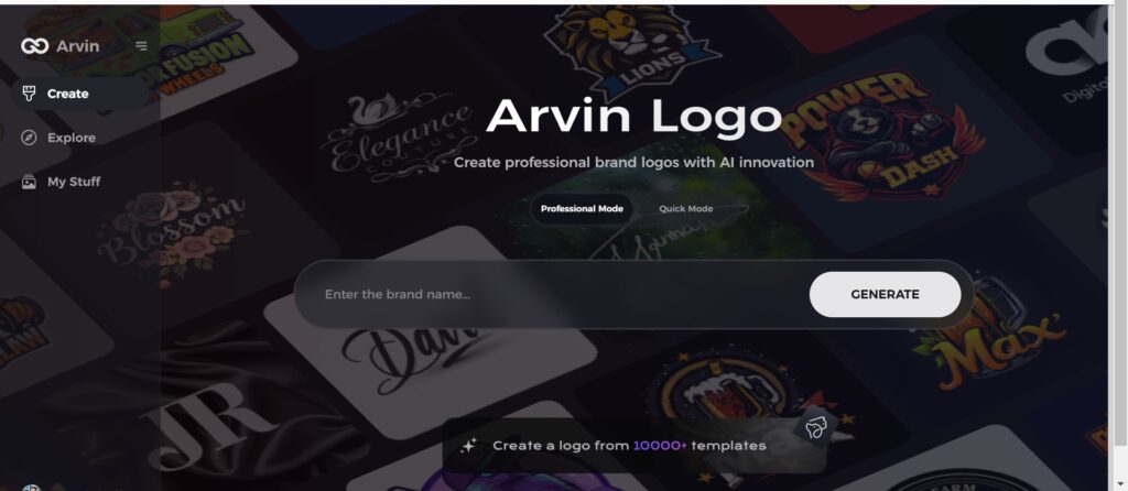
Arvin AI is a simple tool that assists companies and brands in creating logos in no time. An AI technology system develops brand designs using its artificial intelligence capabilities and incorporating both brand values and style elements. You are able to adjust logos according to your requirements using Arvin AI, from selecting colors to modifying fonts. The logo creation process becomes simplified through Arvin AI creating time efficiency and delivering outstanding results. Whether you are a startup or an existing business, Arvin AI assists you in designing the ideal logo for your brand.
Key features of Arvin AI
There are following key features of Arvin AI:
- AI-powered logo creation: Generates custom logos using artificial intelligence.
- Design flexibility: Easily modify fonts, colors, and elements to match your brand’s identity.
- User-friendly interface: Simple and intuitive, even for beginners.
- Quick logo generation: Saves time with fast design creation.
- High-quality designs: Delivers professional-grade logos for various business needs.
- Versatile tool: Suitable for both new businesses and established brands seeking fresh designs.
Steps to Use Arvin AI for making Logo
Step 1: Create an account and log in on Arvin AI
Visit the website of Arvin logo maker, open an account, and log in for the logo design feature.
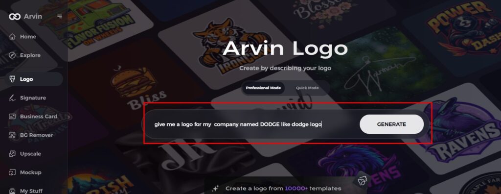
Step 2: Input your brand information and preferences
Input your brand name, slogan, and industry. Specify all your design preferences, which may include font styles or images themes.
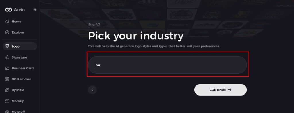
Step 3: Pick your industry
Now select your industry related to your niche. This will help the AI generate logo styles and types that better suit your preferences.
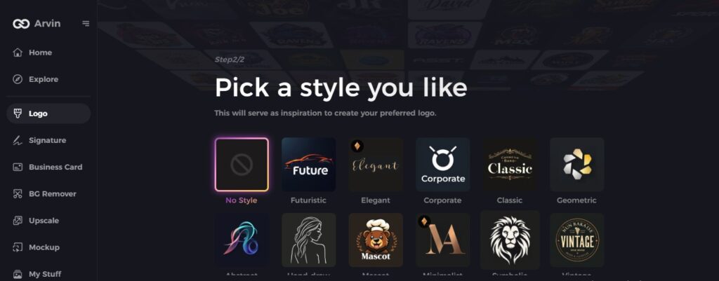
Step 4: Select Style
Now select a style which you would like and continue. This will serve as inspiration to create your preferred logo.
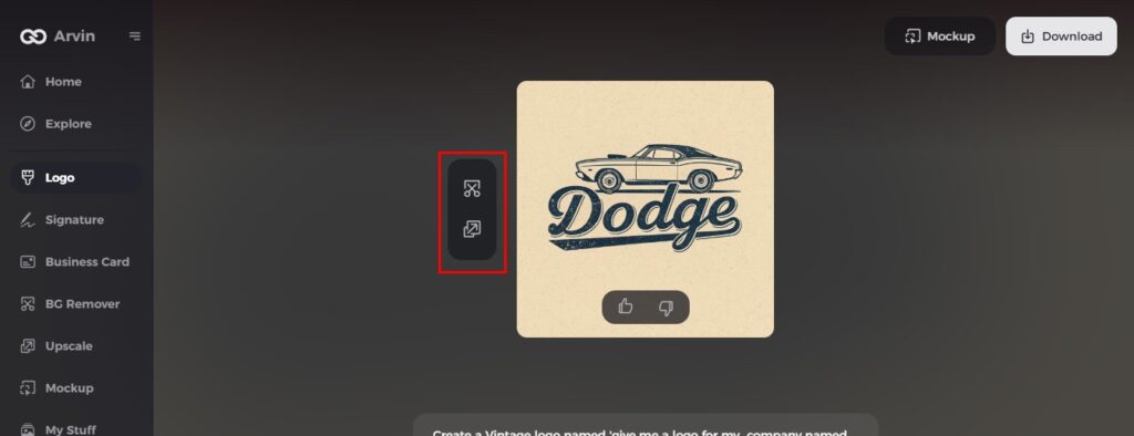
Step 5: Design Personalize through the tools of Arvin AI
After Arvin AI gives create your logo, you can customize those logos with the tools that have elements such as font style, layout, and the positioning of symbols. Experiment on different designs until you like what you see.
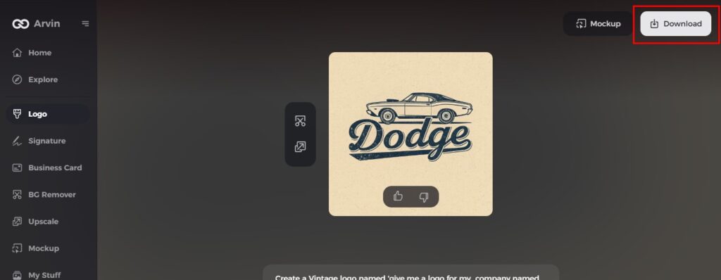
Step 6: Save and download the final logo
Preview the finished logo and save it in a high-resolution format for both print and digital uses.
Conclusion
Role of the Dodge logo in building brand identity produced the perception that consumers have regarding it. A robust logo such as that of Dodge aids in leaving a lasting impression and establishing a level of trust among customers. Within the auto sector, an aptly planned logo is critical for differentiation and creating an impact. If you wish to make a logo that reflects your brand’s values and strength, Arvin AI is the perfect tool to help you make professional and strong logos with ease.
FAQs
What is the meaning behind the Dodge logo?
The Dodge logo features a ram, symbolizing strength, toughness, and ruggedness—basic qualities that Dodge wants to illustrate in its vehicles.
How has the evolution of the Dodge logo unfolded?
The logo of Dodge has undergone numerous alterations, keeping up with the company’s development, yet still carrying its strong, aggressive appearance desired by customers.
Why is the Dodge logo so distinctive in the auto industry?
The Dodge logo is distinctive because of its simple yet powerful design and the powerful symbolism of the ram, making it extremely recognizable and memorable.
How do I create my own logo similar to Dodge’s?
Arvin AI is a simple tool that helps you to create strong, effective logos, so it is simple to create a logo that conveys your brand’s strength and identity.
