
When building a brand, having just one version of your logo isn’t enough. While a primary logo serves as the most recognizable representation of a business, it doesn’t always fit seamlessly into every application. This is why logo variations are essential—they ensure that a brand remains consistent, adaptable, and recognizable across all touchpoints.

Think about how a wide, horizontal logo might not fit neatly as a social media profile picture or how a highly detailed logo loses clarity when printed on small merchandise.
As branding expert Marty Neumeier explains in The Brand Gap,
“A brand is not just a logo—it’s a gut feeling people have about a product, service, or organization.”
However, a logo is the most immediate and tangible representation of a brand, and having multiple variations ensures that it remains legible, professional, and effective across all platforms.
But what exactly are logo variations, and why are they critical in modern branding? Let’s explore the concept in depth.
Logo Variations Meaning
Logo variations refer to adapted versions of a brand’s primary logo, designed to accommodate different placements, formats, and branding needs while maintaining brand consistency. These variations ensure that a logo looks polished whether displayed on a website header, a social media icon, or a business card.
A well-designed branding system includes multiple versions of the logo to suit different applications. Paula Scher, renowned graphic designer at Pentagram, once said,
“A great identity system allows a brand to be recognizable in any format, from a billboard to a mobile icon.”
Having a single, complex logo that doesn’t scale well or fit into different formats can hurt brand visibility. A study by the Journal of Marketing Research found that logos with high complexity negatively impact brand recall, while simplified yet distinctive logos enhance brand recognition by 13%.
Logo Variations Branding
Why Are Logo Variations Important?
1. Ensuring Versatility Across Platforms
From social media and websites to product packaging and business signage, logos need to function across multiple mediums. A logo that works well on a letterhead might not fit neatly into a social media profile picture. Multiple logo variations solve this issue by offering adaptable designs that can be used in different contexts.
2. Improving Readability and Scalability
Logos that are intricate and detailed may lose clarity when reduced to smaller sizes. Research from MIT Sloan School of Management highlights that logos designed with simplicity and high contrast perform better in digital spaces, as they are easier to recognize even at a glance.
3. Enhancing Brand Recognition
Consistency is key in branding. Having recognizable logo variations that align with the primary logo ensures a seamless brand experience across platforms. This maintains brand integrity while reinforcing familiarity with the audience.
4. Boosting Professionalism and Credibility
A polished brand identity signals professionalism and reliability. Inconsistencies in logo application can make a brand appear unorganized or unprofessional. According to Forbes, consistent branding can increase revenue by up to 23%because it builds consumer trust.
4 Logo Variations
Most brands utilize four primary logo variations to cover different branding needs.
1. Primary Logo
The primary logo is the main and most comprehensive version of a brand’s identity.
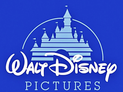
It typically includes the full business name, tagline (if applicable), and design elements such as icons or embellishments. This version is often horizontal and is used in large-scale branding materials like website headers, storefront signage, and official company documents. Since it’s the most detailed, it’s best suited for placements with enough space to maintain clarity and visual impact.
It’s best for website headers, email signatures, letterheads, print marketing materials, large signage.
2. Secondary Logo (Alternate Logo)
A secondary logo, sometimes referred to as an alternate logo, is a simplified version of the primary logo.
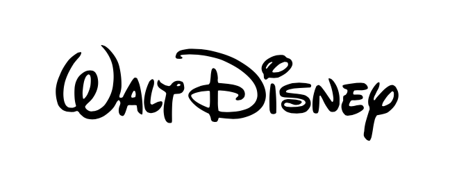
It might be stacked vertically, rearranged for better spacing, or stripped of certain design elements to improve versatility. This variation is particularly useful when the primary logo doesn’t fit well in a certain layout, such as on social media graphics or mobile-friendly website sections. It ensures that branding remains recognizable while being more flexible for different use cases.
It’s best for social media covers, promotional materials, business cards, website footers.
3. Submark Logo (Brandmark)
A submark logo, also known as a brandmark, is a compact, simplified version of the logo that often features just the initials, monogram, or an emblem without the full business name.
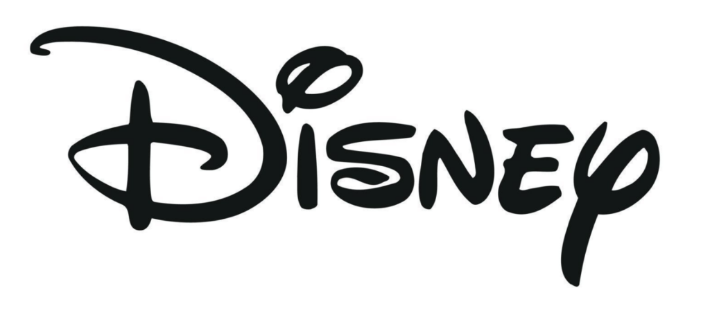
It’s designed for tight spaces where the full logo wouldn’t be legible, such as social media profile images, packaging, stamps, or watermarking branded content. Since it’s highly minimalistic, a submark must still retain recognizable elements of the primary logo to maintain brand identity.
It’s best for social media profile pictures, stickers, apparel, product packaging, branded stamps, watermarking images.
4. Favicon (Mini Logo)
A favicon is the smallest and most stripped-down version of a logo, typically used as an icon for website browser tabs or mobile app icons. It’s usually a single letter, an icon, or a simplified element from the primary logo that remains legible at very small sizes.
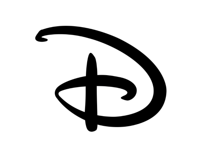
A well-designed favicon enhances brand visibility in digital spaces and ensures that the brand maintains a polished and professional presence online.
It’s best for website browser tabs, mobile app icons, shortcut icons, digital branding assets.
How to Create Logo Variations
Step 1: Start with the Primary Logo Design
Your primary logo is the most complete and detailed version of your brand’s identity. It usually includes:
- Full business name
- Tagline or slogan (if applicable)
- Graphic elements (icon, symbol, or illustration)
- Specific typography and color palette
Best Practices for Creating a Primary Logo:
- Ensure it reflects your brand’s personality and mission
- Keep the design balanced and visually appealing
- Make it scalable so it remains legible in different sizes
- Avoid using excessive details that won’t translate well into smaller formats
Your primary logo serves as the foundation of your brand’s visual identity, acting as the most complete and recognizable representation of your business. Typically, it incorporates the full business name, a tagline or slogan (if applicable), and any graphic elements such as icons, symbols, or illustrations that reinforce brand messaging. Additionally, the typography and color palette are carefully selected to reflect the brand’s personality and ensure a strong visual impact.
When designing a primary logo, it’s crucial to strike a balance between aesthetics and functionality. The logo should effectively communicate the brand’s essence while maintaining clarity and scalability. A well-crafted primary logo should be versatile, allowing it to remain legible and impactful regardless of size or placement. To achieve this, designers should avoid excessive details that may become indistinguishable when scaled down. Instead, simplicity and thoughtful composition should guide the design process.
Case Study: Coca Cola
For example, the Coca-Cola logo is a textbook case of a primary logo that stands the test of time. It features the brand’s full name in its signature Spencerian script, a unique and timeless typeface that has remained consistent for over a century. The elegant curves and red-and-white color scheme create an instantly recognizable visual identity, reinforcing Coca-Cola’s brand equity across all marketing channels.
Step 2: Create a Secondary (Alternate) Logo
A secondary logo, also called an alternate logo, is a modified version of the primary logo designed for better versatility. It may be:
- Stacked or vertical instead of horizontal
- Simplified by removing taglines or decorative elements
- A wordmark version (text-only) without an icon
Where to Use the Secondary Logo:
- Business cards
- Letterheads
- Website footers
- Packaging
Best Practices for Creating a Secondary Logo:
- Ensure it retains key branding elements (e.g., colors, typography)
- Make it visually distinct yet still connected to the primary logo
- Keep it legible and clean for smaller placements
A secondary logo, also referred to as an alternate logo, is a modified version of the primary logo that enhances a brand’s versatility across different placements. Unlike the primary logo, which often contains all branding elements, the secondary logo is designed to fit spaces where the full version might not work as effectively. These adaptations can take several forms, such as a stacked or vertical layout instead of a horizontal one, a simplified version that omits taglines or decorative elements, or a wordmark-only variation that removes icons and symbols, leaving just the brand name in a distinct typeface.
When creating a secondary logo, maintaining consistency with the brand’s identity is essential. The colors, typography, and core visual elements should remain unchanged to ensure seamless brand recognition. However, the design should also offer enough distinction to make it practical for different applications. A well-designed secondary logo should retain clarity even in smaller placements, such as business cards, website footers, and packaging labels, where a more compact design is necessary.
Case Study: Nike
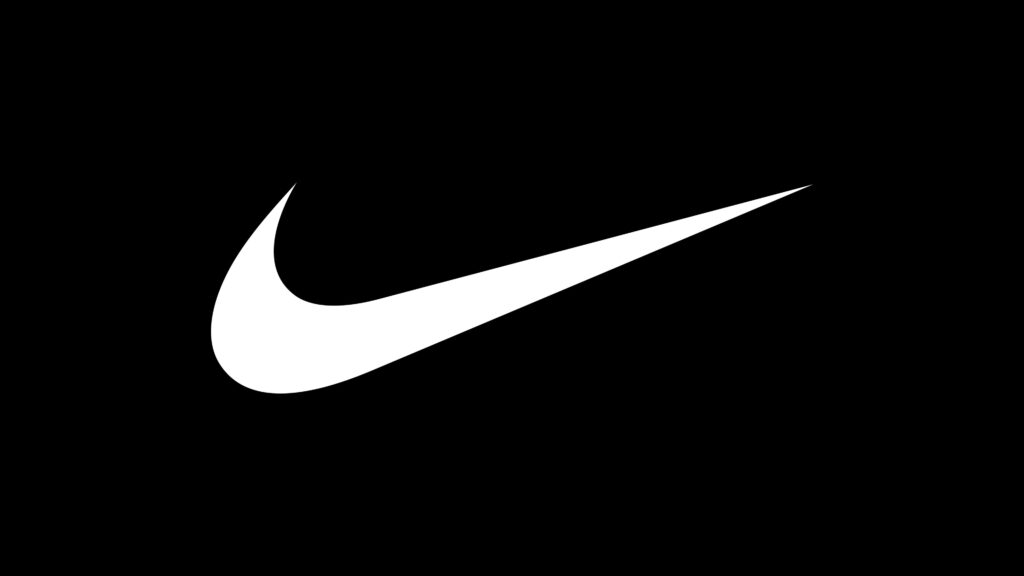
A strong example of this approach is Nike’s secondary logo.
While the brand’s primary logo is the famous Swoosh, Nike also has an alternate version that features just the word “Nike” in a bold sans-serif font.
This text-based secondary logo is particularly useful in layouts where the swoosh alone might not be sufficient for brand recognition. By offering both versions, Nike ensures its brand remains adaptable without sacrificing its distinctive identity.
Step 3: Design a Submark Logo (Brandmark or Monogram)
A submark logo, also known as a brandmark, is a compact, minimalist version of your brand’s identity. It often includes:
- A single letter or initials (monogram)
- An abstract or simplified icon
- A circular or badge-style design
Where to Use a Submark Logo:
- Social media profile pictures
- Watermarks on images
- Stamps or seals
- Apparel and accessories
Best Practices for a Submark Logo:
- Keep it extremely simple and free of clutter
- Ensure it is recognizable even at small sizes
- Avoid including long text—use initials if necessary
A submark logo, also referred to as a brandmark, is a highly condensed and simplified version of a brand’s identity. Designed for compact spaces, this variation strips away unnecessary details, leaving only the most essential elementsthat maintain brand recognition. Unlike primary or secondary logos, a submark is often a symbol, monogram, or abstract icon, making it the most minimalistic representation of a brand. Its primary function is to provide a versatile, scalable, and recognizable branding element for spaces where full-sized logos would be impractical or cluttered.
Submark logos typically take one of three common forms. Some brands use a monogram-based design, which consists of a single letter or initials derived from the full brand name—ideal for high-end fashion houses and luxury brands. Others opt for a simplified icon, often an abstraction of the primary logo, such as a unique shape or symbol that reinforces the brand’s visual identity. Additionally, some brands prefer a circular or badge-style layout, which helps frame the logo in a compact, balanced way, making it visually appealing when used as a seal, stamp, or social media avatar.
Case Study: Chanel
One of the most iconic examples of an effective submark logo is Chanel’s interlocking “C” monogram. This design, which consists of two interwoven “C” letters, is elegant, timeless, and highly recognizable, even without the full “Chanel” name attached.
Logo Variations Generator
Manually creating multiple logo variations can be time-consuming, but AI-powered tools can streamline the process. Arvin AI’s Logo Designer simplifies branding by automatically generating optimized logo variations for different platforms.

Investing in these four essential logo variations is key to maintaining a strong and adaptable brand identity, allowing businesses to present themselves consistently and effectively no matter where their logo appears.
Final Words
Making a logo, let alone four logo variations can be time consuming. So, reduce the time you spend on your logo and focus on the groundwork. Try out the Arvin AI Logo Generator.
Arvin AI is an intelligent, user-friendly AI logo generator designed to simplify and automate the process of creating a complete brand identity. Instead of spending hours tweaking logo designs or hiring expensive design professionals, Arvin AI can generate:
- Primary Logos – A full-fledged, professional logo that serves as your brand’s foundation.
- Secondary Logos – Optimized alternate versions that ensure flexibility across different placements.
- Submark Logos – Minimalist, compact designs for social media, stamps, and digital branding.
- Favicons & Icons – Micro logos tailored for website tabs, mobile apps, and shortcut icons.
Arvin AI doesn’t just generate random logos—it analyzes your industry, brand values, and aesthetic preferences to create highly customized, scalable, and professional-grade logos that fit seamlessly into your overall branding strategy.
FAQ
Logo variations are different versions of a brand’s primary logo, designed to maintain visual consistency while adapting to various platforms and placements. These may include primary logos, secondary logos, submarks, and favicons, each tailored for specific use cases like website headers, social media icons, and merchandise.
Monogram, wordmarks, pictorial marks, abstract marks, mascot marks, combination marks, and emblems.
You need at least 4 variations. These include primary logo, secondary logo, submark, and favicon.
Monogram, wordmarks, pictorial marks, abstract marks, mascot marks, combination marks, emblems, and dynamic logos.
