Logos are a representation of any form of business’ identity. None is an exemption in the building industry. If you have developed a construction company, your logotype is your gateway to forming trust and the professional impression with regard to your services. In this article, we’re going to run through the important components that comprise a good construction logo, and then 12 of the best construction logos, which can be used as examples for inspiration. By the end, you will have an idea of how you can work towards creating your very own construction logo that portrays the values and vision of your company.
Part 1: What Makes a Good Construction Logo?
Typically, a good logo of a construction company should feature some or most of these attributes, because the logo is to symbolically pass the message of your company’s essence. Below are the essential elements of an effective construction logo.
Trustworthiness
Trust is essential in the construction industry. A construction logo should immediately communicate the reliability and capability of delivering work to the potential client. Therefore, a reliable and trustworthy logo design should send subconscious messages to the client that assure him the company can deliver quality results.
Professionalism
A construction logo must present professionalism. For a business that deals with major and at times expensive projects, the logo must convey that your company engages in business practices with integrity and skill and precision. Professional logos are generally clutter-free, and simple and direct, avoiding any frills or fancies.
Clarity and Readability
A construction logo should not be hard to read. Something should be readable in any scale and format, from a business card to website or a huge banner. One should avoid intricate details or overly complicated fonts that would hard to read from a distance or when scaled down.
Relevance to Industry (Construction)
The logo should represent the type of industry the construction business is into. Whether in the form of symbols such as buildings, tools, or even construction-related elements, your logo needs to communicate what your company does. This allows potential clients to immediately understand your services without needing to read much into the logo.
Memorable and Versatile Design
A construction logo should be memorable so that it sticks with clients after they see it. The logo must also be versatile—able to work across different platforms, materials, and sizes. Whether your logo is displayed on a website, on a company vehicle, or as a large sign at a construction site, it should retain its effectiveness and impact.
Part 2: 12 Best Construction Logos
Now that we have covered the key elements of a good construction logo, let’s now look into 12 excellent examples of construction logos and break down what makes them effective.
Midas Group
The logo of the Midas Group copies the theme of Greek mythology, and uses golden lines to form an abstract icon. Gold reflects prestige and quality, while a nod to King Midas, who could turn any touch into gold, creeps in the idea that the company’s work is absolutely phenomenal. This would go a long way in making the logo unique and memorable.
Balfour Beatty
Balfour Beatty uses a bold dark blue font in its logo. The color blue, it is a characteristic of trust and professionalism, two necessary elements for an industry such as construction. Such strong no-nonsense typography immediately communicates that a company can always be relied on to get massive projects done on a precise level.
Roadbridge Limited
An interesting thing in the logo of Roadbridge Limited is the icon, which symbolizes road and bridge construction. It is simple and very much relevant to the industry, putting it right in front of people what kind of services the company offers. Basic geometric shapes help in keeping it versatile and easily recognizable.
McDermott
The logo of McDermott has a clean, modern sans-serif font in blue and green. This design, being simple with contrast between the two colors of blue and green, shows professionalism and trust. Sustainability and innovation, the core values of the construction industry, are also represented by the logo.
PCL
PCL’s logo is oval shaped and has a green and yellow color scheme. The oval reflects wholeness and continuity; this is proper for a firm that focuses on long-term relationships and comprehensive construction services. The green and yellow color palette indicates the commitment to sustainability and safety; yellow is used on construction equipment and safety gear.
Tutor Perini
Tutor Perini’s logo uses the Helvetica Neue Black font, giving the company a strong and bold presence. The clean, modern typography communicates reliability and professionalism, both of which are essential qualities of a construction business dealing with large-scale projects. The design is simple and clear, making it more effective in general.
Perfection Construction Inc.
Perfection Construction Inc. features an icon of a mountain in its logo to mean it can cross mountains and achieve great perfection. Such an icon makes the commitment of the firm about undertaking challenging tasks while availing quality work makes the logo not only attractive but also highly relevant in the construction industry.
Kiewit
Kiewit: The logo design of Kiewit is catchy, with a bold black typographic and the bright yellow hue. Yellow would remind one of a safety and care aspect in building construction, which would make it fit for the company as it is emphasizing security in all functions. The strong black font gives a great sense of might and authority.
Turner Construction Company
Turner Construction Company employs clean lines and a professional blue color in the logo. The blue color gives an impression of trust, and the design directly translates professionalism and efficiency. The no-frills approach works very well to give an impression that the company is reliable and competent.
Layton Construction Company
Layton Construction’s logo is a very strong icon and tagline that represents the company’s values, which include quality and customer satisfaction. The design of the company logo, with lines that are simple and well planned, gives it an elite look and feel so that people do not forget it.
Caterpillar Inc.
Caterpillar’s logo is one of the most iconic in the world. A bold yellow triangle makes a great logo with “CAT” branding, and all of these ingredients make it totally recognizable. The yellow color symbolizes safety and visibility, while the triangle represents stability and strength-two indispensable qualities of a well-known heavy machinery company.
Borras Construction Ltd
The logo of Borras Construction is very simple yet powerful with clean lines and a professional appearance. This design is very flexible due to the simplicity, but the bold clean typography conveys the message that the company has quality and efficiency.
Part 3: Tips for Designing Your Own Construction Logo
Coming up with a logo for your construction business can be pretty fulfilling and may help grow your brand identity while differentiating you in the industry. A well-designed logo, apart from signaling trustworthiness, epitomizes the strength and professionalism with which the construction companies need to identify themselves. Here are some of the key design factors that you should be looking forward to when creating your own construction logo.
Key Design Factors to Consider
Color: Trust, Professionalism, and Safety
Color is, therefore, of paramount importance when designing a construction logo. Since different colors tend to evoke a given emotion and connotation, using the right colours for your logo is important. Blue is a color that denotes trust, professionalism, and reliability. Yellow color is energy, warning, and hopeful. Black is about strength, luxury, and power.
Typography: Strong, clear fonts
Typography plays a significant role in a construction logo. Given the nature of most construction business works, which tends to be quite massive, there is a need to select the bolder, clearer fonts that project strength and clarity required in construction.
- Bold Fonts: The use of strong, bold fonts conveys a sense of robustness and firmness, an important attribute in construction.
- Sans-serif Fonts: Sans-serif fonts are typically cleaner and more modern, making them ideal for construction logos. They provide a contemporary, strong, and professional look.
Icons: Representing Construction-Related Elements
Construction logos often incorporate icons or symbols that represent the industry. These visual elements can communicate what your business does and make your logo more recognizable. Toolssuch as hammers, drills, and wrenches immediately signal the construction industry. Buildings, cranes, or hard hats can create a strong visual identity. Using additional symbols like roads, blueprints, or machinery to further emphasize your area of expertise.
Shapes: Stability and Structure
Shapes are important as they give the construction logo the feeling of stability and structuralness. Good shapes can really portray a well-founded and professional basis.
- Squares and Rectangles: Stable and balanced is the description people give to squares and rectangles.
- Triangles: Triangular forms often signify movement, progress, and building. They convey strength and can be indicative of upward momentum by a company.
- Lines: Clean, horizontal lines can suggest the accuracy and order that construction companies require for success.
Simplification and Balance for Scalability
A construction logo should be simple, balanced, and scalable. When designing your logo, ensure that it remains effective in different sizes and applications. A cluttered or overly complex design can lose its impact when reduced to a small scale, such as on business cards or promotional materials.
Part 4: Understanding Your Target Audience
Designing a logo is very much a function of knowing your target audience. The needs and preferences will vary across the different segments in the construction industry, so it is essential to customize your logo design to the needs of that target market, for instance, local builders versus industrial developers and projects, such as high end residential projects or large commercial projects.
Part 5: How Arvin AI Can Help You Create the Perfect Construction Logo
Designing a professional logo is no longer an elaborate and expensive procedure. Arvin AI is one of the best AI logo makers to provide you with an ideal construction logo in the least time possible. With advanced artificial intelligence, Arvin AI develops highly impressive logos as per your business’s needs
Key features of Arvin AI
- User-Friendly Interface: Arvin AI is designed to be intuitive and easy to use, even for those with no prior design experience.
- Customizable Templates: Choose from a wide variety of construction-related logo templates and personalize them to fit your brand’s colors, typography, and icons.
- Scalability: Arvin AI ensures that your logo is scalable, so it looks great on everything from business cards to billboards.
- Instant Download: Once you’re satisfied with your logo, you can download it instantly and start using it for your business branding.
Steps to Create a Construction Logo with Arvin AI
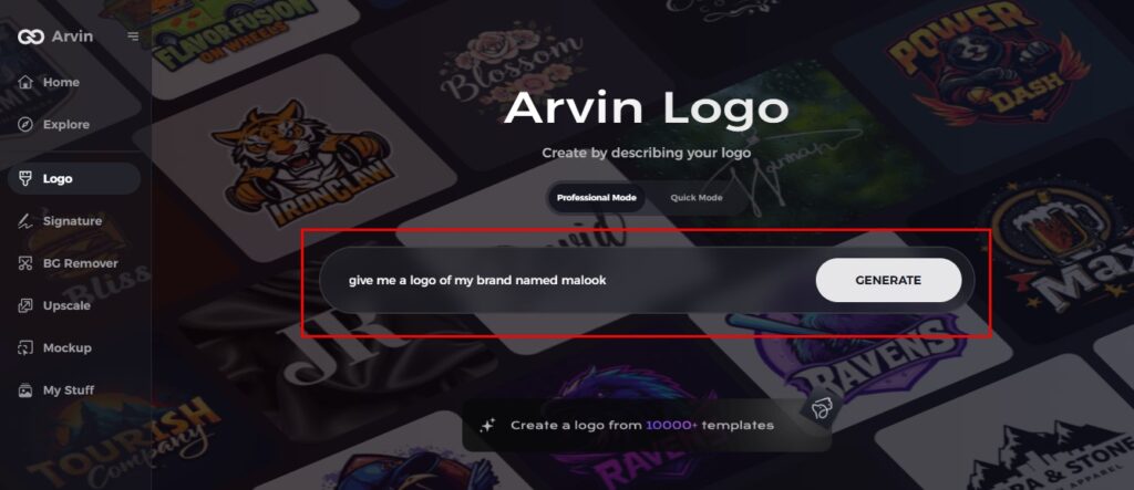
Step 1: Sign Up and Log In
Visit Arvin AI’s website, sign up, and log in to access the logo design feature.
Step 2: Enter Brand Details
Provide your brand name, slogan, and industry, and specify design preferences like fonts and themes.
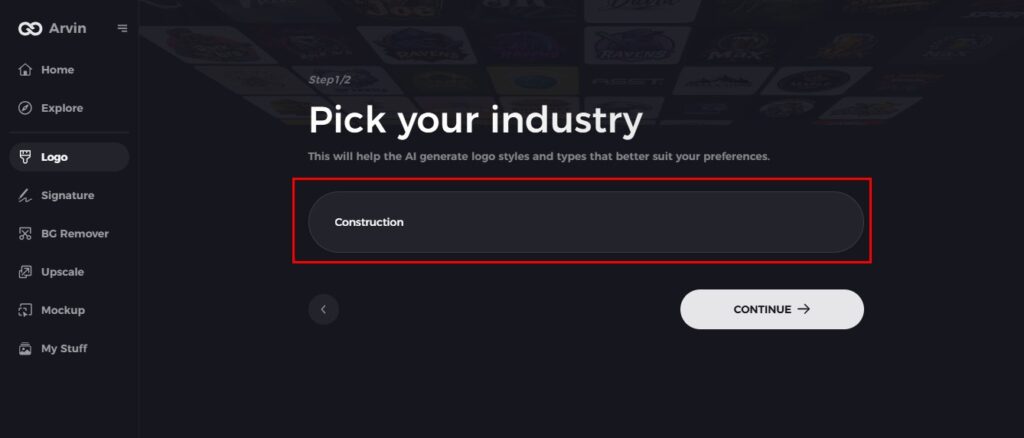
Step 3: Select Your Industry
Choose “Construction” to guide the AI in generating relevant logo styles.
Step 4: Pick a Logo Style
Select a style that fits your brand, inspiring the AI to create the perfect logo.
Step 5: Personalize Your Logo
Use Arvin AI’s tools to adjust fonts, layout, and icons until you’re satisfied with the design.
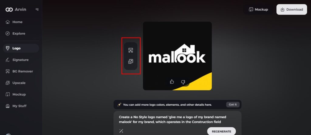
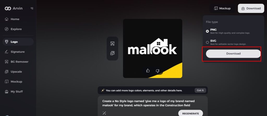
Step 6: Save and Download
Preview your logo in high resolution and save it for both print and digital use.
Conclusion
Your logo acts as the first impression to clients and partners. It’s hence very important to ensure that it tells professionalism, reliability, and expertise. Whether you happen to be a local builder, a high-end residential contractor or a large-scale commercial developer, this should depend on the market that you intend to be targeting. Begin designing your construction logo today with Arvin AI and build a solid foundation for your brand!
FAQs about construction logo
What makes a good construction logo?
A construction logo pops when it embodies the heart of the business, such as trust, strength, and professionalism. Bold typography, strong colors, and relevant symbols help create a memorable and impactful logo.
How can I design a logo for my construction company?
You can design a logo for your construction company by considering the key factors of color, typography, and relevant icons.
What colors are best for a construction logo?
The best colors for a construction logo are blue (trust and professionalism), yellow (safety and energy), and black (strength and sophistication).
Can I design my own construction logo without professional help?
Yes, you can even create your own construction logo with AI-powered tools such as Arvin AI. This process has been simplified, and templates can be customised for creating a professional logo without having design expertise.