Nokia is one of the most identified technology companies that have immensely contributed to the growth of the mobile phone industry. Being one of the world’s most identified brands, it is a reflection of its evolution over the years through the logo. Logos signify strong brand identities since they enable customers to identify companies with relative ease. The Nokia logo is simple yet very powerful, thus reflecting the history of the company from its infancy to becoming one of the technological leaders in the world.
Part 1: The Origins of the Nokia Logo
The history of Nokia starts with its foundation as a paper mill in 1865 in Finland. From that time to this, the company developed and grew in other businesses like rubber and cable production. However, in the 1960s, it focused more on telecommunications; hence, this time the company made its first logo.
Early years of Nokia
Nokia started off as a paper mill from which established in 1865 in Finland. Over time, it grew into rubber and then to the production of cables, then Nokia itself became a growing concern that focused on telecommunications, creating its first logo in the 1960s. The initial form was simple with bold, strong lettering that probably aimed at representing its industrial roots.
First logo related to the company’s business
The very first logo resembled much about Nokia’s core business during the earlier stages. The clean, bold fonts expressed stability and reliability as these were core needs for the company to establish its transition to the telecommunication sector. At the time, the company wanted its logo to represent its engineering background and dependable services.
Significant changes in branding strategy
During the growth of Nokia and its increased focus on mobile phones in the 1980s, it made a few changes to its branding. The company started to rethink how its logo should reflect its new direction in technology. The first big shift came when Nokia began focusing on a more modern and dynamic image.
Part 2: Evolution of the Nokia Logo over the Years
The original Nokia logo appeared in 1866. It depicted a fish that seemed to be salmon of the Noquian Virta River. This emblem used without noticeable change for about a century. The Nokia logo renewed in 1965. This made the pattern more transparent and minimal.
1865 – 1871
The original Nokia logo appeared in 1865. It depicted a fish that seemed to be salmon of the Noquian Virta River. This emblem was used without noticeable change for about a century. The Nokia logo was renewed in 1965. This made the pattern more transparent and minimal.
1871 – 1898
The logo made a few years ago has improved. The details of the fish reduced and the background became black. The fish is rounded and has a more serious expression. It is slightly jumped out of the round emblem, but splashes and water drops are gone from the border. The emblem character has not been changed.
1898 – 1965
Designed for Nokia at the end of the 19th century, the logo remained with Nokia for almost 70 years, making it the longest-used badge in Nokia’s history. The logo is a diamond-shaped pentagon with a white background and black outline. The main part of the logo was occupied by a three-stage lettering with a simple handwritten font, which was also painted black.
1965 – 1966
However, a year later, a new Nokia symbol mark appeared. The white and black emblems contained Nokia’s company name in a round shape. After merging with Finnish Cable Works and Finnish Rubber Works in 1966, Nokia announced the Arrow logo. This logo was very similar to the current one except for the image of the typeface, thin blue shades and arrows. The arrow used as a symbol of Nokia’s progress and progress in the telecommunications industry.
1966 – 1978
This time, the company has only given very few updates to the logo. The curve across the ring became a little linear. The inscriptions slightly adjusted to fit the new shape, making the letters appear short. This update makes the logo look more balanced.
1978 – 2023
The current logo expresses the brand name in minimal sun letters. Characters are thick enough to convey messages such as “reliability” and “quality.” O “is not an ordinary oval or round shape, but a round rectangle. The highlight of the word mark is “K” like an arrow. It is similar to the “Play” button and produces a connection with the industry where Nokia is active.
2023 – Today
In 2023, the Nokia logo was renewed and it was reborn as a very stylish and advanced image. The new concept is a sharp uppercase letter based on a bright blue tone, lacking some of the sticks of “N,” “K,” and “A.” Only O “and” I “have finished contours and are finished with a very unique and edgy logo.
Part 3: Symbolism and Meaning of the Nokia Logo
The Nokia logo is very simple and elegant in design, very easy to recognize. A bold, modern font conveys clarity and readability that sets off the logo both online and offline. Blue is the shade most often associated with the logo, but blue is a color of trust, reliance, and professional qualities in a company such as Nokia.
Visible elements of a logo
Use of font, colors, or symbols. The most recognizable feature about the Nokia brand is its simplicity and elegance. It holds a bold and modern font style that is not hard to read, making the logo fonts stand out both on and offline. Blue represents the main color in this logo structure which signifies reliability as well as trust and professional standards.
The alignment of the logo
This figure of the logo very well describes the core values of the company Nokia, which are trust, innovation, and dependability. The strong and bold font signifies the aspects of stability and strength that are needed for the company who started from heavy industries and gradually moved to state-of-art technology.
Impact of the logo on global recognition
The Nokia logo has been one of the most recognizable symbols around the world for decades. It is a very simple and effective design that has allowed it to stand out from the sea of competing technology companies. As Nokia grew throughout the 1990s and early 2000s, the logo associated with mobile phones.
Part 4: The Nokia Logo in the Digital Age
With the rapid development of digital technology, there is a transformation in the usage of logos. Like other firms, Nokia changed its logo according to the demands of the digital world. The logos are sleek yet bold that’s easy on every screen that even on little hand-held it may be identifiable still.
How the Nokia logo changed with digital platforms?
Since the advancement in technology, the way of logos’ use has also become quite different. Change in logos is similar to that of Nokia, which recently marketed only on computers or laptops because of the increase in internet usage among people. Today, logos are seen everywhere from websites to apps and even social media.
The role of the logo in Nokia’s current business strategy
The Nokia logo is still an important part of the company business today. Since the company has started to focus more on its technology services, like network infrastructure and software, the logo still ties into the past of mobile phones in its form. Reliability alongside innovation represent the enduring values of the brand which serve as the guiding force in Nokia’s strategic development.
Popularity of the logo in mobile technology
Nokia’s logo became a symbol of mobile technology during the 1990s and early 2000s when Nokia was the leader in mobile phones. Even though Nokia is no longer the leader in mobile phones, the logo still has a lot of recognition.
Part 5. Discover Arvin AI: You’re Logo Design Companion
Arvin AI logo maker is the simplest resource used to create and design logos. It uses artificial intelligence to get you a logo that simply fits your brand. With a simple interface, it gives you the simplest ways of coming up with several styles and adjusting the logo on a few clicks. Whether you need a new look or are starting from scratch, AI logo maker offers wonderful options for all types of logos. Those looking for an uncomplicated professional logo will find this solution optimal.
Key Features of Arvin AI
There are the following key features of Arvin AI:
- Easy to use: The tool is simple and doesn’t require any design experience.
- Customizable: You can change colors, shapes, and fonts to match your style.
- Fast results: It creates logos quickly, saving you time.
- Professional designs: The logos look clean and high-quality.
- Multiple options: You can explore different logo ideas to find the perfect one.
- Smart suggestions: AI helps suggest the best design choices for your brand.
Steps to Using Arvin AI in Creating a Logo
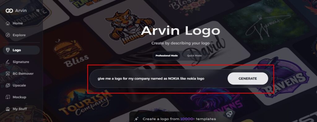
Step 1: Sign Up and Log In
Go to the website for Arvin AI, create your account, and log in to access the logo making tool.
Step 2: Enter Your Brand Details
Include your brand name, slogan, and industry. Add your preferred design preferences, such as particular font styles or color themes.
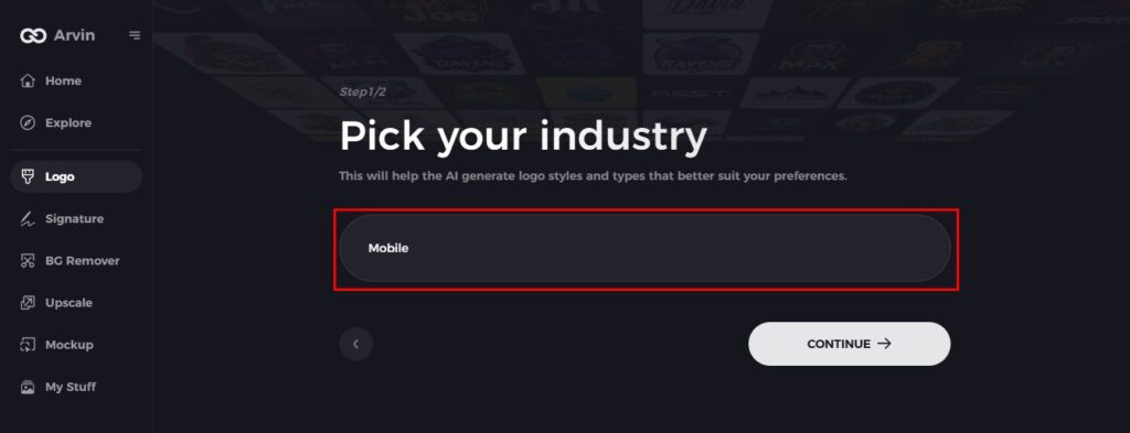
Step 3: Select Your Industry
Select an industry or niche according to which Arvin AI will generate logos best suited for your business.
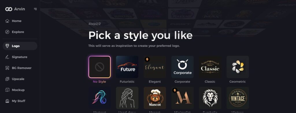
Step 4: Pick a Style
Choose a style that reflects your brand. This will guide the logo design process.
Step 5: Personalize Your Design
Use Arvin AI’s tools to tweak your logo. Adjust font, layout, and symbols until you’re happy with the design.
Step 6: Save and Download
Once satisfied, preview the logo and save it in high-resolution format for print or digital use.
Conclusion
The Nokia logo has greatly changed through the years to depict growth from an industrial business to a technological leader. By implementing straightforward bold designs the logo helps enterprises establish their brand image with widespread global recognition. Logos particularly like Nokia serve to construct brand recognition while establishing identity. The best tool for those businesses and individuals who wish to design a memorable logo of their own is Arvin AI, with easy, professional design options for everyone.
FAQs
What did the original Nokia logo look like?
The first Nokia logo was straightforward with bold letters showing the company’s industrial roots and its reliance on reliability.
Why did Nokia change its logo?
For the first time in 60 years, Nokia has launched a new brand identity including an updated logo. The change is to help shift perceptions of Nokia from a mobile phone company – which is how it is still seen by many – to a B2B innovation and tech company.
What do the hands on Nokia logo mean?
The Nokia logo, which depicts male and female hands tending to shake, is one of the most famous examples. It perfectly emphasizes the slogan “Connecting people.” The Heart Care Centers of Florida logo depicts two hands holding a heart. They symbolize protection and care.
How can Arvin AI assist with logo creation?
Arvin AI is a handy tool where one can make professional logos rapidly, having a customized option and smart AI suggestions to make your design stand out.
