The simple IHOP logo is the result of a long road from just a clean picture to a minimalist yet meaningful emblem. This is because the brand not only offers the finest pancakes, but also delicious marketing campaigns. Humor and creativity are the secrets of IHOP’s marketing magic. Are you ready for marketing inspiration? Then this blog is exactly for you. Here is an overview of the IHOP brand and ideas from IHOP’s marketing strategy. Let’s bake pancakes.
Part 1: Meaning and History
The visual identity of the American restaurant chain IHOP has come a long way from a fine multi-color logo to the minimal and familiar badge we see today. Five versions of the emblem of this famous brand created over the years, and the current one is completely different from the one introduced at the beginning. As this is one of the cute logos for your brand, that enhance your visual identity.
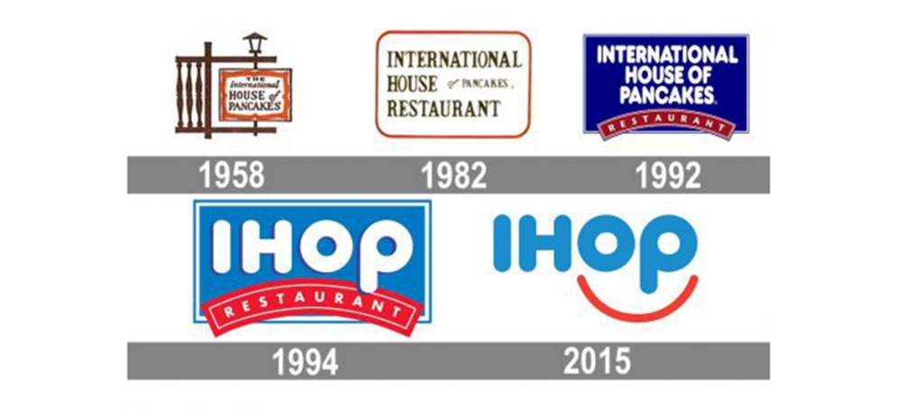
1958 – 1982
IHOP founded in 1958 under the name “The International House of Pancakes,” and has been operating in that style for nearly 40 years. The logo, published in 1958, consisted of a complex brown structure imitating a wooden entrance with street lights.
1982 – 1992
In 1982, the badge simplified and the wooden entrance with streetlights replaced by a round, thin red frame. The inscription on the inside of the frame written in upper letters of the serif of the old character with curves, and the part of “Of Pancakes” became smaller.
1992 – 2003
The logo got its modern look in 1992. The banner colored blue, while the white lettering was all executed in one style and size. All capitals of the inscription featured a bold rounded sans-serif typeface, which evokes a friendly and welcoming feeling. On the bottom part of the banner, there a red arched ribbon with the “Restaurant” in delicate capitals.
1994 – 2015
The new logo announced in 1994 with a new name. Although the previous version completely followed, the color palette changes to a bright one, and the long store name replaced by a huge white “IHOP” with a dark blue shadow in the rounded sans serif bold.
2015 – Present
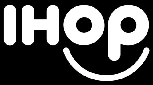
The red “Smile” version was mainly adopted and renewed in 2015. The IHOP logo consists of light blue flat letters with a thin red smile line below the letter “O.”
Symbol Mark
The second logo, adopted in 1982, was the same brown and orange logo colors scheme, with almost the same typeface. Things like “Stage Equipment” disappeared and became simpler, but also like a real logo. In 1994 and 1995, two emblems were created and used simultaneously.
Emblem of 2015
The current brand identity was designed by Studio Tilt, based in Kansas City, Missouri. The curve below the word mark is a smile, and the letters “o” and “p” are an image of the eyes.
Color
In branding, red is a color that invites hunger and means urgency, so it is suitable for fast food stores. Blue, on the other hand, is known as a professional color that evokes trust, and balances perfect with the red of the IHOP logo.
Font
Typography is the next important color in logo design. It is this field that IHOP excels in unique and friendly logo fonts. Heavy stroke weights make the logo look bold and perfect for brands that dominate the market.
Part 2: Arvin AI Can Enhance Designing and Identity of Logo
Logos are, in fact, the support of a brand’s identity; they are the first brand and eternal symbol of trust and appreciation. A good logo can show the values for a brand in addition to communicating emotional attachment or joining to customer and also establish faithfulness. To build such an impactful design for businesses, Arvin AI is the best choice. It uses the latest technological advancement analyzing branding needs to deliver customized logo designs.
Key Features of Arvin AI
- Custom Logo Design: Arvin AI provides logo designing tools to let a brand communicate its values and target audience.
- Design Plasticity: Users can play with different colors, fonts, and styles to come up with something unique.
- AI-Powered Ideas: It comes up with design recommendations based on industry trends and target audience analysis.
- Logo Flexibility: Arvin AI makes sure that logos are flexible and tailored for different uses, such as social media, websites, and packaging.
Steps to Use Arvin AI for making Logo
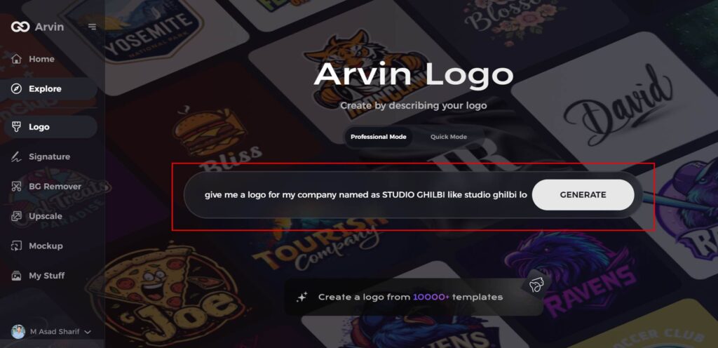
Step 1: Access the Arvin AI Website
Visit the Arvin AI logo maker site using your web browser to begin your logo creation journey.
Step 2: Input Your Business Details
Enter key information about your business, such as its name and category. This helps the AI craft designs tailored to your brand.
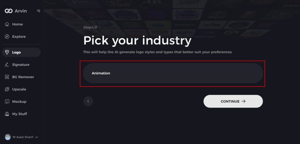
Step 3: Specify Your Industry
Choose your business’s industry from the provided options. This step helps the AI refine logo styles to suit your niche.
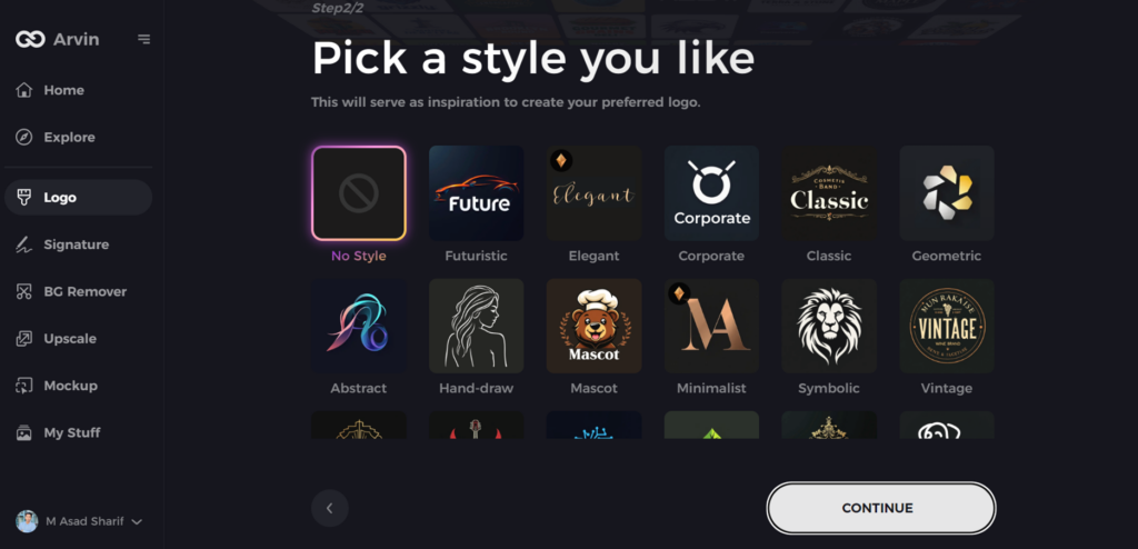
Step 4: Choose a Design Style
Browse the available style options and select one that aligns with your brand vision. If undecided, skip this step, and let the AI suggest designs.
Step 5: Explore Logo Concepts
Review the range of logo ideas generated by the AI based on your inputs and select the one that resonates most with your brand identity.
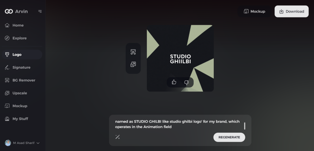
Step 6: Customize Your Design
Modify the selected logo by adjusting elements like colors, fonts, icons, and layouts to perfectly align with your style.
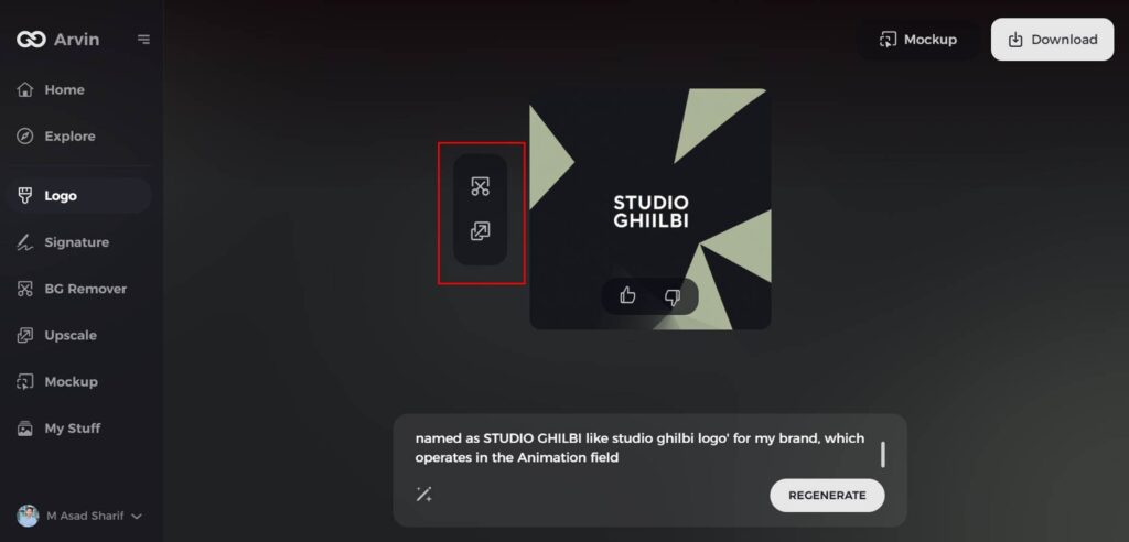
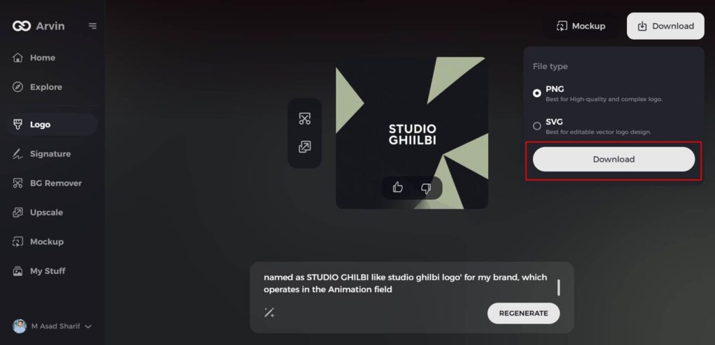
Step 7: Download Your Final Logo
When satisfied with your design, download it in formats such as PNG or SVG. These formats ensure versatility for digital and print use.
Conclusion
It is time to summarize the discussion on IHOP marketing methods. Note that IHOP logo always leverages the right visuals for all campaigns to establish a consistent brand identity. To do so, we need a reliable design team that can help shape our brand image, both online and offline, with all our marketing and branding designs. How a logo can change a brand’s identity and connect with a customer in a way that brings success is the case of IHOP. With the help of Arvin AI businesses can now create logos that have an impact on their audience.
FAQs
What does the IHOP logo represent?
The IHOP logo signifies friendliness and joy, and a red smile below the “O” and “P” indicates a smiling dining experience.
Why did IHOP change its logo?
The IHOP logo got an update that imparted its brand-new energy with less complexity yet enhanced visual attractiveness and customer appeal.
What do the colors in the IHOP logo mean?
The blue is expressing professionalism and trust and the red is expressing appetite stimulation, hence making it a healthy and harmonious brand identity.
How can Arvin AI help in logo design?
Artificial intelligence design solutions from Arvin AI allow companies to create customized logos that evolve through platforms while ensuring uniqueness for differentiation.