A logo is the face of a business, which is where first impressions and expectations for customers begin. For bakeries it takes on added importance since it represents warmth, artistry, and the goodness of the offerings. A great logo is more than just an image-it’s a story, a promise, and a unique mark of identity that stays in your customers’ minds. Good bakery logos should comprise the following and more, while various styles would be presented, including a few tips on how to design one that will aptly fit with your business vision.
Part 1: What Makes a Good Bakery Logo?
Bakery logos play a multifaceted role in building success. It does more than represent your business—it communicates your values, creates recognition, and inspires loyalty. Take a look at some of the world’s most successful bakeries. Their logos are more than just designs; they are symbols that have been associated with quality, taste, and experience. Great logos will not only be memorable but will create a connection that makes customers keep coming back. As follows:
- Recognition: A good-looking logo will make sure that customers remember your bakery even in a crowded market.
- Trust: A professional design signals take your business seriously, reassuring customers of quality and consistency.
- Appeal to Emotions: Logos evoke feelings, whether it’s warmth, nostalgia, or excitement. A bakery’s logo can transport customers to happy moments and pleasant memories.
Key Elements of a Bakery Logo
This process calls for deep thinking of various elements defining the character and message of the bakery logos.
Font Choices
Typography is the most significant characteristic of a logo’s personality. Various fonts express various messages. A handwritten font has a personal feel to it. It is apt for bakeries that give an impression of home. Modern bakeries may opt for sans-serif fonts to convey a clean, upscale look, while vintage bakeries could use script fonts to emphasize tradition and charm.
Color Palettes
The colors in your logo should resonate with the emotions you want to evoke. Warm tones such as browns and creams are resonant with the natural color of baked goods, while pastels suggest sweetness and joy. Bold and vibrant colors can appeal to a youthful, energetic crowd.
Icons and Symbols
Icons in the bakery logos are quick visual cues. A loaf of bread, a whisk, or a cupcake can immediately let customers know about the business. Carefully selected symbols enhance the brand’s identity and make the logo more memorable.
Design Styles
The overall style of your logo should reflect the unique character of your bakery. These would be very much suited to the minimalist modern style and playful styles using whimsical illustrations would do good for a family-oriented bakery or children’s bakeries. A rustic logo with vintage elements can emphasize heritage and craftsmanship.
Part 2: Industry-Specific Inspirations for Bakery Logos
To inspire you in creating the bakery logos here are examples of bakery, pastry, cake logo fonts, icons, and character features.
Bakery Café
Need a little inspiration for your bakery logo? Here’s some examples on how to be creative.
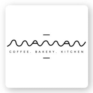
Maman:
Maman started out as a small, independent cafe in Soho and then expanded into the lifestyle brand that makes use of local ingredients within Montreal, Toronto, and New York. Celebrities have rushed to their cafes, and they now hold high-end designer and brand events. The flowing logo reflects a leisurely yet modern business.
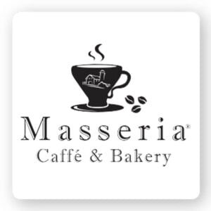
Masseria Cafe & Bakery:
Masseria Cafe & Bakery is a small coffee shop in New York City that offers pastries and drinks. But their dishes say it all. Their cafes are simple, rewarding and traditional. So they decided on a logo that represents the value of such a business. The font of their logo is what catches the eye, telling them they are a reliable traditional cafe/bakery.
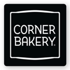
Corner Bakery:
Corner Bakery is a cafe chain in the US offering bread, sandwiches, pastries, and lunch. It is originally a small cafe but it now has over 129 locations throughout the US. Fresh ingredients and direct fire stoves motivate the customers to create fine food. Their business values are very well expressed by this logo.
Cake Shop
This cake shop logo speaks of the sweet life. Let’s see some good examples here for inspiration.
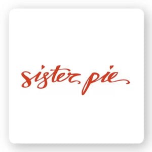
Sister Pie:
Lisa, who made pies in her kitchen, slowly built her business, raised $25,000 at Indiegogo and opened up the cake shop Sister Pie. The name “Sister Pie” was so-called by nickname between Lisa and her sister. The writing font is elegant and feminine while the heart gives warmth to the logo. This logo transmits love from it.
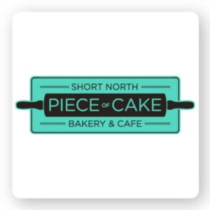
Piece of Cake
“You make memories, we make sweet memories,” that’s all about Piece of Cake Bakery. Their logo uses icons that symbolize what their business offers and the business name is very straight. In other words just by looking at the logo, you can see well what they are doing. Some businesses use abstract icons; however, literal icons deliver messages very clearly and effectively.
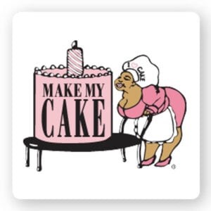
Make My Cake:
Many businesses choose contemporary and trendy logos, but they don’t have to. It is just a matter of the theme that your business portrays. Make My Cake provides cakes that have old bread making in the south Mississippi and Alabama. The logo comes from Josephine Smith, who heads the family and symbolizes tradition, quality, and reliability.
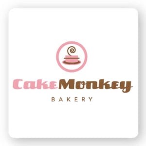
Cake Monkey:
Lisa J. Olin, film producer and baker, was a cake and pastry enthusiast and, therefore, founded a cake monkey bakery. Presently, Cake Monkey sells and wholesales in-store and more than 80 stores sell Cake Monkey products. The logo of Cakes Monkey symbolizes traditional elements, and the retro fonts bring nostalgic emotions.
Pastry Shop
The logo of the pastry shop takes many shapes. Let’s take a few examples.
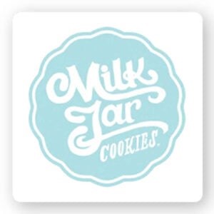
Milk Jar Cookies:
Milk Jar Cookies is a logo that unifies milk and cookies. Homemade cookies and locally made milk are favorites of many people, and the logo also demonstrates this. Mixing the old-fashioned fonts with vivid colors helps you play around the messages buried within the logo. This example applies a pale blue background color for it to become more vibrant and entertaining.
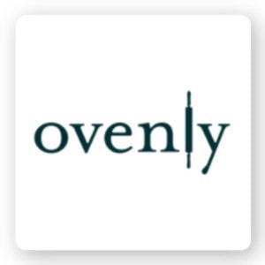
Ovenly:
Ovenly is a New York award-winning retail and wholesale bakery. Their Logo design is sophisticate simplicity with modernity. They are concentrated on the balance between aroma and sweetness of baked goods. This logo is consisted of simple fonts and beautifully laying noodle stick icons to present what they are doing as a business.
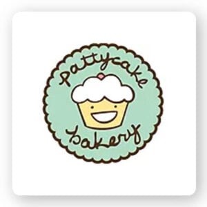
Pattycake Bakery
Pattycake Bakery contains organic and vegan sweets fresh made from scratch, with a twist on the good old sweets. The logo has a warm feel to it as the middle shows a smiling cupcake, and the writing body’s font is comfortable to read. The bright colors and fonts and icons merge well to make up a cozy and family-friendly logo.
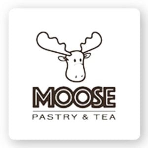
Moose:
Moose is an Asian French fusion bakery in Michigan. The head chef was Taiwanese and wanted to connect with his roots by opening a Moose bakery. The logo is clear, symbolizing business content using icons and fonts. The bold logo immediately catches the eye, meaning stability and safety.
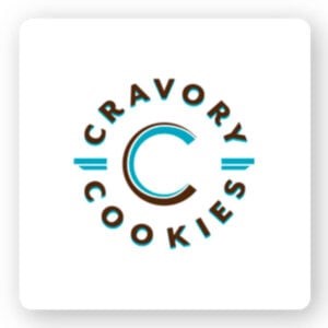
Cravory:
It all has to do with two entrepreneurs who founded The Cravory to bring something new to the world of the dessert. They’re coming up with some new flavors from the traditional cookies in a surprise for the customers. Their fonts are traditional, but their colors and layouts help create a modern atmosphere. Their business stories reflect in their logos.
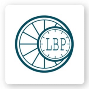
LBP bakery:
Many of the logos introduced so far use strong icons and fonts. However, the LBP bakery chose an abstract logo using monogram fonts. Monogram fonts speak of professionalism and luxury. Abstract logos make them unique to their business and even more appealing to customers.
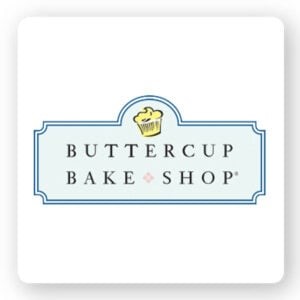
Buttercup Bake Shop:
Many bakeries and cake shops want a classic atmosphere for their business. Therefore, stick to traditional fonts and icons. Buttercup Bake Shop is one of the examples. They have selected the fonts, which are conventional and elegant in nature.
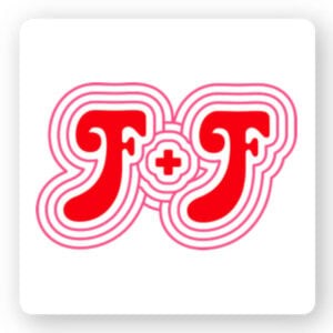
F + F (fat and flour):
F + F (fat and flour) is a small pie shop in Los Angeles, California. Owner Nicole Rucker is an award-winning pie champion and cookbook author. In launching her business, I thought of a fun and light business name! She abbreviated the business name in her logo and created a retro logo in her 70s. The bright colors and overall design are eye-catching and interest what the business offers.
Traditional bakery
If you are a traditional bakery, you want the traditional bakery logos that matches that. Let’s see some inspiration for the logo.
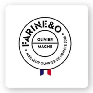
Farine&O:
Farine & O is located in the middle of Paris, France. A traditional French bakery, the logo wanted to represent its traditional values. They employ a wide range of fonts to highlight one font in their logo. This way, you find a name of the shop before reading other fonts. It is a masculine and traditional logo that says it all in one word- business.
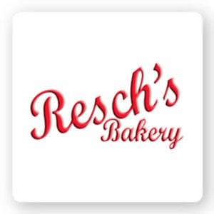
Resch’s bakery:
The bakery of Resch has a history from 1920. The logo shows that. The name of the bakery indicates that it is a family business, but aside from that, the font used represents the tradition. A modern twist is added with bright red and the logo is popped.
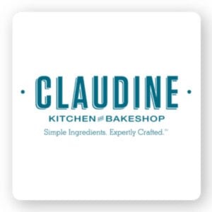
Claudine Kitchen & Bakeshop:
Claudine Kitchen & Bakeshop is a brunch cafe that makes all the dishes and baked goods from scratch. The focus is on modern arrangement of casual comfort food. The logo tells us everything. Using three different fonts, the name is the thickest. Simple material. Skilled skill. “So you know what you are going to get and the quality of the product.
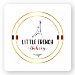
Little French Bakery:
Redondo Beach, California is home to The Little French bakery. The logo tells us everything. They mix fonts that give the logo a French feel and of course use the Eiffel Tower, the symbol of Paris. Even if you use the icon on the logo, it will not occupy the logo.
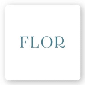
Flor bakery:
Flor bakeries focus on making simple, flavorful desserts and breads. They chose a very simple logo only for the Yogo. Simple logo, but powerful. The font is clear and clear, and the color is bold. Just looking at the logo, I do not know what this company offers, but I am intrigued by just seeing the logo.
Bread shops
Do you run a Bread shops and want a pop logo? Here are some examples of successful bakery logos.
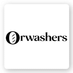
Orwashers:
Orwashers was founded in 1916 in New York by a Hungarian immigrant family. Since then, it has been constantly blooming to contribute to its local community. The logo of this bakery is indeed powerful and very smart. The font of the logo is bold, meaning tradition and trust. However, they see “O” as a loaf of bread and show what their business is. The logo is simple but has succeeded in creating a sense of purpose.
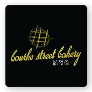
Burke Street Bakery:
The Burke Street Bakery began in a small corner of Sydney, Australia. So what makes their logo special? Well, compared to other logos in this list, it is different. And we like that difference. They use gold writing fonts to express the rustic elongation of bread. This logo has something hip and trendy, at the same time reliable.
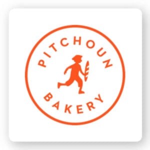
Pitchoun:
Pitchoun!is a fine French bakery in Los Angeles, offering artisans bread, pastries, cakes, and dishes. Their logo is clean and simple and easy to communicate messages. Vivid oranges are different from other bakery logos, which help to stand out. French boys with baguettes tell them exactly what they are offering and the font is bold.
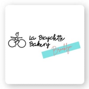
La Bicyclette Bakery:
La Bicyclette Bakery was opened by Fro, the founder of French bread. And his logo represents his story. Next, the French male logo with baguette tells the story of everything. Adding sophistication and elegance to the business, the business utterly had a writing font. It also has a logo and a bakery in Brooklyn, New York.
Artisan bakery
Do you have an Artisan bakery? Let’s get inspiration by looking at the artisan bakery logo.
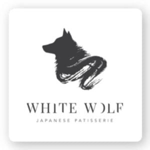
White Wolf:
The goal of Japanese patisserie White Wolf is to break and unite people’s walls with food. We love this logo! Their logo contains multiple meanings. In Japan, white wolves are protectors and guardians. For this patisserie, this may have a special meaning. So you can make logos that have multiple meanings in your business.
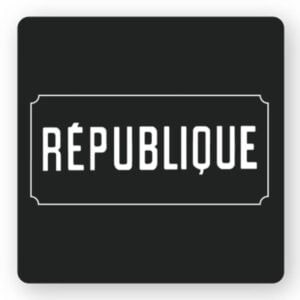
Republique:
Republique in Los Angeles offers a gastronomic environment in a historic space. There is a bakery, café and dining area where you can enjoy a French-style menu. But it goes without saying. The font of the logo probably indicates that it is a French bakery. Do you know what fonts can do? The logo is simple and bold with a story, and when designing your logo, choose the font that would suit your business.
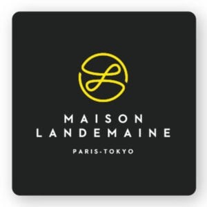
Maison Landemaine:
Maison Landemaine is an artisan bakery using organic and eco-friendly ingredients. For the first time, they wanted to go for an abstract logo of the business. The logo is bright, fluid and smooth. This makes a sophisticated, elegant, and respected atmosphere. Curiosity arose over what they were offering.
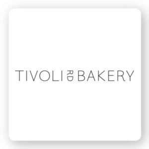
Tivoli Bakery:
Tivoli Bakery specializes in sourdough bread and only uses natural ingredients; the bread of their traditional recipes. The logo is simple but reflects the style of the bakery. The thin font of the logo means softness, femininity and concern. In contrast, the fineness of the letters represents modernity.
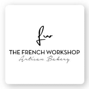
French Workshop:
The French Workshop is an artisanal bakery in New York. As you can see, most artisanal bakeries use fonts as logos to minimize the use of icons. The French Workshop uses icons and various fonts to tell stories. Also, since the name of the shop may be misunderstood, “artisan’s bakery” is included in the logo. If you feel your logo is not clear, you can include more details.
Part 3: Mistakes to Avoid When Designing a Bakery Logo
Making the bakery logos are exciting, yet common traps can prevent it from doing the job it’s supposed to do. Avoid these common mistakes to have an extraordinary logo.
- Overcomplicating: A complicated design is hard to identify and copy. Make it simple so it is clear and long-lasting.
- Using Generic Symbols: Generic icons such as basic bread loaves or cupcakes make your logo look less creative. Have a unique logo that represents the character of your bakery.
- Ignoring Brand Consistency: Your logo should be related to your entire brand, your interior design, packaging, and marketing materials. Consistency develops brand recognition and trust.
- Skipping feedback: Request input from trusted persons and test the logo in other contexts before settling on it as your final.
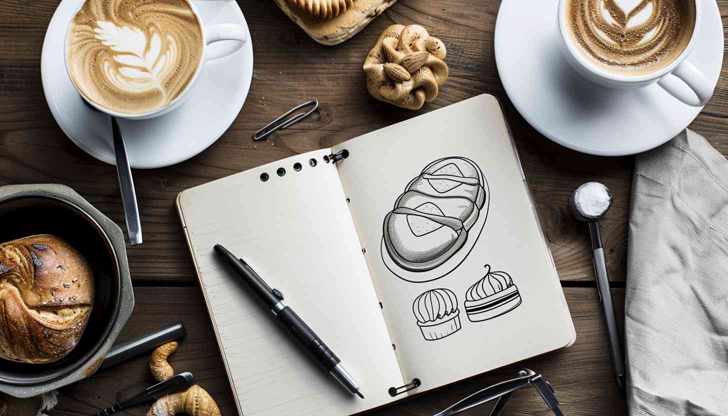
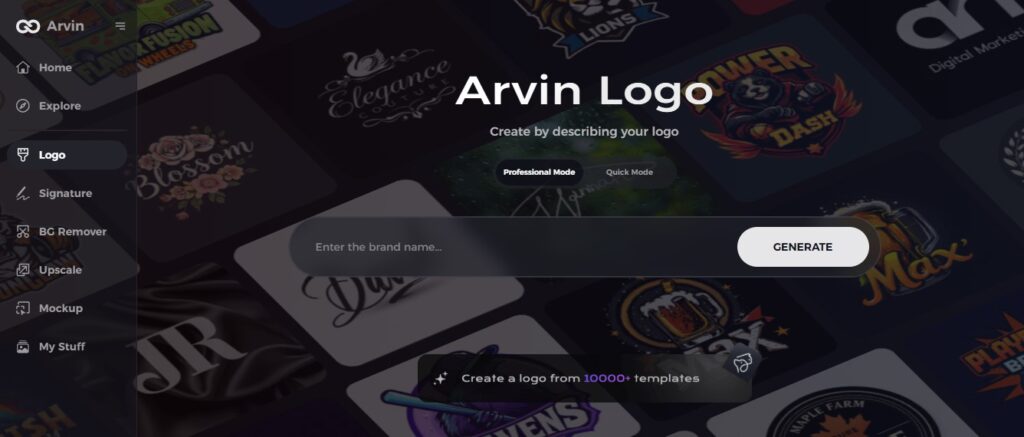
Part 4: How to Create the Perfect Bakery Logo with Arvin AI
Designing the bakery logos do not have to be a daunting task. Arvin AI, the advanced logo maker, makes it easy with tools designed for bakery businesses. It offers an intuitive platform where users can create professional logos in minutes.
Key Features
- Customizable Templates: A wide variety of bakery-themed templates to choose from.
- User-Friendly Interface: Easy-to-use tools for both beginners and experienced designers.
- Color and Font Recommendations: Suggestions by AI according to branding principles.
- Scalable Designs: High-resolution logos that look excellent in any size.
- Quick Preview: Instant previews of how the logo will look on signage, packaging, and much more.
- Affordable Pricing: Cost-effective solutions for businesses of all sizes.
Steps to Use Arvin AI for Crafting the Perfect Bakery Logo
Step 1: Create an Account and Log In to Arvin AI
Visit the Arvin AI website, create an account, and log in to access the logo design features.
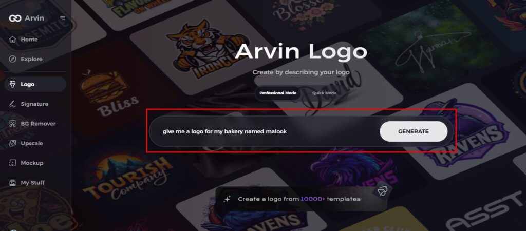
Step 2: Input Your Bakery’s Information and Preferences
Enter your bakery’s name, slogan, and industry. Provide design preferences, such as specific font styles, colors, or themes that reflect your brand identity.
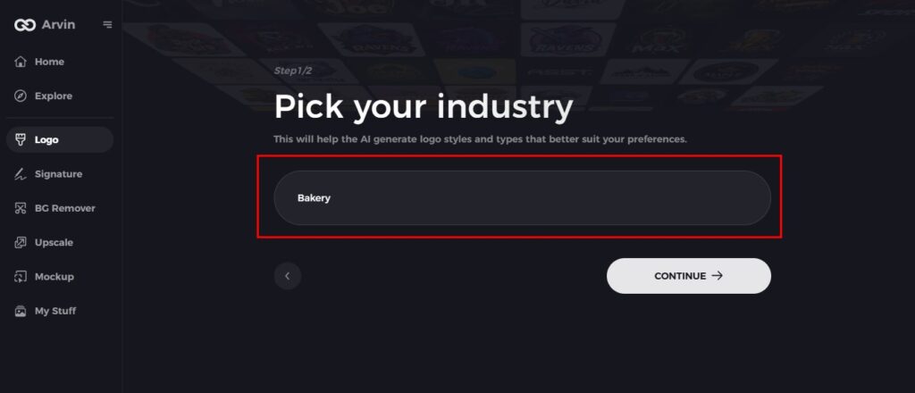
Step 3: Select Your Industry
Choose the “Bakery” or related industry from the options. This helps Arvin AI generate logo styles tailored to your niche.
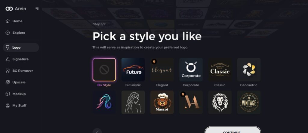
Step 4: Choose a Logo Style
Browse through different logo styles and select one that resonates with your bakery’s vibe, whether it’s vintage, modern, or playful.
Step 5: Personalize Your Design Using Arvin AI’s Tools
Once Arvin AI generates logo options, use its customization tools to refine your design. Adjust font styles, layouts, and symbols to align perfectly with your brand image.
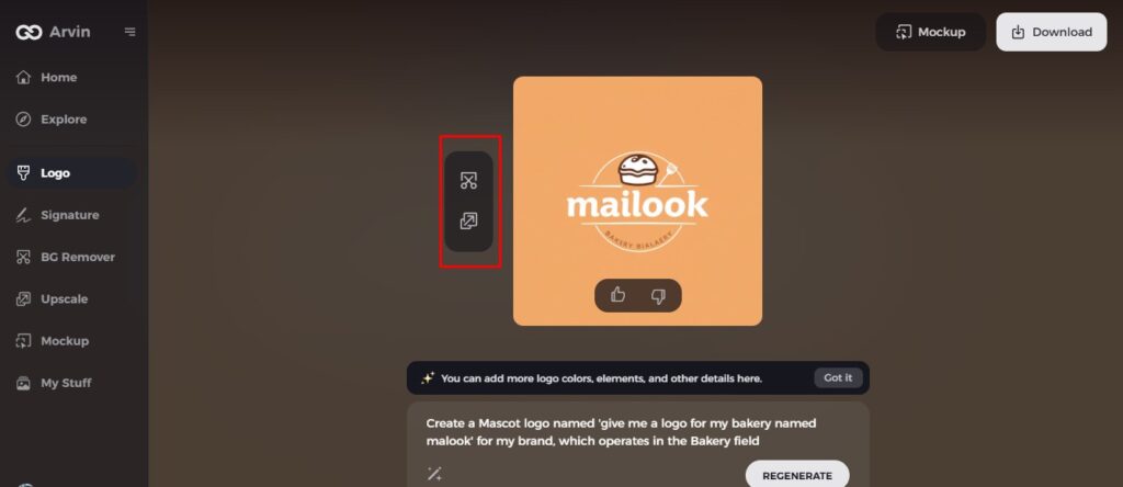
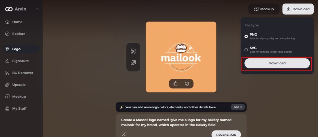
Step 6: Save and Download Your Bakery Logo
Preview your finished logo and save it in a high-resolution format suitable for both digital and print materials, ensuring it looks great on everything from your website to packaging.
Conclusion
A good logo design is the core of a successful bakery as it acts as the visual representation of the brand and its values. From the choice of fonts and colors to the use of icons and design styles, everything contributes to making an identity memorable. A bakery owner avoids common pitfalls by using tools such as Arvin AI and designs logos that truly represent their business. If you Want to create your perfect bakery logos? Head to Arvin AI today and make your vision a reality.
FAQs
Why is a logo important for my bakery?
When it comes to logos, a good one creates a memorable, lasting impression the first time someone sees your bakery in a very crowded marketplace.
What is a good logo for a bakery?
Some bakeries choose literal symbols, such as a rolling pin or a baker’s hat, while others may select a mascot to set them apart from their competitors. Just be sure your symbol fits in well with your other logo features to create a flavorful, cohesive brand.
Can I create a bakery logo myself using Arvin AI?
Yes Arvin AI provides simple tools and customizable templates specifically for bakery businesses.
What’s the best color scheme for a bakery logo?
Soft pastels, warm neutrals, or vibrant colors, depending on your bakery’s branding style.