One of the most recognized symbols of American motorsport is NASCAR. As a symbol of the National Association for Stock Car Auto Racing (NASCAR), the logo has changed over the years to adapt to the dynamic nature of the sport. Originally founded in 1948, it evolved through various versions, each marking the progression and modernization of NASCAR. The NASCAR logo represents speed, power, and action — the very lifeblood of stock-car racing. NASCAR continues to evolve, and as it does, the logo does as well, which keeps up with the current design trends while paying homage to its history.
PART 1: The History of the NASCAR Logo
The NASCAR logo has evolved significantly since its inception in 1948. Each redesign is a symbol of the sport’s evolution, modernization, and dedication to speed, rendering it an iconic logo in motorsports.
The First NASCAR Logo: 1948 – 1955
The original NASCAR logo dating back to 1948 was anything but dull and was very much representative of the racing culture. It included the silhouettes of two black racing cars against a black background, with crossed checkered flags in the middle. The “NASCAR” logo written across a bold white arched ribbon — representing the unity and competitiveness of the sport. Over the ribbon, a four-storey-high inscription in black sans-serif type reinforced its identity. This initial version laid the groundwork for the brand’s visual appeal, focused on the simple thrill of stock car racing.
1955 – 1963: The Yellow Track-Inspired Shape
A wide yellow oval frame, resembling a racetrack, distinguished the NASCAR logo redesigned in 1955. This made the new logo half way animated in appearance, bringing movement and energy to the logo. The left and right sides were reinforced with the black and white checkered flags to fully align with the racing theme. The two racing cars were colored in red, representing passion and speed. The NASCAR International wordmark also orbited the mark, rendered in a bold sans-serif typeface for maximum legibility and brand recognition.
1964 — 1975: The Gray & Blue Palette
The other major redesign of the 1964 NASCAR logo was again based on the aesthetics of race cars of the era what came in gray and blue. A striped background design was introduced to mirror a car grille, depicting the mechanics behind racing machines. The blue “NASCAR” wordmark was above a gray background, and the word “International,” lay on a ribbon below. The checkered flags were put back to their original spot, keeping the main branding theme of speed and competition. This version would be used until the mid-1970s.
1976 – 2016: The Iconic Rainbows Bar Logo
One of the major changes to the NASCAR logo came in 1976 when NASCAR redesigned. It added four angled color bars — yellow, red, purple and blue — to the left of the NASCAR wordmark, signifying speed, motion and diversity. Thus, this contemporary design became one of NASCAR’s longest-lasting designs lasting a whopping 40 years as one of NASCAR’s most recognizable and recognized brands. The brave white print easily legible on the colorful pallet that selected ensuring eye-popping contrast on apparel, racers and promotional items alike.
2017 – Present: The Current NASCAR Logo
The NASCAR logo seen today, introduced in 2017, features the well-known multi-coloured bars but a more polished and minimalist logo. The bars moved to the left of the NASCAR wordmark, which set on a clean white background. This redesign made it more legible and adaptable across digital platforms, leaving the logo relevant in today’s world. They removed the purple bar, which simplified the color scheme even further. NASCAR’s new logo emphasizes continued forward-thinking design, brand consistency and modernism.
PART 2: NASCAR Logo Meaning and Its Representation in the Racing World
And the NASCAR logo represents more than just a symbol; it represents speed, motion, and competitive spirit. It captures the high octane heart that beats behind stock car racing, where precision and performance are the benchmarks that dictate what it takes to win. Whether it’s the stripes from the racetrack, or the load copy, everything about the logo screams NASCAR — which is part of what makes it one of the most iconic depicting major sports.
The Illusion of Motion in Design: How NASCAR Captures Speed
The italicized typeface, along with the slanted bars, gives the subsidiary its own momentum, and serves to reinforce the high-speed nature of stock car racing. The sharp angles of the design elements aimed at encouraging a dynamic sense of movement and racing excitement to embody that vehicle experience central to NASCAR events. This approach is a key part of establishing NASCAR’s identity as fast-paced and action-packed motorsport.
The Colors are Meant to Be Seen — A Visual Statement
The four colors served some symbolism as well with yellow, red, blue and black being the representations of different terminologies such as energy, passion, trust and strength respectively In addition, these vibrant colors capture the passion and energy of racing, as well as convey reassurance regarding their reliability and strength. This blend of factors makes a logo that is both timeless and contemporary, placing NASCAR’s identity in a position to resonate strongly with its exciting races and ardent fan base in the fast-paced world of motorsports.
PART 3: NASCAR Logo Font and Typography: A Reflection of Speed and Precision
The NASCAR logo consists of bold italic type which adds motion, energy, and impact. This is what a lot of the letters look like if you take the slants of letters into account, and this gives an idea of forward momentum, which is very helpful for the fast-paced world of stock car racing. This approach makes the logo more prominent in all spheres of design, solidifying its place within NASCAR’s visual identity across digital and physical mediums.
The Illusion of Motion in Design: How NASCAR Captures Speed
The NASCAR font is versatile enough to replicate on everything from race cars and promotional materials to merchandise and digital content. Whether the font is in use on banners at the racetracks or on branded apparel. Its clarity of form accompanied by the bold presence needed to ensure maximum recognition among a wide-ranging fanbase.
Branding Typography for Marketing Versatility
The NASCAR logo features modern typography that is well-adjusted to ensure uniformity and distinctive nature of the brand identity. The clean, bold, forward-leaning designed aligns perfectly with today’s marketing, digital branding, and future sponsorship strategies. With all the growth NASCAR is experiencing, typography will play a vital role in ensuring that strong, professional, iconic visual presence.
PART 4: Design a NASCAR Themed Logo
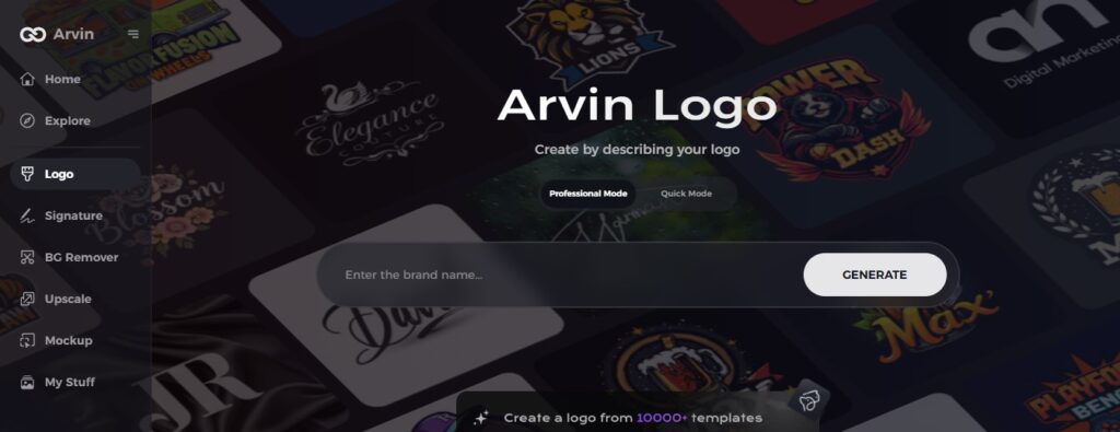
If you need something to make you a logo with a racing theme, you can use the Arvin AI Logo Maker. To create a professional and high-quality logog, this AI-based design software helps users and is quite simple to use. Arvin AI used by designers, artists, and business owners, Arvin AI makes design easy.
Key Features Of Arvin Ai
- AI-Powered Design Assistance: Get instant logo suggestions tailored to your brand’s needs.
- Customizable Templates: Choose from a wide range of ready-made templates for racing and sports logos.
- High-Resolution Downloads: Export your logo in SVG, PNG, and JPEG formats for flexibility.
- User-Friendly Interface: Easily create professional-quality logos without design experience.
- Instant Previews: See real-time previews before finalizing your design.
Steps to Create Your Own Logo Using Arvin AI
Step 1: Sign up and log in on Arvin AI
Go to the website page of Arvin AI and sign up. Once signed up, sign in to access the feature of logo designing.
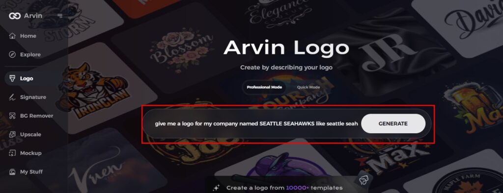
Step 2: Give your brand details and design preference
Please insert your brand name, slogan, and industry. You may also specify the type of design that you like and which type of font and what type of theme with images.
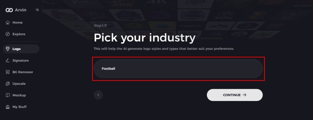
Step 3: Choose Your Industry
Please choose your industry or niche. This helps Arvin AI come up with suitable logo styles and design elements best for your brand’s needs.
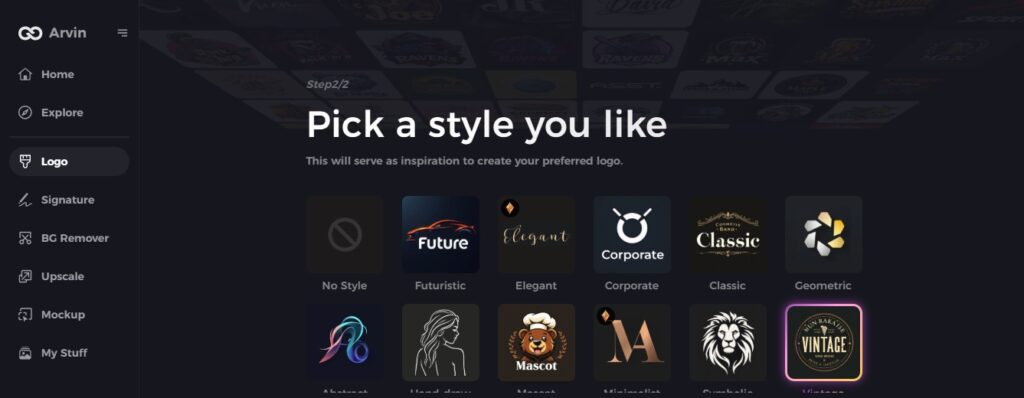
Step 4: Pick a Design Style
Choose a style that resonates with you. This will provide the inspiration for your logo, guiding the AI in crafting your ideal design.
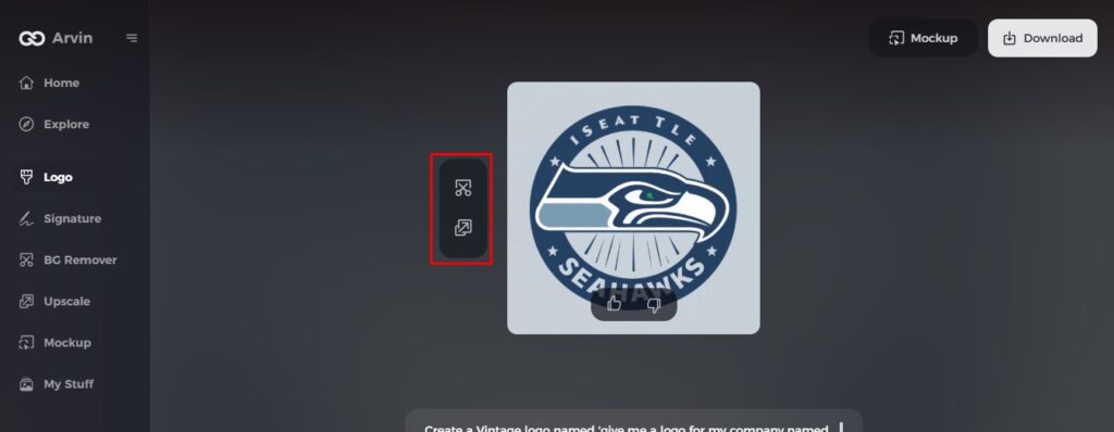
Step 5: Customize your design with Arvin AI tools
Once Arvin AI generates a logo, personalize it using various tools. Adjust font styles, layouts, and symbol placements until you satisfy with the result.
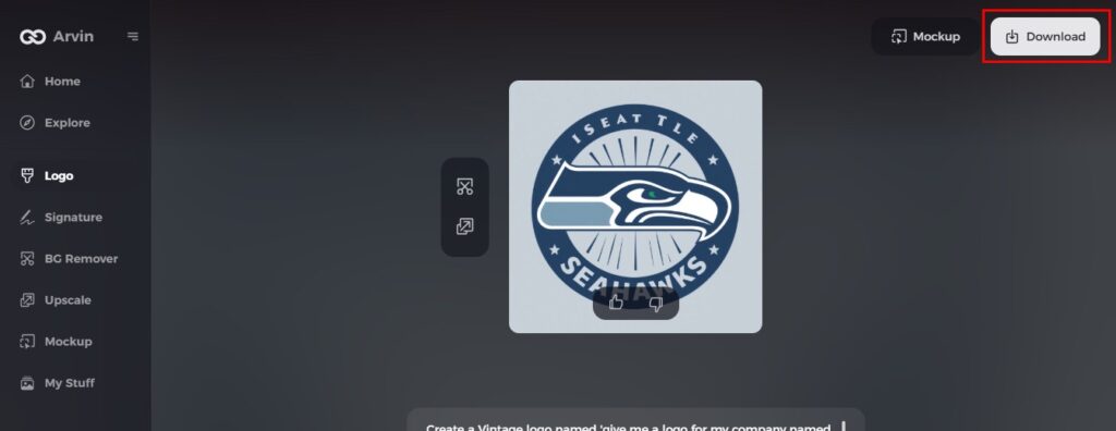
Step 6: Save and download your logo
Preview the logo. Save it in a high resolution for use in various digital and print applications.
Conclusion
The logo of NASCAR has evolved through time, but remains a symbol for speed, racing history, and excitement. Through its car silhouette design, the logo is widely recognizable. Its evolution reflects branding and versatility as essential factors in motorsport. As a designer, business person, or simply a fan of NASCAR, the logo of NASCAR is a solid example of great branding. Design your own unique racing logo with the Arvin AI Logo Maker and make it real!
FAQs
What does the NASCAR logo mean?
The NASCAR logo represents the thrilling world of stock car auto racing, showcasing the thrill of high-speed competition on various types of tracks. Ad. The logo has evolved over the years, reflecting the growth and changes within the sport.
Why did NASCAR change its logo in 2017?
The 2017 redesign aimed to modernize the NASCAR brand while keeping its core elements intact.
Can I use the NASCAR logo for personal projects?
No, the NASCAR logo trademarked and cannot used without official permission from NASCAR.
How can I create a racing-themed logo similar to NASCAR?
You can use Arvin AI Logo Maker to design a custom racing-themed logo with AI-generated templates.
