According to design Lululemon logo is more than an emblem seamed on your favorite leggings, representing the brand’s philosophy and course. However, with any superior design, it is not born overnight. There are background stories that may change, spark conversations and surprise you. So, whether you are a graphic design junkie, Lululemon mania, or just someone who appreciates the role of design in everyday life, you must be fond of this article. Now we are going to discuss about lululemon logo.
Part 1: Meaning and History of Lululemon logo
Founder Chip Wilson decided to conduct a questionnaire because he was unsure what to name the brand. About 100 people proposed 20 brand names and 20 logos, and selected from them. And the name “Lululemon” was chosen.
Why does the Emblem Look A?
The logotype adopted by the company refers to the name “athletic hip,” but this was dropped. However, the founder liked this emblem very much and eventually chose it. Today, many believe that this emblem represents Athletica’s “A” (the official name of the brand is Lululemon Athletica).
Description of the Symbol Mark
This is one of the iconic logos of Lululemon consists of symbols very similar to Omega in Greek letters. Omega is placed in a red circle between two words of the company name. Many customers point out that the logo resembles the outline of a woman’s hair and face.
Part 2: Design Elements of Lululemon logo
These elements make the Lululemon logo perfect for brand identity. Following are the main elements of Lululemon logo:
Font
The Canadian sportswear brand’s wordmark is written in lowercase letters, giving a friendly and welcoming impression. The inscription is written in a traditional sans-serif logo fonts, and its elegant and smooth lines and clean outlines are very similar to Brasley Bold. The inscription is minimalistic yet stylish and timeless, with an exquisite balance of shape, space and line thickness.
Color
A white symbol appears on the red background. The emblem and circle is black outlines.
Part 3: Analysis: Evolution of Lemon logo design
Let’s analyze in detail how Lululemon’s logo design has evolved over the years while maintaining its core identity. Understanding this journey gives you insight into how to build an effective brand. Here are five key points that define the evolution of this iconic logo.
1. First impression
When the Lululemon logo first debuted, it was a fresh breeze in the fitness and fashion industry. The stylized Omega Ω immediately made its logo stand out. People who do not know it is Greek alphabets often mistake it for Oriental characters. This exotic ambiguity was a factor in its appeal.
2. Minimal Approach
Over the years, Lululemon has witnessed the shift of design trends to minimalism, but Lululemon was ahead of its time in this regard. The simple and clean line of the Omega Ω logo proves that it is possible to withstand the trials of time, and sometimes it is very few. The minimalist approach resonates with the brand’s comprehensive philosophy of simplicity and functionality.
3. Versatility
One of the advantages of Lululemon’s logo design is its versatility. This logo is like a chameleon, and looks equally stylish on a yoga mat or on high-performance athletic wear and accessories. The design of this logo can be seamlessly integrated into various textures and materials, making it a highly adaptable brand element.
4. Color Consistency
Unlike many other brands that try the color scheme to avoid being trendy, Lululemon is quite consistent. By focusing on shapes rather than colors, brand awareness has been increased. The neutrality of the color scheme means that the logo fits with clothes of various styles and logo colors, and again tells of its adaptability.
5. Emotional connections
Of particular interest is how Lululemon’s logo design has fostered emotional connections with audiences. Through its design the logo creates a community ambiance between those who love Lululemon. The mark functions as more than a logo because it stands for a complete lifestyle which people view as a declaration of dedication to physical fitness and fashion.
Part 5: Philosophy and meaning hidden in Lululemon logo design
Dig deeper into the logo design of Lululemon. Every organization uses its logo to present its vital business concepts alongside the core beliefs of its brand through visually design and symbols. The Lululemon logo obtains its strategic depth by transcending conventional aesthetic guidelines. The subsequent description reveals the essential theoretical aspects present within this distinctive logo design.
Omega Ω: Symbol of Eternal Growth
As previously mentioned, Lululemon‘s logo design features a stylized Ω (omega). In the Greek alphabet, Ω is the last letter, often symbolizing integrity or the end of something. But for Lululemon, travel is more important than destination. The brand logo works with the mission to create boundless expansion and motivates people to reach their fullest potential.
Balance and Harmony
The balanced design style in the logo displays the brand’s yoga heritage and presents equilibrium and harmony. This design metaphorically achieves the same stability as performing a successful yoga position. The design demonstrates the brand’s idea about achieving equilibrium by uniting health, practicality and sophisticated style.
Delicacy is key
Unlike logos that call attention, Lululemon logo designs are often casually incorporated into products such as leggings seams and yoga mats. This casual nod to mindfulness, the core belief in yoga philosophy. We are here, but we are not going to shout it out loud.
Community Power
Interestingly, Lululemon’s logo design is a tribal mark for those investing in an active and healthy lifestyle. The Lululemon logo is a tribal mark for those practicing an active and healthy lifestyle.
No Trends
Other brands may redesign the logo to suit the current, but the Lululemon logo is consistent. Rather than riding on the trendy wave of design, it focuses on being true to longevity and its roots.
Part 6: What can You Learn from Lululemon Logo Design?
There are many things you can learn from Lululemon logo design. Especially for those who are interested in creating brand identities that endure the trials of time. Let’s take a closer look at the important points from the evolution and consistency of the Lululemon logo.
Strong concept key
One thing to note first is the power of a strong concept. Lululemon’s logo design is based on the Greek letter Ω (Omega), which itself means integrity and eternal growth. This resonates with the brand’s philosophy and target users, creating a strong and appropriate visual identity.
Simplicity exceeds times
Since Lululemon’s logo design is simple, it was able to remain appropriate for many years despite changes in design trends. There are many fewer things, and clean and clear designs can have a lasting impact. In addition, simple designs can be versatile for various products and materials.
Consistency increases awareness
Lululemon has not made any major changes to its logo, despite having been in business for more than 20 years. This consistency is key to increasing brand awareness and loyalty. You may want to chase the latest design trends, but being true to the brand’s roots means that you will be rewarded in the long run.
Casual branding is effective
Lululemon often casually incorporates logos into the product, such as a small emblem on the back of the shirt or the corner of the yoga mat. This approach is in line with the brand’s philosophy of mindfulness and not overly flashy. It reminds us that effective branding does not necessarily need to be flashy and conspicuous.
Emotional connections are powerful
The logo design of Lululemon is a symbol of a specific lifestyle and way of thinking and fosters community awareness among the wearer. Creating a logo that resonates emotionally with the target audience leads to deeper connections and royalties with the brand.
Part 7: Arvin AI: The Future of Logo Analysis and Design
In the modern world, branding is one of the essential elements through which small businesses maintain their competitiveness. Arvin AI is a very powerful technology and creativity combination tool that enables companies to analyze and improve their logos. It offers insight into the design elements that make logos effective as well as which elements make them popular with audiences. This guarantees that, with Arvin AI, businesses maintain their branding impact even in the dynamic market.
Key Features of Arvin AI
- Logo Identification: Arvin AI recognizes logos and analyzes their visual structures.
- Historical Study: The software monitors logo development over time, providing insight into businesses and customer preferences.
- AI-Based Suggestions: It provides auto-suggested changes in color schemes, typography, and layout changes.
- Competitor Comparison: Arvin AI tracks how businesses’ logos are compared and potential competitor weaknesses and areas for improvement.
Steps to Create a Logo Using Arvin AI
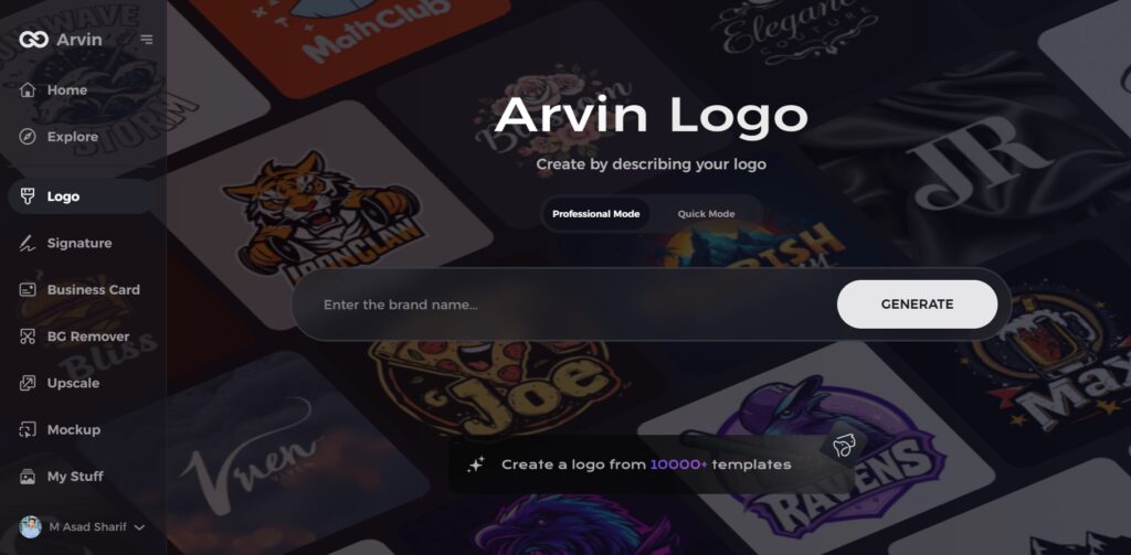
Step 1: Visit the Arvin AI Website
Go to the Arvin AI logo maker page using your web browser to start designing your logo.
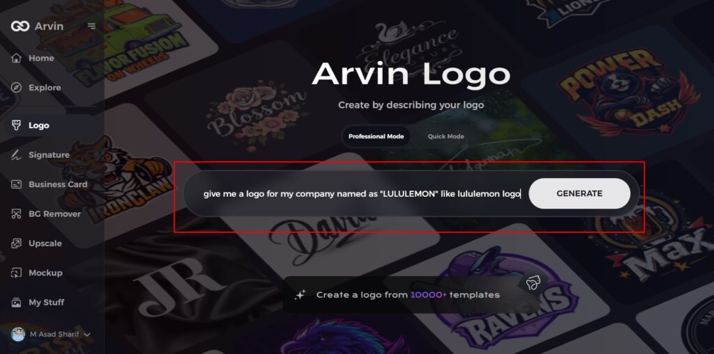
Step 2: Enter Your Business Details
Provide key information like your business name and category. This helps the AI generate designs tailored to your brand.
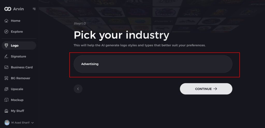
Step 3: Choose Your Industry
Select an industry from the given options. This helps the AI refine the logo styles to match your business type.
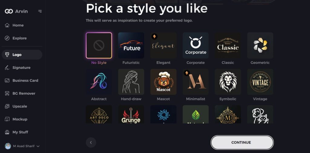
Step 4: Select a Style
Browse through the available styles and pick one that fits your brand’s vision. If you’re unsure, skip this step, and the AI will choose a default style.
Step 5: Explore Logo Ideas
Arvin AI will generate multiple logo concepts based on your inputs. Review the options and choose the ones that best represent your brand.
Step 6: Customize Your Logo
Adjust colors, fonts, icons, and layout to match your brand identity. Make changes until you’re satisfied with the design.
Step 7: Download Your Logo
Once finalized, download your logo in PNG or SVG format for use on websites, social media, and printed materials.
Conclusion
Lululemon logo represents the company’s philosophy, values, and commitment to an active lifestyle. Its timelessness, consistency, and simplicity make it the best-case study of successful branding. But developing such a potent logo requires expertise, analysis, and creativity. Arvin AI is the perfect solution for businesses that wish to establish a lasting brand identity. With its AI-driven analysis, historical context, and auto-suggested enhancements, Arvin AI maintains logos current and effective in a competitive market.
FAQs
What does the Lululemon logo represent?
The Lululemon logo draws from the Greek symbol Omega (Ω) to convey a message about perpetual development together with peaceful balance and peaceful connection.
Why hasn’t Lululemon changed its logo?
The brand foundation which focuses on consistency has enabled followers to consistently recall and emotionally relate to the brand.
How does Arvin AI help in logo design?
The Logo Analysis tool based on Arvin AI enables users to evaluate logos in addition to retrieving design optimization from AI which allows users to monitor brand trends with competitor analysis features.
Can Arvin AI recommend changes for a pre-existing logo?
External users can benefit from Arvin AI’s smart recommendation system which helps them improve their brand with design and color palette and typography updates.