The General Motors logo has evolved over the years, reflecting changes in the company’s identity and values. We will also touch on the meaning of the logo and the significance for the company. General Motor’s Mark of Excellence emblem widely known as one of the most instantly recognizable and memorable car logos. The blue color stands for the excellence and reliability of GM, and white for purity, honesty, and charm. In this article, we will discuss the story of the development of the logo of GM logo.
Part 1: What is the symbol of General Motors?
The General Motors logo is a stylized version of the small letter “M,” which represents an iconic logos which shift the electric car market because it looks like an electric plug. This symbol is part of the abbreviation for the lowercase “GM”, drawn on a pure white background and surrounded by a thick square frame with rounded corners.
Part 2: Evolution of General Motor Logo
Founded in 1908 by William C. Durant, General Motors started as a holding company of Buick and quickly acquired more than 20 companies including Allsmobil, Cadillac and Pontiac. The leading role it plays in the 20th-century automotive revolution was matched by that it played when introducing technological innovations into the world-the electric starter and airbags.
1908 – 1938
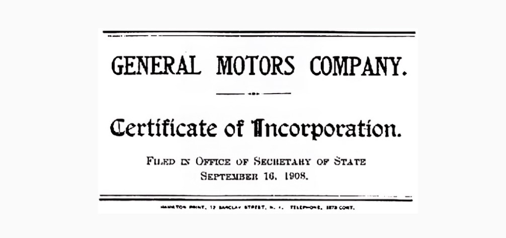
This logo is a copy of the General Motors Corporation’s certificate of incorporation. At the top, the company name is displayed in thick font with capital letters, immediately attract attention. Below it, the letters “Certificate of Incorporation” appear in a more decorative and slightly smaller font, officially declaring the purpose of this document.
1938 – 1964
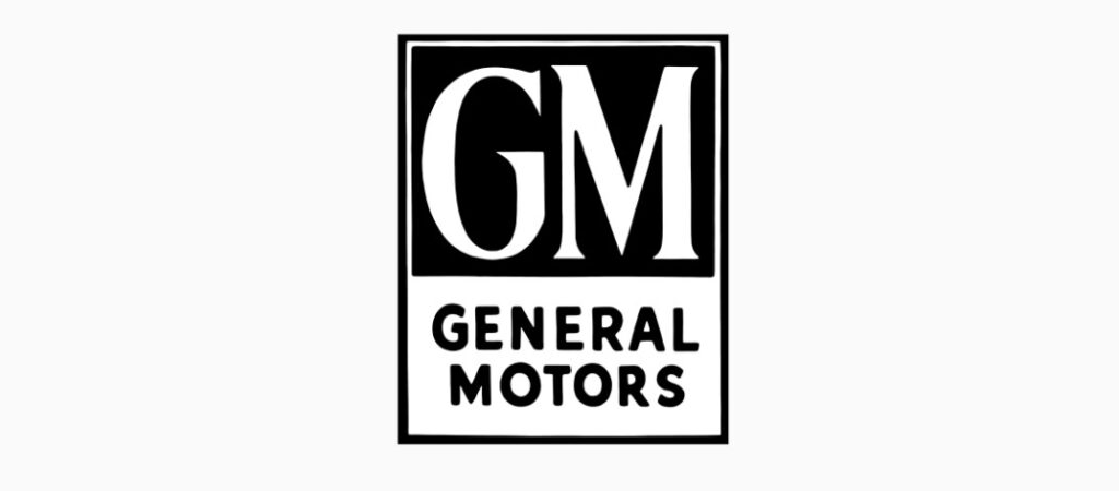
General Motors logo. The logo is one of cute logos for your brand which embodies strength and reliability with bold capital letters G and M at the top of the design. Underneath, the full name of “GENERAL MOTORS” spelled in small, but equally bold, capital letters, providing clarity and strengthening brand identity. The entire composition is surrounded by a dark rectangular frame, creating a border and a sense of protrusion.
1964 – 1966
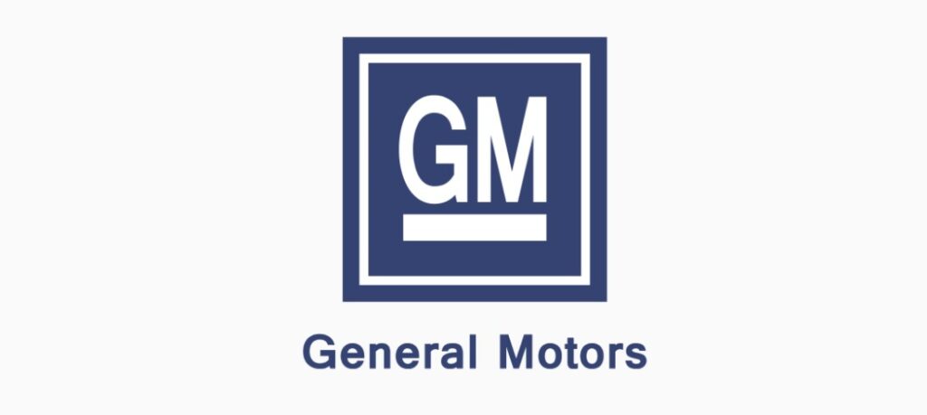
The logo colors have changed from the white and black of the previous logo to a calm shade of blue that symbolizes stability and trust. Under the square, the full name “General Motors” written in a neat, sans-serif font, giving it a refreshing and modern impression. The entire structure is surrounded by a dark rectangular frame, creating a border and a noticeable feeling.
1966 – 2021
Compared to the previous logo, the most noticeable difference is the absence of a rectangular border and the full name “General Motors” under the initials. The design chooses a simpler approach and relies solely on the power of the initials and suggestive white lines of GM for brand recognition. The blue in the background of this version suggests a brand image that is more emphasized and more expansive.
2001 – 2010
The General Motors logo with a dynamic and modern twist. The initials of “GM” placed in the center, creating a luminous effect in a gradient blue background that changes from dark blue at the top to light blue at the bottom. Below the initials is a horizontal line drawn in the same light tones as GM, which is a visual axis in a fluid background.
2010 – 2021
The General Motors logo has a 3D effect, adding depth and modern touch to the classic design. The initials of “GM” stand out in silver against the background of a deep blue square with a soft gradient. The letters have a metallic luster, representing sophistication and durability. A silver horizontal bar is placed under the initials, and the design is balanced by echoing the letters above.
2016 – 2021
The automaker has certified a fresh typography format. This type of logo fonts, with its corporate name, is a relaxed space sans serif that gives a modern and airy impression. Each letter stands with a capital letter and exudes confidence and clarity. This style of font is mainly used to decorate the company’s digital portal, distinguished from the vehicle with a square emblem that symbolizes the condensed initials.
2021 – Current
The logo is a refreshing representation of General Motors, and characterized by a significant departure from the traditional format. Boldly, the initials “gm” used in lower case to create a more casual and friendlier atmosphere. The type face is a solid, clean sans serif that defines modernity as well as efficacy.
Part 3: Design Elements of General Motors
Elements in the design of the General Motors logo represent their core values, along with that evolution over the years. These elements, including bold typography, sophisticated color choices, and carefully crafted design choices, all say that GM means reliability, innovation, and a sense of being modern.
Font
The bold-style lowercase letters on the main General Motors logo set in a heavy, voluminous, custom sans serif typeface with attractive contours of futuristic characters. The designer font used for this logo is closest to Venus Envy Regular or Deportivo a Regular.
Color
The color palette of General Motors logo visual identity is based on a glossy gradation of blue, with a range of colors used, from deep and dark tones at the bottom of the letters to bright and vivid sky blue at the top. Blue is a color that reminds us of confidence, reliability, and safety, and technical and medical companies often use blue because of its association. This shows that logo colors are the main components which make it visually perfect.

Color Code
| Color Name | Hex | RGB | CMYK | HSV | HSL | RAL | Pantone |
| Dark Cornflower Blue | #194390 | (25, 67, 144) | (83, 54, 0, 44) | 219° 83% 56% | 219° 70% 33% | 5002 | 10249 C |
| Blue-Gray | #5C93CC | (92, 147, 204) | (55, 28, 0, 20) | 211° 55% 80% | 211° 52% 58% | 5024 | 2718 C |
| White | #FFFFFF | (255, 255, 255) | (0, 0, 0, 0) | 359° 0% 100% | 0° 0% 100% | 9016 | 7436 C |
| Dark Sky Blue | #86C1E2 | (134, 193, 226) | (41, 15, 0, 11) | 202° 41% 89% | 202° 61% 71% | 6027 | 2905 C |
| Dark Cornflower Blue | #1F3F97 | (31, 63, 151) | (80, 58, 0, 41) | 224° 79% 59% | 224° 66% 36% | 5002 | 10249 C |
| Navy Blue | #000082 | (0, 0, 130) | (100, 100, 0, 49) | 240° 100% 51% | 240° 100% 25% | 5002 | 2738 C |
Part 4: Transform Your Logos with Arvin AI Advanced Tool
Organizations seeking to create or improve a logo. They consider design trends, symbolism, and flexibility in digital and global markets. Arvin AI is an advanced solution for this process, which favors companies. It is an authoritative platform specifically designed to help companies design a very effective logo. It is powerful algorithms and the machine learning capabilities deliver very deep logo analysis to discover essential design features and trends.
Key Features of Arvin AI
- Logo Design: Arvin AI assesses logo designs against aesthetics, symbolism, and market trend.
- Trend Suggestions: Arvin AI helps identify current design trends in the market to suggest improvements to the design created.
- AI In Design: Arvin AI combines principles of design and AI to bring out logos representing a brand.
- Custom Suggestions: Arvin AI will customize the suggestions to suit the target audience and industry trends, ensuring the logo appeals to the desired market.
- Digital Readiness: The system checks the effectiveness of a logo on digital media, refining it for use on websites, social media, and mobile devices.
Steps to Use Arvin AI for making Logo
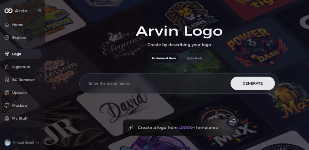
Step 1: Access the Arvin AI Logo Maker
Start by visiting the design page of the Arvin AI logo maker using your preferred web browser. This is where your logo creation journey begins.
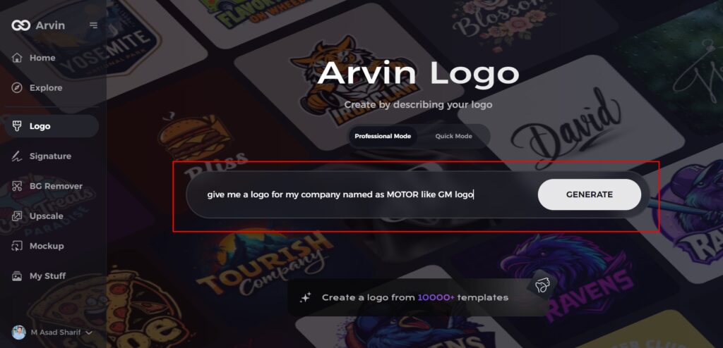
Step 2: Enter Your Business Details
Provide essential information, such as your business name and category, to help the AI design logos that resonate with your brand identity.
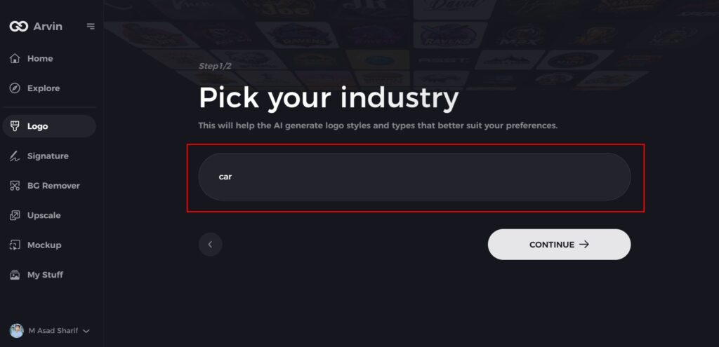
Step 3: Choose Your Industry
Select the relevant industry from a predefined list. This step enables the AI to tailor logo styles and elements specific to your sector.
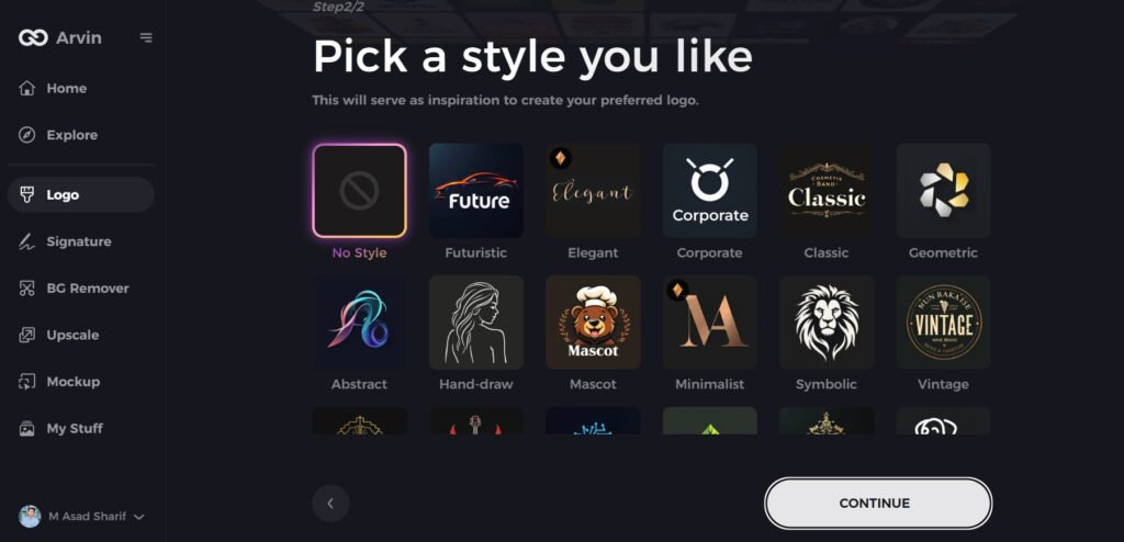
Step 4: Select a Style
Browse through the available design styles and pick one that aligns with your vision. If none appeal to you, skip this step, and the AI will proceed with default suggestions.
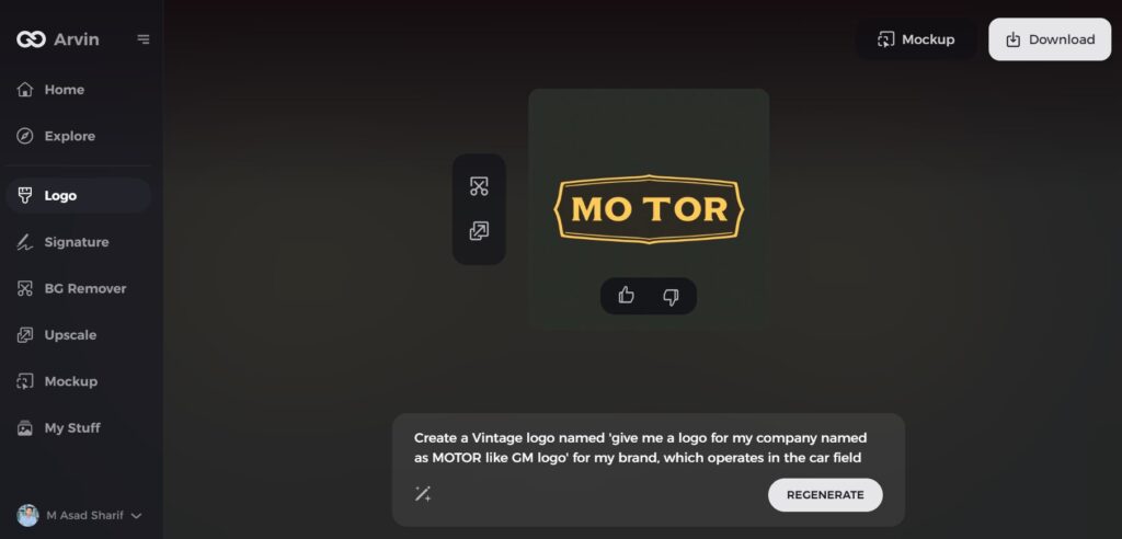
Step 5: Explore Logo Concepts
Based on the information provided, the AI will generate a variety of logo ideas. Review the options and choose the one that best represents your brand.
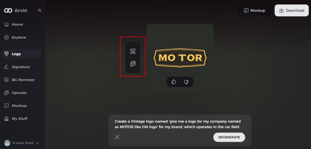
Step 6: Customize Your Logo
Refine your selected design by adjusting elements such as colors, fonts, icons, and layout. Personalize it to match your unique style.
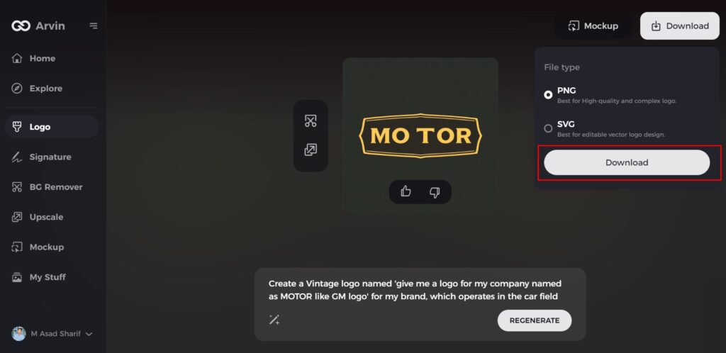
Step 7: Download Your Final Design
Once satisfied with the finalized logo. Download it in versatile formats like PNG, ensuring it’s ready for use across websites, social media, and print materials.
Conclusion
General Motors logo has transformed dramatically for the purpose of describing the growth and process that company undertook. As a symbol it is supposed to represent a great logo can do much to build ideas of trust and brand loyalty. For business houses looking for fine-tuning their logos, Arvin AI can be helpful. Arvin AI helps the brand create symbols that resonate with the audience and become timeless by perfecting logo designs through analysis.
FAQs
What is the logo of General Motors?
The “Mark of Excellence” logo of the General Motors Corporation. It is widely regarded as one of the most memorable and instantly recognizable car logos in history. While the blue color depicts the excellence and trustworthiness of General Motors, the white color stands for its purity, charm and integrity.
Why did General Motors change their logo?
The new logo reflects the company’s move into the world of electric vehicles. The new logo presents the letter “M” as an electric plug and utilizes a brighter blue-sky appearance.
How can I analyze my logo design using Arvin AI?
You may upload your logo on Arvin AI for deep analysis and recommendation tailored to trends and industry standards.
Has the General Motors logo changed in recent years?
GM rebranded to a minimalist style, focusing more on sustainability and innovation, particularly in the electric vehicle market.

