Logos play a very significant role in branding because they are the face of a company or product. 90s logos became more creative and bold, thus leaving a mark on the visual communication of brands. The colorful and simple designs from that era still influence the logo trends of today. Current brands emulate the visual language of 90s branding because the original logos remained influential enough to spur design trends among contemporary generations of industry professionals.
Part 1: Iconic 90s Logos of the 1990s
The 90s were a time of big changes in design, and many of the logos created during this era became symbols that are still recognized today. In this section, we’ll take a closer look at some of the most iconic logos from the 90s.
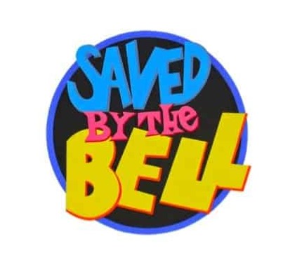
1. Saved by the Bell
The circular logo of Saved by the Bell, a mix of rare design elements by today’s standards, consists of three unrelated pallet colors and typefaces that successfully convey the fun of the show. The word “bell” is emphasized by a large font, intense yellow, and diagonally overlapped letters symbolizing the working bell.
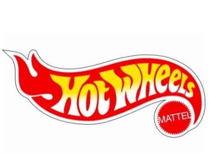
2. Hot Wheels
Mattel’s logo was ahead of its time. While simplifying the logo with two colors and flat design, intense red and yellow catch the eye and convey the message of flame, speed and excitement. The font is playful and has a graffiti style that matches the style of the time. The name of Mattel was also put in so that it would not be pressed.
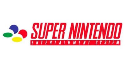
3. Super Nintendo
Nintendo’s combination logo was designed to do what every logo should do: it’s “eye-catching.” The bold red caught the eye, and the brilliant four-color Super Famicom emblem corresponds to the ABXY button of the game console, echoing the hearts of everyone who definitely used it. Italic fonts were quite a modern approach at the time, and were quite prominent among competitors.
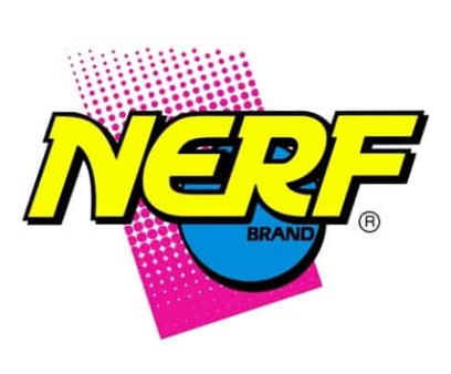
4. Nerf
Nerf created a logo that actually matched the energy of its target audience, kids and teenagers between the ages of 8 and 17. The bright, contrasting colors make the logo stand out and catch the eye. The all-caps typeface slanting to the right gives the impression of movement and speed and excitement.
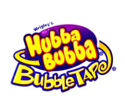
5. Bubble Tape
This is the design of the era when it was considered the right approach to invest everything including kitchen sinks in the logo! The Wrigley combination logo leaves no room for imagination. The multiple typefaces are all worthy of that era, and the bright colors fringed with blue represent youth, fun and joy. And the “E” that stretches around the logo represented the length of the taped gum.
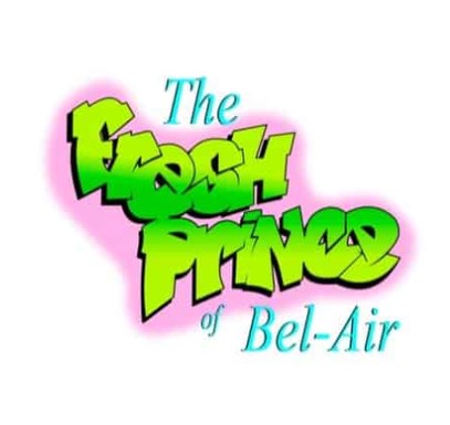
6. The Fresh Prince of Bel-Air
This word mark logo is one of the first graffiti-style logos to unite two different worlds and represent a hit TV show, breaking barriers in the process. It is a good example of how perfectly harmonized the typeface (representing Will Smith) and the typeface (representing a wealthy family) of the serif.
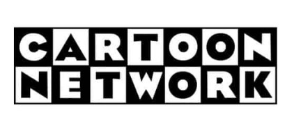
7. Cartoon Network
At first glance, because there is no bright color, it may seem a strange choice for children’s anime channels. However, the black-and-white 7 × 2 grid, named after the Eagle’s thick font, became an iconic logo. This logo was used until 2004 and decorated with goods until 2017! Founder Hannah Barbara and designer Cory McPherson made a brave choice to use only contrast and font to convey playful messages.
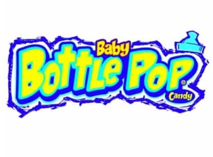
8. Baby Bottle Pop
When Tops announced candy in 1998, they created a logo using several design trends. The word mark logotype using a foam-like neon yellow typeface was set with a playful font matching the letters “Baby” and “Candy,” and concluded with a top of a doodle-like mammal bottle. The chalk-ready finish joining all elements expresses the brand identity of a happy candy manufacturer delivering explosive flavors during consumption.
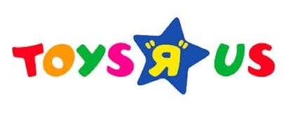
9. Toys “R” Us
Toys “R” Us may have closed its doors in 2018 after 70 years of offering a wide range of popular toys, but their logo is still remembered and recognized today. The logo used bright colors and a fun, playful font to connect with children, making it feel approachable and exciting.
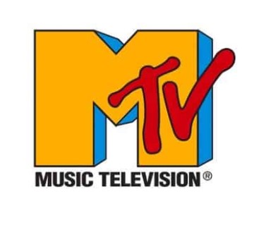
10. MTV
This was a classic logo symbolizing the atmosphere of the time and the beginning of the new era of music television. With the Rakugi-style logo (you know the trends already) featuring an oversized M-character shouting its affiliation with music, MTV showed the apparent anti-bone spirit of the outdated music scene without shame, and by doing so it was deeply linked to the target audience.
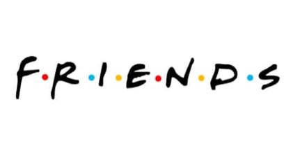
11. Friends
I can’t look back on my 90s logos without talking about friends. Friends is still the most regenerated rebroadcast on Earth! The handwritten typeface and simple word mark logotype successfully emphasized the playfulness of the show, and the six dot colors between each character match the umbrella used by each friend in the program intro, highlighting the personality of each character.
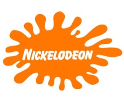
12. Nickelodeon
Still classic splat. Here, oranges are used that have become popular in fitness and youth-related markets. Nickelodeon brought energy and fun to the logo and viewers. The straight approach of using only two colors and a playful logo, rounded sans-serif typeface was far from the typical design trend of the time, and towards a simpler approach today.
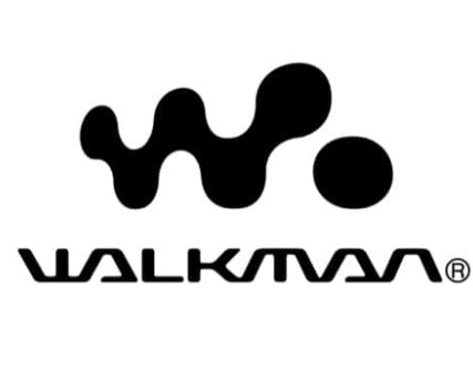
13. Walkman
Was there something as cool as Sony’s Walkman? The freedom to listen to music anytime and anywhere was a big leap forward. The logo reflects this by using an abstract “W.” and a modern, bespoke typeface. The L “part is disconnected, expressing how freely the product listens to music and how unique it is.
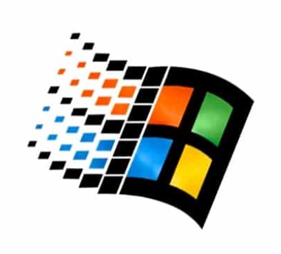
14. Microsoft Windows
The window that gave us a glimpse of the future. The original design was just glass. However, Windows quickly turned this into an iconic logo like it is here. Wave effects provide movement (forward) and four-color signature brands to recognize this logo and company at a glance.
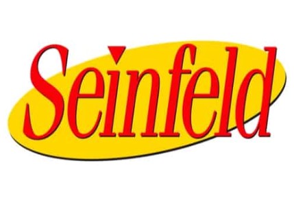
15. Seinfeld
Nothing show had everything! Classic shows and classic logos. Yellow emphasizes the spotlight on Jerry, and the italic font represents the quirk of the cast and the show, but also the masculine nature. I use shapes, colors and fonts very creatively. Like the show itself!
Part 2: The Rise of Bold and Bright Colors
The 90s were a decade when everything became big, bolder, and brighter, and so did the logos. The specific colors act as important elements that help create an energetic personality which both appeals to younger people and stays memorable in their minds.
Vibrant, bold colors in the 90s
The 90s logos witnessed a shift from milder tones to vibrant and striking colors. This change was a natural after-effect of the changing cultural value towards an energetic and playful attitude. Brands realized that bold colors would better attract attention and be a more striking logo. Bright greens, pinks, oranges, and yellows helped to bring out a feeling of fun, excitement, and youth.
Well-known logos used in 90s
Two of the most iconic examples of such colorful trends are Nickelodeon and MTV. Nickelodeon, in that line of programming focused more on the little ones, would use bright orange hues to symbolize fun and happiness. Its logo was energetic, almost sloppy, which reflected the content provided by the channel.
The psychological effects of these colors
Colors elicit a wide range of feelings that people use in reference to a brand. Bright colors such as orange and pink depict energy, enthusiasm, and happiness in most instances. Through advertising, these colors bring about an emotional contact between the audience and the advertisement.
Part 3: Geometric Shapes and Minimalism
This decade, as the 90s progressed, began to change how logos were made. Geometric shapes and minimalism began to gain prominence in logo designs at this point as brands sought ways to be distinctive while keeping things simple and modern.
The trend towards simpler, cleaner logo designs
In the early days, logos were very detailed with complex elements, but in the 90s, brands started embracing a more minimal approach. The idea was to make logos easy to recognize at a glance. Products with streamlined designs achieved realism and modernity which attracted consumers who valued presentable luxury in their brands.
Geometric shapes became the trend
One of the biggest trends of 90s logos is the use of geometric shapes. The clean, structured look of logos resulted from these shapes—circles, squares, and triangles. For instance, Microsoft used the logo in a grid of colorful squares that stood for different products, and Adidas used bold simple shapes like the three stripes to become instantly recognizable.
Simplicity and boldness in 90s logos branding
Even though logos were becoming simpler, they still needed to be bold and memorable. This means achieving a middle ground between being simple and standing out. Brands desired for their logos to have some uniqueness so, with few elements and clean lines, used strong colors, unique features, and special shapes for maintaining the impact.
Part 4: The Impact of Technology and Digital Culture
The rise of internet resources initiated the new era during a decade which brought fundamental transformations to personal and professional lifestyles. The designs shifted to look more modern, tech-forward, and ready for the online space.
Boom of the internet and tech companies
The internet became such a huge part of life, and the tech world needed logos to represent their digital presence. The two biggest names during the 90s were Yahoo and AOL, and their logos were designed to be simple yet memorable. Yahoo used bold, friendly colors and playful typography to make the brand sound available.
The new wave of online businesses
As companies shifted more operations online, they needed logos that considered digital spaces. Companies wanted a logo that not only looked nice on websites, advertisements, and other early mobile phones but also should be clear and simple to understand on any kind of screen, big or small.
New wave of technology and modernity
The greatest logos of the 90s were a direct result of the growing culture of technology. For example, the clean, modern logo of Microsoft and the bold, colorful “N” of Netscape embrace the new wave of digital technology. These logos did not just represent a brand but also represented the modern fast-paced digital world that was now taking over.
Part 5. Introducing Arvin AI: The future of logo design
Arvin AI is a creative tool that lets you design creative and unique logos easily. It uses artificial intelligence to generate different ideas for logos according to your preference. You can either create a new brand or just rebrand with Arvin AI, making the process of designing easy. You can customize the logos it creates to really be yours. With Arvin AI, creating professional logos is fast, easy, and fun.
Key Features of Arvin AI
There are following key features of Arvin AI:
- AI-powered Logo Generation: Creates logos based on trends like 90s logos.
- Customization Tools: Allows you to personalize your logo for unique branding.
- Fast and Intuitive Interface: Makes the design process easy and seamless.
- Wide Range of Templates: Choose from various templates or start fresh.
- Auto Resizing and Adjustments: Your logo is automatically resized for different uses.
- Suggestions for Improvement: Provides tips and tweaks to enhance your logo.
Steps to Use Arvin AI for Designing a 90s-Style Logo:
Step1: Sign Up and Log In on Arvin AI
Go to the Arvin AI website, sign up, and log in to use the logo design inspired by 90s designs.
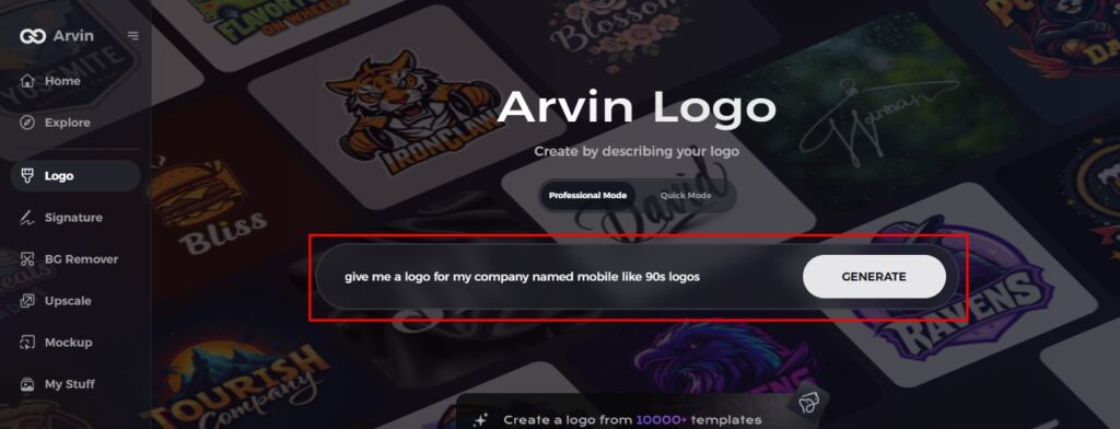
Step2: Input Your Brand Information and Preferences
Insert your brand name, slogan, and industry. Let them know your design preferences, such as font styles or color choices that fit the bold, vibrant aesthetic of the 90s.
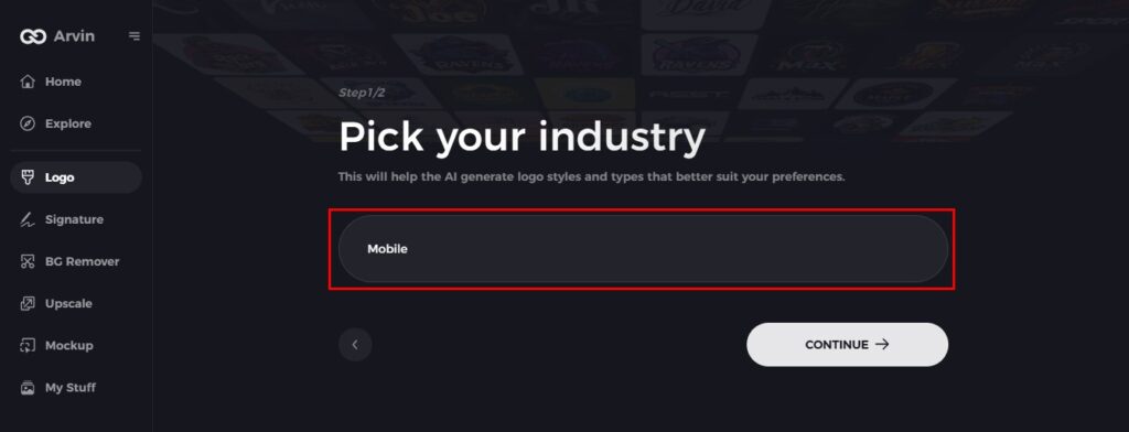
Step3: Select Your Industry
Choose an industry that fits your brand. This ensures Arvin AI creates logo styles that align with specific niche 90s design trends.
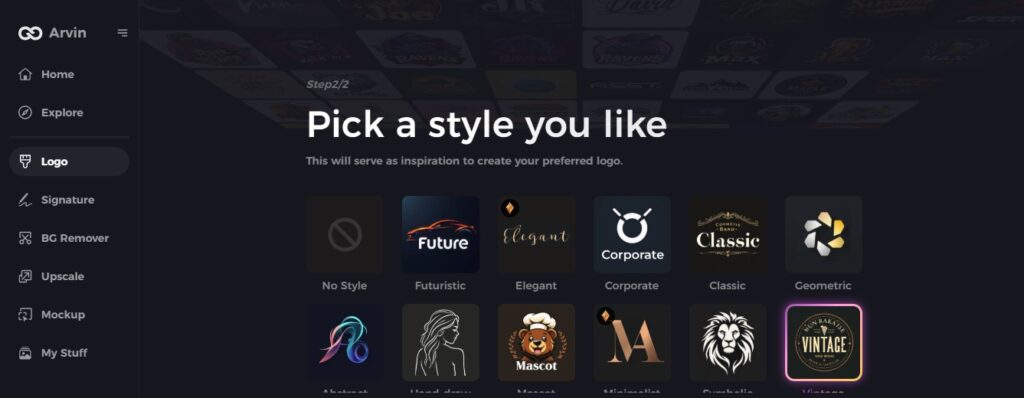
Step 4: Select Style
Select a design style that appeals to you, whether it’s bold and playful or totally geometric, inspired by the 90s logos look.
Step 5: Edit Your Logo with Arvin AI Tools
Once Arvin AI has created your logo, edit it with the tools available to you. Style the font, layout, and symbols to look like the dynamic minimalism of the 90s.
Step 6: Save and Download Your Final Logo
Preview the logo and save it in high resolution for use digitally and on print, capturing the bold and iconic design of the 90s logos you had in mind.
Conclusion
90s logos had played a huge role in branding history, in terms of being bold and highly creative. These logos are constantly influencing every other modern brand out there, making new ideas and ageless visions. For that perfect logo, look no further than Arvin AI, which brings every nostalgic style with modern technology for the most fun, easy, and unique logo design experience. Explore Arvin AI today to start your own creative journey and craft the perfect logo.
FAQs
How were logos made in the 90s?
The aesthetic of the 90s logos featured vibrant colors, abstract shapes, sometimes fun patterns where applicable, and many gradients. Comic Sans used in many retro 90s logos, as well as condensed sans serif and handwritten styles.
How did technology evolve during the 90’s to affect the logos?
Clean lines, and simple shapes fit better with tech and online spaces as logotypes.
Do the 90’s logos apply in the present time in modern branding?
Many brands use design trends that have lasted long into today’s times, and are evidence that these were really lasting designs.
How can Arvin AI assist me in designing a logo inspired by 90s trends?
Arvin AI allows you to make logos with the feel of 90s inspiration through easy and customizable templates along with trendy design elements.