Fruit of the Loom is a familiar clothing brand with a very simple yet memorable logo. Logos are crucial for building a powerful brand identity and how customers feel about a company. The Fruit of the Loom logo has changed over the years yet it has been able to stay relevant while retaining its classic appeal. Through historical review we analyze the development of the Fruit of the Loom logo because it has played a key role in maintaining brand performance.
Part 1: The History of the Fruit of the Loom Logo
Fruit of the Loom started in 1851 by brothers Robert and Benjamin Knight. Initially, the company was more about making good quality textiles. The iconic logos consist of a basket filled with assorted fruits. It was a symbolic representation of the natural abundance chosen to depict fruits as the means of signifying quality, freshness, and affluence and, by association, durability and quality of products.
Part 2: Evolution of the Fruit of the Loom Logo
The Fruit of the Loom logo, with its tale of versatility, kept transforming over the years to meet the growth and design trend. Let’s find out more about the changing moments of the logo and how and why it underwent such changes.
1893
The oldest logo on the list painted in detail, like a painting. Still life paintings include apples, green and blue grapes, and light berries. The background alone would not have been possible with the modern logo. Various shades of blue and white combined and resembling clouds in the sky.
1927
The most significant change on the logo would be the change in shape form, from a rectangle to an ellipse. The banner, which used to frame the previous logos, was eliminated in the new logo. Instead, the brand name was typed directly over the blue background, in a clean and simple fashion.
1936
It became more official, formal, and even a kind of seal. The color of the background became a rich gold color, giving the logo a feel that is expensive yet elegant and prestigious. Fruits given a 3D Aspect Ratio; they seemed real, aiming to be more lifelike and visually appealing.
1951
The logo design updated, but the general structure of it remained the same. The background was the most changed part as it became lighter in color. This made the fruits stand out more because they became much more visible and vibrant.
1962
The “seal” swapped with a clean white ellipse; the logo took on a fresher and even more minimal appearance. The brand name enlarged so readable enough, but it was not readable enough at first. The improvement was based on the enhancement of the general legibility of the logo but on a basic, simple design.
1978
While the design of the Fruit of the Loom logo did not change, the fruit surrounding the circles now lacked the white highlights they once included. This would make the logo appear much more stream-lined and less detailed. Simultaneously, the brand name “Fruit of the Loom” became easier to read.
2003 – Today
The 2003 redesign of the legendary Fruit of the Room logo was modified to make it more progressive and simple for the digital needs of the brand. The image of the fruit is enlarged and placed in the center of the composition, directly on a plain transparent background with no edges.
Part 3: The Legacy and Influence of the Fruit of the Loom Logo
The Fruit of the Loom logo has, over the years, gained immense reputation. It is symbolized for trust. It is easy to understand, clean, and will give off messages of quality and dependability to customers. The brand maintains a loyal customer base along with a distinct position in the apparel market because of its steady branding.
How the Logo Remains Relevant Today
Despite the fluctuations in design fads, Fruit of the Loom has stayed true to the core identity in its logo. It did update its logos so that they remain recognizable along with the iconic image of fruit. This fruit blend has seen the brand still fresh and well within the changeable market in this modern century.
Role of the Logo in Global Branding
The Fruit of the Loom logo is one of the most recognizable in the world today. With widespread advertisements, packaging, and products, the logo becomes an integral element of global branding. It could be considered long-lasting success; therefore, durability and a lasting effect on brand identity and its international presence.
Part 4: The Fruit of the Loom Logo in Popular Culture
The Fruit of the Loom logo has been featured in thousands of advertisements, television commercials, and product placements over the years. It’s easy to identify the font because of its basic design which enables clear visibility across many types of media.
Influence of the Logo on Other Brands
The Fruit of the Loom logo is one of the very simple and highly successful logos in branding. There are other brands whose designs are similar, highly influential, and adopted as straightforward forms. Its impact is seen in the apparel industry, a lot of companies are seeking straightforwardly clean logos, modern, and reliable in nature.
Fruit of the Loom Logo is Still Appearing in Forms of Media
The logo remains easy to recognize over the years because of its consistency and simplicity. It appears in a range of formats: from print, online, and even on billboards, still creating an instant impression. The familiar fruit imagery and strong brand identity ensure it remains prominent in all media and therefore relevant in the eyes of consumers.
Part 5: Future of the Fruit of the Loom Logo
Any iconic brand always has a topic that is always of interest in terms of its future. This section talks about how the logo might change while keeping the identity intact, and also about how customers’ opinions may affect further decisions concerning the design of the logo.
Rumors of Future Updates
There is always room for speculating how the Fruit of the Loom logo will be updated based on changes in branding trends. The redesign may focus on updating the modern’s of the logo while preserving its timeless qualities. A shift in font, color, or fruit placement can be expected; however, it is likely that the main elements such as fruit imagery will be recognizable.
How the Brand Would Likely Evolve
The brand would likely continue evolving to be consistent with changing design trends and consumer preferences. Yet, it would probably strive to retain the logo’s soul: the fruits and the solid brand identity so that the logo would remain easily recognizable. It will be difficult to maintain the tradition while keeping it fresh and modern.
Part 6: The Color Palette of the Fruit of the Loom Logo
One area where the development of the Fruit of the Loom logo depends is the presence of colors in it. Early on, a brand like this one created by color. Let’s understand which colors the developers have been changing, the importance of such color, and in what manner are these logo colors giving the representation for the identity today.
The Role of Colors in the Logo’s Evolution
Colors in the Fruit of the Loom logo have changed with the brand. When the designs were still at their early stages, bright, vibrant colors were used, suggesting freshness and quality. As time passed, the colors of the logo were toned down and balanced, showing the change in the logo as the brand moved towards simplicity. This exemplifies changes in design trends and consumer preference.
Meaning and Significance of the Colors
The colors in the logo hold deep meanings. The red piece of fruit symbolizes energy and vigor but the green part represents freshness along with natural characteristics. Sometimes, the addition of a blue background gives the impression of reliability and trustworthiness. Through multiple years these color selections helped convey Toyota as a brand that emphasizes both product excellence through quality and ties itself to natural settings.
How Color Choices Reflect the Brand’s Identity
Fruit of the Loom color scheme really associated with brand’s identity towards being fresh, healthy, and dependable. It only logical that color palettes also adapted throughout the changing faces of logos. Where the colors limited while maintaining an essential feel to look modern as well as not timely.
Part 7: Typography and Font Choices in the Logo Design
It goes without saying that typography is highly important in communication of the Fruit of the Loom logo concerning brand identity. This section delves deeper into changes in logo fonts as applied in logos their influences on readability and if all these have actually supported the overarching simplicity and a modern touch with the brand.
The Evolution of Typography Applied in the Logo
The font applied in the Fruit of the Loom logo has changed many times over the years. When it was first introduced, the font was quite ornate, indicating a more traditional look. The font, however, kept becoming simpler and cleaner with the passage of time, making it more readable and contemporary.
The Effects of the Changes in Font
Each new font release made the logo more readable and coherent between various media, including advertisements and product labeling. The clearer font allowed the brand to portray a more accessible and professional image.
How the Font Matches the Logo’s Sense of Simplicity
More recent fonts in the logo are simple and streamlined. These signify the brand transition towards modernity and simplicity as part of minimalist design trends while making sure that the brand name is visible.
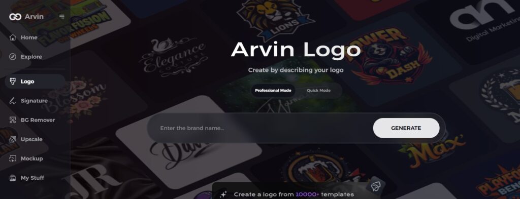
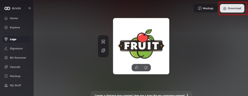
Part 8: Arvin AI: Revolutionizing Logo Design
A powerful tool designed in such a way that it makes creating logos easier than ever. Using artificial intelligence, Arvin AI can generate logo ideas based on your brand’s details, including the industry and style. There is easy customization for colors, fonts, and symbols and allows users to suit their design as per their requirement. Arvin AI has successfully made the process of creating a professional logo relatively easier and faster for any user without design experience. It’s great for companies wanting to create meaningful branding.
Key features of Arvin AI
There are following key features of Arvin AI:
- AI-driven design suggestions: The platform generates logo ideas based on your brand’s information.
- Customization options: Easily change fonts, colors, and symbols to match your style.
- Quick and simple process: Create a high-quality logo fast with minimal effort.
- No design experience needed: Arvin AI is user-friendly for beginners and experts alike.
- Wide variety of templates: Choose from many design styles to fit your brand’s personality.
- Instant logo downloads: Get your logo ready for use in just a few steps.
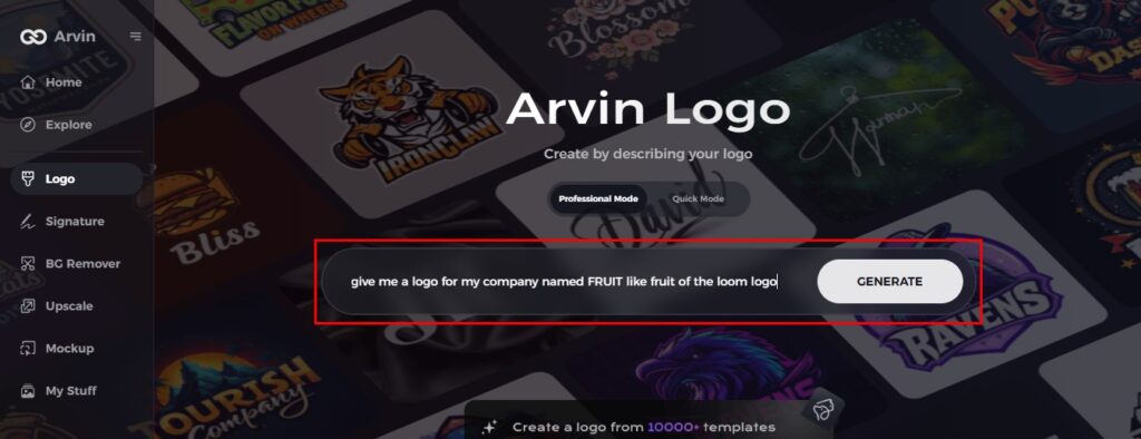
Steps on How to Utilize Arvin AI for Logo Design
Step 1: Sign up and log in
Create your account on the Arvin AI platform to get started with your logo design.
Step 2: Provide brand details
Fill in your brand’s name, slogan, and industry. Describe your style and theme preferences.
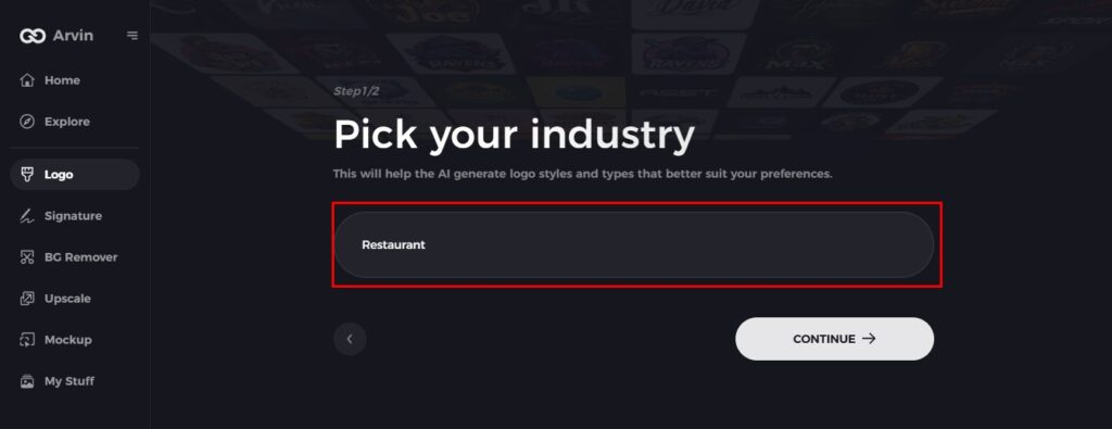
Step 3: Choose your industry
Choose your business sector. This is where the AI will give you recommendations for logos suitable for your niche.
Step 4: Pick a logo style
Choose a design style that fits the vision you have for the logo.
Step 5: Personalize with tools
You can use the customization options from Arvin AI to adjust the font, layout, and symbols according to your brand’s style.
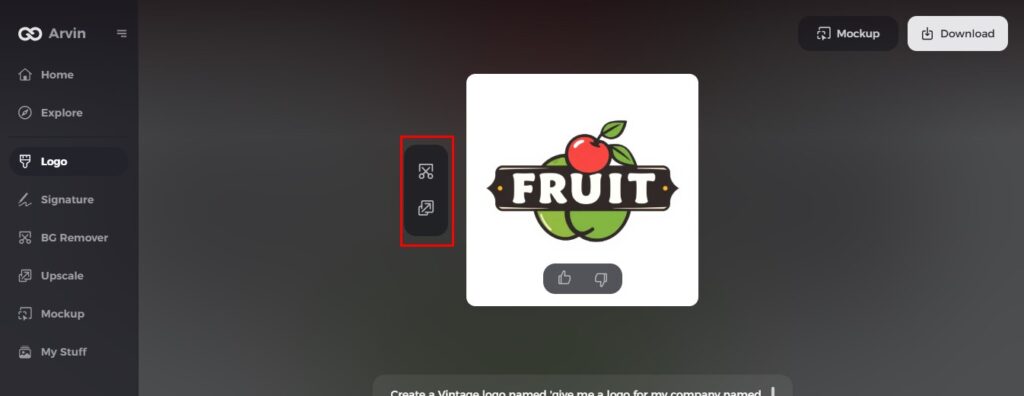
Step 6: Save and download
Check your logo, finalize it, and download it in a high-quality format.
Conclusion
The Fruit of the Loom logo has changed quite interestingly over the brand’s years of existence, portraying growth and adaptability. A very consistent brand with thoughtful evolution in the logos helps this company stand the test of time. Every business requires an excellent logo, and the best tool to do so is through Arvin AI for great logos for new-age brands. Arvin AI can help businesses quickly and easily develop unique, professional logos using user-friendly features and AI-driven design suggestions.
FAQs
What do the Fruit of the Loom logos stand for?
The logo basically represents the brand’s commitment to great quality, plenty, and reliability; they use fruit pictures to represent these attributes.
Did Fruit of the Loom ever have a cornucopia in logo?
If there has never been a cornucopia in the logo, why the claim that Fruit of the Loom is misleading or “gaslighting” consumers? Fruit of the Loom, in over 170 years of manufacturing, has never used, applied for, or registered a trademark design/logo depicting a cornucopia.
Why did Fruit of the Loom flatten its logo in recent years?
This was to make the logo more contemporary and easily readable on various mediums.
How do I use Arvin AI to create my logo?
You can use Arvin AI to get logo ideas that you can customize easily for a professional result, by entering your brand details.
