Logos play a very crucial role in branding as they enable businesses to become distinctive and get closer to the customers. Target logo is the simple bullseye, but in so many words, it has been a very powerful logo to the retail giant in terms of creating tremendous identity with time and therefore convincing its consumers. The simple yet memorable clean design has really helped Target achieve success in becoming one of the most known brands in the retail industry.
Part 1: Evolution of Target logo
The Target logo, since its birth, has witnessed many updates of the design because of growth, changing times, and how such changes impacted and continue to do so to its brand identity and success. Within this section, we take an overview of what the Target logo has gone through in years to date from designs to this magnificent bullseye we all identify with.
1962 – 1968
This is arguably the most detailed version of the target logo to date. You can see the letter “Target” written across the target design (three red rings and three white rings). The choice of typeface and the two elements overlap, so there was a problem with readability.
1968 – 1972
The problem of readability solved, and the emblem became easier to grasp. First, the characters became more transparent and each element of the target logo separated (when the company name placed on a white background, it became easier to understand). In addition, the three rings gone and the design is simpler.
1972 – 1973
Designers played with existing elements while creating visual identities for new brands. First, I moved the so-called bullseye to the left of the name. The italics replaced by ordinary characters. In addition, the black outline around the white letters became thicker, the inscription became easier to read, and it became easier to see even on different backgrounds.
1973 – 2004
As the brand became more aware, the font of the logo turned into a bold black single-color typeface, greatly improved readability, and the brand name became clearly visible in various media and backgrounds. Furthermore, the bold black typeface expressed strength, authority and confidence, and matched the reputation of the growing target as a reliable retail store.
2004 – 2018
In 2004, the logo changed significantly. The monochromatic, giant bullseye and small wordmarks logo placed beneath it were all united in the same red color. By making the logo monochromatic, it made it look so refreshing and in minimal beauty by aligning the trend of modern branding.
2018 – Today
The last version of the Target logo was all lowercase from capitalized typography, largely unchanged until 2018. This casually impactful change moved away from the dignity and boldness of previous versions to relieve the brand’s image and resonate more effectively with modern consumers.
Part 2: Design Elements of the Target Logo
The Target logo is very simple and effective and easy to identify. Let’s get into the nitty-gritty design elements that make this logo so great.
Design Elements
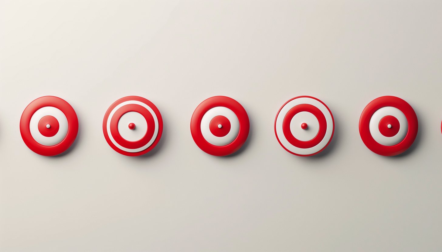
The Target logo built on a simple circular shape, more commonly known as a bullseye. A red circle is symbolic of a bullseye that ties into the name and thrust of the business. A smaller white circle appears inside the large red circle creating the bullseye effect. The word “Target” has a clean bold typeface applied when it used in any form of advertisement or marketing campaign.
Simplicity of the bullseye
The bullseye symbol is powerful because it is simple and does not hold many details and complex designs; however, the target shape in the logo automatically brings to one’s mind that idea of hitting the mark to meet the customer’s needs as part of the mission of Target. The logo is versatile as it can easily be used for different contexts on a store sign, online, or in an advertisement without losing its impact.
The Psychology of the Logo
Red and white are not hues that would easily be chosen for just their aesthetic qualities; there are also psychological impacts. Red is an energetic and attention-seeking colour which represents excitement, urgency, and passion. It tends to catch people’s attraction, which is one of the reasons that this color perfect for a retail brand. The color white has a symbolizing simplicity, cleanness, and balance.
The Overall Visual Impact
The Target logo, clean and bold in color, leaves a mark. The logo gives a clear sense of values about the brand, including accessibility, dependability, and a focus on customers. The shape is a circle, indicating fullness and completeness; in other words, one stop shop for every Target customer’s needs.
Part 3: The Impact of the Target Logo on Branding and Marketing
The Target logo has become more than just a symbol of a retail store; it’s a key part of the company’s success in branding and marketing. In this section, we’ll explore how the logo has shaped the company’s image and played a big role in its growth.
Part of American Pop Culture
The Target logo is instantly recognizable in and out of stores. The mark has entered into American pop culture, featured frequently on television programs, in movies, and even on social media. Simple and bold, the design will immediately remind anyone who sees it of the brand.
Effectiveness in Building Brand Recognition
The primary reason Target’s logo is this effective is that it is easy to recognize. People quickly identify the red bullseye and immediately associate it with the Target brand. That recognition is an important factor in customer loyalty. When customers view the logo, they feel that the store represents quality and value.
Part 4: Target Logo’s Role in Digital Transformation
As technology continues to change how people shop and interact with brands, Target has adapted its logo to fit the digital age. In this section, we’ll look at how the Target logo has been updated for digital platforms and its role in Target’s online success.
Target Logo for the Digital Age
Due to shopping becoming electronic, Target was very sure the logo is responsive and usable everywhere digitally. Through its modifications of resizing on different mobile apps, users will now recognize it really fast on the phones. Where there is online shopping through ecommerce sites, on whichever device whether on computer or on the handheld devices, a customer gets this sense of familiarizing himself to the brand in its use through the logo.
Target Logo Integration
The logo for Target is integrated into the different digital marketing actions. The image is used across online advertisements, email newsletters, and social media campaigns to focus attention and foster brand awareness. The logo can be used along with specific promotions or seasonal events to make it relevant to the customers at the right time.
Part 5: Use Arvin AI for designing a unique logo
Arvin AI has made it easier to use a logo machine with an interface created to simplify the design process and help users in branding. Artificial intelligence-based ideas for logos are produced based on the user’s preferences and brand values. Be it a newbie or a professional, the process is simple and swift. The tool also provides some very meaningful hints for research into trends and designs to be made in other offerings. Use Arvin AI to make a well-designed logo in the flash of an eye.
Key features of Arvin AI
There are following key features of Arvin AI:
- AI-powered design suggestions: Helps create logos based on your preferences.
- Logo generation tools: Allows you to create custom, high-quality logos.
- Market trend analysis: Gives ideas based on what’s popular in your industry.
- Competitor logo analysis: Helps you compare your logo to others in the market.
- User-friendly interface: Easy for both beginners and experienced designers.
- Customizable templates: Lets you tweak logos to match your brand’s needs.
Steps to Use Arvin AI for Creating Your Target Logo
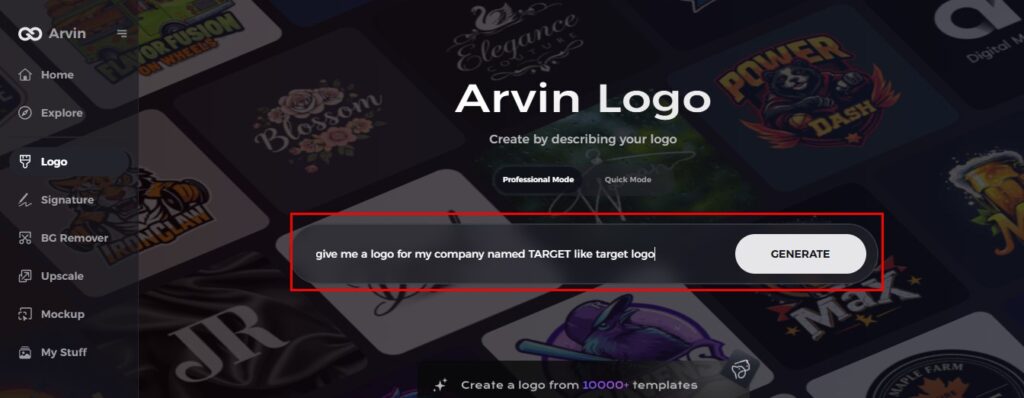
Step 1: Sign up and log in on Arvin AI
Visit the Arvin AI logo maker website, create an account, and log in to start using the logo design feature.
Step 2: Enter your brand details and preferences
Provide your brand name, slogan, and industry. Also, specify your design preferences, such as font choices or image themes.
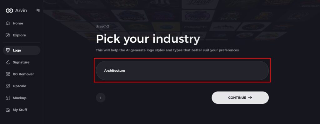
Step 3: Choose your industry
Select the industry that best fits your brand. This will help Arvin AI to suggest logo styles and designs that fit your niche.
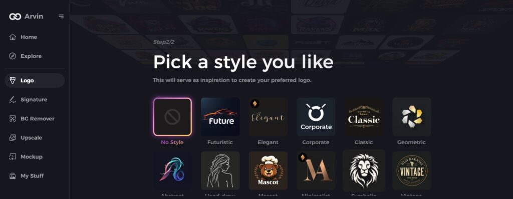
Step 4: Pick a design style
Choose the style that appeals to you. This will inspire Arvin AI to create a logo that fits your vision.
Step 5: Personalize your design with Arvin AI tools
Now, once your logo is produced by the Arvin AI, you can refine it according to your preference. Change the font style, arrangement, and order of symbols so that the logo will look exactly the way you want it to be.
Step 6: Saving your final logo
Preview your logo and save it in a high resolution for print and digital applications.
Conclusion
The great success driver has been the target logo for this brand. It has helped separate it and even take it closer to the customers. The logo is very simple yet remembered, giving significant lessons to other brands about being consistent and clear. Tools such as Arvin AI are great in letting businesses design logos meaningful to their audience through easy design suggestions and insights. Anyone working to build up a robust impactful logo for any brand should settle on Arvin AI.
FAQs
Why is the Target logo so iconic?
The Target logo is iconic because it is simple and bold in its red and white colors, yet it stands out so easily. With a clear bullseye symbol, the logo is easy to find, even in the crowded retail market.
How has the Target logo evolved over time?
The Target logo has evolved over the years, but the bullseye remains constant. It has gotten simpler over the years with an emphasis on the iconic target symbol so it’s easy to spot.
What can I take away from the Target logo to inform my own branding?
From the Target logo you can learn the importance of simplicity strong color choices and how it is possible to create something memorable. One good logo must be recognized easily and correlate with your brand values.
How does Arvin AI help with logo design?
Arvin AI helps by giving you design suggestions on the basis of your preference and brand values. It guides you in the process of how to create a custom logo for your business.