The John Deere logo is a fascinating step forward in the field of agriculture. Over the years, the logo has changed many times, each time reflecting the growth and evolution of the company. From the humble beginnings of the 1800s to today’s modern emblem, this logo tells the story of innovation and tradition. Understanding the history of this iconic logo gives you a glimpse of how John Deere has maintained its reputation. We’ll cover the various transitions of the John Deere logo and highlight the key moments that shaped its identity.
Part 1: The Visionary Beginnings: Who Invented John Deere?
The company John Deer would not have been possible without the determination of a man John Deere. Since the first steel plow made in 1837, Deere has been committed to helping farmers to make their day-to-day work easier. As the demand for the plow grew, Deere moved its business from Grand Detour to Moline, Illinois, in 1848, taking advantage of the power and transportation benefits.
Charles Deere (1886-1907)
Charles Deere, the second son of John Deere, took over the leadership in 1886, before his father passed away that same year. Drawing on his experience as a top salesman, he established John Deere’s first branch in Kansas City. This branch house provided valuable information from the field that has had an impact on new product development.
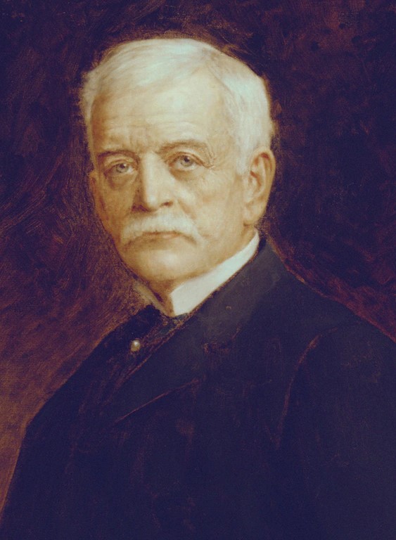
William Batterworth (1907 – 1936)
William Batterworth, Charles Deere’s son-in-law, became president of John Deere in 1907, just 15 years after joining Dieere as an assistant buyer. Under his leadership, 11 factories and 25 sales organizations integrated into one, which leads to the development of modern Deere & Company.
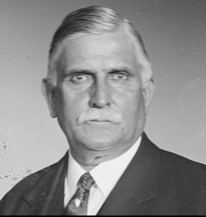
Charles Deere Wiman (1928-1955)
Charles Deere Wyman, a great-grandson of John Deere, joined the company as a line employee and eventually became president with the retirement of his uncle, William Butterworth, in 1928. Despite the hardships of the Great Depression, Wyman worked hard to keep John Deer running. As a result, he announced the famous model “A” tractor in 1934 and the model “B” the following year.
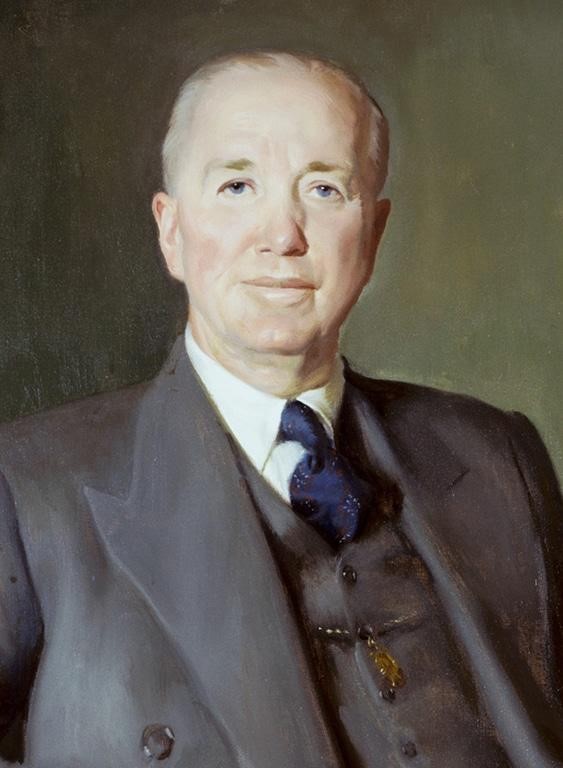
(1955-1982)
Just two years after joining Deere & Company as a California territory manager, William Hewitt became a board member in 1950 and president after the death of Hewitt’s stepfather, Charles Dia Wyman, in 1955. Since then, the company has established itself as a multinational company, buying shares in a tractor company in Mannheim, Germany, and acquiring land in Monterrey, Mexico in 1956.

Robert Hanson (1982-1990)
Robert Hanson was able to leave a mark on John Deer’s history, even though he was not related to John Deere himself. Hanson became president and CEO of Deer & Company in 1978 and after William Hewitt retired in 1982. During the difficult recession of the 1980s, Hanson not only contributed to the company’s survival, but also achieved more sales than expected.
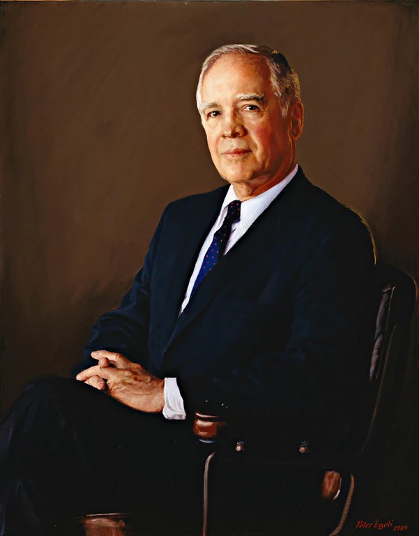
Hans Behler (1990-2000)
With the retirement of Robert Hanson. Hans Behler elected the president of Deere and Company in 1990, emphasized the values that have played an important role in John Deere’s history since the birth of the first steel plow. During Behler’s tenure, Deere continued to lead the way in new agricultural technologies and precision agriculture.

Robert W. Lane (2000-2009)
Robert W. Lane’s experience in managing various operations in the global construction machinery sector helped him understand what Deere & Company needed to achieve maximum global growth. By establishing the SVA model, the company was able to gain a world-class position in asset efficiency and ROI.

Part 2: Tracing the Changes in the John Deere Logo
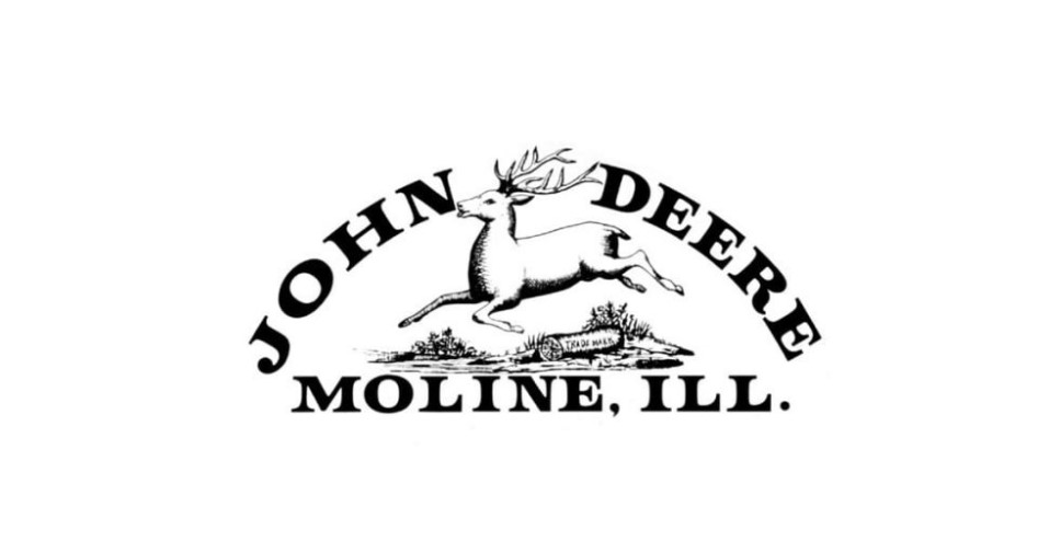
According to official John Deere sources, the first logo depicted deer living in Africa, not North America. In later versions, the correct deer are depicted, but there are some differences in the way the animal leaps. The John Deere logo has evolved many times since its inception, but the central theme of the leaping deer has been passed down since then.
1876 – 1910
The company existed for a while when John Deere decided to register its first logo in 1876. However, the logo used for three years. But was not officially registered. Around this time, the company produced more than 60,000 cultivators a year. Therefore, the management considered it appropriate to register the symbol as a trademark to protect its products from counterfeiting and deception.
1910 – 1936
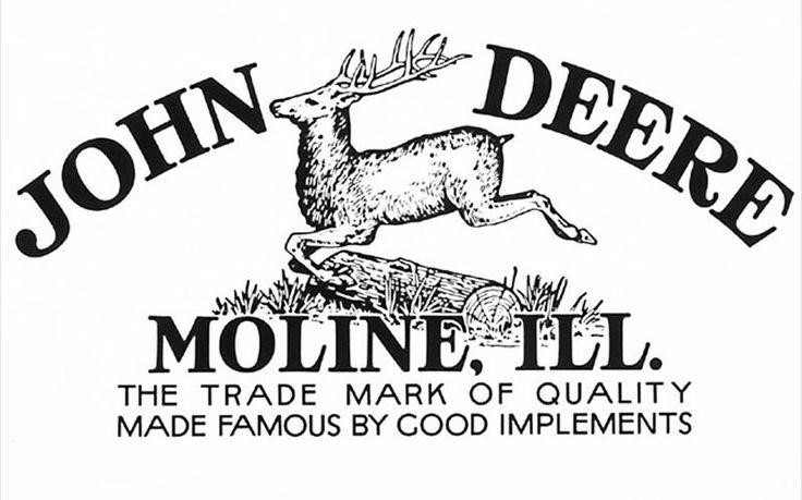
It was registered in 1912, but the logo appeared for the second time in 1910. The overall design remains largely unchanged, but this version introduced higher-definition typographic logos, which made it look much sharper than the previous version. At the bottom, a new two-line slogan is added, reading “The Trade Mark of Quality Made Famous by Good Implements”.
1950 – 1956
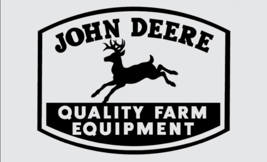
1950 is the year logo design set a new direction. The jumping deer remained in the form of a silhouette, but the logs were probably abolished to reduce clutter. A new quadrangular outline has been introduced, with the upper and lower lines slightly curved outward. The outline, however, did not appear at least as out of place as it did in the 1936 edition.
1956 – 1968
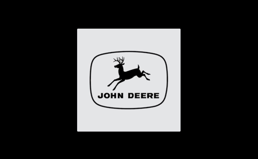
In 1956, the John Deere logo was reborn almost in a new design. This version was the most minimal in the history of the brand, with only the silhouette of the leaping deer and the brand name below it. It was also the first time that WordMark had transitioned from a serif to a sans-serif font. The outline remains unchanged, and it changed to an ellipse and a rounded rectangle.
1968 – 2000
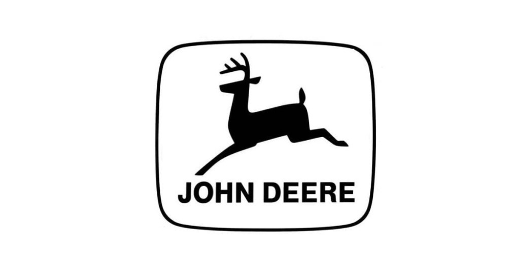
The 1968 version changed to a cleaner and more modern design, while adhering to the overall design concept of the previous model. The silhouette of the deer slimmed from four legs to two legs. And the edges were at a straight angle, creating a clean impression. In an internal memo describing the change, the new trademark announced that provides better reproducibility and greater readability for a wider range of use”.
2000 – Current
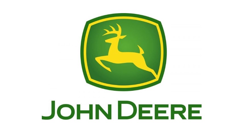
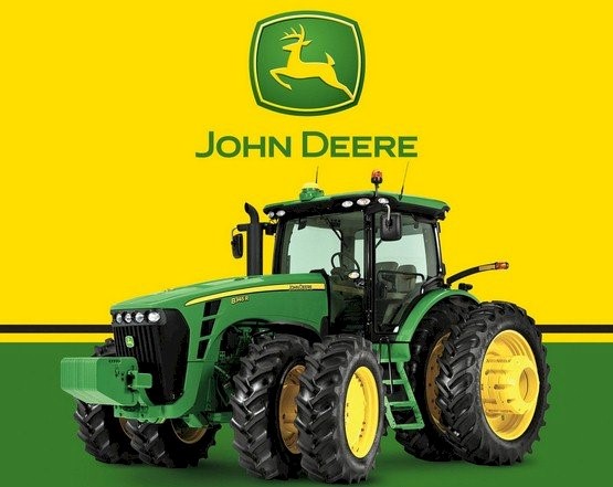
In 2000, the John Deere brand announced a modern and new trademark. This is the first time that the classic color scheme of black and white changed to green and yellow. The John deere logo also known as a leaping deer, but this is the first time that a deer has become leaping upwards, not in the direction of landing horizontally.
Part 3: Design elements for the John Dia logo
After several changes to the 1968 version, the Johndia logo now has a curved green rectangular shape, with a yellow lining inside, as well as a yellow deer.
Design Element | Description |
Deere | Streamlined, dynamic, ready to leap |
Color Scheme | Brighter green and yellow |
Font | Modern, bold, and clear |
Symbol Mark
John Deere’s symbol mark has always symbolized the leaping deer since its birth. Over the years, improvements have been made, and the deer became more elegant. John Deere’s symbol mark represents a constant rush to the progress and prosperity of the brand.
Logo font
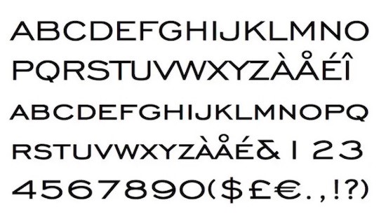
The current logo uses the font closest to Trade Gothic Bold Extended. Readability was one of the most important factors in choosing a logo font for the John Deere logo. The designer wanted a font that was stylish but also easy to read on miniature labels. In the early days of the brand, the inscriptions were written in the verbatim script. In 1968, it was finally transferred to Sanserif.
Logo Color
Until 2000, the John Deere logo color was based on black and white. The current green and yellow logo represents warmth and fullness. This color also conveys the company’s mission to make machines and tools that help care for basic necessities.

Part 7: Arvin AI: The Future of Logo Analysis and Design
In the modern world, branding is one of the essential elements through which small businesses maintain their competitiveness. Arvin AI is a very powerful technology and creativity combination that enables companies to analyze and improve their logos. It offers insight into the design elements that make logos effective as well as which elements make them popular with audiences. This guarantees that, with Arvin AI, businesses maintain their branding impact even in the dynamic market. With this, companies will be leading the rest of the crowd by ensuring the logos updated and more presentable through using tools such as Arvin AI.
Key Features of Arvin AI
- Logo Identification: Arvin AI recognizes logos and analyzes their visual structures.
- Historical Study: The software monitors logo development over time, providing insight into businesses and customer preferences.
- Branding Information: Arvin AI gives suggestions for enhancing logo designs that will increase brand recognition.
- AI-Based Suggestions: It provides auto-suggested changes in color schemes, typography, and layout changes.
- Competitor Comparison: Arvin AI tracks how businesses’ logos are compared and potential competitor weaknesses and areas for improvement.
- Customer’s Feedback Integration: Obtain views from the customers regarding designing of the logos and improve on them so that it stands out at its best.
Steps to Use Arvin AI for making Logo
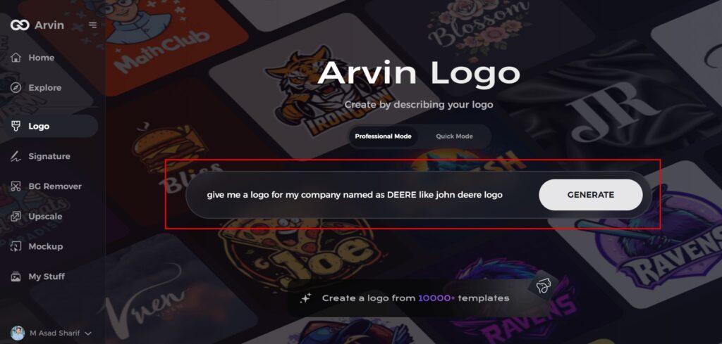
Step 1: Explore Arvin AI for Logo Design
Begin by visiting the Arvin AI design page on Arvin AI’s official website. It’s the perfect starting point for creating a logo that reflects your brand’s history and values.

Step 2: Input Your Business Details
Provide essential information like your business name and category. This helps the AI generate designs tailored to your company’s unique identity.
Step 3: Choose Your Industry
Select the industry your business belongs to. This step allows Arvin AI to create logo concepts aligned with your sector’s standards and trends.

Step 4: Define Your Logo Style
Browse through a variety of logo styles and choose one that aligns with your brand’s vision. Not sure? You can skip this step, and the AI will use its default design inspiration.

Step 5: Review Logo Concepts
The AI will present multiple logo ideas based on your inputs. Take your time to review and identify designs that resonate with your brand’s identity and legacy.
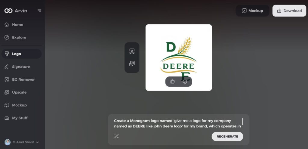
Step 6: Customize Your Logo
Fine-tune your chosen logo by adjusting elements like colors, fonts, icons, and layouts. Personalize the design to reflect your company’s story and aspirations.
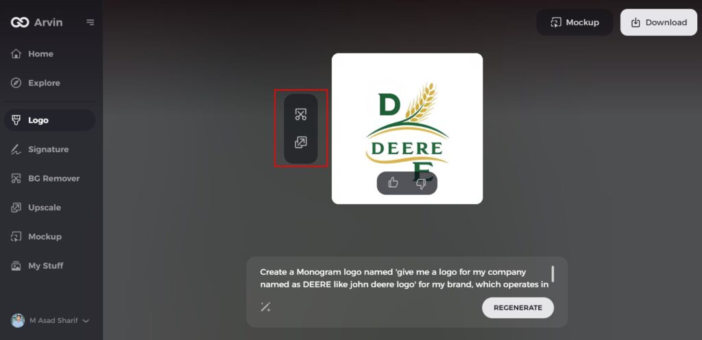
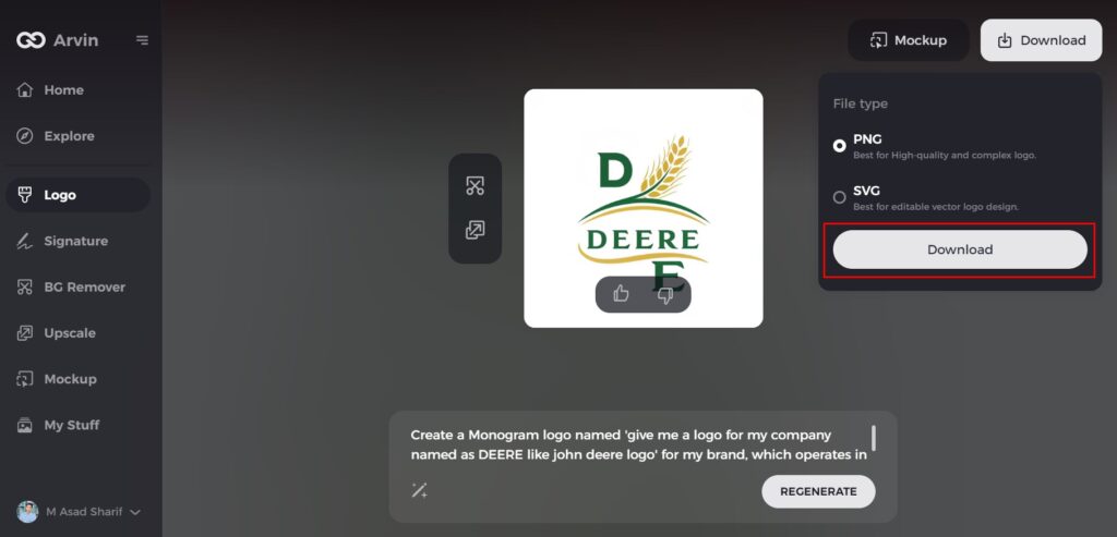
Step 7: Download Your Final Logo
After finalizing your logo, download it in formats like PNG or SVG. These formats ensure versatility for various uses, including digital platforms and print materials.
Conclusion
The John Deere logo is a mixture of tradition, innovation, and brand excellence. Since its first appearance in 1876, it has transformed to represent the growth and values of the company while maintaining the iconic identity. The green and yellow colors along with the leaping deere are a symbol of quality, resilience, and progress. Tools like Arvin AI, gives inspiration for a business to build an impactful logo that evolves in relation to trends. The history of the John Deere logo speaks volumes of effective branding, which never fails.
FAQs
What does the John Deere logo represent?
The John Deere logo signifies strength, agility, and a long legacy in agriculture that established for a very long time.
When was the first John Deere logo introduced?
The first official John Deere logo introduced in 1876 for branding.
Why did John Deere change its logo over the years?
Logo changes are to depict the company’s growth, modernization, and a need to remain current in the ever-changing market
How Arvin AI can help with logo design?
Arvin AI provides logo design analysis and improvement tools that provide information on brand recognition and historical trends.

