This is among the most popular social networking sites globally, with the use by billions. With its massive growth, the logo for Facebook had to change to reflect the site’s growing development as well as the social influence it started to acquire. We will explore how Facebook’s logo developed overtime with what each of them symbolized. We will also describe how the logo helped build Facebook’s identity and brand image. Finally, we’ll look at how it continues to change in the modern digital world.
Who designed the Facebook logo?
Mike Buzzard The original Facebook logo was a custom version of the Klavika font. The logo fonts itself was developed by Eric Olson and modified by type & graphic designer Joe Kral. The head of the project was Mike Buzzard, co-founder of Cuban Council. He offered to invest in the job, but refused.
Part 1: The Emergence of Facebook’s Identity – Early Life (2003-2005)
Here, we investigate into the origins of Facebook and explore the story behind the development of its first logos. From the initial incarnation of Facemash to its nascent stage as Thefacebook, we examine the emergence of Facebook’s identity.
Facemash (2003-2004):
Just before Facebook was fashioned to be what it is today, the initial project was known as Facemash. Mark Zuckerberg started building it as a way through which the Harvard students can rate photos of others. The logo associated with the original Facemash is very basic, with mere text and no real branding. It was the start of one of the most influential social media platforms.
Thefacebook (2004-2005):
Facemash had to be rebranded as Thefacebook in 2004. Early logos had the name in quotation marks with brackets around it. This was the first official logo that Facebook ever had. At that time, the website was only accessible through Harvard, but attention had already begun to accumulate.
Design Influence
The early logos of Facemash and Thefacebook were very simple. The text-based logos were inspired by the concept of making a platform that was easy to use and recognizable. From these early designs, the final version that formed the polished and modern Facebook logo was born, sticking to all things clean, simple, and user-friendly.
Part 2: The First Significant Logo Redesign-(2005-2015)
The next section shows the evolution that Facebook’s logo has had in between 2005 and 2015. This period showed the big evolution that came on the path to make it bigger and different.
Simple Wordmark “Facebook” 2005
In 2005, Facebook changed its name and dropped “the” from its name, hence becoming just “Facebook.” The small but crucial update reflected a move away from a college network and toward something everyone could use. To make the first simple logo, the company worked to simplify it, ensuring it was easier to remember and strong in identity; the new logo marked the beginning of the rise to worldwide popularity, making the brand feel approachable and professional.
Design Evolution:
As part of its logo update, Facebook launched a new typeface known as Klavika. This was a clean and modern font that would give emblem logo design a refreshing and professional look. This simplicity was also a departure from the earlier complicated look, thereby giving Facebook an opportunity to present its site in a manner easy to use and understand.
The Lasting Impression through Blue Color:
To put it another way, without blue, this was not how the Facebook company could have defined its brand through color. The company uses blue so often in logos, and by the nature of things, these hues are attached to trustworthiness, soothing calmness, and reliability-making the color synonymous with a go-to place a user would regularly check on. It also became one of the most recognizable elements of the brand, influencing how people felt about the platform.
Part 3: Minor Changes and Global Reach (2015-2019)
In 2015 to 2019, Facebook continued to change its logo and branding slightly and thereby continued its expansion into other parts of the world. The changes in 2015 also made Facebook even more recognizable, which meant an even greater impact on social media and online culture.
2015 Update:
In 2015, Facebook made some minor but really important updates in its logo. The majority of the changes concerned typographic logos design of letters. These were in an attempt to make the logo easier to read and more recognizable to users worldwide. This way, the new font made letters clearer; thus, it made it easier for people to identify a brand quickly, especially on smaller screens such as headphones.
Logo’s Global Recognition:
By now, Facebook’s logo had become the most recognized logo around. The blue wordmark was easy to spot on a website, app, or even a billboard ad. Its cleanliness drew attention, and the color blue became identifiable with social media. This helped Facebook to become a portal for people all over the world. The logo gave it a sense of trust and made Facebook seem like part of daily life.
Role of Facebook in Social Media Growth:
That was when Facebook started trending as the social network that would popularize social media and online culture. It stopped being only for the meeting of friends, turning into a platform for business, news, and entertainment. It was then a logo for that change in communication, ideas, and ways to interact on the internet.
Part 4: The Era of Corporate Reinvention – (2019-2023)
In the period between 2019 and 2023, Facebook began a tremendous shift in its corporate characterization. The company altered its focus, and it even rebranded to become Meta, which now indicated a new point in its growth.
The Corporate Logo Shift (2019):
Facebook in 2019 made a strategic shift in corporate identity by making a new logo for the entire company. This new logo was not only for the social media site but for the parent company owning other products like Instagram and WhatsApp. It was a technology company, although it focused its interest on something outside of the realm of social media.
2023 – The Monogram Logo:
In 2023, Facebook unveiled a new “f” monogram logo. This simple, clean design featured a lowercase “f” in a rounded style and became the new face of Facebook after the shift to Meta. The new logo was part of a larger rebranding effort. It was to be iconic yet contemporary and thus simplify the visual identity of Facebook without losing touch with its heritage.
Meta’s New VISION
A shift from Facebook to Meta was a name change as well as logo change, which was part of the company’s future vision. It focused on an idea called “metaverse” – a virtual world where people could connect in new ways. This symbol of Facebook and Meta was, in a larger sense, more than just the name of the social media site, but of the bigger vision to shape people’s interactions with the digital and virtual worlds.
Part 5: The 2023 Refresh – Simplification and Modernization
The Facebook logo got another update in 2023 as it strives for a simpler yet more modern appearance. The whole development was an integral part of the company’s continuous process for refreshing its brand, especially with the fact that it ventured even deeper into new technological and virtual worlds. It often featured in logo design inspiration for its branding.
2023 Design Update:
Removing the gradient effect used in the older designs of Facebook, its logo update of 2023 depicts a flat solid color of blue which makes it cleaner and simpler. Along with that, the boldness of blue color increased that made it strong and modern, and it aims to make it look updated without complexity, similar to current digital trends.
Impact on Brand Perception:
The updated design makes Facebook look more polished and contemporary. In reality, the logotype is better recognized and comes with a refreshed feeling of modernists. At the same time, the changes never lost the integrity of the idea. The familiar blue color together with the universally recognized font unite the logo even more with long history of the brand Facebook-the brand remains what it was for years, at the same time, evolving by keeping its relevance without losing identification.
What’s Next for Facebook’s Visual Identity?
Since Meta keeps exploring the use of virtual reality and new technology, future changes to the Facebook visual identity could take place. For example, it can make the logo even more simplistic, or develop more symbols related to the metaverse and other virtual environments. It could mean that the Facebook visual identity might change once more as it advances through growth and expanding past social media to encompass more technologies that Meta introduces to the public.
Part 6: Key Design Elements and What Makes the Facebook Logo Timeless
In this chapter, we take apart the primary elements that help the Facebook logo be so distinguished and timeless. The design that was used when creating the Facebook logo has played a huge role in its freshness with time, contributing to it becoming one of the most recognizable brands globally.
Typography:
The Klavika is the font used in Facebook’s logotype. The font is clean and modern, which makes the logo readable. Slight changes have made over the years to keep the font fresh and appealing without changing its core style. This keeps the logo looking modern and fitting with the design trends that change while maintaining the familiar feel that people recognize.
The Importance of the Blue Color:
Facebook’s choice of blue for its logo is important because the color is often linked to feelings of trust, calmness, and security. The shade of blue Facebook uses is bold and stands out, which helps grab attention. At the same time, the color blue symbolizes professionalism and reliability. Reliability is quite an important point in a network where users have shared their personal details.
Iconic Monogram: End
It simplifies the main logo and makes it easy to use on smaller screens, like in apps or on mobile devices. The “f” icon is simple and instantly recognizable, which makes it perfect for quick identification. This monogram became so strongly linked to Facebook that it’s often used alone, without the full name, and people still know exactly what it represents. The “f” monogram helps keep the brand in places where a full logo might be too large or complicated.
Part 7: Facebook Logo’s Impact on Branding and Global Recognition
In this section, we shall identify how the logo of Facebook influences branding and, consequently, why the brand is one of the globally recognized ones today. Over time, the logo has contributed massively to determining how the brand develops its identity and the influences it holds outside the company itself.
Facebook Logo in Popular Culture:
The Facebook logo is not merely an identity mark of the network, but rather part of pop culture. Most individuals in society have identified with this because the bright blue color along with the letter “f” logo, no matter the users. Movies and other advertising will even make appearances within everyday life using this symbol.
Brand Success and Challenges
Facebook logo has contributed to a large extent to the success of branding for Facebook. The simple yet recognizable design of the logo has enabled Facebook to be among the most identified brands in the world. On the other hand, the company has also faced challenges. The problem with Facebook over the years, such as privacy issues and the spread of misinformation, also changed the perception people have for social media.
Recognition Power:
The primary reason Facebook’s logo is very much recognized is that the design of the logo is very consistent. The blue color along with the “f” monogram are conspicuous, and with the passage of time, people begin to associate that logo with the social media concept and connecting each other. Another fact that played an important role was Facebook’s globalization—millions of people using the platform daily means the logo could be seen in every corner of the world.
Part 8: Why Arvin AI Is Your Best Bet for Logo Design
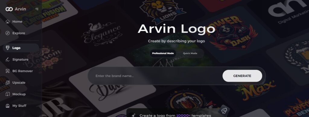
Arvin AI Logo maker is a powerful tool that uses artificial intelligence to help create logos quickly and easily. This allows anyone to design a professional-looking logo without needing advanced design skills. The AI technology understands your preferences and also provides logo options based on your brand’s style, making the whole process faster and more efficient. A completely new business idea or a renewed rebrand can now easily receive an attractive yet unique logo because of AI Logo maker.
Key Features of Arvin AI
There are following key features of Arvin AI:
- User-Friendly Interface: Arvin AI provides an easy-to-use platform where anyone can create a logo without prior design experience.
- AI-Powered Suggestions: The tool analyzes your preferences and provides customized logo options tailored to your brand’s style.
- Wide Variety of Templates: Arvin AI provides a vast collection of pre-designed templates to choose from and customize.
- Color and Font Customization: Users can adjust colors, fonts, and other design elements to fit their brand identity.
- Fast and Efficient Process: Arvin AI produces high-quality logos within minutes, thus saving time and effort.
- Download in High-Quality Format: Logos are downloadable in the best possible high-resolution formats that can be used on websites, social media, or printed materials.
How to Make a Logo with Arvin AI
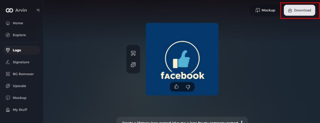
Step 1: Create an account and log in to Arvin AI
Go to the website of the Arvin logo maker and register. Use the login feature afterward to access your account and go to the section of logo designing.
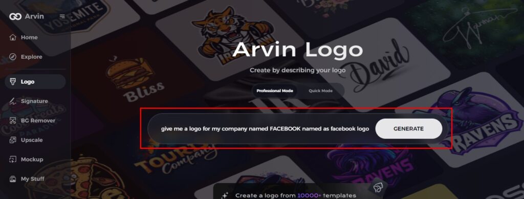
Step 2: Input your brand information
Fill out some basic details regarding your brand like name, slogan, and your business industry. You can further include specific designs, such as font or themes, if preferred.
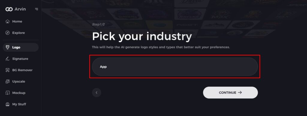
Step 3: Pick your industry
Industry selection for your brand. This enables the AI to generate logos specific to your niche and target audience.
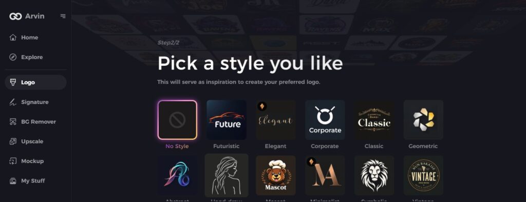
Step 4: Select a style
Choose a style that resonates with your brand. This will help guide the AI to create logos aligned with your vision.
Step 5: Customize Your Design
Once the AI has generated options for logos, use Arvin AI’s tools to personalize your logo. You may change elements like font, layout, and symbols to fit your brand identity.
Step 6: Save and Download
Review your final logo design and save it in high resolution. Your logo will be ready for use in both print and digital platforms.
Conclusion
The phases of the Facebook logo have reflected much about the growth of the platform, how adaptable it can be with every change in life. Indeed, every version reflects its journey from simple social networking into being part of Meta to define the future of digital connection-it remains timeless and still an icon of innovation and trust. Want to create a professional logo like Facebook—simple, sleek, and impactful? Try Arvin AI Logo Maker today and bring your vision to life with ease!
FAQs about the Facebook Logo
What did the first Facebook logo look like?
The very first Facebook logo was in the form of text with square brackets around the word “thefacebook.” published in 2004.
What made Facebook alter its logo in 2019?
It changed the font into a more readable type and gave it a new look for the brand.
How does Facebook use logos?
Our primary expression of the logo is in Facebook Blue with a white ‘f’. A Facebook Blue logo on a white background is our primary logo use. A Facebook Blue logo also use over imagery placed with consideration of the image content and contrast. The ‘f’ is always white in this case, never transparent.
How can I make my custom logo on Arvin AI?
Arvin AI makes making logos a breeze. Using AI-based tools, it makes it fast to change color, font, and design of a logo for a brand.
