Today’s video blog goes far beyond just hobbies and entertainment. This is a new business that brings millions of benefits to the most successful representatives. And of course, that’s because of the benefits of social platforms. Of course, the main stage of the development of the video blog was the birth of YouTube, but the second most important platform was TikTok. TikTok, launched in 2016, revolutionized short video content. We will explore evolution of TikTok logo. Because Today, TikTok is one of the most expensive brands in history. Therefore, as of 2024, the platform has over 1 billion monthly active users.
Part 1: What is TikTok?
TikTok is an online platform for creating and publishing short videos owned by ByteDance. The service was launched in China 2015 and is currently one of the best and most downloaded services around the world and viewed by more than 1 billion viewers.
Place where the TikTok found
TikTok was founded in 2016 by Chinese businessman Zhang Yi-min, the home of the world’s most famous social media platform. Today, Tiktok boasts of more than 700m users globally even as the application remains banned in several Asian nations.
Who made TikTok?
One of the most famous social media in the last few years, TikTok was created by Zhang Yiming, a young Chinese entrepreneur and software engineer. He designs applications through his company ByteDance.
Part 2: Meaning and History TikTok Logo
TikTok, which appeared in 2016, revolutionized short video content. The platform is quick to be a favorite among young people. Why can it be this way, though, and who came up with the idea of creating such a platform? We will tell you about it below. The official development and owner of TikTok and its Chinese version of Douyin is Beijing.
September-December 2016
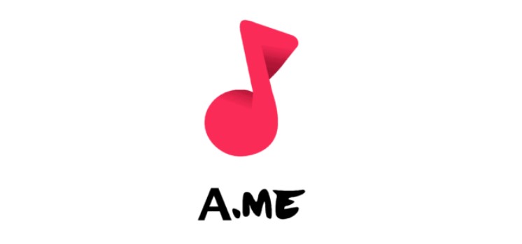
The first name of the famous TikTok platform was “A.me.” It was printed at the bottom using two different fonts. The “A” part is a traditional sans serif font with linear strokes and cuts, and the “ME” part was handwritten using markers. On the inscription, bright pink notes are placed three-dimensionally, reflecting the depth and diversity of the content on the platform.
2016 – 2017
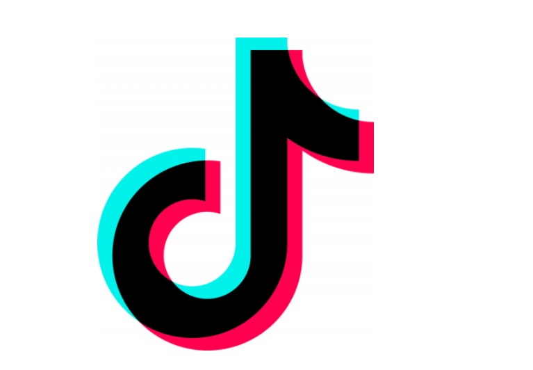
The center of the TikTok logo is always the “note” (mark “d”). The d form of the note indicates the service initial name in Chinese, Douyin, though the application is still called this in China.
2017 – 2018
A word mark was added to the note. In the original word mark, “Tik” and “Tok” were given as separate words: there is a clear gap between them. This was the most noticeable difference, but not all. The glyph itself looked ambiguous and had fewer clear angles. For example, let’s look at the edge of the bar above the original logo “T’s” or “k’s.”
2018 – Current
Two parts of the logo, the emblem and the brand name can be placed in several different ways. The word mark can be placed below the note, in which case the note is relatively large. If the note is placed on the left side of the letter, it becomes slightly larger than the letter. The original word mark was black and white, but the version adopted in 2018 has a color accent on “o.” This is an imitation of the blue and red shades used in the main logo of TikTok.
Part 3: Design Elements of Tik Tok Logo
Tik Tok logo is simple but its color scheme and logo fonts choices are invalueable. Consider this pattern when using a social media graphic maker to develop a logo.
Fonts
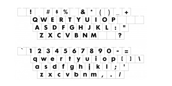
The author of the TikTok logo chose a simple and perfectly readable sans-serif. The bold and clean title case lettering of the official TikTok badge is set in a modern geometric san serif typeface close to popular fonts such as ITC Avant Garde Gothic Paneuropean Bold and Yaro Sr Black.
colors
For TikTok’s visual identity color palette, the black logotype and emblem logos are accompanied by neon pink and blue shades. This color scheme has a very interesting explanation. The designer of the TikTok logo imagined a rock concert in a dark hall and a bright stage. The highlight of the emblem is the 3D effect.

Symbol
The name of the author of the TickTock logo is unknown, but we know what inspired him to create a black note with an outline similar to the letter D. The designer came to the concert, where it was dark, and the loud sound vibrated the picture. Therefore, I added a light color accent to the black note so that it reflects in any color.
icon
TikTok logo icon TikTok logo icon TikTok logo icon TikTok logo icon TikTok logo icon. The TikTok icon is like a bright color note from the beginning, which represents the musicality of the application. This TikTok icon seen alone or a part of official social media logo. It looks like a note symbol on black ground. This shows that iconic logos are the essential part for the uplift of your branding.

Part 4: Analysis: TikTok Logo Design Evolution
In the ever-changing social media, there are few logos that capture the essence of the brand as TikTok. TikTok’s logo design was an attractive journey of creativity, adaptability and consistency. Crack into the three points that condense the talent hidden in the TikTok logo design.
Consistency of core symbols
The TikTok logo design has maintained the symbol of the symbolic “d” note since its birth. This consistency is not just a choice of design, but a connection between brand identity and musical roots. The constant use of notes maintains consistency which signifies a brand that is confident about its identity because it understands it and does not have to Guess on it.
Flexibility in design positioning
Starting in 2018, the logo incorporated adaptability by allowing the emblem and brand name to be placed in various forms. The flexibility of the design ensures consistency on various platforms, whether the notes are placed large under the word mark or slightly larger on the left side of the text. This is one of the cute logos for your brand to adapt uniqueness.
Part 5: What Does the TikTok Logo Signify?
The TikTok logo is not just a visual identifier, it aggregates the core values and essences of the platform:
Creativity and Expression
The dynamic design of the logo embodies the creative spirit of TikTok users. This would signify the commitment of the platform for the self-creation of its users, conducting experiments with its content, and participation in varied arts.
Pro Tip: It would also make your logo some visual insight about what your brand aims at. Consider elements showing off unique aspects of the brand.
Global Community
The sharp green background symbolizes the globalization and interconnectivity of the TikTok community around the world. It symbolizes the cultural/multimedia approach as well as the vast array of other people and systems involved in constructing a versatile and attractive hub.
Pro Tip: Connect with your audience through professional advice logo symbolism. Visual elements can evoke sense of belonging and unity.
Playful and Entertainment
Lowercase and playful typography expresses casuality and fun, highlighting TikTok’s reputation as a hub for entertainment and light content.
Pro Tip: The choice of typography depends on how your brand received it. Choose a font that fits your brand’s personality.
Movement and momentum
This design represents the fast tempo of TikTok’s short video.It shows how fast the platform is in popularizing a trend and how it wakes up the people’s imagination.
Pro Tip: Incorporating design elements that imply movement creates a sense of energy and engagement.
Part 6: Branding lessons from TikTok’s success
TikTok’s branding journey provides some important lessons for brands trying to impact the digital age:
1. Embrace playfulness
TikTok’s playful logo reflects its commitment to providing a nimble and enjoyable experience. Do not hesitate to incorporate playfulness into your brand’s visual identity.
2. Connect globally
The reach of TikTok’s logo into the international market underlines the need to come up with a culture sensitive logo.
3. Importance of Adaptability
Variations of the logo in various TikTok events show the strength of adaptation. You can keep your branding fresh by creating your logo to suit specific campaigns and events.
4. Expressing Essence
The TikTok logo concisely captures the essence of the platform. The logo should visually embody what your brand represents and what kind of experience it offers.
5. User-centric design
The TikTok logo prepared to your preferences and behavior. Prioritize user-centric design elements that enhance user experience.
Part 7: Shine Your Branding Approach with Arvin AI
No branding is possible without an effective logo. It covers the mission and values of an organization and its identity. This happens to be the first point of contact with your vision through any form of visual means that reaches out to the target market. The best tool in doing so is Arvin AI, which can assist in designing logos that really hit the hearts of the target audience through the help of advanced technology and insight uniquely suited to every business.
Key Features of Arvin AI
- Customizable Solutions: Modifies logos to the unique mission and values of each business.
- Targeted Impact: Creates audience-resonating logos with advanced insights.
- Creative Empowerment: Inspires designs capturing the brand’s essence.
- Tech-Driven Excellence: Produces professional, data-driven logo designs.
- Seamless Support: Logo-making for small business to large enterprises, simplified.
- Audience Alignment: Shapes logos that deliver powerfully in accordance with the perceptions of customers and market trends.
Steps to Use Arvin AI for making Logo
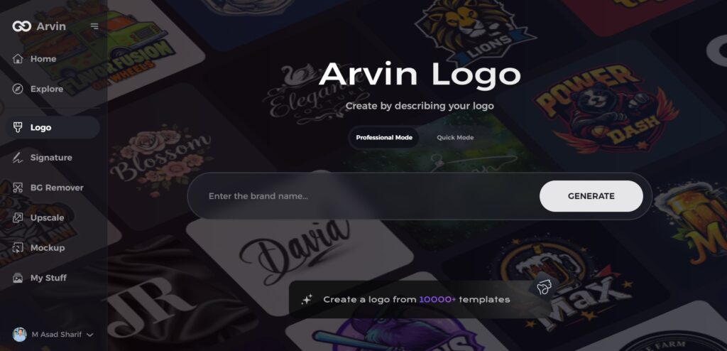
Step 1: Visit the Arvin AI Website
Open your web browser and go to the Arvin AI logo maker site to begin designing your logo.
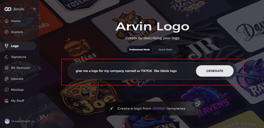
Step 2: Provide Business Information
Enter your business details, such as name and category, so the AI can generate logos tailored to your brand.
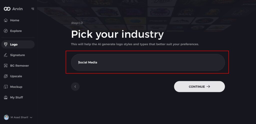
Step 3: Choose Your Industry
Select an industry from the available list. This will guide the AI in narrowing down logo styles that fit your sector.
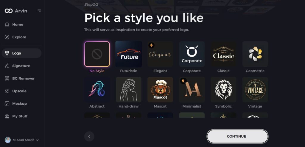
Step 4: Select a Logo Style
Browse through the style options and choose one that aligns with your brand’s vision. If unsure, skip this step, and let the AI use its default inspiration.
Step 5: View Logo Ideas
The AI will generate a variety of logos based on your inputs. Review the options that best represent your brand.
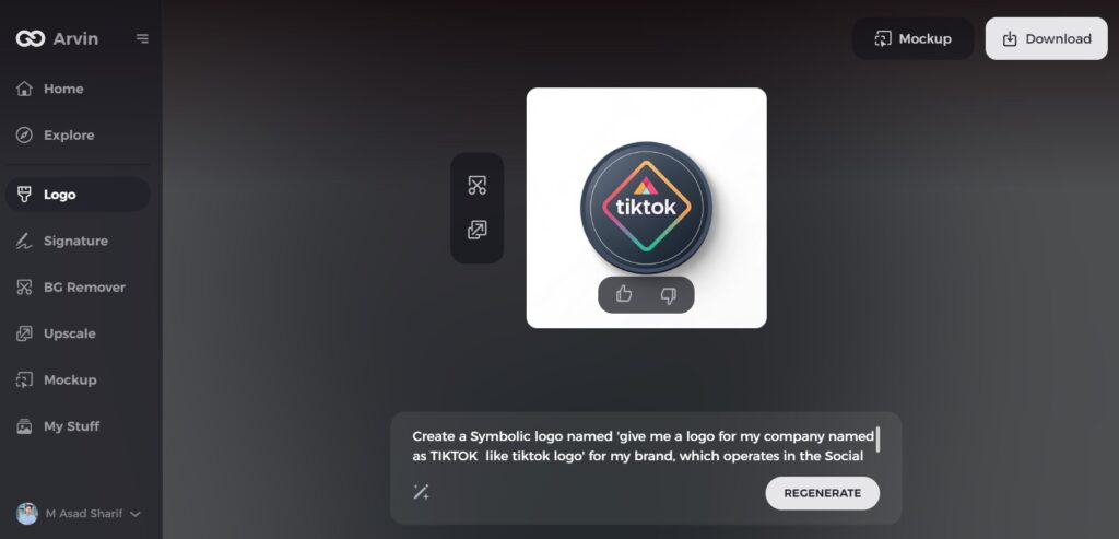
Step 6: Customize Your Logo
Tweak your selected logo design by adjusting elements like color, font, icon, and layout to reflect your unique style.
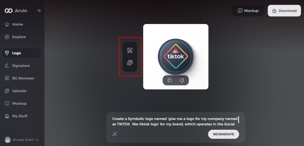
Step 7: Download Your Logo
Once satisfied, download your final logo in PNG or SVG format, ensuring compatibility for online and print use.
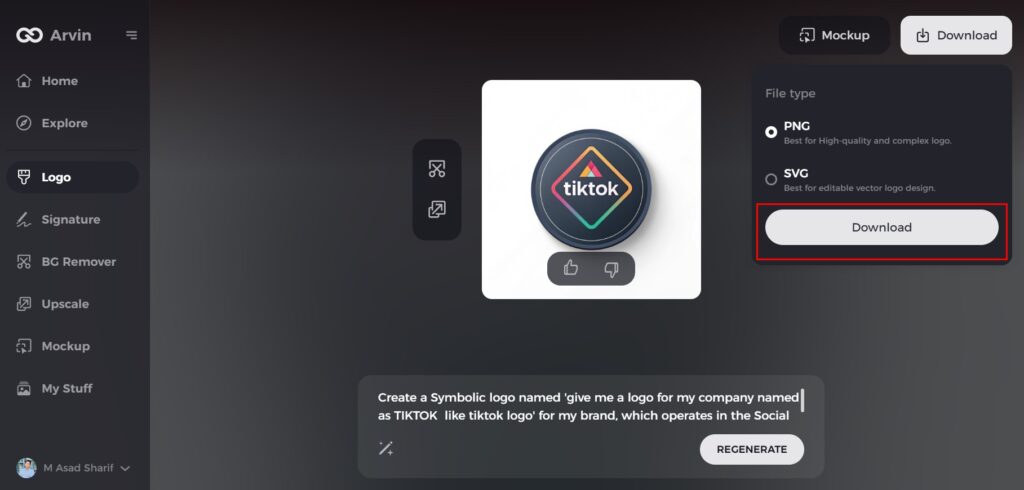
Conclusion
As mentioned earlier, this is the way that logo works for branding. More so, the image of TikTok logo is the emblem of its growth and value towards the whole brand. The creation of TikTok from being humble Leader to being changed into an overall phenomenon across all nations involved using that logo. It is most important characteristic in creating the brand, especially one that shall be able to connect with those audiences. Tools such as Arvin AI enable businesses that intend to boost their branding strategy to design logos.
FAQs
What inspired the design of the TikTok logo?
The earlier idea for the TikTok logo was also concerned with music and creative leaning in view of the contents of the platform, and how people created and shared them.
What is the effect on the TikTok logo?
Those who have read this article carefully also know that the original name of TikTok’s word mark was “Douyin,” which translates to “trembling sound” or “trembling music.”
Why is the TikTok logo so iconic?
A simple font, bright colors, and a music note can all come together to create a memorable and impactful logo for TikTok.
How to make a logo like TikTok?
You can make logo like TikTok with AI logoi maker like Arvin AI. It looks to share the list of insights, solutions, and guidelines generated through AI with businesses who want to establish logos that represent the core character of their company.

